Next in line in my army of High Elves project, is this pretty unit of Ellyrian Reavers, again from the fantastic box of Warhammer: Island of Blood. They will be a very nice addition since they are interesting miniatures and the first ones on horses for my army. I hope this doesn't go too long in time but with many projects at the same time, one never knows! Come with me, I hope you enjoy the process!
Each Ellyrian Reaver is made of three pieces, one for each side of the horse, and the head of the rider. The quality of the plastic is amazing.
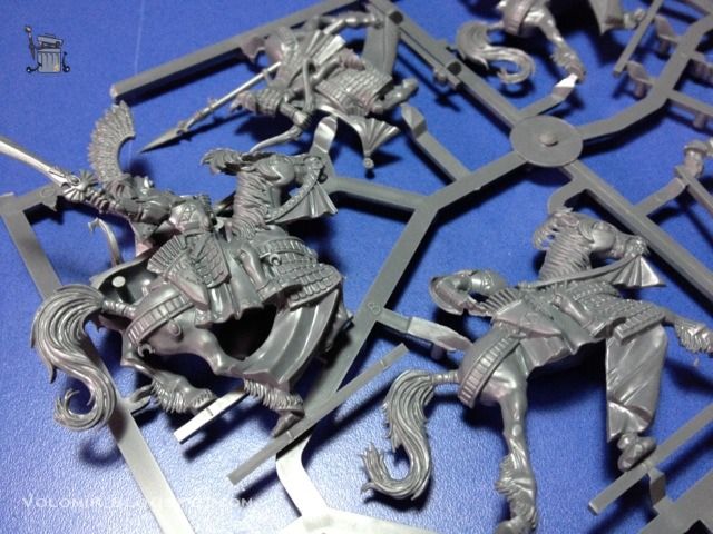
Even so, the sculpt have minor flaws (as usual) so that the casts are easier. One example is this plastic between rein and neck of the horse which is a bit disturbing for me. Fortunately it is easily removed with a knife.
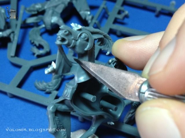
It's a little bit like sculpting (shaping, mainly), and the result is very good.
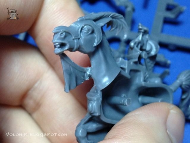
Obviously, as with all the other elves, the scales in the armours are too big for my taste. I followed my usual scale sculpting process to fill the rows in between scales. Check the Sea Guard or the Swordmasters for more info. After that, as usual, I washed the miniatures with water and soap, let them dry, and then I fixed the miniatures temporarily to some big corks. You might have noticed that I was trying to paint miniature and base altogether to save time. In this case, the bases will need some work because of the idea I have (I will talk about this later) and I won't be able to paint them together. So for now, corks and patafix.
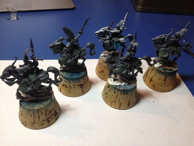
After this, I prime them black. You might have noticed in the previous photos that one of the riders was already primed with black and white, and even had paint on him. That was because I used the guy in a painting demo, but I will prime him too.
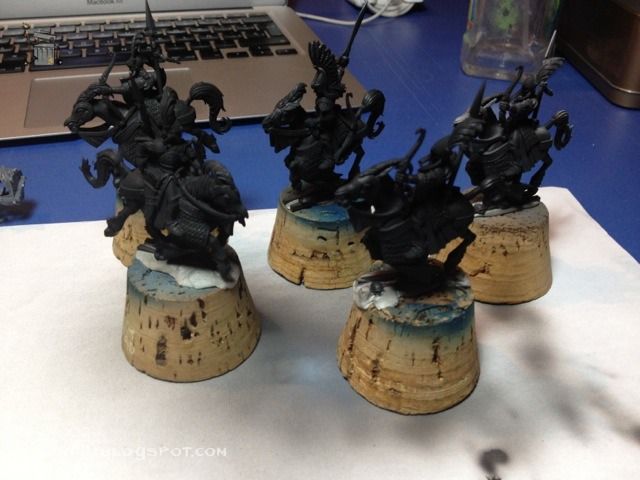
And then I prime them white over the top. This gives me a general idea of where the light will be when following a zenithal lighting scheme.
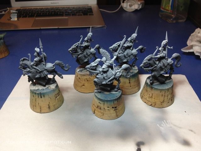
The most common surface in these miniatures is the silver metals (armour, helmets, plates and scales). I will paint them in a dark colour to serve as base for the metallic paints, in this case, Dark Sea Blue.
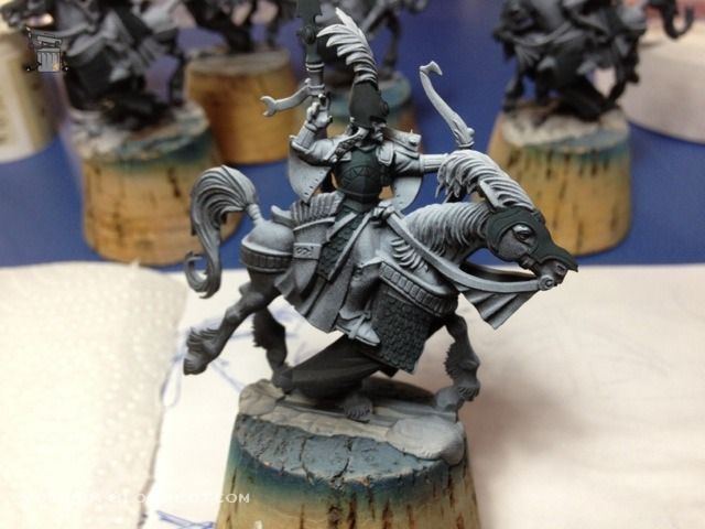
Now I wash the scales with black and blue inks. This is different to what I did in other units, where I just outlined the shadows after painting the metallic scales. I think this will save me some time.
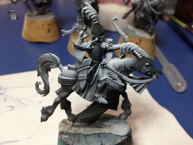
Once this is done on the scales, I basecoat everything with Boltgun Metal. On the scales I was careful to leave the dark colours of the recesses that work as outline.
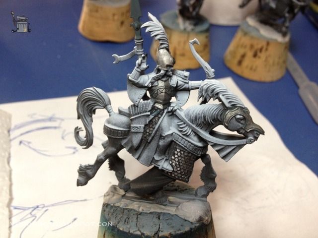
Lights on the metallic parts are done with Mithril silver and then Metallic Medium from Vallejo. Check out where the lights are placed. Especially on the scale parts, because it is important to simulate the shines from a fixed position. Illuminating a line of scales more than the rest, increases realism.
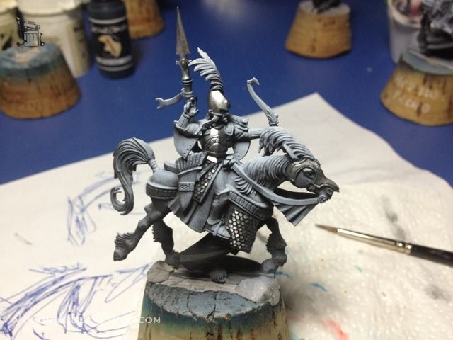
Further shadows on the metallic parts will be done using airbrush and blue-green tones, as with all the elves. Let's show the process once again on the sword of the Ellyrian Reaver Harbinger (the one with the feathered helmet).
First thing is covering the metal that will not be painted, in this case, with some masking tape. Then airbrush with Turquoise on the part opposite to where the shine would be placed.
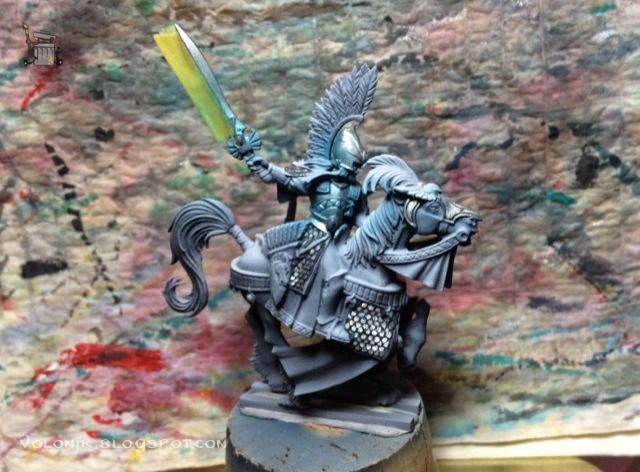
Deeper shadows with Dark Sea Blue, airbrushed.
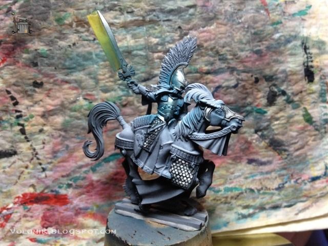
Further down with a darker colour, in this case mixing some blue and green inks with the Dark Sea Blue.
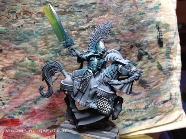
Once satisfied with one side of the blade, we do the same on the other side, keeping in mind that shines on opposite blades should be on opposite places (as a general rule if we don't want to think too much about how metal would reflect light).
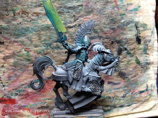
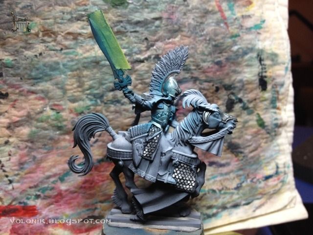
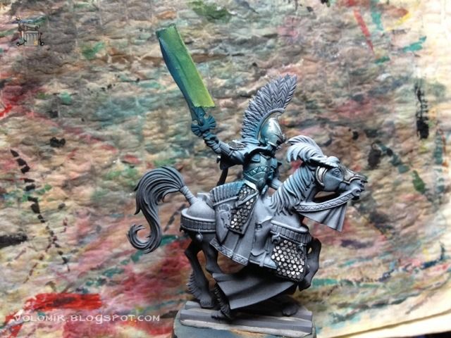
Once it's done, the only thing left for this metal would be to take off the masks and then outline carefully all the details.
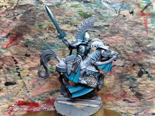
As you can see I added the turquoise blue to all the cloths that will be painted in that colour. I will do that on all the other riders, I want to get a glimpse of the whole colour scheme before moving forward.
It's now time to get some basic colour scheme on all the Reavers.

Following the same colour schemes as what I used in the rest of the army, I will be using turquoises, cold reds, whites and metallic silver and golds. In this case, I'm adding the red parts.

Now the brown parts, these will serve as the basecoat colour for the shiny gold metallic parts.

Of course, this step also works for the parts that will be in some king of brown, like the bow.

The colour scheme is quite simple as usual, and seems to work so far. Obviously, the scheme has been tested before in the other elves so making it work was trivial at this point! Just making sure that all the colours are not concentrated in just one area for compositional reasons.
I'm also darkening the grey of the horse in some parts and making it a bit dark blue.

With the basic colours in place, I will start detailing every part. I will follow a simple methodology which has proven very useful to me in the past. It prevents me from procrastinating, a big problem I have because I lose tons of time just looking at the miniature trying to decide what to tackle next. But not any more! What I will do is simply start from the bottom and complete areas moving on to the top. It's REALLY simple, I know, but it's also REALLY effective.
First off, the cloth hanging from the barding. It's really interesting to make it double sided, so the external part will be blue, and the internal will be red. Also, to deal with the flaws in sculpting due to the designs of these plastic miniatures, I will simulate that instead of one cloth, there are two, one on top of the other, just by using paint. I do it by outlining the edge of the material with two lines of lighter blue and red with a dark line in between them. Sculpting with paint! Magical!


Same with the other side. Check out the barding with just base colours of red and blue.

And the finished version with lights, shadows and outlines.


Cool, right?
Let's do it now on the rest of the riders, I think it is interesting to see the before and after pics in each case.



It's time now to start putting some paint on those horses. Each of them is going to be different! For now I will just do some washes of the base colours of the horse skins. Since the priming job is already good for zenithal lighting, changing the colour but letting the black and white gradients underneath shine through will do the trick.
For example, this horse would be brown.

After those first washes, I insist with the colour to bring up the saturation. Also, the legs will be darker (nearly black) and I will do some work on the face. Basically outlining the eyes and the mouth. You can see how the mouth is also a bit darker.


This other horse will be ochre. First, with some washes.


Then again, insisting on the colour to make it more saturated, but always following the lighting scheme of the priming job.


This third horse will be dark grey. I will just go with some washes of a slightly dark blue over the priming. It is very difficult to distinguish, because its so light that it looks like I did nothing and I just left the prime base.


When I paint and define more the face of the horse, the colour starts to show a little bit.


A very similar colour is what I am going to use for the horse of the captain.


Tired of the horse colours, I decide to move on and go back once the rest is more advanced. I will move on to the golden parts of the horse barding and the rider.
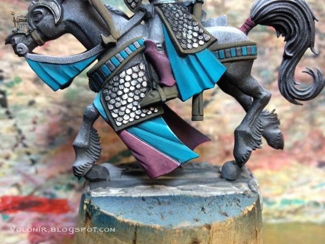
For example, let's take one of the brown horses. In this pictures you can see what are those golden parts that I am talking about: borders of scale armours, bracers and shoulder pads.


In a next step I outline and use silver metal as final highlights.


I also use this step to paint the blue clothing on the riders. It's very interesting to see the pictures of before...

...and after.


Or in this one, these two pictures are from before...


...and these two, after.


I need to do this in all the horses, so let's take a closer look in detail at the process. First I put a base of a dark brown, Chocolate Brown will do in this case.
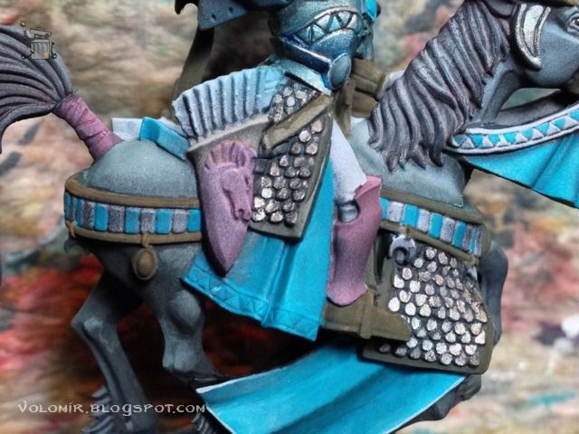
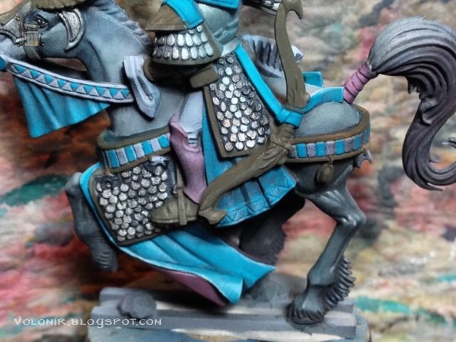
On top of that, a layer of a lighter brown. English Uniform for example.
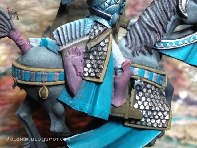
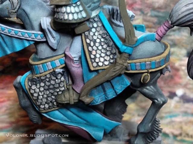
And on top of that, lighter areas of yellow.
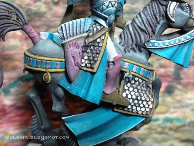
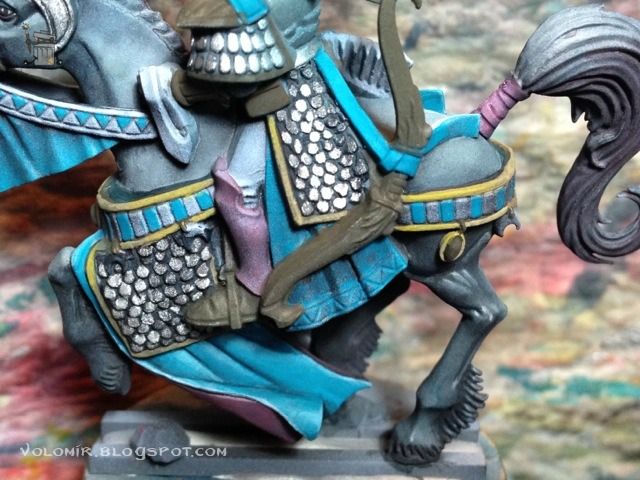
Those yellow areas are now covered with gold metallic paint.
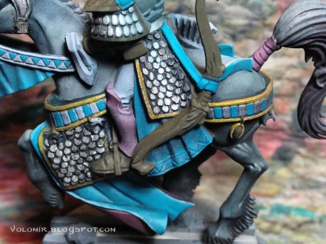
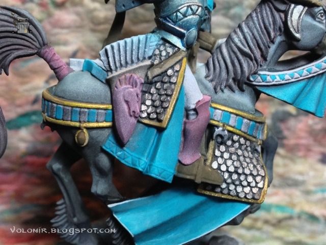
Highlighted with silver metallic paint.
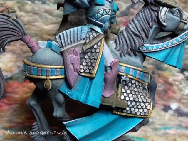
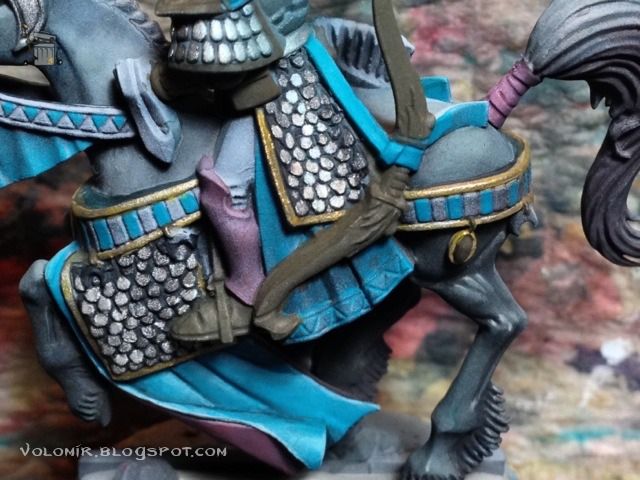
And metallic medium for the highest light spots.
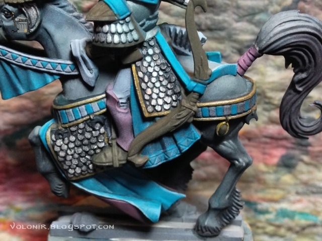
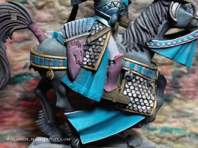
Once the golden edges are done, I paint the white and blue tiles. First, a simple basecoat of white and blue, careful not to mess with the recesses.
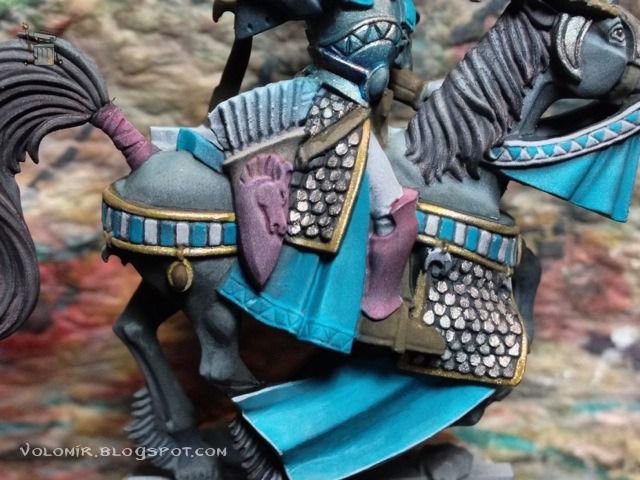
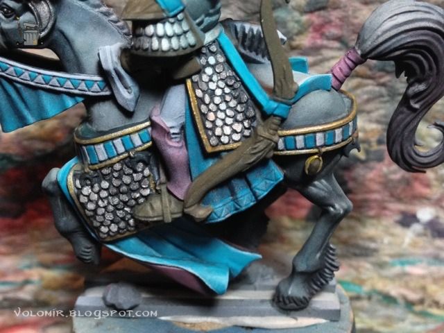
The key to the effect of the tiles is the outlining. Thin lines of nearly pure white on top of the white tiles and very light blue (Space Wolves Grey) on top of the blue tiles.
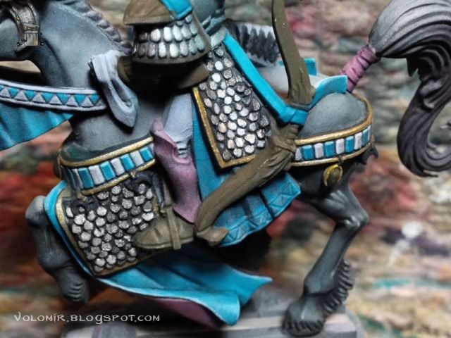
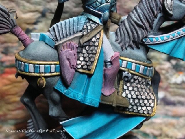
The process is pretty simple but it can be time consuming since we are painting a whole unit. So much work deserves another dose of "before" and "after"!
Before...
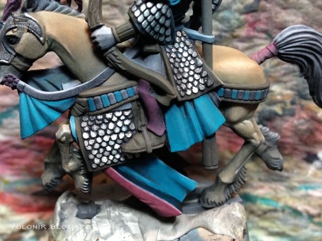
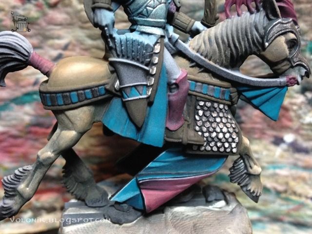
...after!
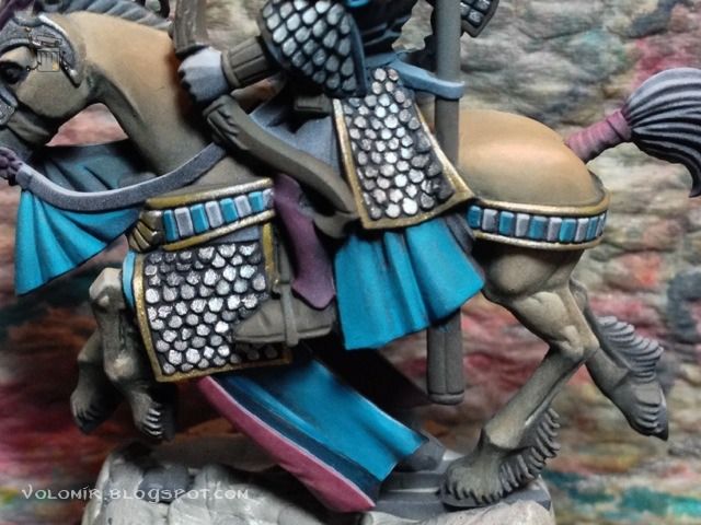
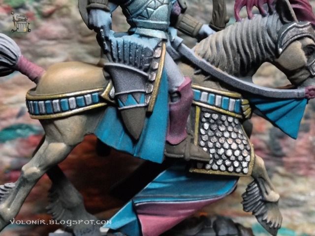
Let's move on to the shoes. The key here is to define the leather by outlining and creating texture. First, a quick wash of brown over the shoe, showing the prime coat underneath.
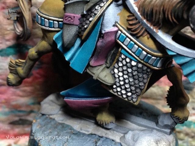
Lighter coat with Bestial Brown.
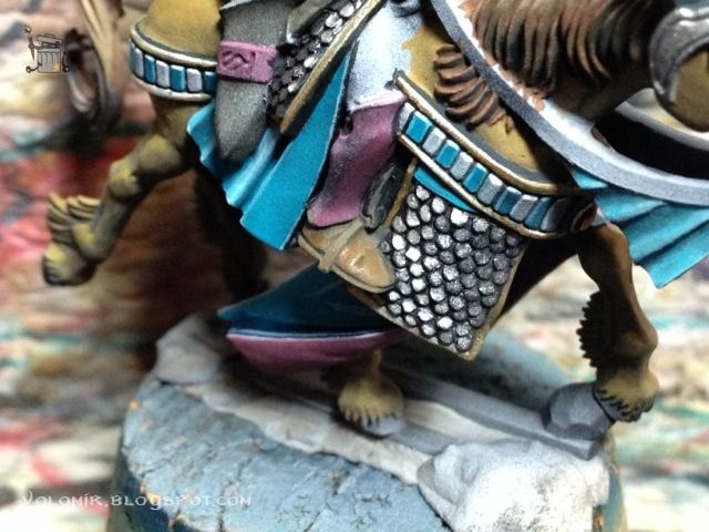
Dotting, I raise the colour with English Uniform (Vallejo) and Confederate Grey (Andrea).
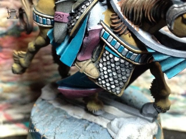
Outlining is essential here, even if it is done dotting. Confederate Grey.
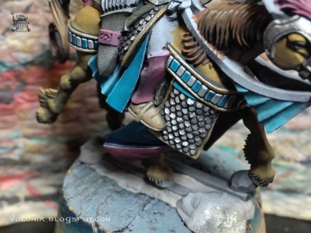
A bit more, adding Nacar to Confederate Grey to make it lighter.
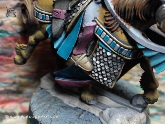
And further more adding pure white to the previous mix.
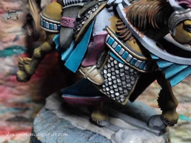
Then I paint the shadow outlining, with Dark Sea Blue (Vallejo) and some Inks (Andrea) to gain depth. It defines everything very much.
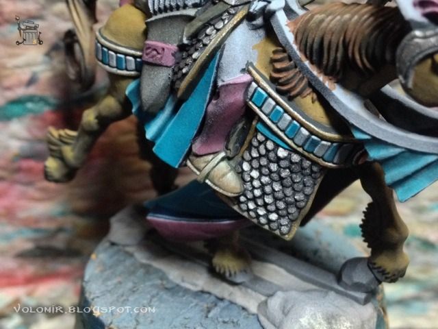
If the result is too white, we can always colour it up with Brown Ink (Andrea) which will also give an interesting satin finish. Also pure white will work for the most extreme light spots.
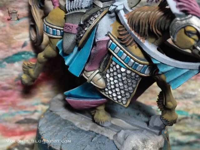
This is done in all the riders, but I don't think I need to show it on each and every one of them!
Let's continue with the gaiters instead. First off, just a thin coat of blueish red over the black&white priming.
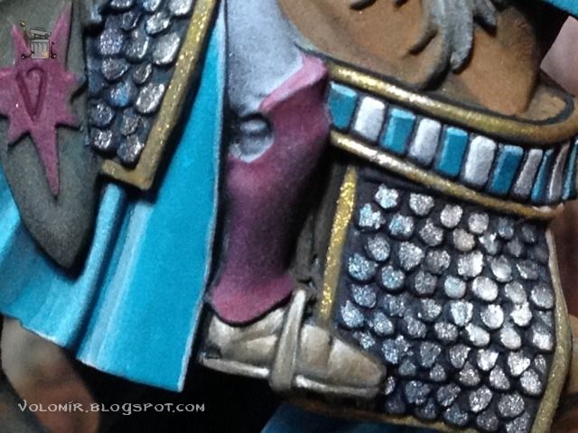
The priming is very useful as it let's us guess where to situate lights and shadows, that's what I will start to do, with a slightly lighter tone of red.
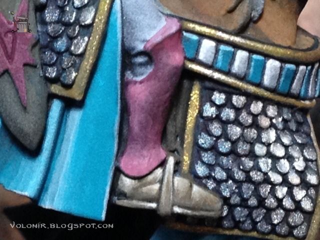
I keep on raising the light by adding Space Wolves Grey.
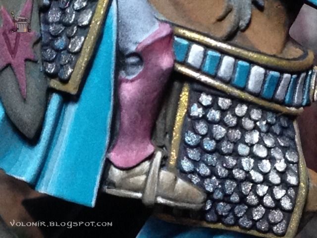
The final lights are done adding white to the mix, which results in a very light shade of pink. I will also outline the edges of the gaiter with this colour.
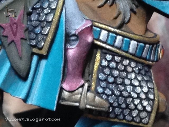
I will start with the shadows, adding Dark Sea Blue to the original red.
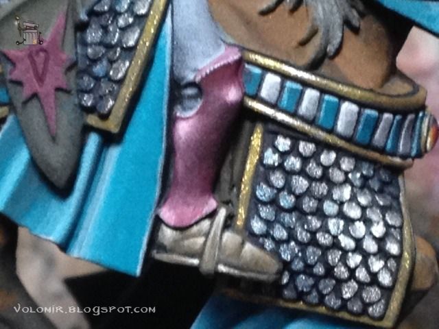
A darker shadow is done by adding Dark Sea Blue and some ink (blue/green from Andrea) which is also used to outline the gap between the edge of the gaiter and the leg.
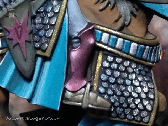
With the base tone, I smooth some of the transitions.
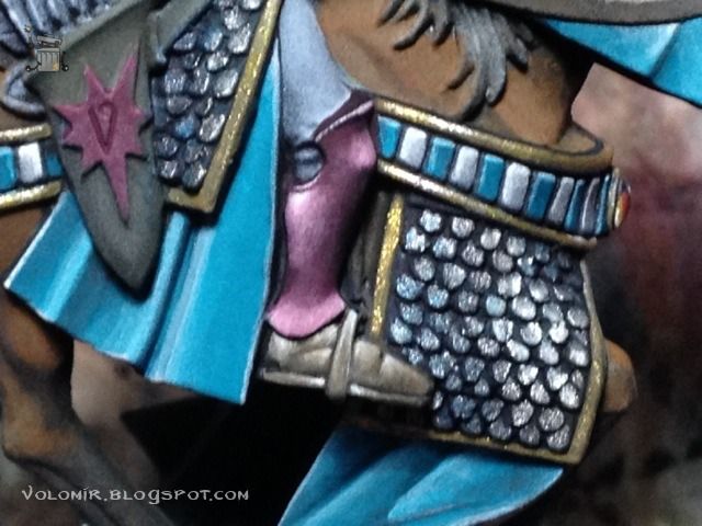
And some final touches to clean it all up and add a bit more overall contrast.
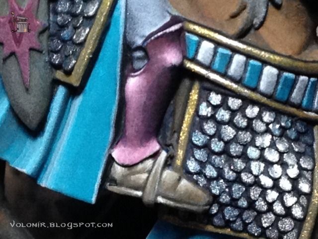
Moving up to the pants, you can see how the gaiter is finished. The pants will be painted white with blue/green stripes, freehanded. The pants are not one of the best parts of these models, because they can't have gaps due to plastic casting. Therefore, my paint needs to make this important area interesting and more realistic. To make it interesting, the stripes; to make it more realistic, proper lighting.
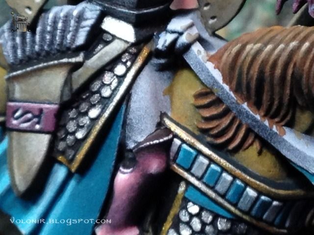
Over the grey prime base, a sketch of the stripes in Dark Sea Blue (very thin).
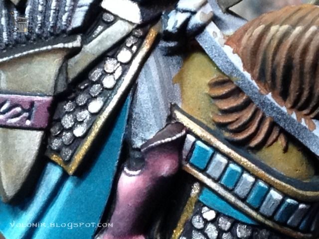
Once happy with the sketch, stronger layer of blue over the stripes.
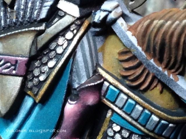
In between the blue stripes, I add white. These stripes are whiter on top and greyer on the bottom, to follow zenithal lighting.
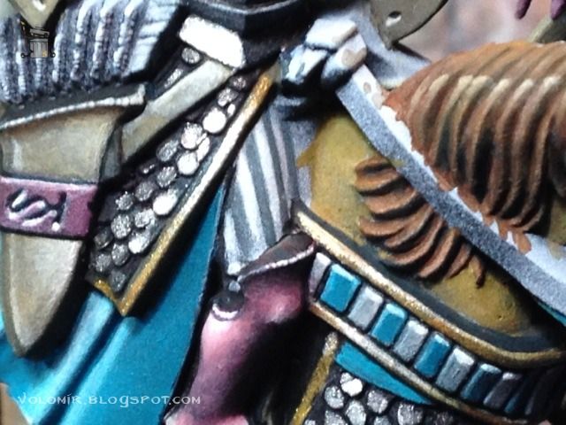
To the blue stripes, I will add some lights in turquoise.
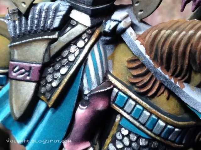
The gap between rider and horse could be interpreted as pant. I shadow it down as if there was a gap in between. This is a key way of correcting bad sculpture with paint!
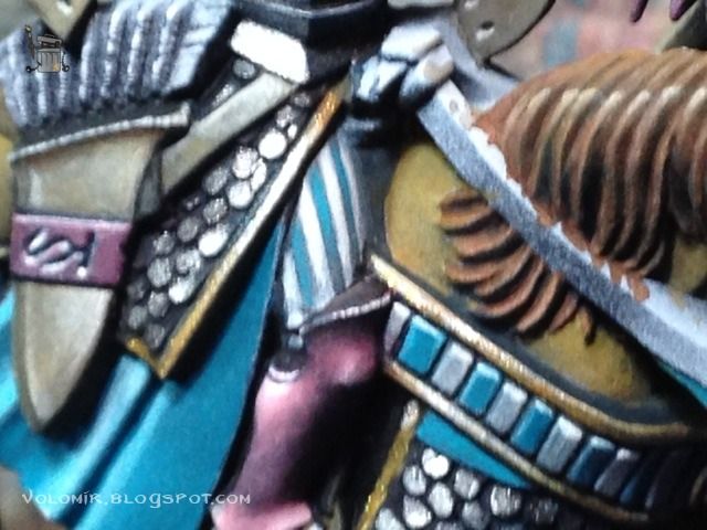
I define the stripes a bit more adding stronger shadows on the bottom and refining the edges a bit.
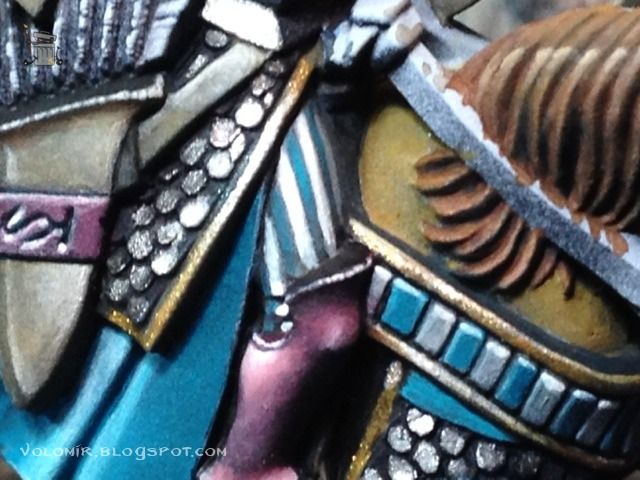
Some thing glazes over all will homogenize everything and make them more coherent.
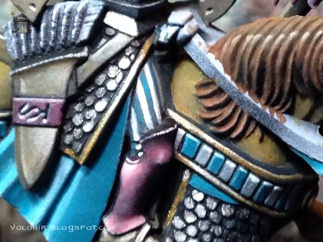
That's it! Let's do it on all the horses. I will not bore you repeating the same process all over again! ;)
Let's move on to some other details of the horses, for example, the reins. Pretty simple paintjob, basecoat of some kind of brown, English Uniform for example.
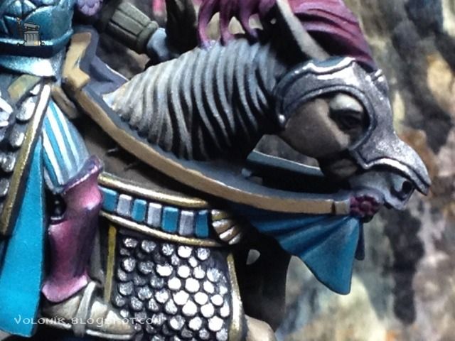
And then, a fine outline over the top to define it. I could have done some gradient or texture, but this is not a very important nor visible element so for now I don't want it to pop out more. Pretty simple right?
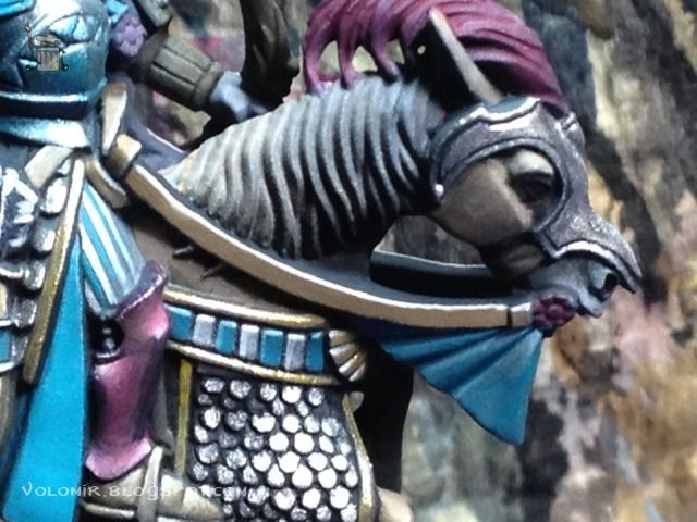
Moving up in the miniature, I have the bow. Let's do a simple wood effect on them. Basecoat of a dark brown, Chocolate Brown in this case.
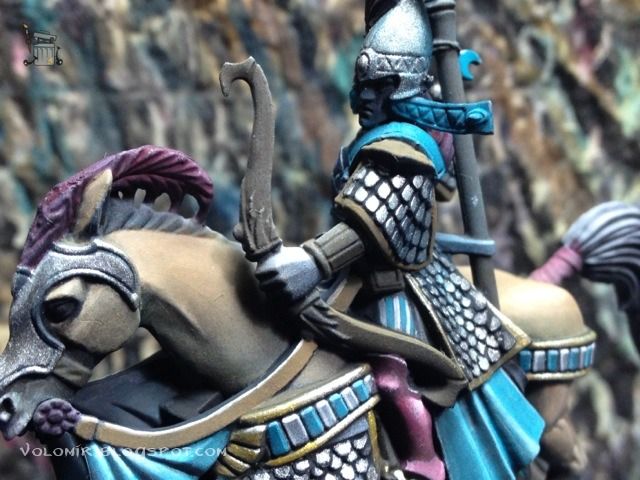
Progressively, I will draw the stripes on the wood, simple and thin lines of lighter browns.
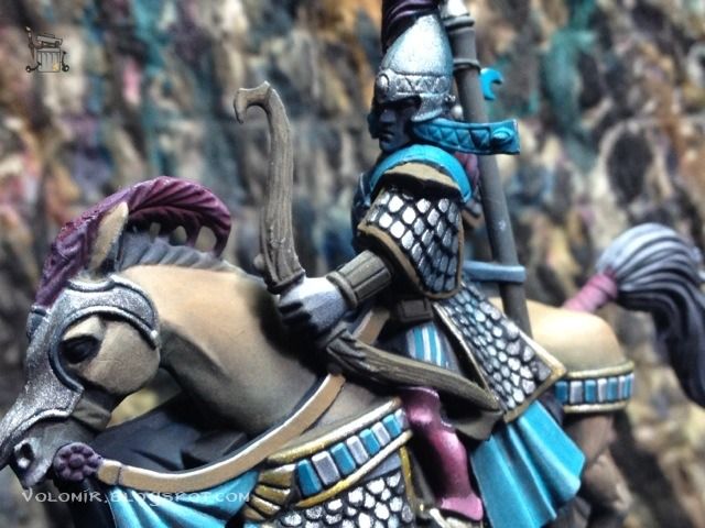
In each stage a use a lighter brown, and cover less of the line.
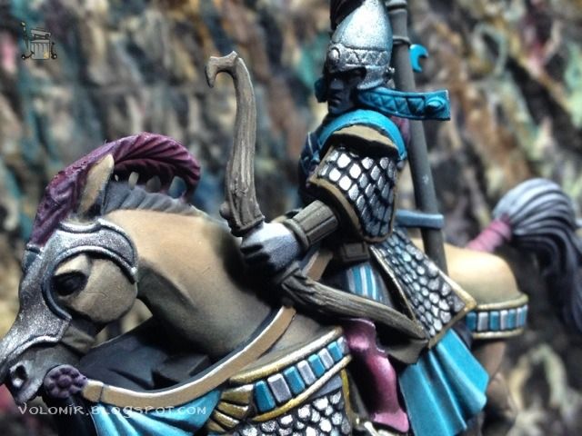
I don't want to outline the whole lines, just some spots, like the upper part, or the part closer to the hand. Also, I outline the elements on the grip of the bow.
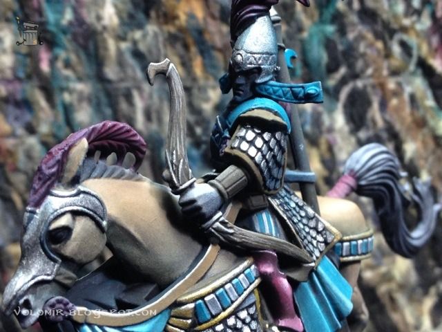
In this last step, I just slightly shade those elements and the wood with some inks, blue and brown. They give a nice satin finish which is perfect for my purposes.
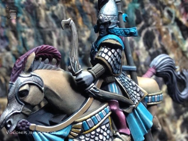
I continue with the golden elements on the arms. On top of that brown coat, I just paint some flat gold colour.
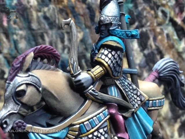
Highlights of that gold are done with a silver metallic paint mixed with the previous golden colour, just following zenithal lighting.
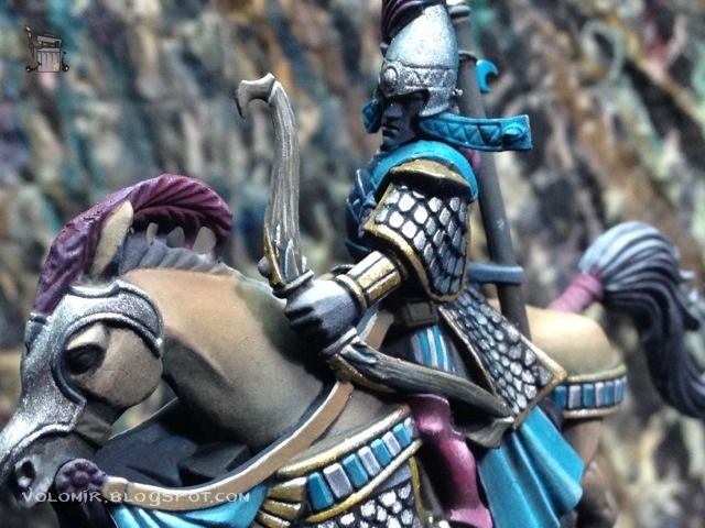
The armour on the horse heads will also be painted in a very polished silver elven armour. First a simple basecoat of a dark silver metal, in this case Dark Metal from Scale75.

I start highlighthing progressively with lighter metallic paints. First, Heavy Metal (Scale75) and then Speed Metal (Scale75).

The lightest spots are done with White Alchemy (Scale75).

Now it's time for the blue elven look of the metals, shading down with glazes of turquoise.

And further with Dark Sea Blue.

It's important to have a clear outline of the elements so that everything is clean, I go over the recesses with dark inks (Green, Blue inks).

Another shot of the finished head, it's difficult to photograph metals on work in progress articles!

The face of another horse, this one was painted with Citadel metallic paints instead of the Scale75 ones.

Moving on to the higher parts of the minis, here we have the blue parts around the torso and face. They will be painted in the same way as all the turquoise-blue parts of the elves.
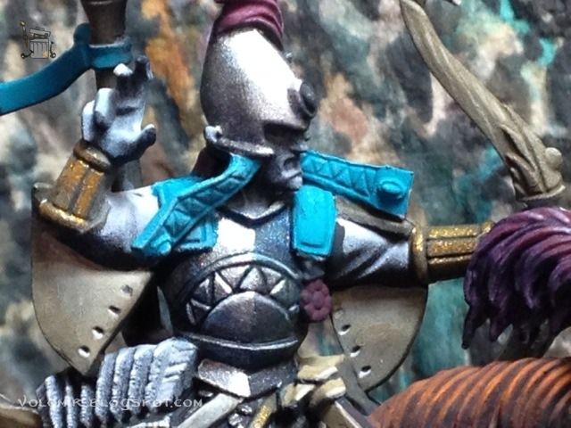
I am going to try a different way of blending, just for fun. First I mark the colour areas very roughly (Space Wolves Grey on top, Dark Sea Blue on the bottom).
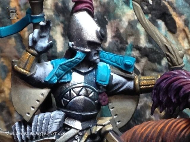
In between the areas, I introduce middle tones (basically 50%-50% mixes of Space Wolves and Turquoise for the upper transition and 50%-50% mixes of Dark Sea Blue and Turquioise for the lower transition). Then I glaze over to blend it.
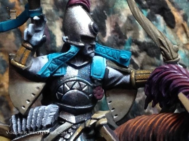
The result stands out when you outline properly. Heavy definition with Dark Sea Blue mixed with blue and green inks.
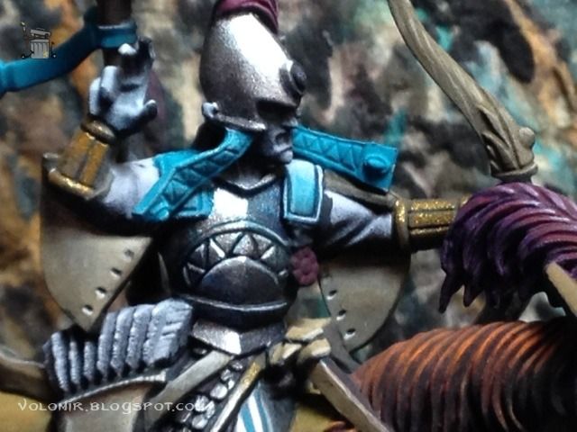
The stripes that come from the helmet will also follow the colour scheme. I will go from dark to light, so I start over a coat of Dark Sea Blue.
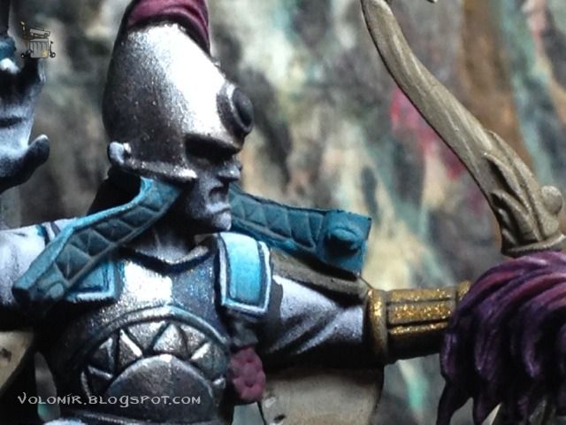
The upper triangles will be white.
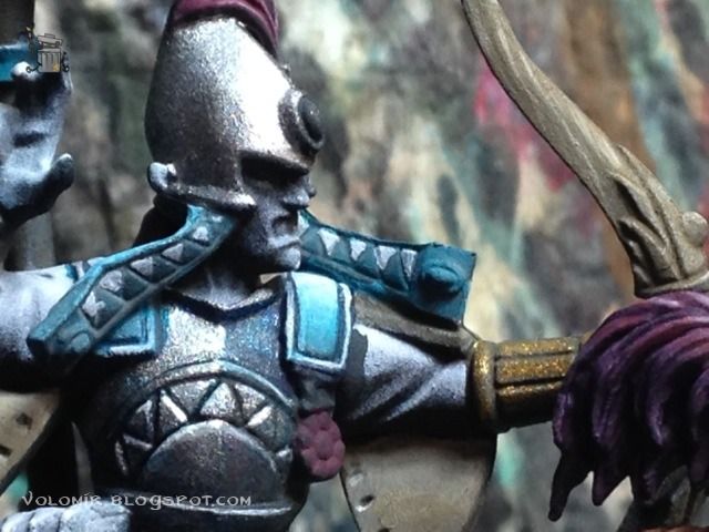
The lower ones will be turquoise.
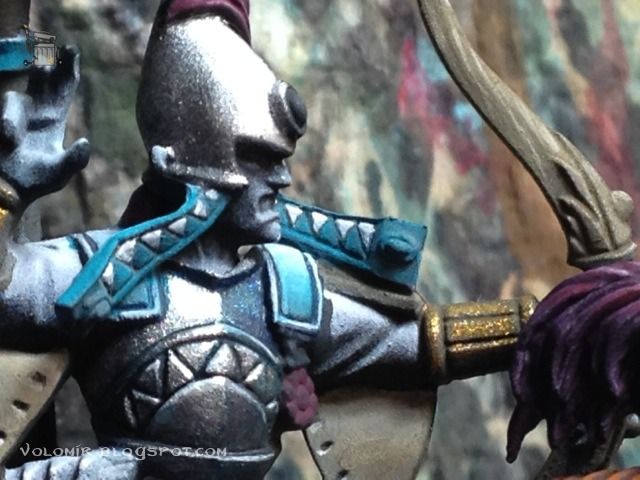
Outlining according to zenithal lighting will do the trick.
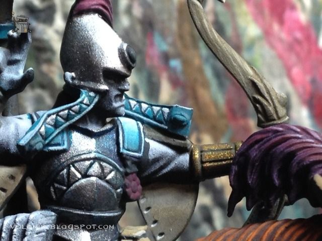
I will use the turquoise and blue colours on my palette to paint the feathers on the helmets. Again, a basecoat of Dark Sea Blue.
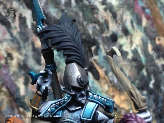
I will place the light on the middle of the feathers, so my brushstroke will go from the outside to the inside, leaving the final drop of paint where I want the lightspot to be. With this tecnique, I apply careful layers of Turquoise to progressively light them up. The trick here is to control the brushstroke properly and the thickness of the layer. Watch and control the dillution of paint (with water) and the quantity of the mix on the brush.
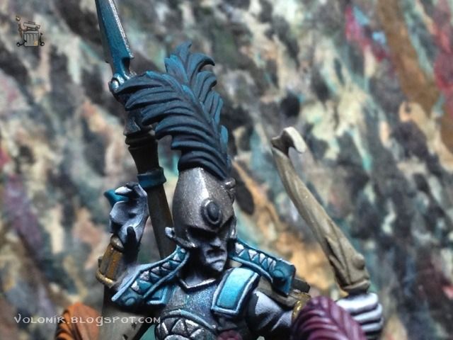
If you do it correctly, it should work with one single brushstroke. It's cleaner and faster. If the layer is too transparent, then wait for it to dry and then go over it again with the same colour, like I do in this case.
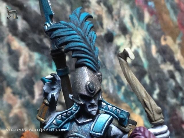
Final highlights with Space Wolves Grey, again, with single brushstrokes, very important to ensure a clean and smooth blending.
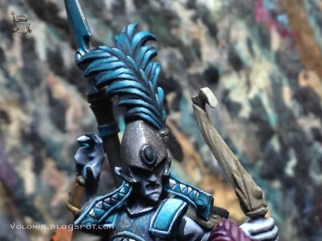
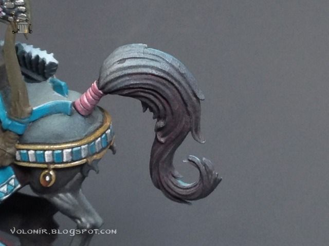
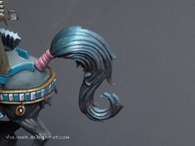
Something really similar will be done on the horsetails. This is how it looks before any painting on top (just the priming work still untouched).
And this is how it looks once finished.
Let's work now on the golden parts. This time, I'm going to use Scale75 golden metallic paints, starting off from a basecoat of a dark brown, like Chocolate Brown or similar. This will be great for recesses and shadows because it will look like gold but matte.
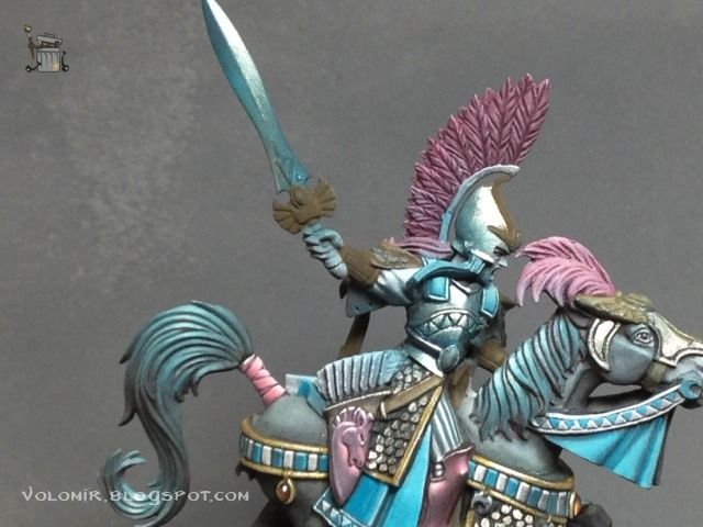
On top of that matte brown, I will paint the darkest golden metal of the set. As you can see, I'm painting all the golden parts at the same time.
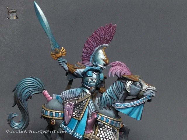
Hightlights on the golden parts are done with some lighter golden metallic paint.
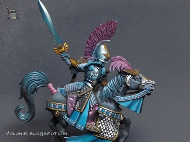
This is how the golden parts look from another angle.
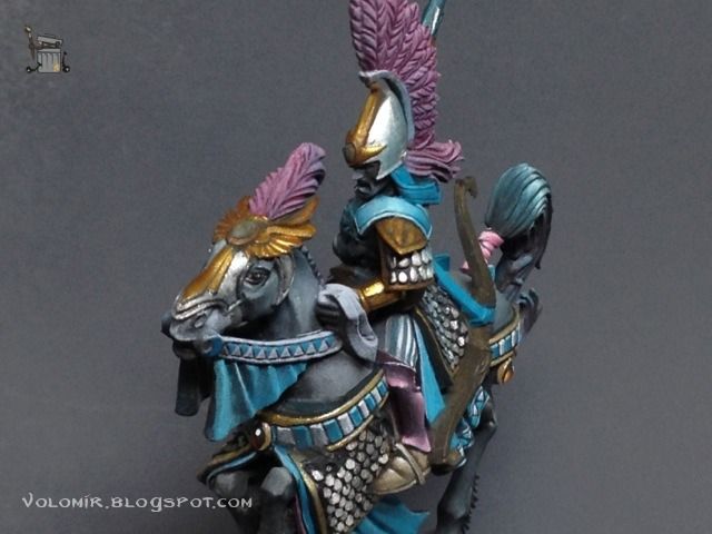
Final highligths are done with the lightest golden paint of the set. Some light spots can be painted with just Metallic Medium, or White Alchemy if you are using Scale75.
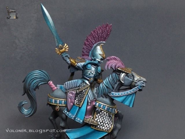
Same golds from other angles. Metallic areas are difficult to show in photographs.
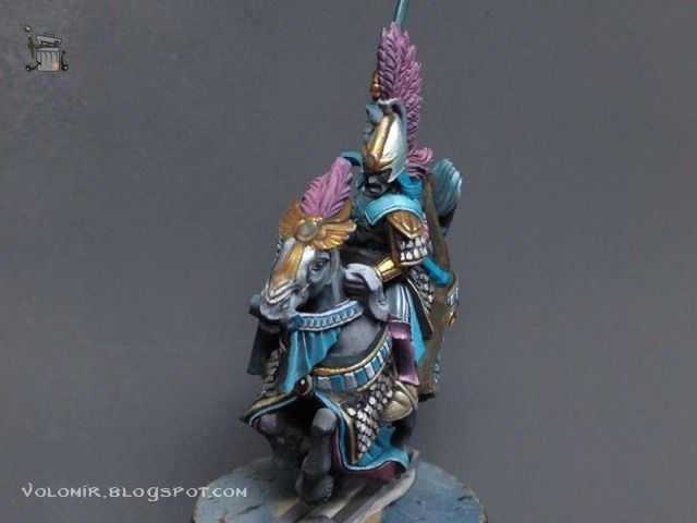
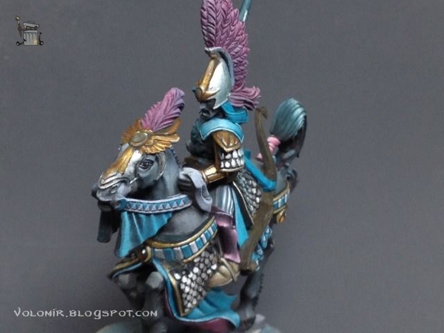
Time for some darker areas, I use dark browns and also brown inks to gain intensity. It's important to be careful not to use too much ink or it will destroy the matte effect in the shadows. It should stay a little satin, but not too much.
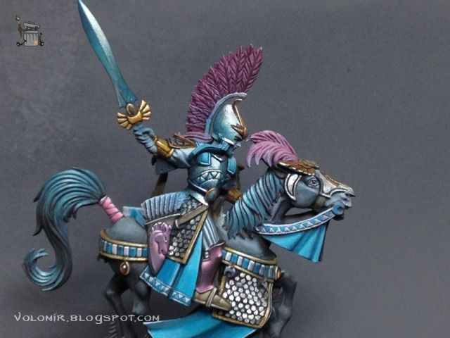
View from the front.
That should be all on the metallic parts. Let's move on to the skin of the elves.
Here's how the skin looks without any paint on. It's funny to notice how the rest is painted, but the face and hands aren't. A lot of people like to start painting skin the first thing, I left it for last this time!
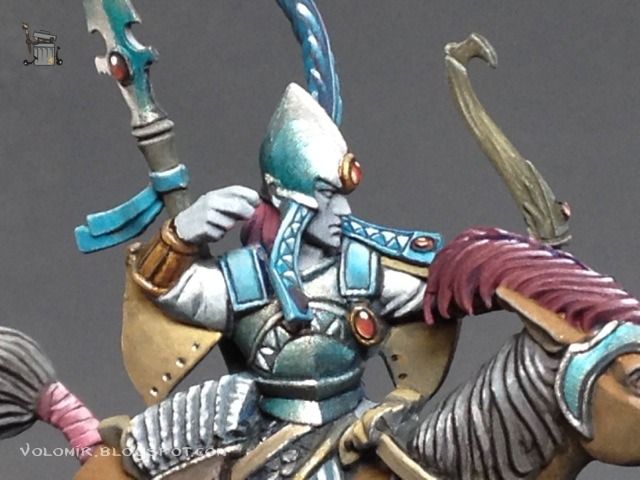
Base skin overall. Important to see how the eye wasn't completely covered. I left the recess with the grey of the priming coat so that it would serve to outline it.
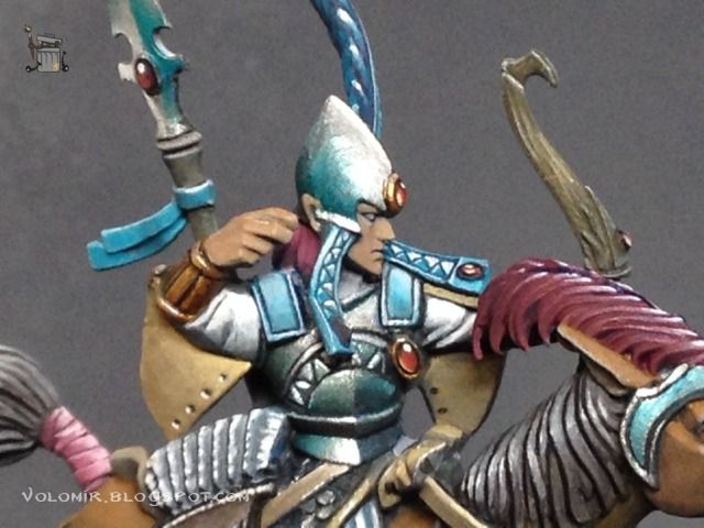
First highlights with the next skintone, slightly paler.
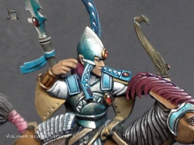
Instead of highlighting more now, I will paint first shadows and then go back to the next lights. The order is not that important, and will help me control the contrast.
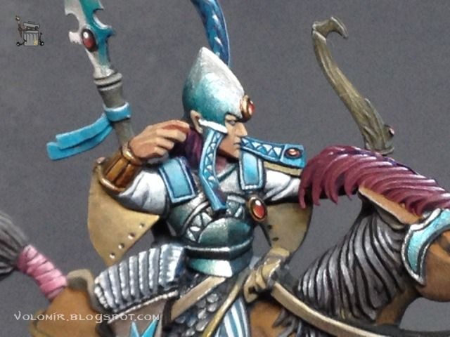
Painting the eyes makes a big difference. They are subtle but extremely important.
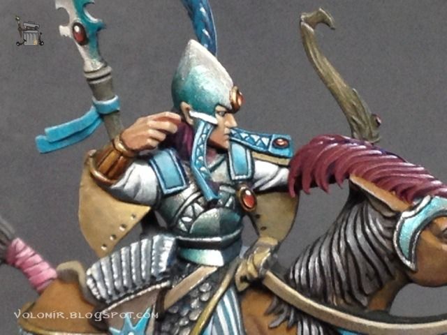
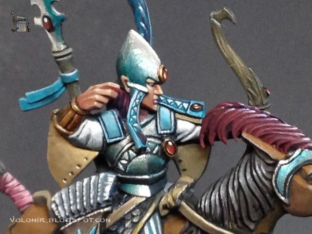
Some stronger and slightly red skin tones in shadow parts make the face alive, as well as the paint in the lips.
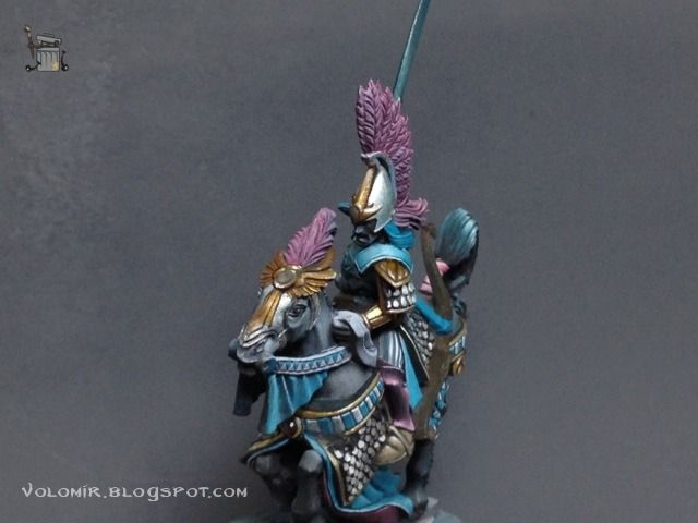
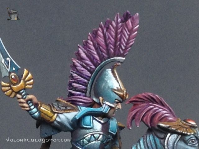
One part I haven't painted yet is the feathered helmet of the captain, which is heavily inspired by the Polish Hussars (just inspired, as the Polish had two lines of feathers).
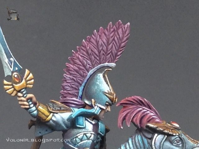
I wasn't sure about the colour, but I tried the slightly violet red that I've been using for these elves in other occasions, and I think it looks good so I will just add some depth to it. First, a wash of violet ink, to get an intense violet tone in all the recesses.
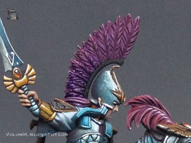
Now I start hightlighting parts of the feathers with a slightly lighter red (mixed with Space Wolves Grey so it turns out to be a little pink, desaturated red).
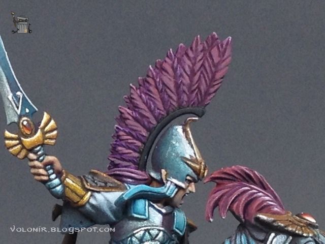
I insist on the lighting, with even more Spave Wolves Grey.
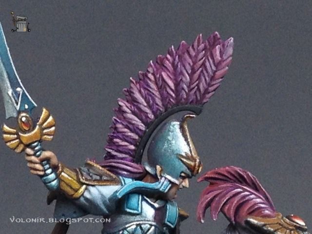
Some final lights with a lot of Space Wolves Grey (still some red in it too).
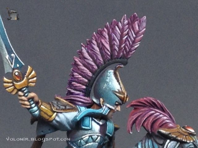
I finally recover the colour by going over some of the lightest tones with the initial pink.
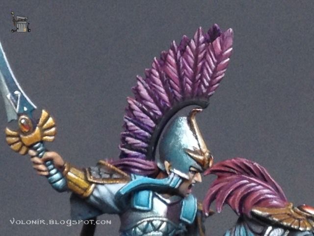
All that is missing is that metallic part that holds all the feathers over the helmet.
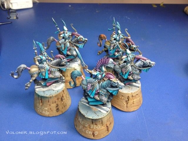
Seems like we are really close to the end, let's see a quick pic of all the Reavers together!
Now that the paintwork on the Reavers is finished, it's time to put them on their bases. Normally I have them already done before I put the miniatures on to save time, because we don't have to bother painting areas which are not going to be visible. In this specific case, I didn't have a clear idea of how the bases were going to be. My take from the very beginning was to do the Reavers riding in the closest waters of a shore, following the general coastal idea of the whole army.
The objective would be to create tiny waves over a base of calm water and finally add water splashes and foam., all using resins to make artificial water, snow and paint.
Following this plan, the first is to create some calm waters. Therefore, I begin with a thin layer of putty on the bases, to make a plain ground to start with. The idea is not to texture the base, on the contrary, hide the grain from the plastic gaming bases and fill in the gap between base and miniature.
Once the putty is dry, I paint it with a very generic brown. This will be the ground that is underneath the water in the shore.
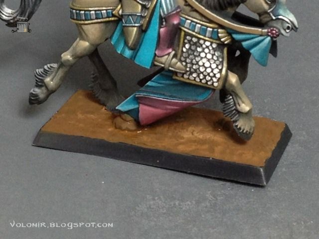
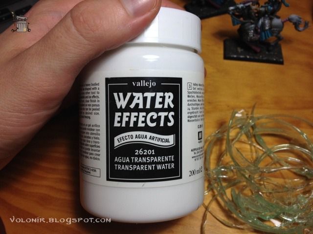
At this point I apply a couple of layers of artificial water resin to simulate the acuatic base. I will be using Vallejo Water Effects which is a thick paste that becomes transparent when it dries. If the layer is too thick, it is possible that the result may not be transparent, but rather misty. For this reason, it is better to apply thinner layers letting them dry in between. Water Effects resin can be applied with a modelling tool and shaped if necessary; when dried it becomes hard and keeps the shape.
After applying a layer and letting it dry, I saw that it was too brown, so I painted that already hard resin soil with touches of turquoise blue (greener than the one used in the elves) and then I put another layer of Water Effects on top.
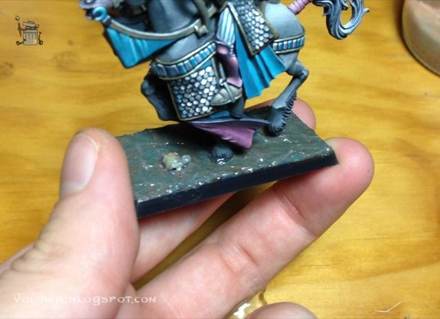
This process can be repeated many times until you are happy with the thickness of the water layer and the colour of the floor. Using different colours in each layer will leave a realistic colour effect under the water, where light constantly refracts in different ways because of the sea movement and produces many colours (as well as shines and reflections, already in place thanks to the natural gloss of the hardened resin).
After this is prepared it is the moment of working on the splashes. For this, I took many scrap pieces of hardened water resin tainted in turquoise that I kept from when I did the water base for the High Elf Dragonlord.
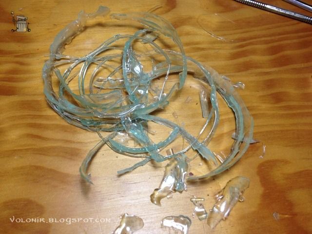
The scrap pieces can be cut in different shapes with some clippers, to create small resin triangles that will be used to simulate water splashes.
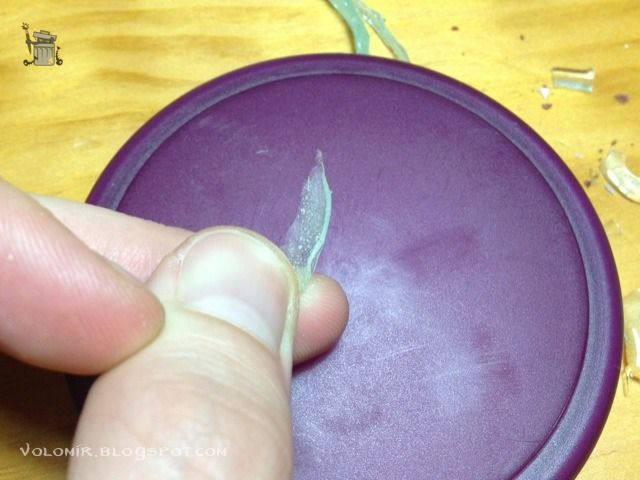
The splash bits are very small (we are dealing with ~28mm miniatures) so we will use pincers to work comfortably.
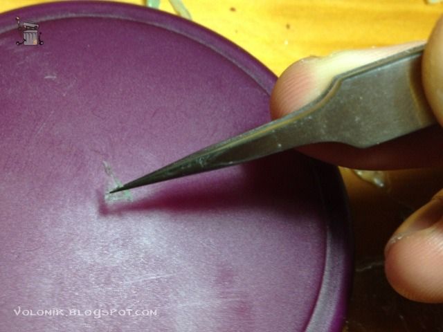
After this we will locate the place of the base where there will be a splash, in our case, where the horse shoes have just hit the water.
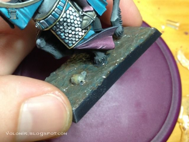
Carefully, we put the resin piece and use glue to put it in place. It will be useful to have a glue pot with large dropper, or use some tool to let us reach the are with enough precision to avoid any damages to the paint of the horses.
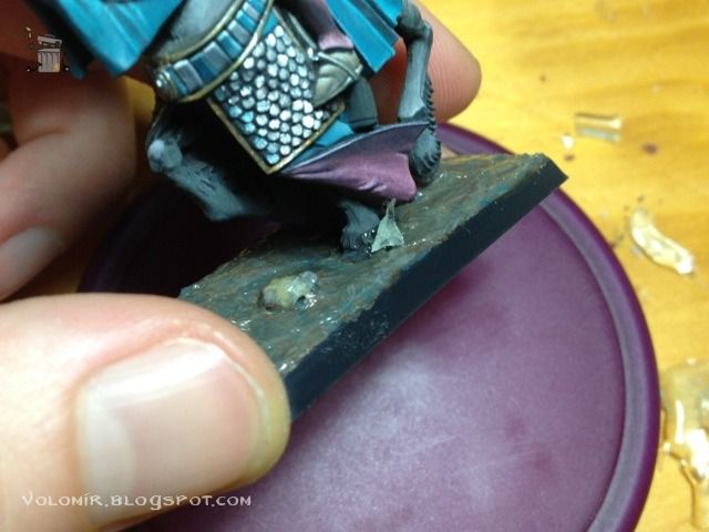
We continue doing the same thing with the rest of the splashes, we pick pieces of resin, cut them in shape and glue them in place.
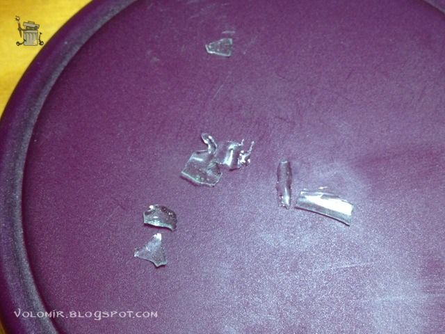
We will try to simulate in the best way possible the splash of water. It will not be very convincing at this point, but for now it will be enough to achieve an approximated basic shape of the water splash.
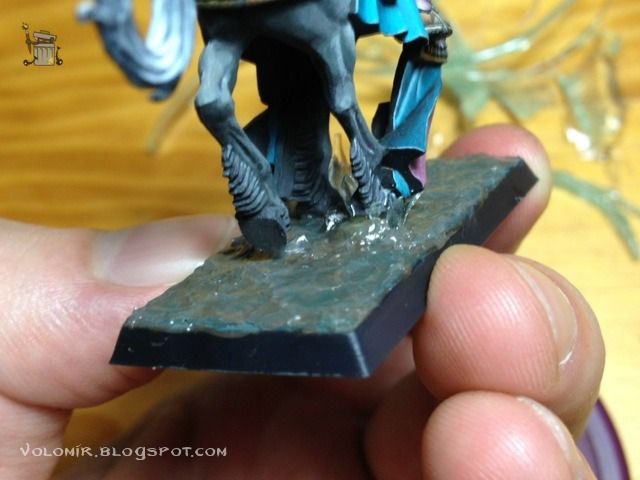
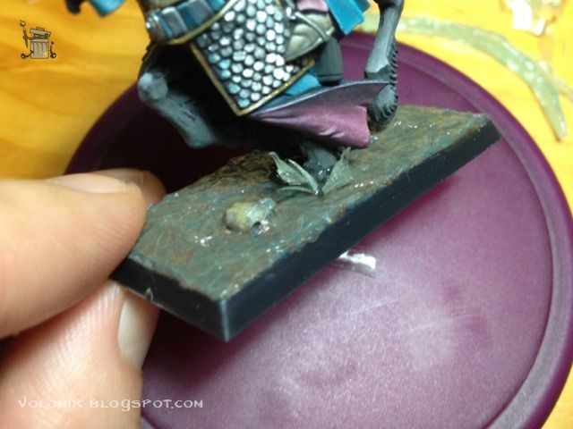
Once all the splashes are in place, we apply another layer of Water Effects over all the base, especially in the base of the splashes, to fill in the gaps and join them with the rest of the water.
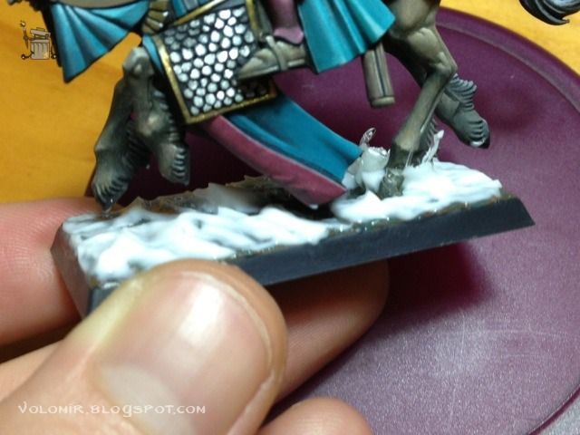
In the areas in which, because of the movement of the horse when galloping, the shoes of the horse are just leaving the water, we have to take into consideration that there will be a water spray behind. We will apply Watter Effects in that area but modelling it in such a way that we simulate the movement of the water.
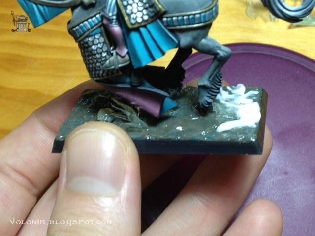
With all the resin pieces glued in place and the Water Effects applied to fill in the gaps, we create the foam from the waves and splashes.
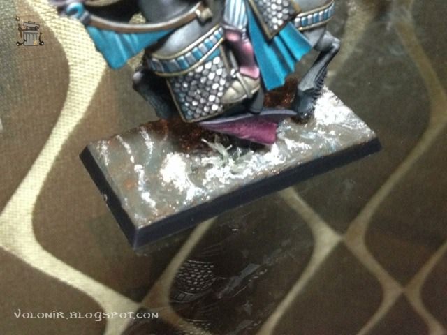
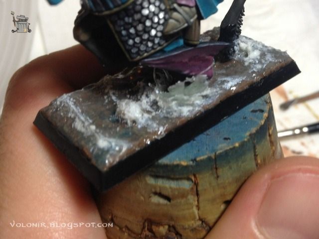
Very easily, it is just a matter of stippling with different shades of white in the areas were there is foam. We will try that the dots are not painted homogeneously and that there is more white in the areas where the foam is more intense.
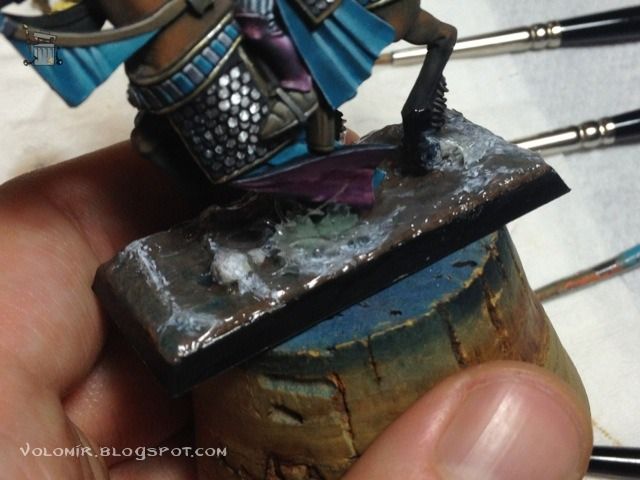
Just by doing this we will have a quite convincing foam effect.
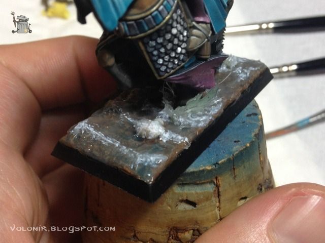
To make it more realistic we will use texture. We can put talcum powder or artificial snow in the places where the foam is more intense. It will be an additional touch of colour variety and grain that will be very appropriate to make it look like real water.
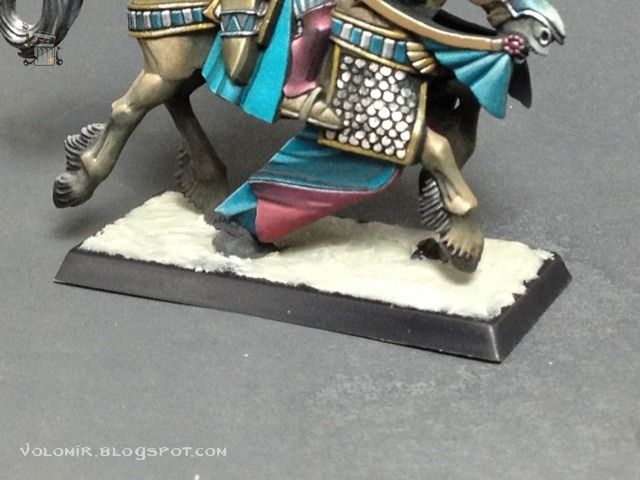
And with this we get to the end. Here are some final pics!
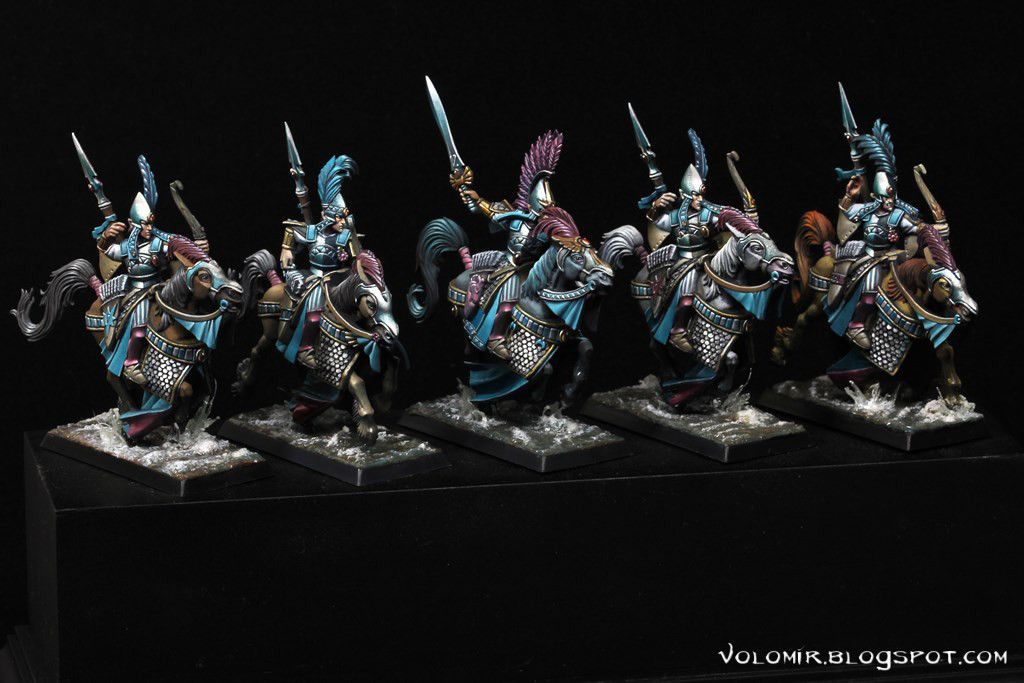

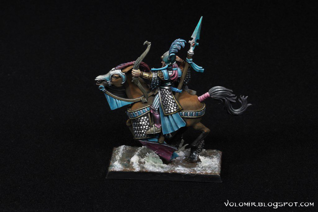
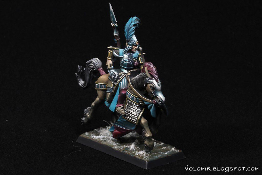
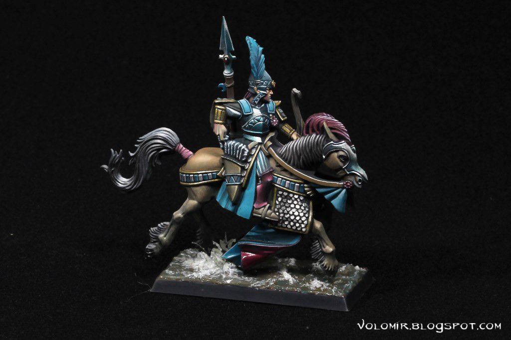
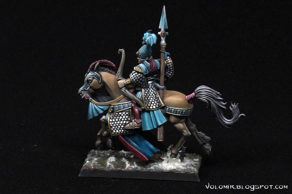
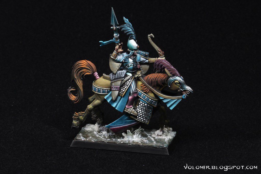
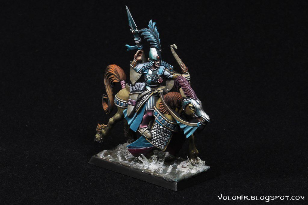
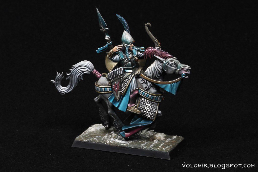
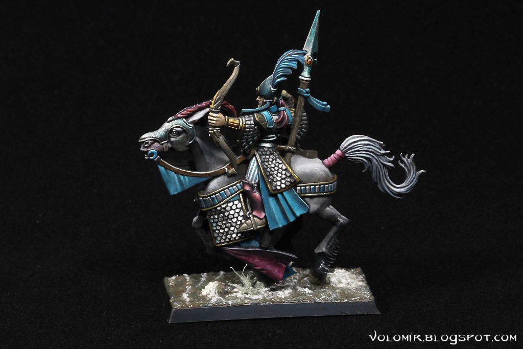
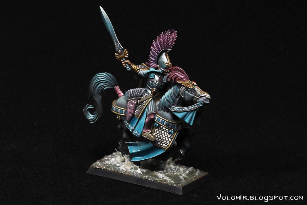
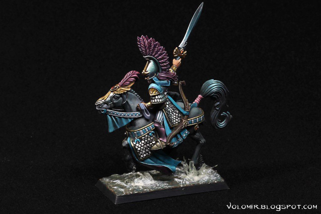
I hope you enjoyed the article. Until next time!