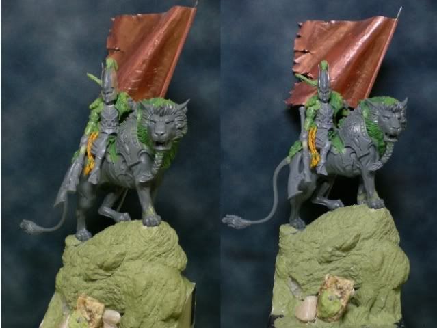
The idea for the figure comes from a very similar one I saw in coolminiornot. This conversion was done with a lion from the High Elf Chariot kit from GW and various pieces of high elves for the elf rider. The pose of the lion is more or less the same as the one I would do later on my version; this is because I really fell in love with the idea for the pose. And I had to do justice to the idea, the pose of the lion was beautiful but the rider wasn’t as good. So I began my work, and the first thing I had to do was copying the lion’s pose. This was quite an easy task because the transformation was only based on cutting the forepaws. This way I could get the lion to look with this attitude both noble and defiant.
Once the lion was finished, it was my turn to innovate, because up to this point everything was a copy. With some pieces of High Elf Commander from GW I began the conversion for the rider. I tried different options, especially of weapons and poses of torso and arms. Finally I chose he would be wielding the axe with one hand, pointing down, and on the other hand would be grabbing a banner. This is something quite recurrent in my works, but just because it is really a very visual element
which never disappoints and it gives a lot of options for the painting.
With the pose of the rider more or less decided, I began modelling the details of the conversion with putty, mainly a mix between green stuff and Milliput which always serves me well. In the beginning I considered the possibility of using a helmetless head, which is always better when it comes to painting. However, the helmet of the elves is an element which I have always liked very much, and I thought it would be very appropriate. I built some wings for the helmet out of brass sheets, to paint it afterwards and simulate the effect of metallic feathers. Commercial winged helmets from GW are a bit rude for me, too thick, and I wanted to emphasize the fineness of this clothing, elegant and warlike. This task turned out to be a bit complicated. I had to cut the sheet with a very determined shape, glue it to the helmet with very little space, and then manipulate the wings very carefully to give them the adequate curvature. Afterwards I would have to be very careful when painting not to bend this shape.
The banner, as opposed to what I did in previous works, was made out of a brass sheet. I have discovered that this is a very interesting option because you can shape waves again and again until you are happy with the result. However, you have to be very careful not to undo the waves, and also that softening all those little metallic folds generated while working can be very laborious.
For the base, I thought that the best option was to situate the scene on some sea rocks. The lion pose was very suitable for some kind of scene over a cliff and the breaking waves are elements which give a lot of strength to the scene. Also, this meant the beginning of the idea which would give me the background story for the figure.
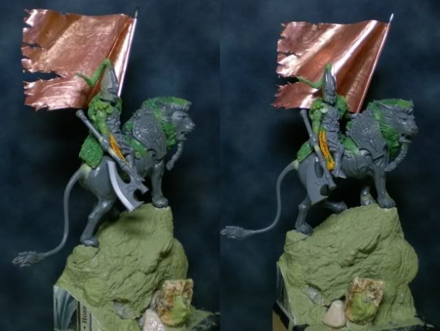
In these first photos we can see how the elements combine at this point of the process.
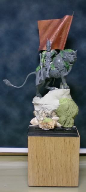
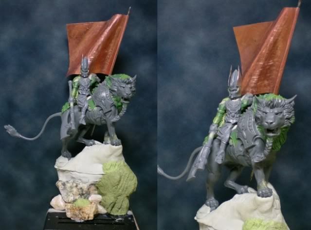
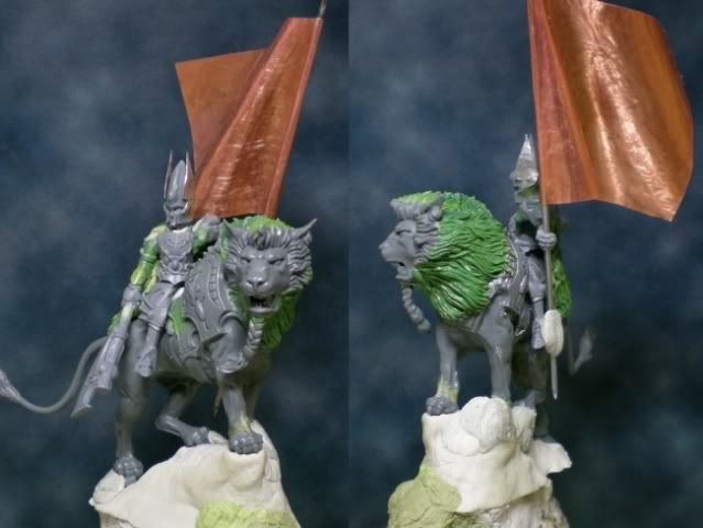
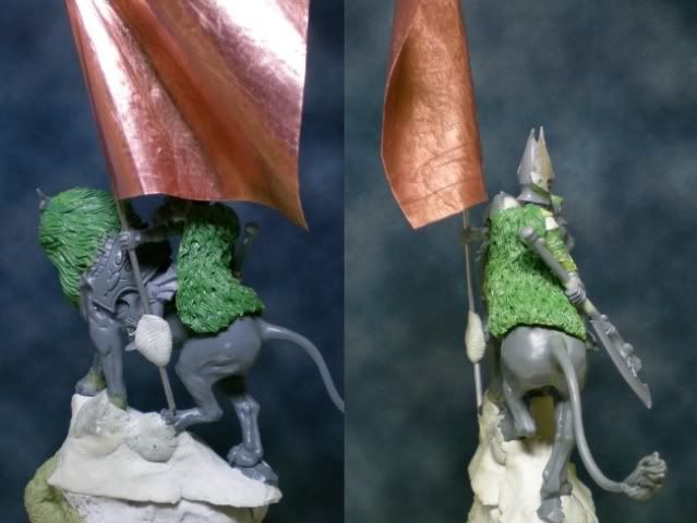
In the next photos we can see how I have already finished the conversion. In the first place, all the torn pieces of cloth have been done already, simply done with scissors and a lot of care not to break more than what it’s supposed to be torn. Also, I’ve finished all the locks of hair, in the lion and in the elf’s clothes, and also the one on top of the helmet. The base is also finished, simply with some putty filling on the rock hollows and giving it a texture similar to the one of a rock. To do this I got some real stones and I used them as a tool to model the putty. The surface of the stone is smashed against the putty so it gets the rocky texture. Also, I made the braid out of some string. This is one of the biggest mistakes of the figure because it was a mess to paint it later. I will never do hair again with nothing else than regular putty.

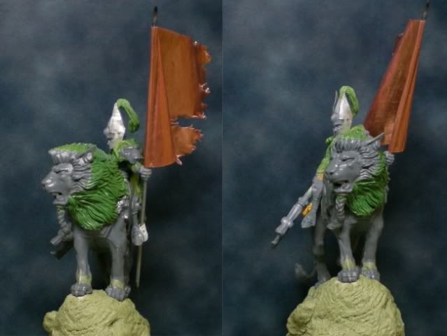
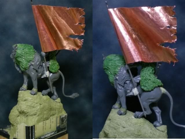
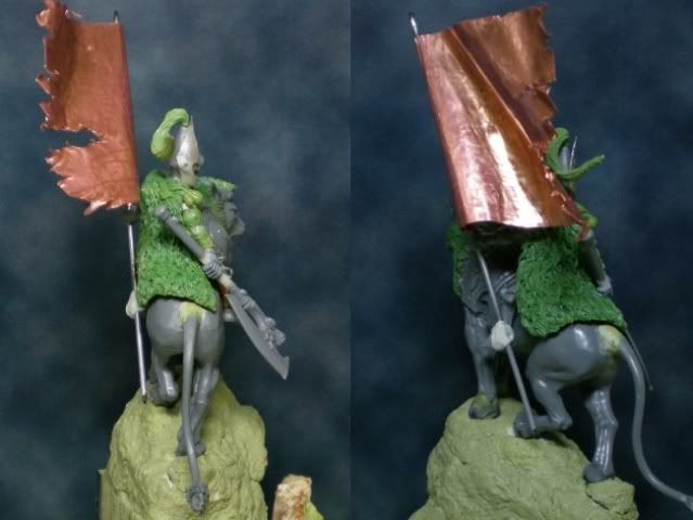
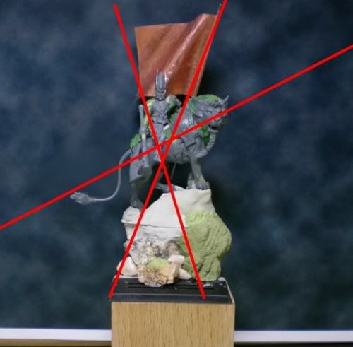
Finally, there is a very special thing redone which can be quite unnoticeable. It’s the tail. I cut it and repositioned it so that it would be lower in the composition. This has a very simple and graphic explanation with the following picture:
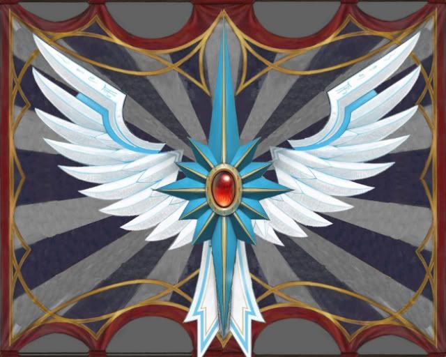
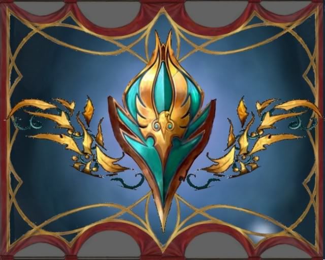
Regarding the banner, this is the process I followed to paint it. First and foremost is having a clear design of what we will be painting. I have always faced the same problem when painting a standard, is the famous problem of starting with a blank page. It’s crucial to have forethought what it is we will be painting. This is why I did some designs in Photoshop, as detailed as possible, for the front and the back side. This is very useful because its fast, we can edit and borrow pieces from other designs, we can change and modify it until we are done and totally confident with it. I put some pictures of the designs I made in Photoshop.
This designs in Photoshop have to be printed in the exact dimensions of the flag. With some airbrush templates (sort of plastic sheets with a slightly adhesive surface on one of its sides) we will be cutting the main shapes of the design and to do so we will be using the printings made before. We put the printing over an airbrush template and with some sharp blade we will cut these main shapes. The question arising now is: what are these main shapes?
To answer this question we have to do a study of the design. To paint as efficiently as possible, we have to do a decomposition of the design. In this case for example, I divided the drawing in the different general parts which compose it, which are a striped background, the winged symbol and the exterior watermarks. These parts can be also divided. The striped background has two parts, the light stripes and the dark ones. The winged symbol has the wings, the star and the main gem. With this clear in mind, we plan the painting process, from what is more general to what is more concrete, to take advantage of the airbrush as much as possible. In this case I will first paint the background in dark stripes. Afterwards, I will paint the background in light stripes. Then I will mark the star drawing and the wings, and finally I will mark just the star shape, leaving a gap where the central gem will be situated.
Now that we have clearly thought about what we will be drawing and how we will be doing it, and after making sure that the surface to paint is clean and free from rough imperfections, I prime it grey with airbrush. I cut out the shape of the wings and the star in the airbrush template and then I put it in the flag.
With airbrush I prime all the banner with a dark blue grey. When dry, I position the stripes template of the background. When situated, I paint with airbrush, now with a lighter colour.
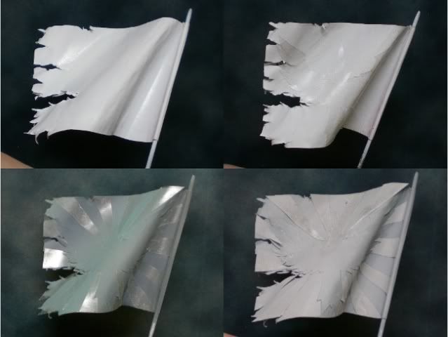
Now I do another template in which I get rid of the central part of the wings and the star, to hide the stripes we have just painted. I paint with white to have the general shape of the wings and the star. Finally, with a star template I paint blue with airbrush. This is the final stage where I can take advantage of the airbrush. From now on I will have to use a normal brush. I start with the star and the gem, and then I realise that the background stripes have a colour too greyish, it must have been more bluish. This is something I will take care with brush, but we can see in the pictures what the result is. There are brushstrokes everywhere and the colour is not uniform. I resign and decide to fix it later with templates and airbrush. I will have to use the airbrush on the back part of the banner anyway, so I will wait to get to that moment and I will finish this part with the wings and the tail with brush. I leave the watermarks for the end.
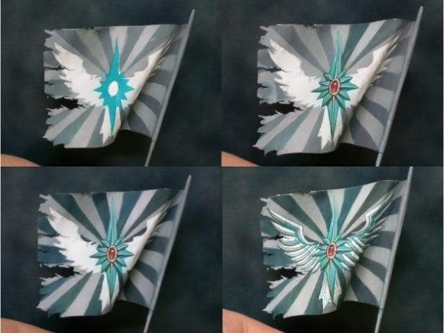
With the back part of the banner, the process is the same. We plan at first our attack strategy, we separate the drawing mentally and we think about the painting process to use the airbrush as much as possible. The background in this case has no stripes. It’s plain but has some gradient from the inside to the outside. This is the first thing I will be doing with the airbrush. Now it’s time to fix the stripes of the flag’s front part. Very carefully I hide the freehand with some templates and some Maskol to seal any possible gaps. Once I’m sure of this, I paint with airbrush always taking into consideration the position of lights and shadows.
We continue now with the back side. I paint golden yellow to mark the main shapes of the design. With some templates I hide the exterior part of the heart and I give turquoise to mark carefully the interior shapes. And we finish the airbrush work here.
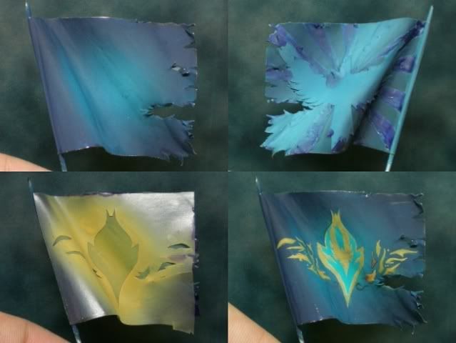
With a brush I start painting the leaves and the central symbol. With both designs already finished I can start to do the watermarks, for the front and the back side of the flag, always considering the effects of light and shadow.
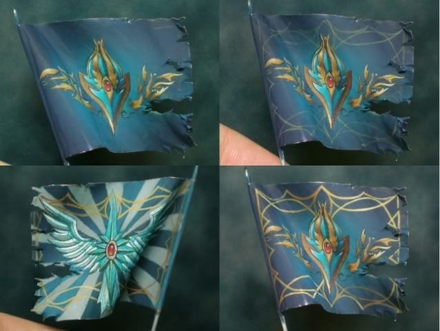
And it’s done! The flag is finished, I put it over the figure to see the global effect (ignore the elf head in the first photo).
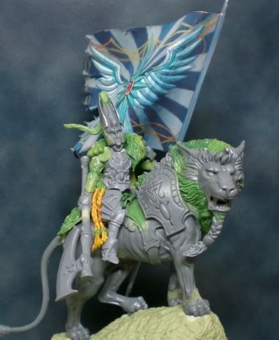
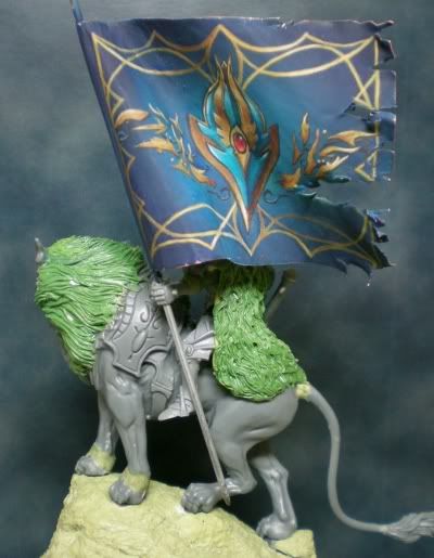
With the flag finished, I started the painting of the rest of the figure. However, I have no photos of the rest of the painting process, so here is where this tutorial finishes. I have only photos of the first bases for the lion:
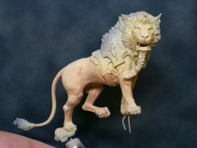
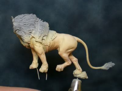
And here we finish the creation process. Some final photos!
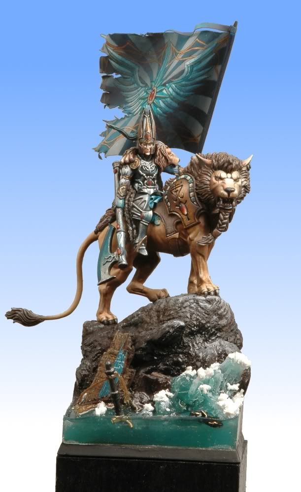
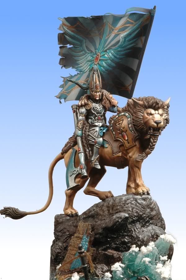
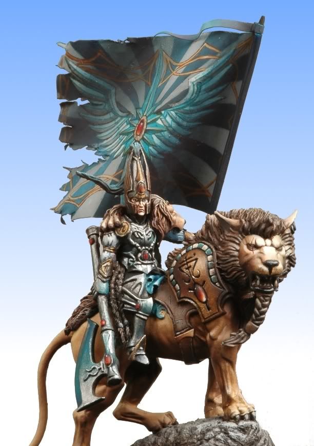
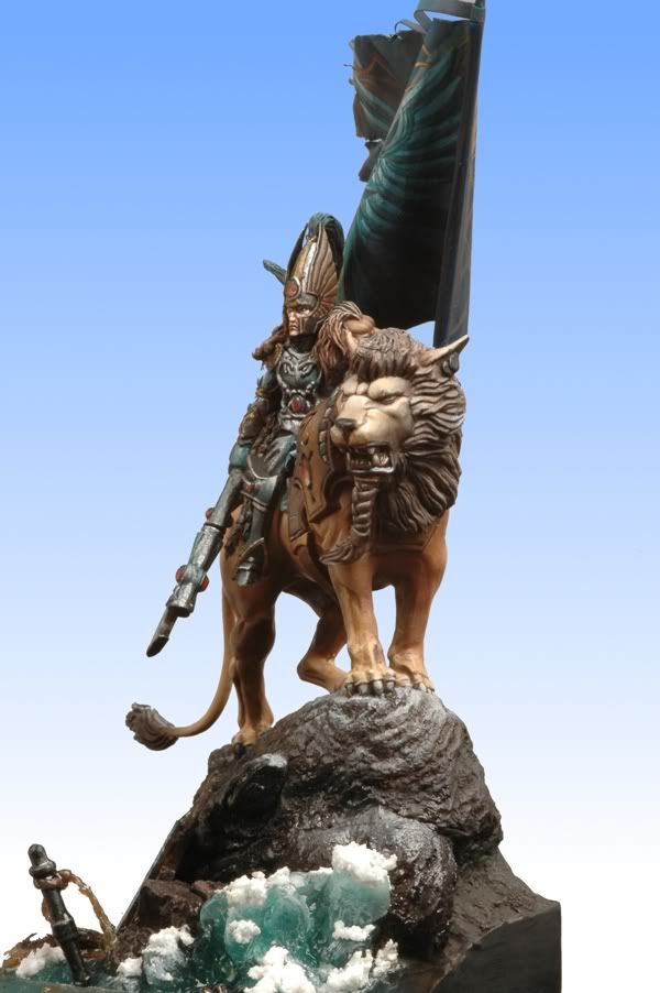
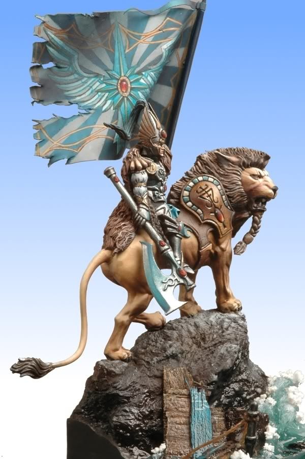
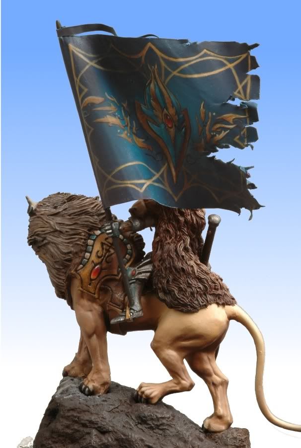

19 comments:
Superbe!
That's is an amazing piece of work. Lovely step by step guide. You should be very proud!
PS; Love the blog.
Chris
Awesome work. I love the ferocious feel to the model; the lion is so majestic. I love it!! :D
edit: fantastic! you've inspired me to strive for greater things with my own work. thanks for the truly inspirational model.
So cool! How about for the flagpoles, did you use brass rod? Suppliers call it "yellow metal", but I tend to paint them with other colors in some of my works. What about you?
@Lawrence: for the flagpoles I use brass rods, yes, in this particular case I used some brass rods which are sold to be used as spears on 28 mm napeleonic models, from Foundry I believe... I bought them ages ago so I can't really assure you that!
May I ask a few questions?:
What pressure do you use on the airbrush?
What thinner do yo use?
And in what ratio colour:thinner?
Big THX in advance!
Sure! Pressure is about 1.5-2 atm. Thinners that I use are Tamiya Thinner for Citadel and Andrea Thinner for Andrea Color. Vallejo Model Air doesn't need one. I mix a few drops of thinner with just plain water. Then add colour, I can't say proportion because it depends on what you want to do. If you want smoother and slower and more strokes, then less paint. If you want faster results, then add more paint.
Hey, so I just have a simple question about painting in general. It looks like more and more golden demon winners are painting with an airbrush over brushes. And I've only been in to the hobby about a year and a half and I'm fairly young, but I've grasped a good concept of brushwork. Do you think it would be more beneficial to start working with an airbrush or stick to a regular brush for now, to move onto to higher skilled painting?
The airbrush is just a very useful tool but it won't make you a better painter just because you start using it. It is another way of doing things which you can add to your toolkit, and its very good for certain things but useless for others. I would say its a great purchase and a very interesting path to walk, but in no way replaces the regular brush.
I have been admiring this fantastic composition for months,and keep on coming back to it. The pose, the sculpt, the construct, everything is just marvellous. Truly awesome work and very well done.
Wayne
amazing work!
What color did you use for the lion and how did you shade it?
thank you in advance
Hi Dalis, thanks for commenting! To be honest, I don't remember the exact mix of colours used in the lion skin... it's been quite some time since I painted this. I can tell you that it was probably done with a mixture of Vallejo sand tones shaded with a bit of purple added to the previous mix. The exact colours? Can't say now, I don't remember. :)
We will be migrating all of this content to the new site volomir.com. I hope to see you there too!
Thanks!
thats so cool , which kind of rod you used ? Copper Brass rod ? Supplier doesn't provide these easily .. though great work
Post a Comment