
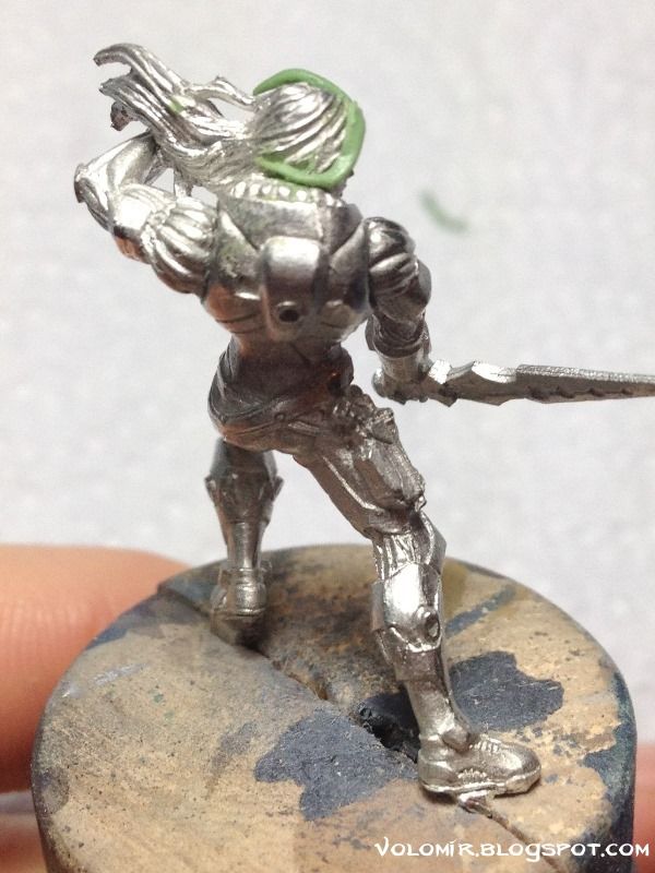
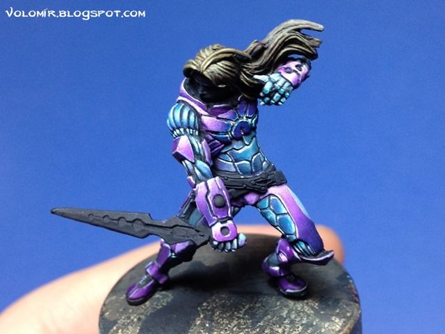
Infinity miniatures are so well sculpted and are so small (properly scaled to measure less than 3 cm in height, the true 28mm) that you can create amazing pieces of miniature art in relatively little time. Achilles is one of those miniatures. The concept is incredible, the quality of the sculpt is top notch, and the possibilities endless. That's why I decided to paint this little beauty.
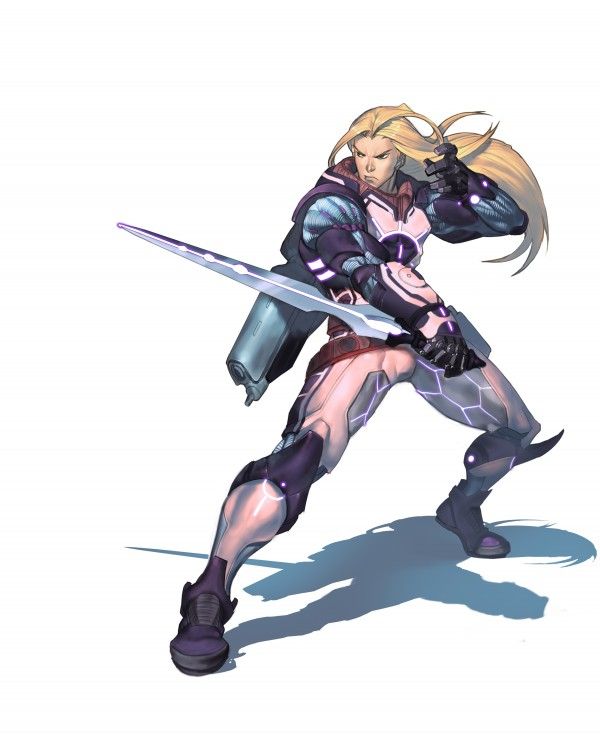
The sculpture is wonderful and very true to the concept art.
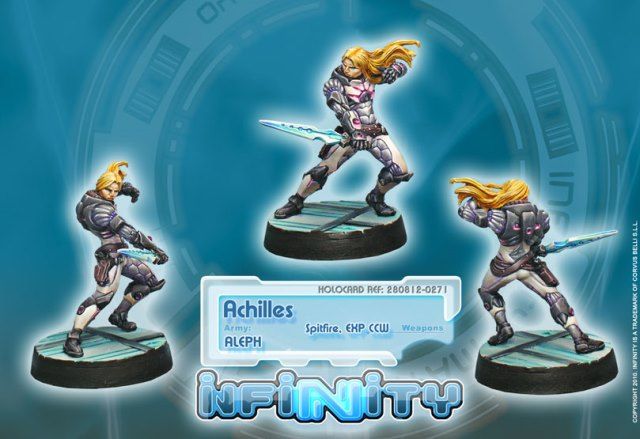
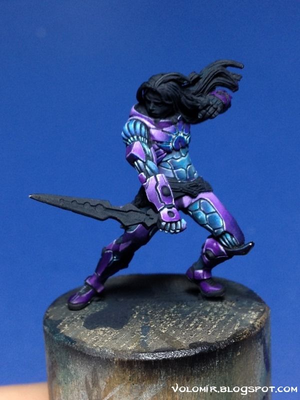
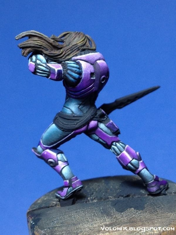
But obviously, since it's a commercial miniature, there are some details that have to be sacrificed in order to be able to cast and mass produce them. If you see the image, you can see how a couple of hair locks weaving in the air make a huge difference. Also, as you can see, the character is heavily tilted to one side, which might seem better to insinuate movement, but compositionally is weird, and this can be fixed by just positioning the miniature in a base that would be diagonal to the ground. This absolutely tiny conversion is extremely important to me. Makes the miniature different to all others and makes it way more dynamic.
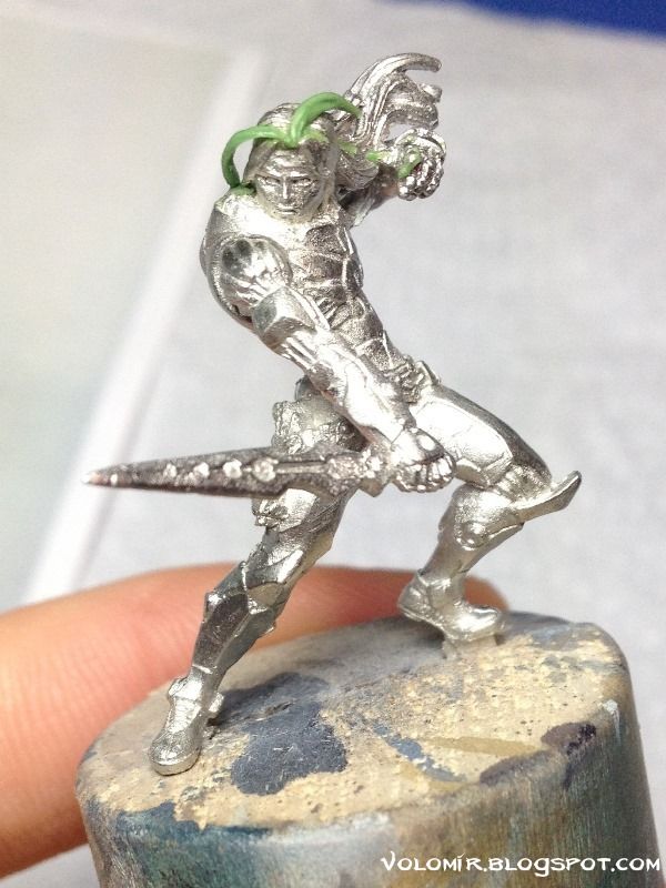
Even so, in this first approach, the lock of hair on the right is too widely open. I'll strecht it closer to the face for a better result.
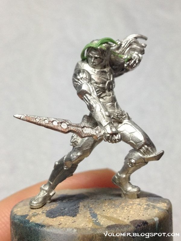
Perfect, simple, easy, essential! Time to paint.
The amount of tiny details is overwhelming, there will be a lot of outlining required to enhance all those borders and recesses. I choose to prime the miniature black, something I don't do very frequently, but in this case will help me work faster because the black will already be in the recesses and I will just concentrate on painting the surfaces. Way easier in my opinion.
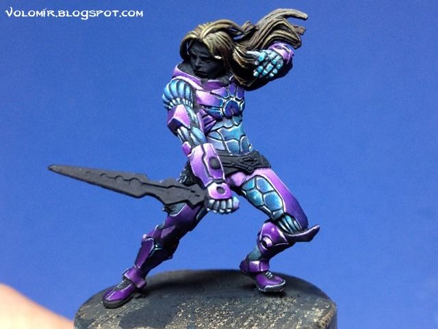
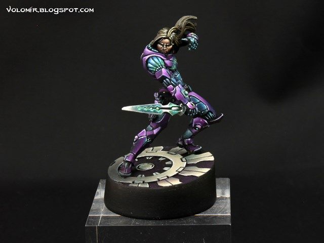
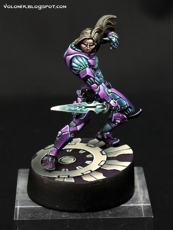
The colour scheme is in reality the same (or very similar) to the one in the concept art, but just inverting the colours and changing the white areas slightly so that the colour is closer to grey-blue instead.
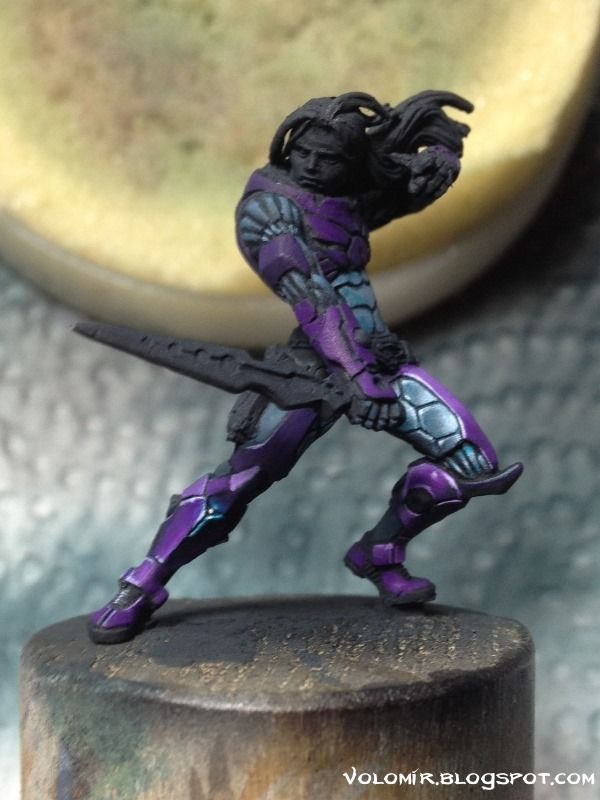
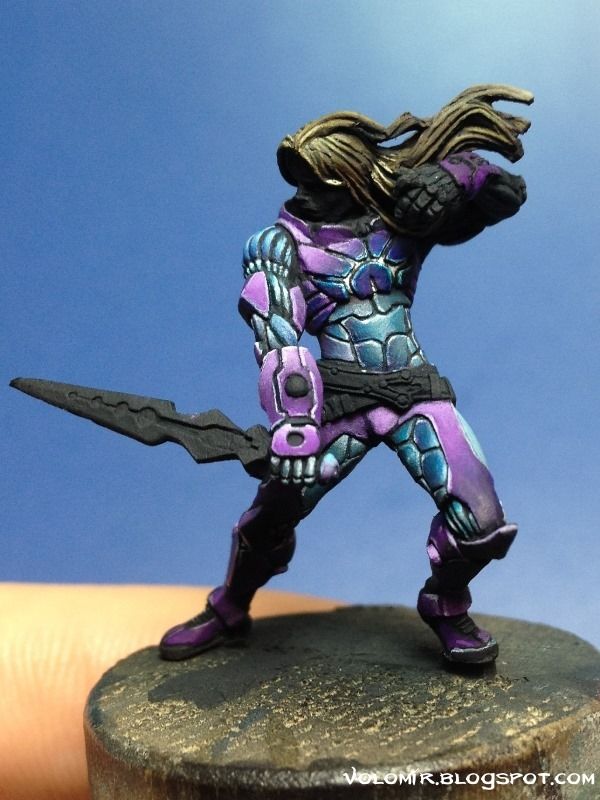
The key on this miniature is to enhance the technological look, simulating very shiny and reflective surfaces. This is done by painting all the reflections of the light sources over the suit. There will be a lot of them, as I will create light sources on some of the suit recesses, such as the plates in the chest, below the knees, on the armbands or on the sword.
The purple plates will not be so reflective, so they are painted following the scheme of zenithal lighting, as usual. I leave the highly reflective glass-like appearance to the grey-blue surfaces. Also, I start insinuating the light from the chest, in blue-white.
Before going forward with more light effects, I want to have all the colours in place, as of now the light effect on the chest is too subtle, probably because everything is very blue and cold, there's not much contrast.
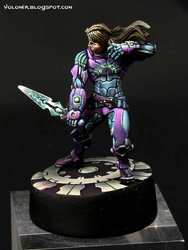
Adding the brown-yellow hair adds some depth to the scheme. There's great contrast between the head and the rest because of temperature. I need to be careful not to make the hair too warm or I will have an ambience problem.
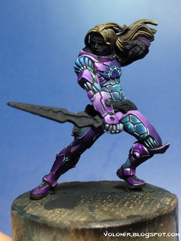
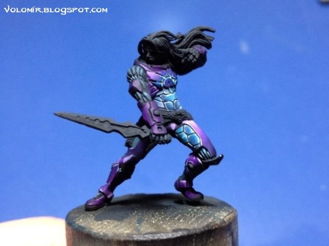
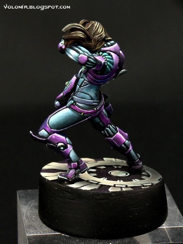
The right side of the leg is a beautiful area for a nice gradient from light blue to dark. Really nice in my opinion.
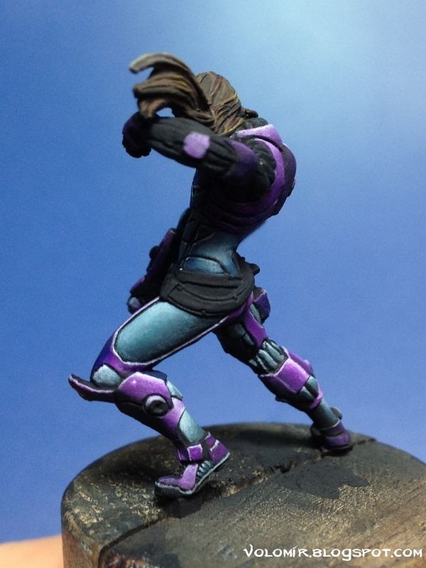
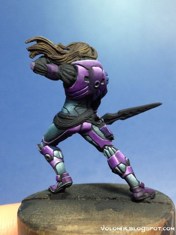
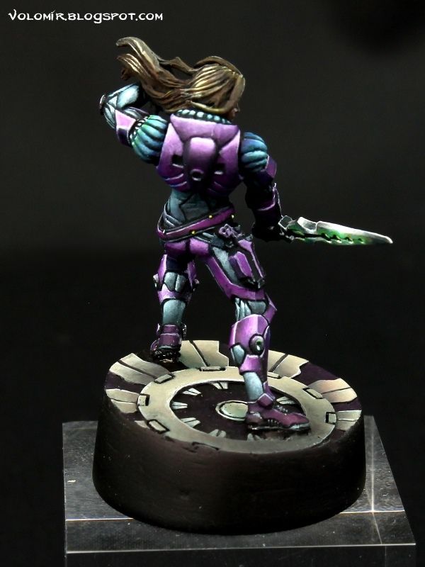
The back side is not as complicated as the front part. Good since this won't be a very important view.
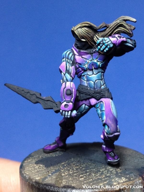
The light effect from the chest is good but still not entirely convincing.
I keep on working, now on the raised arm.
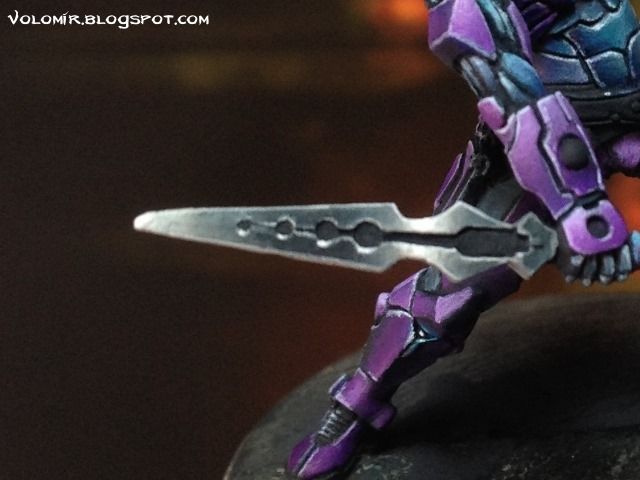
There are not that many colours to put in the miniature now. Let's move on to the sword where I will do a simple NMM effect using Scale75 new NMM colour set.
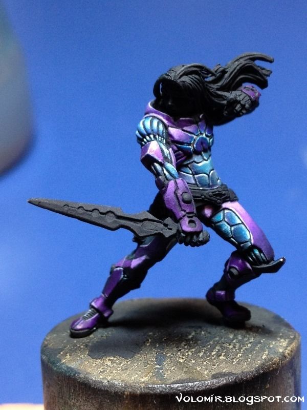
As I have been working throughout the whole mini, I go from dark to light. I begin with a basecoat of Abyssal Blue or Abyssal Blue mixed with Anthracite Grey, whatever you prefer. The Scale75 set has many possibilities.
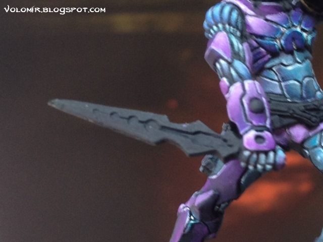
The important thing is to situate the light spots properly, and once they are fixed, work around accordingly. I start to raise the lights with Graphite.
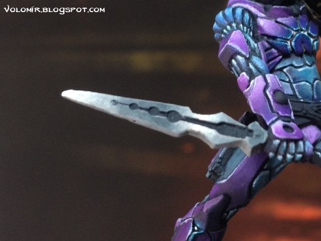
I raise the lights gradually with lighter tones. I keep raising the light with Nacar.
Then outline the borders to separate volumes, using Nacar and White.
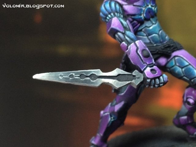
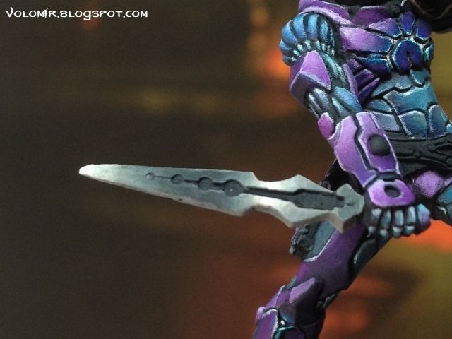
And finally create some lightspots with pure white.
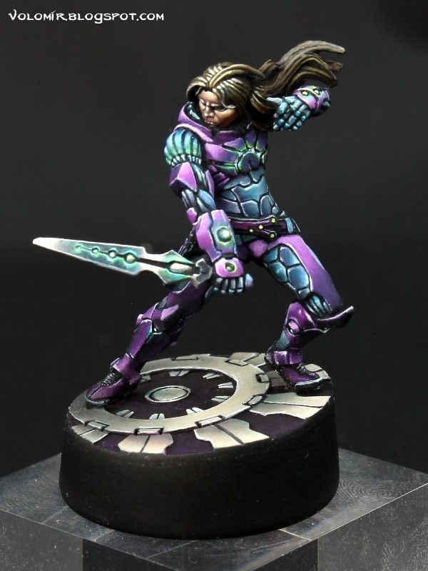
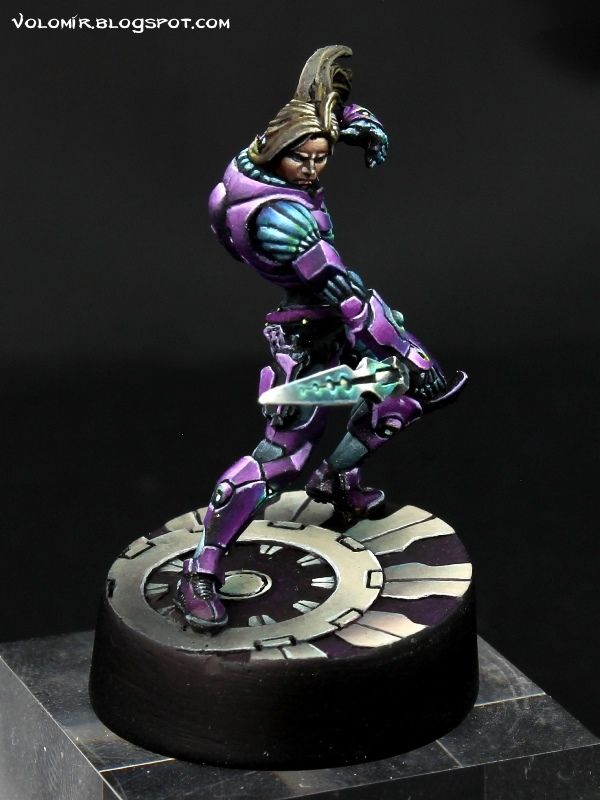
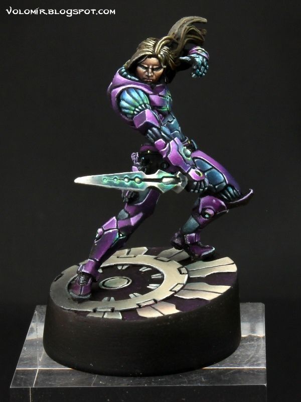
These are all the photos I have from the WIP. Sad, because there are still quite a few things to work on. The main thing is increasing contrast all over pushing the colours further to the limits in each case, and then work more on the glow effects, were finally I decided to change the blue to something different to get more contrast, a very yellow green in this case. The rest of the work to complete the miniature was the face, a very simple but careful work of raising the skin tone gradually to the light starting from a very dark one (since the prime colour is black) and finally the base, which are you can see is diagonal to the ground axis, to compensate that tilt that I talked about in the beginning.
Using light yellows and light blues for all the light effects was a very good decision in the end.
6 comments:
lovely walk through more please!
Simply perfect!
Amazing job, love the colours and step-by-step brushwork! Thanx for sharing!
Amazing Volomir everytime I come here the hours just disappear as I catch up on posts and then book surgery to attach my jaw again.
I suspect you owe me compensation for eye strain as well! :D
This is astounding work.
That's the coolest thing anyone has ever told me!! :D
Brilliant paintjob. Thanks so much for the tutorial!
Post a Comment