
So I kept doing colour scheme experiments on the Phoenix Guard I was painting during the holidays, and it seems that I have got the feeling I was looking for.
Here's some pretty bad pictures of it, but you can get a rough idea of how the scheme will look.
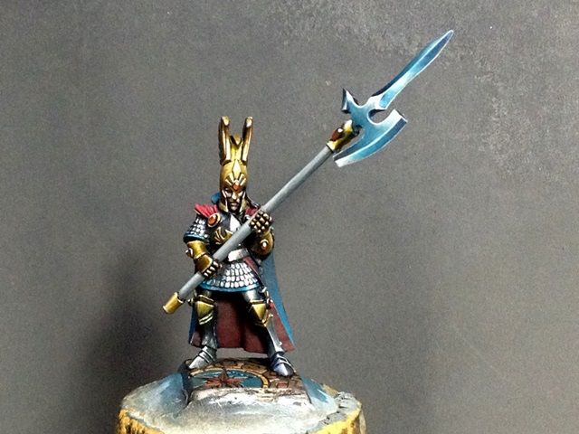
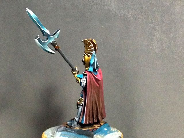
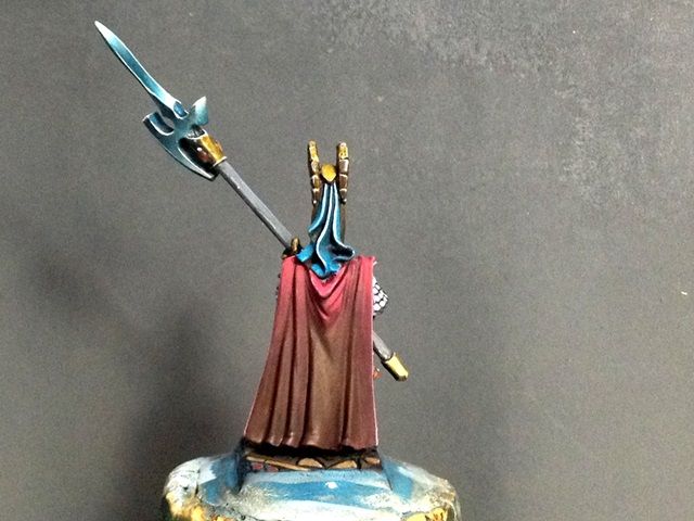
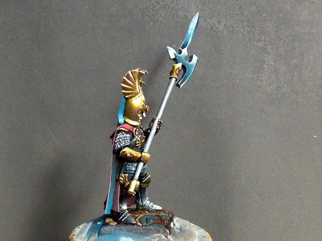
I think it suits much better my purposes than the previous one:
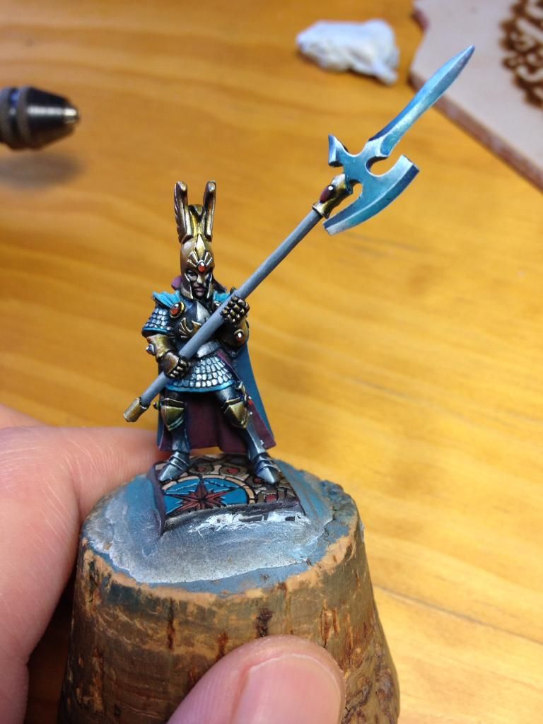
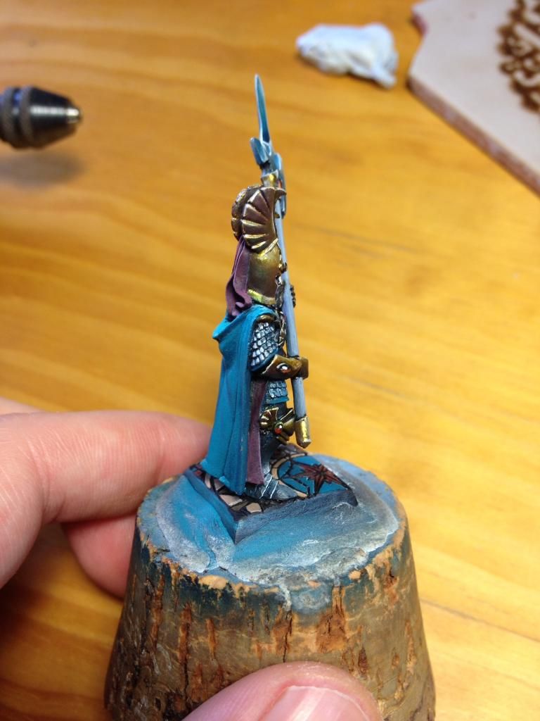
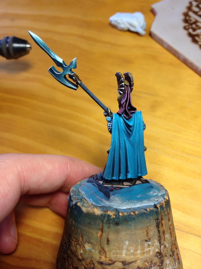
Wonders of colour theory, the red is made mainly with Fucsia (Scale Color) but it looks much more red because of the colours surrounding it. I think it works well, and solves the fact that I wanted them to stand out as elite warriors of my army. Also, I might change the gems from red to a very cold and bright blue (ice blue/light turquoise) to contrast with the cape, but still undecided.
What do you think?
All that is left now for the Guard to be complete would be painting some freehands on the cape. I am thinking of doing some elven patterns in NMM gold (like the gold on the armour, but in NMM). I'm still unsure about what to do, I tried doing the flames of Asuryan (GW codex) but I do not like them that much. Probably something more elegant/royal?
While I decide (all help will be much appreciated!), I have started the work on the rest of the guards, and I had a breakthrough on my serial painting technique that I will share with you very soon. :) I'm very excited about it! It is speeding up quite much the weapon batch painting. I will prepare the whole WIP article where I will tell you all about it very soon, so stay tuned. Also, pictures of the Ultramarines that went to GD 2014 are underway, and the Ellyrian Reavers too!
3 comments:
Looking good mate. I lthink the red works better than e blue (looked like there was a little too much blue on him before) - can't help but think a nice rich imperial purple might also work?
As for the pattern on the cape - how about a wave type pattern? It would fit with the dramatic bases on your lion and dragon riders (and the sundering story arc :( ) quite nicely. Something like this - http://image.shutterstock.com/display_pic_with_logo/890086/146227472/stock-photo-seamless-pattern-with-stylized-waves-dark-blue-ornamental-decorative-background-of-sea-and-ocean-146227472.jpg
Cheers,
CMDante
Hi Volomir,
I really like PG with red cloak, somehow it does look elite (although previous version looks great anyway!). I am wondering, however, it the scale armor of the model was intended to be pure silver. Your previous miniatures had that great bluish shine so I wonder if it is just the picture or maybe it is not yet finished model? Bluish effect would tie it nicely with the blade of the halberd too.
As always you are an inspiration and while Elven players have some hard time due to End Times books (background changes are dramatic!) at least your pictures are bringing some more brightness to that doom and gloom we experience now!
Thanks!
Thanks for the comments guys! You are very helpful!
Andrew, the wave pattern is certainly worth considering. It is a very good idea. It fits with the story arc and it also ties the elves with the sea and the landscape of Ulthuan.
Swordmaster, your recommendation on the bluish shines in the armour is something that for some reason slipped my mind this time! I have to include that for sure in the model, the shadows are too grey this time. I need that blue vibe!! Thanks for reminding me of that!! Also, I'm thinking of writing something about the End Times fluff, I am nearly finishing Khaine at the moment and these are indeed very dramatic times. I'm quite worried about the future of Warhammer! Let's see what happens...
Post a Comment