Showing posts with label debate. Show all posts

Friday, October 21, 2011

Seeking sensation: elements of suggestion

Today let's go deep into artistic talk, for all of you hardcore painters who seek something more than just a correctly painted miniature.

I'm having a wonderful discussion with my friend Francesco Farabi, a great miniature painter from Italy who I'm sure you a lot about already. The discussion was regarding his last piece, the Last Stand of Nuln, modelled by Mariano Numitone (a great honour) and painted by himself. I'm also sure you have seen this one already, presented on the last Golden Demon Italy and awarded Gold in Diorama (I posted pics previously on the blog):


While the scene is just outstanding, I pictured out that the painting is too clean for a battle scene like this, I miss blood and dust and dirt in general. I couldn't see how the guys could be dying from arrows without choking in their own blood. Francesco answered:

About the question of dirt... yes you may be absolutely right, but there is a reason because I chose not to put a lot of dirt. It's because there is no close combat body fighting been done there, this is a "long distance attack, like some terrible enemy attacking the bastion of the castle and the soldiers go to the broken part to defend as a last stand, but a great swarm of arrows arrive and kill them all. If you look there are no soldiers with blade weapons, only guns, also the campion shouted with arrow in the neck tries to bring his guns, not a sword for example.
About blood... yes interesting in effect! Also because I am an habitual gory painter (i make a lot of blood effects in my miniatures) but we talked a lot with Numi about how much blood I wanted to put and therefore I studied that arrow shots don't create some blood spatter effect because it is very direct and quick, there's just a little quantity of blood exit from the wounds before you pull the arrow off from them.


My comment just started a great discussion around the use of explicit elements to achieve sensation which I wanted to share with all the readers of Volomir's Blog because I'm sure you will find it deeply interesting and maybe we can learn a lot together with it.

I had my own inner discussion about this when I painted my Last Stand of the Crimson Fists (which has also flaws because of lack of time and impatience, but that is another topic). I used the illustration as the main source (I very much copied it and tried to translate that into a 360º scene with 3d volumes) and in the drawing there is not much blood, or even dirt. There is weathering on the armours, yes, but not that kind of blood and dirty stuff that you would expect from a war scene. And I tried to be loyal to that concept because the drawing pours war and drama sensation from every brushstroke and I thought I could get that with my scene using the same resources. Some say that I got it, some say that I failed. I really can't be objective because it's my own creation and I have mixed feelings about it. Sometimes I think I got it, sometimes I don't. There is also a bit of regret in some decisions that I took during the process, specially because it took such a long time that now when I think that I could have done better it just freaks me out. But anyway, that is done and past and from that I learned a lot (at least is what I try to think) and next time, when I do something to try and achieve something dramatic I'll try to use my own resources instead of just copying, so for that I am happy.

Here is a great example of how to achieve drama sensation and battle without the use of a single drop of blood:
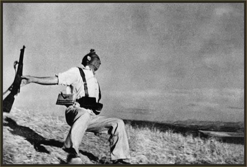

When I see this picture of the spanish civil war I don't see dirt, blood or anything gory (it is true that absence of colours is also very powerful and we are adding colours to the equation so that is really something we cannot forget). I see drama there mainly because of two reasons. The first one and the most important and evident is the dynamism. The pose of the soldier falling, the weapon in the air, the clothes inflated and the blurryness of the picture around the area of the feet clearly suggest that there is action going on, and you feel that he is falling. Second is the expression of the guy. If you just concentrate con his face and forget about everything else you'll feel like if he is sleeping, at least that's what I get from it. But in the context of dynamism and movement you feel as if he is dying. You see no pain, you see no grief or scare, but you see he is "leaving", he is passing out. And you get the feeling that he is being shot because of the pose and specially the weapon on his arm, which suggests he was fighting. But you see no blood, no dirt, not even the place where he has been shot. And still you get the feeling that he has just received a gunshot.

Doing this is very difficult in my opinion. I see what Francesco tried to do, and I think he did it very well but there is still a long way to go I think. What if you had to do what Francesco tried to do, how would yo do it? Now I'll tell you about an idea of mine that could work:

In a scene like this you don't use blood, you don't use dirt, but you still need to reflect action, war and suffering. Francesco used the right colours for a realistic ambience, greys and dark reds, desaturated. But it is the same greys and amount of saturation that you use when he painted the rocks. What if you transform the scenery, and make it more colourful, more saturated, specially the banner, the ground (maybe adding grass or flowers, I don't know) and the standard bearer, his face much more reddish and orange? Just saturating their colours, but leave the dead in a more grey ambience, the same way they are now so that you suggest death with the use of colours. I think it would be a very good idea. I think that if you don't use explicit objects like blood or dirt, the use of colours is the key, and you used the right greyish ambience to suugest that. But if you don't show a contrast so that the effect of the grey ambience just stands out, I think that the main purpose just doesn't show.

So, today I offer you this interesting debate to all of you fellow readers of Volomir's Blog. What do you think? Discussion will help you better understand this great piece of work and will for sure motivate you in your own personal creations!

Friday, October 7, 2011

Today we talk about contest controversy (GD UK 2011)

As I said the other day, Golden Demon UK 2011 was celebrated during my spiritual retirement. But even though I was away, news came to my ears that there were some important judge decisions that are now heavily questioned, and have generated a lot of chatter in forums. So let's talk today about contest controversy.

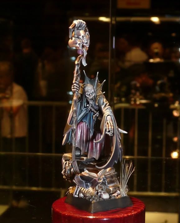
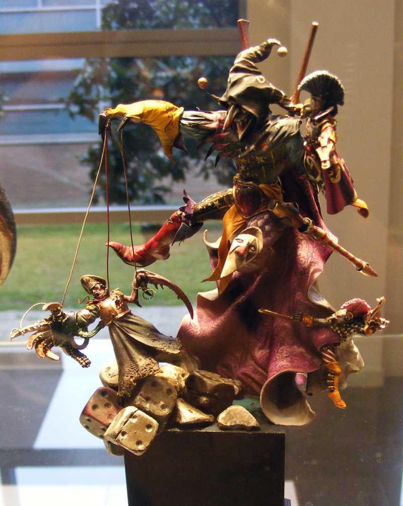
First of all, let's present facts. This is GD UK 2011 Slayersword winner:


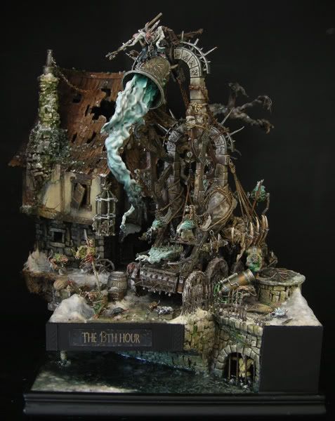
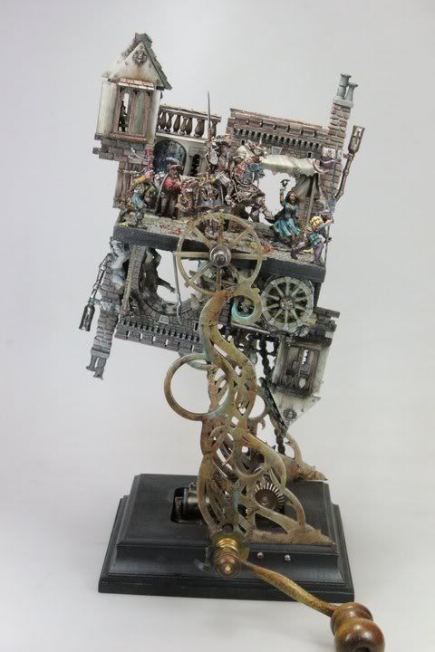
And now let's see other European Slayerword winners this year (click on the names to see more and better photos of them):


This is Remy's diorama, winner in France.


This is Ruben's duel, winner in Spain.


This is Matt's diorama, winner in Germany.

I would never judge or question a decision. But this one just seems odd. We all know that GD UK is the contest with the greatest number of participants and entries by far. And there are a lot of great painters there, even many awesome non-UK european painters travel to the contest. I didn't go to the contest, but... was this sorcerer really the best miniature they found in all the contest? Really?

See more photos of GD UK entries here.

I know some great spanish painters (to mention just an example that I know of, not that I want to brag about spanish painting quality!) that entered competition with really great miniatures and dioramas. I believe that this sorcerer is a great miniature, that's for sure. But the best of the whole GD UK contest? Really?

Is this another example of GW commercial criterion being used to judge? Would this decision benefit GW commercially at all? Is there some other dark criterion we do not know of? Should painters start fleeing out of GW Golden Demons to protest GW policies as many people are proposing a long time ago?

I want to hear your opinions!

Friday, June 10, 2011

Painting using another model as a reference

This is a question that many of us ask ourselves frequently. Is it okay to paint using another person's creation as a reference trying to copy the colour or the idea? Is it ethical to copy? What do we get out of doing that?

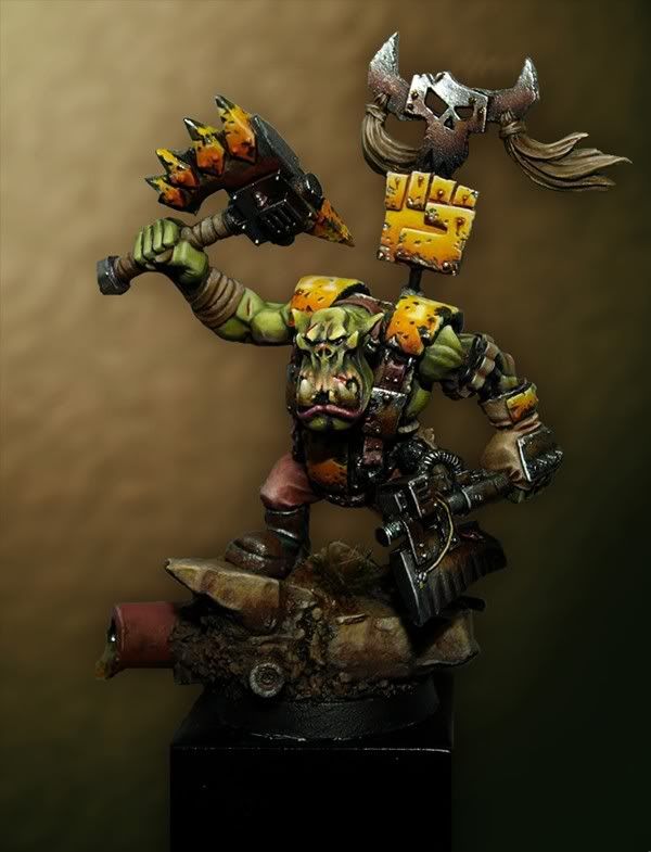
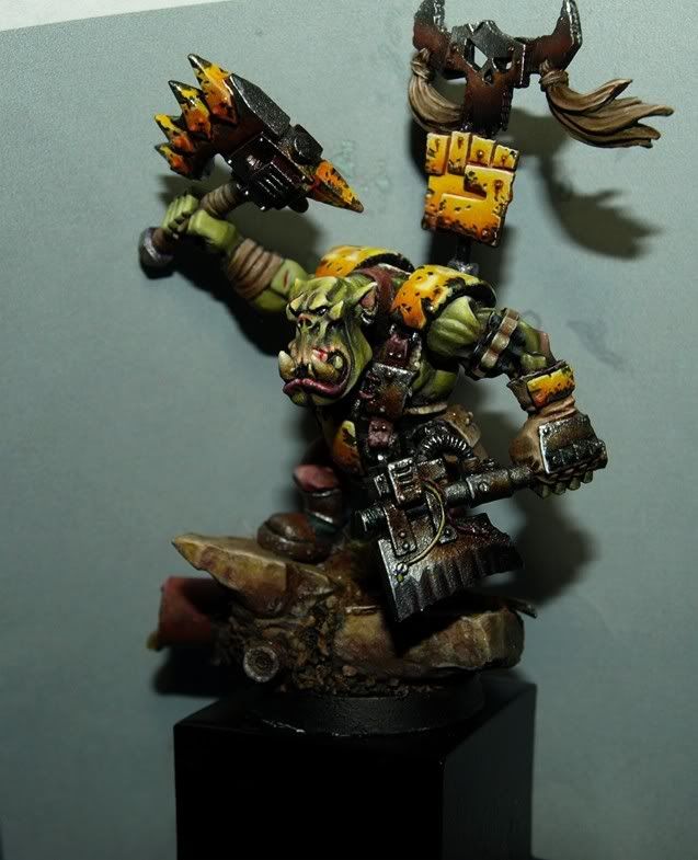
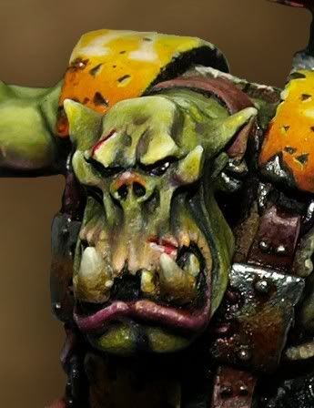
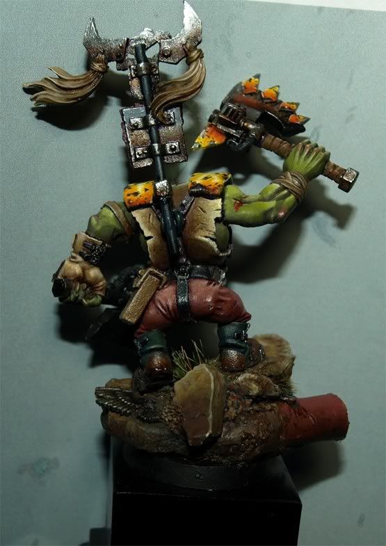
Recently, Manuel del Toro, also known as zwo, embarked on the adventure of painting an Ork Nob using mine as a reference (if you do not know what minaiture we are speaking of, you have a link in the gallery, click on the face of Ork). Manu told me openly about his ideas from the beginning and I have followed his creative process carefully. I am personally very proud that someone likes a work of mine so much as to try to achieve something similar. Therefore, he had my full support from the beginning. In fact, Manu used almost the same parts for the conversion and the colors that I used myself. In addition, Manu took the opportunity of coming to one of my painting courses and learn first hand how to get the Ork painted as the one I did back in the day. Well, here is the result of his work:


Manu has accepted my invitation to write a few words about his experience painting the Ork. Here you have it:


    Why did you decide to paint an Ork so similar?

    I started in the hobby not more than a year ago I loved Rafa's Ork from the beginning and thought to myself "someday I have to make a miniature like this one". I think it is a miniature with great strength using a great composition, both the pose and the colours.

    When I started painting the figure had not planned to enter competition in Golden Demon Spain 2011, however, because of lack of time, and seeing that I will not be able paint more entries, I'll present it there. Frankly I doubt that it will win something as it is my version but based on a figure of another, there is not much merit about that.

    Have you encountered any difficulties in the process?

    The truth is that the process was fun at first but eventually became a little tedious. I enjoyed working the yellow and the weathering, something I had never done before. However, both the base and the raised arm cost me a lot more than I thought they would.

    Something I've noticed in this case and It didn't happen to me in other miniatures is my lack of consistency. Because of me having exams I have been forced to delay the process very much. Most of the days I could just paint for about 30 minutes and it shows because it becomes something very long and hard. Therefore, I reccommend you guys that when you begin a figure finish it as soon as possible!

    What have you learned from this experience?

    I have encountered many things from working on this miniature, both good and bad. I am very happy with it because I learned a lot, mainly to better define the areas to be weathered or to perform small changes in the composition because little details may completely change the outcome of your work.

    However, I've noticed that before starting a miniature you should put a lot of time into it to make the most out of it. For example, I believe that the face I chose for the ork is not bad, in fact I like it, but it lacks a lot of strength. This choice has proven to be a mistake in the end.

    I think that having such a clear reference to paint is very good for learning because you save time and effort on avoiding many of the obstacles you find in the creation process. BUt anyway I'm sure I would have learned more if the work had been 100% mine, we must be aware that making a creative process can be tough but is very rewardful.

    In short, this is a miniature that has taught me a lot as a painter of I am very happy about it. I would like to conclude by thanking Rafa because in a situation like this many other people would have been angry, but he has helped me right from the beginning.


And I am grateful to Manu for accepting to write these words for Volomir's Blog and I congratulate him because I think he has managed to do a great job. I am convinced that the experience has proven very good for his learning and I will carefully follow his progress because without doubt he'll be one of the names to be followed in the future. Keep up the good work zwo!

I leave you his blog address if you want to know more about him.

Zwo ArtStudio

Wednesday, October 20, 2010

Space Wolves are the fashion in Spain

Seems like Space Wolves are quite trendy now in Spain, I can count at least three different Space Wolf wonders winning trophies from spanish painters in the Golden Demons celebrated last month.

My friend Arsies (Javier González) won Gold in this year's edition of Golden Demon Italy. I thought I had to dedicate a post to spanish Space Wolves because of this amazing Space Wolf Lord, it has really surprised me! Congratulations to Arsies on his award!


This is another one from my friend Kai (Cristian Sánchez), he also won Gold but in Golden Demon UK 2010 last month (you might have seen it already). For me, Kai's best miniature so far, and I'm sure one of the best awards he's managed to win. Total different style to that of Arsies but check it out! Breathtaking!


And yet another Space Wolf, from Iguazzu (Alex Varela), silver in GD Italy 2010 just behind Arsies:


Check his blog for photos of the Italian GD and figures presented there. Meanwhile, check this harlequin in 80 mm from Rusto:

Thursday, November 13, 2008

Painting Styles

Interesting topic about painting styles in ST forum (in Spanish):

Link to discussion

Here are my thoughts:

I think that the best way to know if a painter has a certain style is if you are capable of identifying his figures without knowing they are painted by them. There are more original and less original styles, also learnt styles and developed styles.

One thing i've noticed is that people lately tend to say that in spanish contests all figures have more or less the same style, and that they don't like it. Is it that bad? Isn't it logical that spanish painters learn from one another and develop similar styles (but not identical)?

In my personal case, its obvious that my style is very close to those of Banshee or JMPN because they have been basicly my masters. It's not the same anyway, because I don't pretend it and I don't try to be. It's just that I learnt to paint that way and its the painting standard I use. When I go to France and I see what they do there, the first thing I do is get crazy because I can't think of how to do what they do and if I am able to learn anything, I try to do it. I also think that it isn't bad to have similar styles, they show our roots and also our personal tastes.

I think it's important to develop our own styles, the more original the better (there is nothing original in the end, but there's always something to add) and a good way of getting a name in this world is to have a recognisable style. This can only be achieved by using colours you like or you are used to, but without using always the same. Because one thing is having style and another is to paint everything the same way, with the same colours, the same ambience. I think that these are different things.

There's a threshold between style and repetition, I couldn't really measure it because I doubt if there is some way of measuring it, but its something subjective that anyone can perceive differently, one way or the other.

Tuesday, October 7, 2008

Non Metallic Metals and Chrome effects

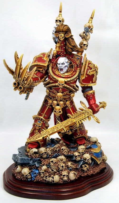
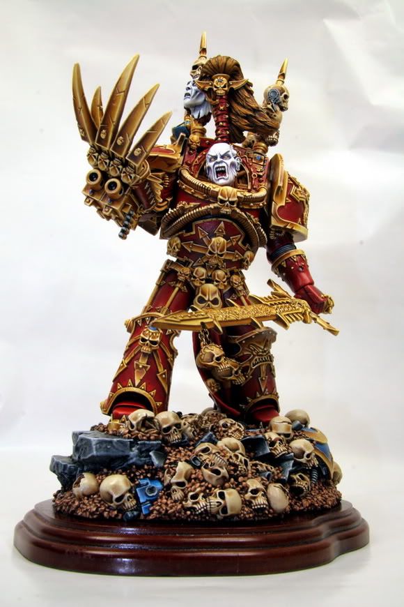
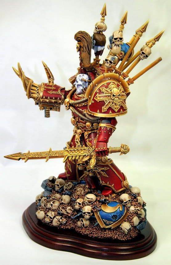
Today I give birth to this new section of the blog. I'm going to post photos from miniatures I see, and I begin just right now. I'll begin posting this awesome miniature from Pinnen, a Sweden painter who did this incredible Abaddon from Forgeworld (a very old miniature) quite big in fact (28 cm tall). The NMM and the contrast between the whites of the face and the reds and yellows of the armour are simply amazing. They remind me of the World Eaters painted by Vincent Hudon which inspired me very much and led me into painting miniatures more seriously. Check it out:


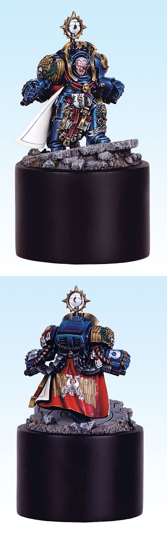
The other miniature for today is the winner of gold in the Open category in the UK Golden Demon. This is a Marneus Calgar of the Ultramarines painted with a supernatural taste. It has a wonderful chromed effect very well executed which catches the eye instantaneously, brutal contrast and maximum smoothness. Precious effect which you can't miss! Thanks to Brokenblade for painting this marvel.


I put you links to coolmini for both of the figures so you can vote them:

Marneus Calgar
Abaddon NMM