
The freehand is a technique that can substantially improve our figures. It is a key element and the best ally of all those parts of minis that are completely flat, plain and boring. By making good drawings we can get authentic works of art, is also a very popular practice when it comes to evaluate a paint job. The good news is that the technique is not complicated at all, and with a few concepts we can achieve great results. All it takes is practice, good ideas for designs and some patience, since the most complicated freehands are laborious and take some time to do.
What we need for our freehands are not a single hair brushes or anything like that. We use natural hair brushes (sable mainly) as those normally used to paint our figures, only that we must make sure that no there is no hair longer than another, that the brush head does not open and therefore can get a tip as pointy as possible. I will use a Winsor & Newton zero, carefully selected to ensure that hairs are of the same length. Anyway, I would also use a larger brush, as long as the tip is well maintained.
Beginning
Before we madly launch into drawing, we should learn to use our tools carefully. In this technique it’s essential to perform fine and firm lines with the brush tip. Contrary to what it may seem, it is not necessary to have the best pulse. We just have to find the way to hold the brush which gives us the greatest stability possible. For example, I usually hold the brush like this, though it may seem strange to you:
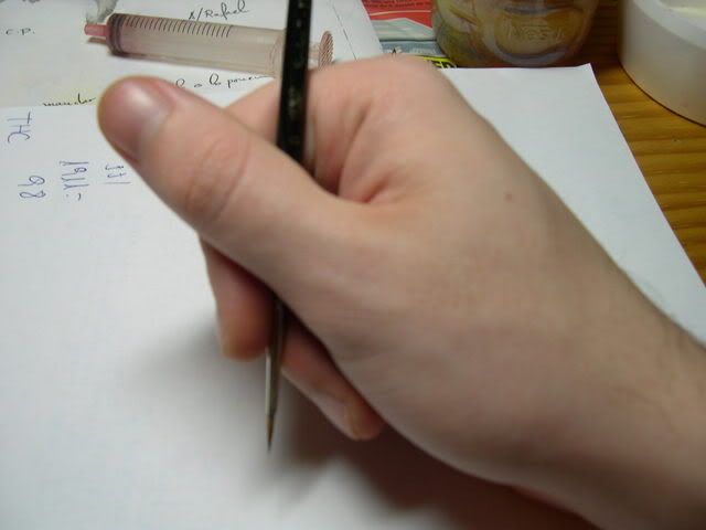
You will be able to achieve less shaky lines if you seek a position that minimizes the impact on your precision pulse. It's just one example of how to hold it, but not the only one. Look how you find it more convenient to move the brush giving strokes with the tip as fine as possible. Painting, as always, well diluted. Try with 60% water, but with practice you will forget about proportions, you’ll see for yourself. You can vary the dilution: using much diluted paint will leave an almost imperceptible line that we can serve as a guide to sketch, while if we use paint too thick we will cover more, risking to leave too much paint, but having to reload the brush fewer times. One of the most important things is to have a rapid stroke. That means that we have to give continuous strokes, without stopping, fast and clean. Especially when you do lines, because when we do it more slowly trying to do it better we are in fact going to get worse outcome. You will see that the line is more diffuse and dirty (shaking) the slower we brush. A good exercise to start testing your ability is to make lines or write your name on a piece of paper.
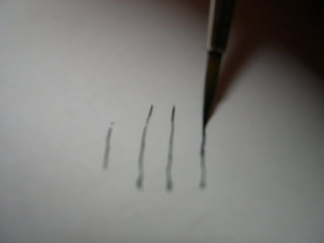
As you can see it’s pretty simple, with only this you can now do texts or litanies in books and purity seals. Here are some pictures which show you more clearly what can happen in different cases:

Do you see that there is more paint at then end of the letter "m"? This is the paint which we drag with the brush and always leave right at the end of the stroke. Check this, because it may be useful when colouring, and if you don’t consider it you may ruin your work due to bad use of the paintbrush. Therefore it is advisable to draw lines from outside to inside (from a non painted area to a already painted one) to leave the excess paint in an area that already has that colour and therefore avoid this phenomenon.
Do it as many times as necessary to control dilution and brushwork. This movement control is essential not only for freehands, also scratches, effects, lining... Come on and practise!
Now we can start to draw.
Drawings
Obviously not everybody knows how to draw. But making a decent drawing is available almost to anyone. We just have to be very clear about the design we want. To do this, you should start by copying a design already known to you.
When making large drawings, either on banners or on any flat area we should take into account:
- We will always do a sketch on paper to get an idea of how we want the design to be, size and other stuff (when we are not copying from an existing design).
- First we finish the work of the clothing or the flat area where we will be doing the drawing. Therefore, we paint the base coat, we do lights and shadows and then blend accordingly.
- We will mark the drawing with fine lines, drawing the outline to get a general idea of the shape. It is important to note that since we are likely to make mistakes (particularly with our early designs) is very advisable to make a drawing a little smaller than sketched. This is because when we have to correct it’s always better to enlarge the picture a bit rather than use the background colour to cover up a mistake. If we do this, the correcting will be more evident and also you may not achieve the same colour as the original background painting.
- Once we have defined the form, we fill the drawing with a base colour, usually darker, to cover well, then we will light up as if it were a miniature, with the same techniques.
- Unless the illustration recommends so explicitly, it is not advisable to outline the design. It is very unrealistic.
- If your design includes any area that represents metals, it’s better to paint it with the NMM technique. Painting designs on cloth or metal with metallic paint is not recommended, unless explicitly advised by the drawing.
- Finally, to integrate the design it is always desirable to introduce a common colour to the mixtures as an easy way to achieve realistic ambience. If the freehand is in some area with waves, we must simulate the shadows of the waves in the freehand. For this purpose it is best to give glazes with airbrush to the freehand with the shadow tone of the background. You can also do this with a brush but it is much more complicated, especially if the area is very large.
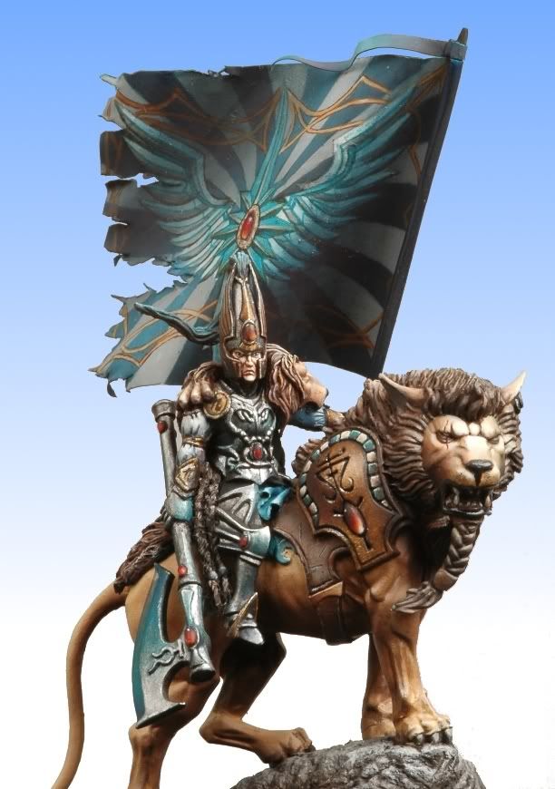
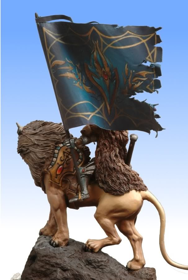
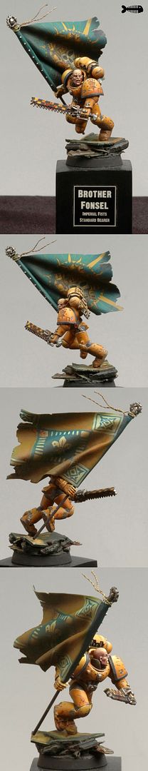
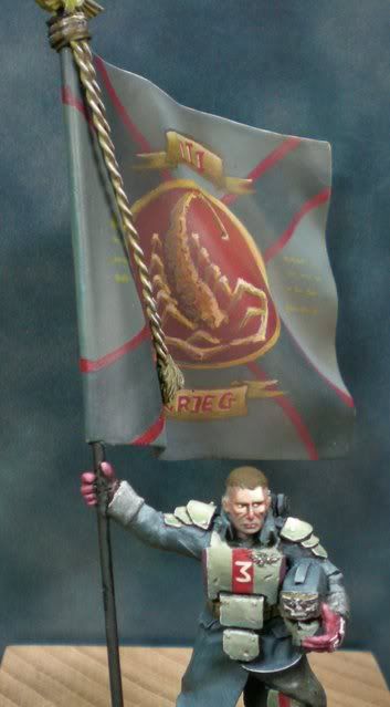
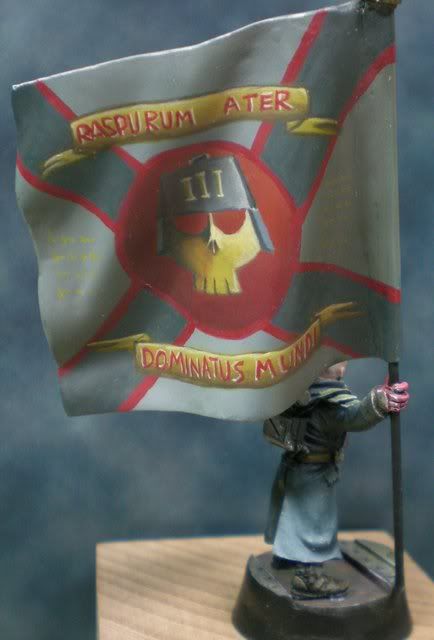
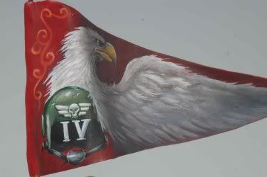
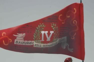
Examples of standards:
I recommend that you read Banshee’s (Alfonso Giraldes) step by step on the banner that his Catachan ogre is bearing. It’s included in the monograph "How to Paint Fantasy Miniatures" by Andrea Press. It’s quite short but the pictures of the process speak for themselves, and you can clearly see what steps you must follow to make a good banner. Here are pictures of some of my own banners:
Simple Tribal Drawing
Sometimes we do not need an elaborate drawing. Some simple lines, a tribal (like a tattoo) or something like that will serve. To do this you must take into account the considerations which I gave to handle the brush, paint and dilution, together with these others:
- As in all our works, we must take into consideration the colour theory. Knowing the colour of the background on which our freehand will be set, it will be more convenient to use one colour or another depending on the effect we want. This is not the subject of this tutorial, so take a look at tutorials on colour theory and intonation.
- If the area is undulating, or it has cuts, holes or discontinuities, we should pretend that our drawing has them also. There’s an example at the end where you will see what I mean.
- The idea and design of the drawing are very important, ensuring that it has relation to what you are painting. That is, if you make a freehand on the canvas of a warrior elf, it should be "Elvish" style, slender lines, sharp point motives or inscriptions of that style; if it is a dwarf, we should seek runes, celtic tribal drawings, straight lines...
- It is recommended to paint guide lines which will be marked first with very diluted paint, with the brush slightly loaded with paint and using strictly the tip of the brush, just to get an idea of what it will look and feel. If after that you are not convinced, you can "delete" it easily just by painting over the background colour. Remember that the freehand is always done over an area which has been lighted and shadowed accordingly, if we are not careful we could ruin what we had done previously.
- Although often very thin, we can simulate degraded drawings by simply giving thin glazes in other tones over the lines. Look at these cadian shoulder pads. They have a thin glaze of a different tone to simulate the gradient below the iconography:

- In the picture above we can see how to make scratches on our designs. Simply by using the colour on the background we introduce paint a bit into the drawing. This is even more realistic if we use Maskol, we put a little of this disgusting substance in the areas we want to simulate chips, then we do the freehand on top and finally we scratch gently to remove the Maskol, kicking off the paint.
Examples of tribal drawings:
Here’s a little tutorial from Sebastian Archer (automaton) where you can clearly see him performing a freehand in the clothing.

More examples
We can find many examples of freehands for our minis, some more elaborate than others, in coolminiornot. I recommend you to search there because it is a significant source of inspiration for your masterpieces.
Meanwhile, I leave you a few links that may be illustrating, not that they are particularly representative (some are) but can be used as fast examples as I know you won’t be doing the research any time soon!
Freehand in progress on a web:
Here’s a freehand in progress on the drape of a Celestine. As you can see the stroke is a bit rough and it seems to have plastered. To avoid this you already know what to do, more dilution and fast and clean strokes. However, it is a good example for you to see how discontinuities in the freehand are simulated because of the waving of the cloth.
http://coolminiornot.com/143285
Fabrics:
http://www.coolminiornot.com/48849
http://coolminiornot.com/42248
Based on freehands:
http://www.coolminiornot.com/122271
http://www.coolminiornot.com/8880
http://www.coolminiornot.com/79991
http://www.farabi.it/immagini/beelakor/parziale1.jpg
http://coolminiornot.com/56793
http://www.coolminiornot.com/140420
Vehicles:
http://www.coolminiornot.com/74896
http://www.coolminiornot.com/105371
http://www.coolminiornot.com/15937
Tatoos:
For these I recommend you to look real tattoos, tribals, and others where you can get many ideas. These are Banshee’s Rawne tattoos:
http://www.coolminiornot.com/143272
No comments:
Post a Comment