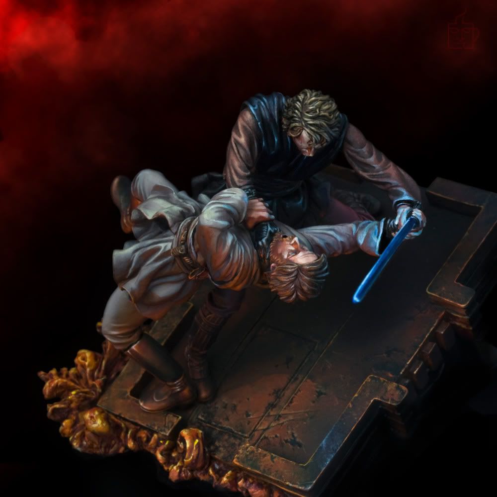
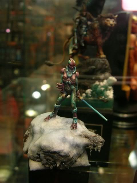
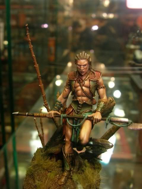
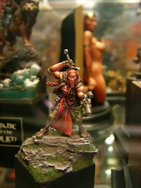
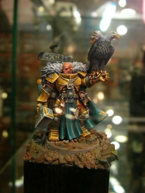
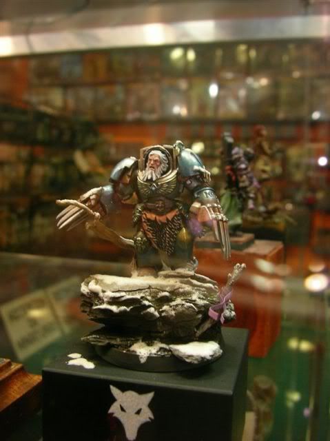
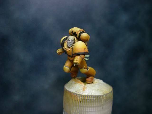
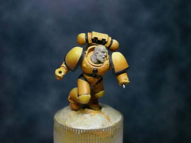
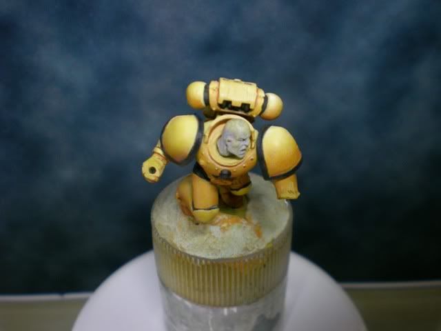
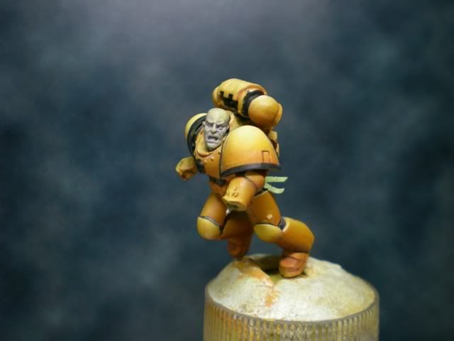
Here I present you a Step by Step article on how I painted my Brother Fonsel, a figure which you can see here in the gallery. I hope you make the effort of reading it. You will enjoy it very much as it has photos from the very beginning of the process, because in fact, I usually concentrate very much on the pre-paint stage of my figures, much more than in the painting part. I don’t paint miniatures directly from the box very often. Normally they are conversions more or less complicated, looking for a certain pose, an effect or a sensation.
As time passes by, I have realized that I put much more effort on achieving this different pose, this special front view or that interesting composition rather than choosing this or that colour when painting the figure. You will notice this in the last 3 figures which you will see posted on the web (Brother Fonsel, Malus Darkblade and Tribute to the Fallen), they have much effort put in this first stage rather than in the painting. I don’t know if this is anything bad, but this happens to me and I know that one of the things I have to improve in is dedicating more time in the last stages of my painting (we always get to contests in the last minute, painting the day before and all those things we do).
When creating Brother Fonsel I wanted a simple miniature to take to a single category, and never before had I painted a loyal Space Marine, so this was the perfect opportunity. The idea comes from Brother Joshel from mi master Alfonso Giraldes (Banshee), a figure which is a conversion of an Artemis from the Inquisitor catalogue. The marine bases its pose in this figure from Banshee. I always liked the idea of a Space Marine running with a flag waving with the wind, and Brother Joshel is great, but I thought it would have been better if the sensation of movement and speed was greater.
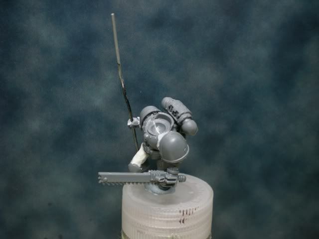
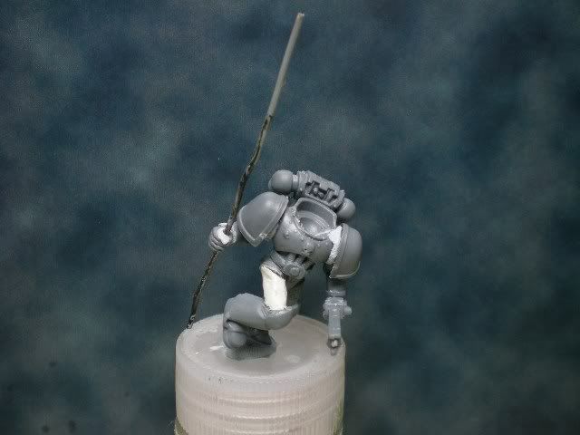
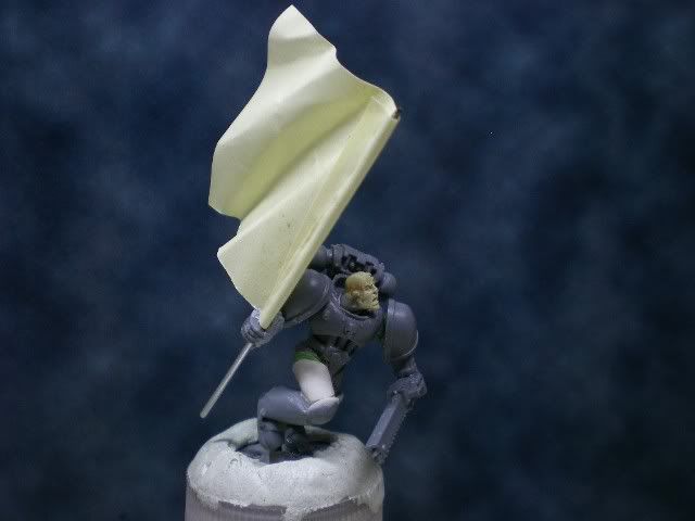
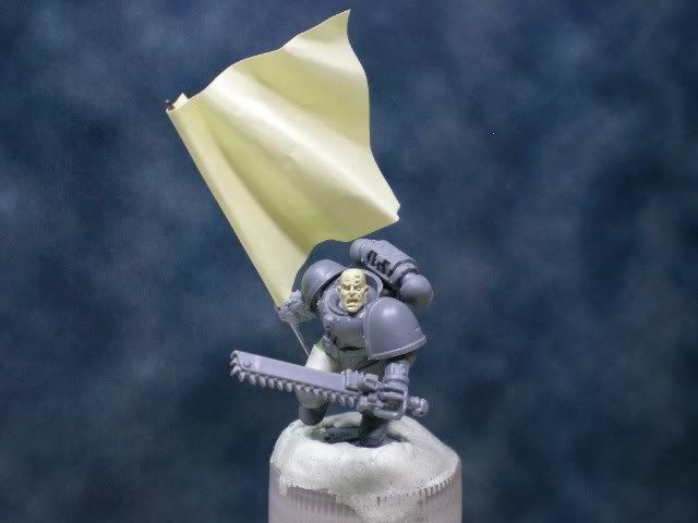
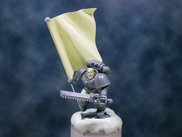
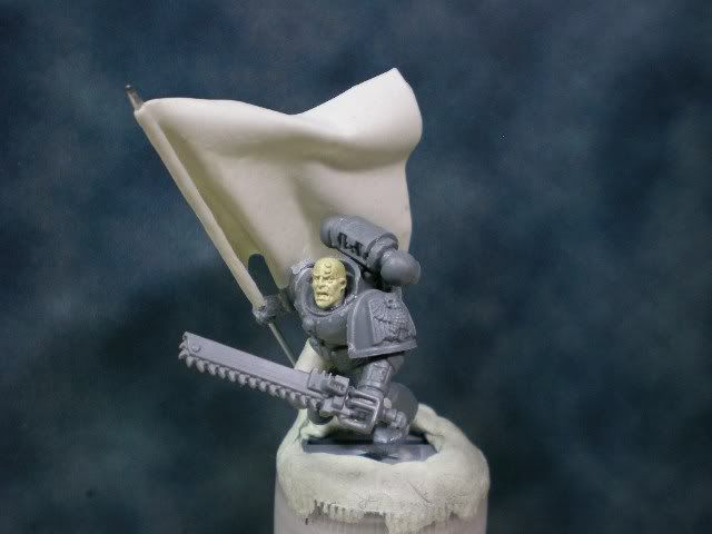
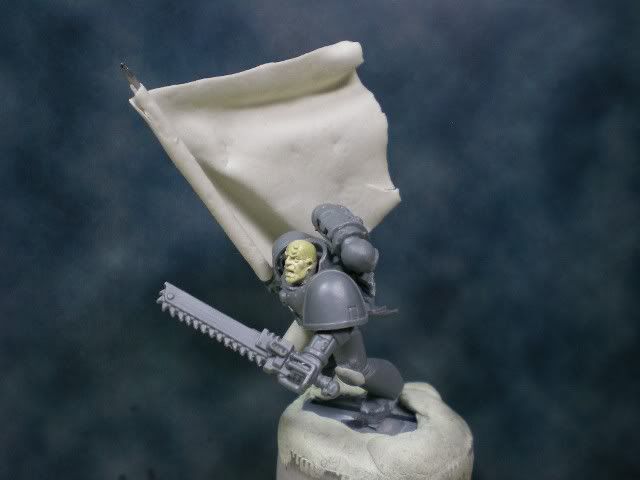
With this as a starting point, I began my job. These are the first photos of the experiment:


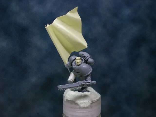
The head is the same as the one from the special edition Space Marine from Games Day 2006, modelled by Juan Díaz, which I think is a very good one and has great possibilities for painting.
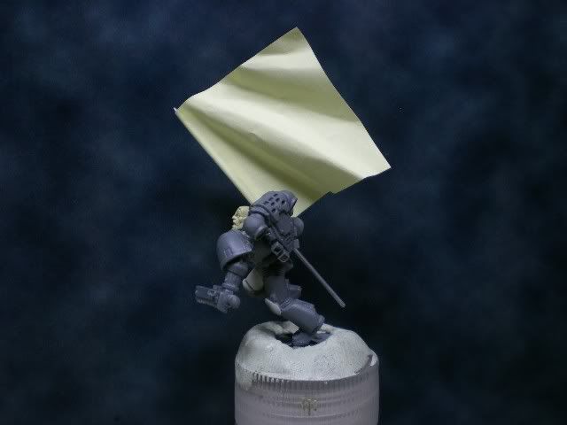
To try and see how the flag would look like, I sticked a post-it to a bit of wire (this is not the final pole of the flag) and I folded it conveniently simulating the waves which more or less I considered a flag would have in this position. However, the post-it was not enough. Because of the pose, the flag would have a very strong folding close to the pole so that the upper border of the cloth was parallel to the movement of the marine. This folding couldn’t be modelled in the post-it so I left it more or less indicated and tried the different poses with it.


These are the first steps of the creation, many pieces are glued together with blu-tack simply to see how the pose works and to try different options. Many times this may suppose that you achieve a pose you like, you remove the blu-tack and when you glue it definitely you realize that you could not redo the pose you had before. That really can demoralize you. This is a good reason to start making photos during the process, but of course, it takes time. In the next step you can see how I changed a few things about the marine, such as the height where he carries the sword, or the position of the arms.

After talking to a few colleagues, I realized that the torso was too much tilted aside and although it’s a space marine, it’s quite unnatural, so there you have another change made.

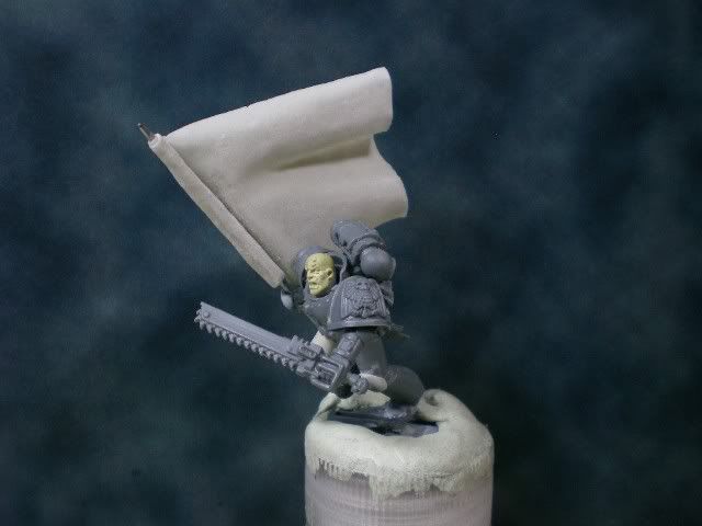
With the pose more or less decided, I started the modelling of the standard. This was the part which worried me the most because I was not convinced about the form of the waves and I wasn’t sure if I was going to succeed in modelling those waves with the standard modelling process of a flag I had been doing in the past. This typical process consisted of doing a plasticine bed with the form of the waves. Over this bed, I would put a fine piece of Milliput and then with a brush I’d give slight strokes on it so that it gained the shape of the plasticine waves. Because of what I said before about the difficulty of the folding and the edge of the flag being parallel to the ground, I was not convinced about doing the flag by using simply the plasticine bed. Therefore, I decided to try new methods of my own invention until I found the one I liked most. And that is how it happened, that I had to model 9 different flags to perfect the method until I got the one which fitted. This happens when you start investigating, and then the usual friend comes and says, “why haven’t you used a piece of tin?”, to which you answer nodding and thinking you have been a miserable fool. But you learn with these mistakes and that is why the next standard was done directly with a piece of tin (the one in Tribute to the Fallen).
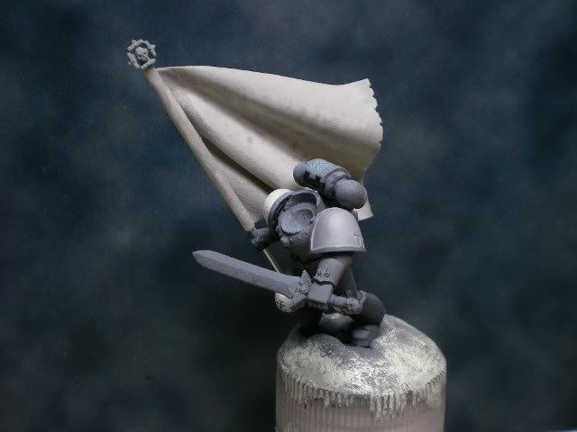
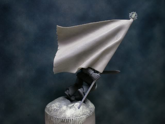
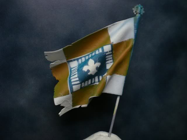
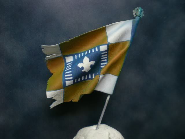
The experimental process leaded me to a new method of modelling standards, at least new to me. I kneaded the putty until I got a fine piece of flat and thin Milliput. Then I cut it with the shape of the flag. Next, I rolled the edge over the pole and crushed the putty there to stick the flag to the pole. Then I put the flag into the oven just to give it a bit of heat so it hardens and becomes not too hard but flexible enough to fold and keep the shape (the time in the oven was something I perfected as I repeated each attempt of the standards). After this, I put the pole on the space marine to get the position of the flag and directly with my fingers I folded the standard to get the shape desired. It’s quite a chaotic way of working, but it resulted in success, after 9 attempts I got to the good one. I have to say that the fact that I was not sure at all about how the waves had to be and that is why I had to repeat it so many times, but anyway, in the end it all ended well and that what matters. Here are photos of three of the versions which went wrong, and two photos of the version which I used finally .


In the last photos you can see that I changed the sword and that I started painting it all black. Well, this is because in the beginning I was thinking of painting it as a Black Templar, and so I changed the chain sword for a normal one which fitted the chapter more. When I saw how sad the space marine would feel painted all in black, I decided to repaint and recover the original chain sword. I think this was no mistake because if it had stayed in black, it would have never become the Lemon Marine! (as I kindly call it).
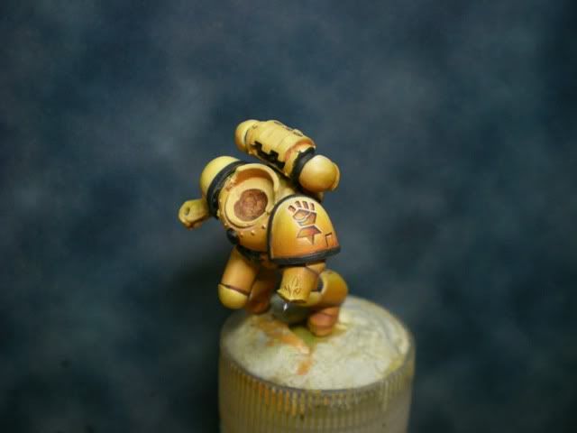
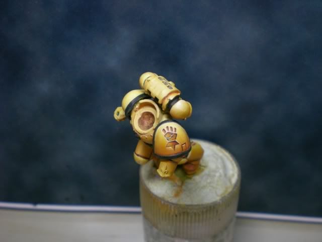
Therefore, using the same yellows which I already used in the Nob Ork, I repainted over the black. The base is Golden Yellow and Bestial Brown from Citadel, highlighted with Golden Yellow and Ice Yellow from Vallejo, and shadowed with Bestial Brown.


I decided to paint the edges of the armour in black. I think it’s quite a good scheme.
Then I painted the freehand of the shoulder pad. I was inspired by an Imperial Fist symbol which I saw in a standard from a figure in coolminiornot. I really liked the fact that it seemed to be carved into the armour rather than just painted, so I try to simulate the effect.


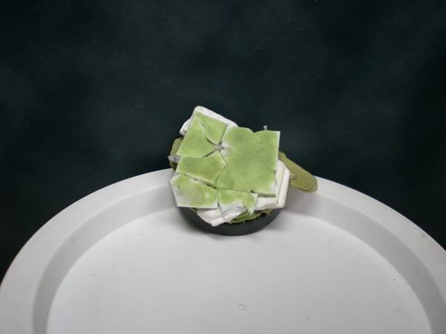
Now I put photos of the base I used. I wanted something which would not be a problem to paint and which wouldn’t distract the attention from the important things: the face of the marine and the flag. And I won’t try to fool you, bases are not the things which I like to do best in a miniature!

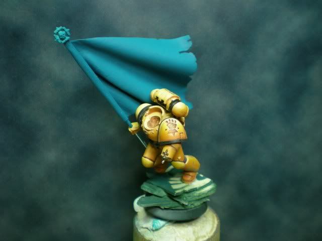
With everything in line, I mounted the flag in its position and painted it in the base blue colour with airbrush, to see the effect of the composition. The blue is a Turquoise from Citadel.

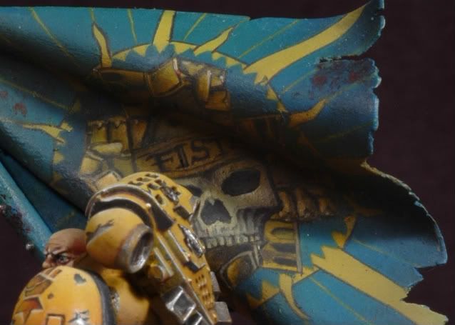
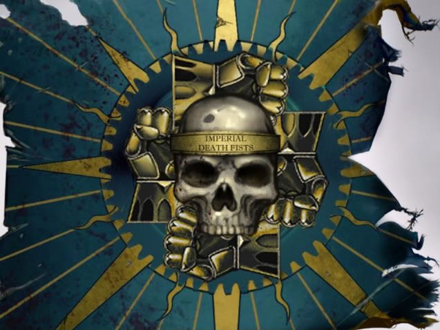
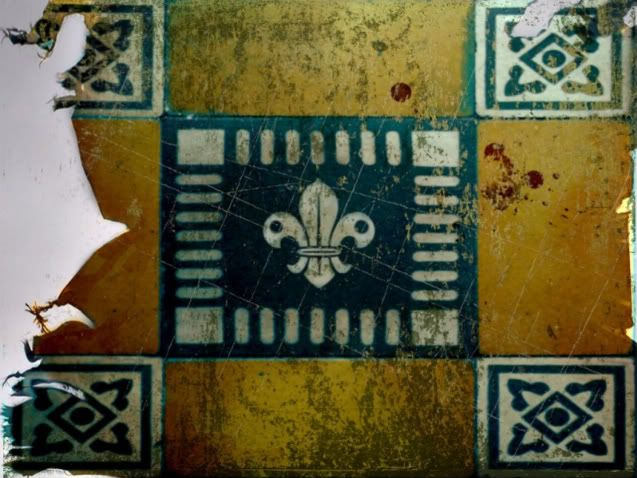
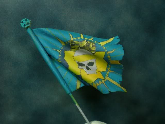
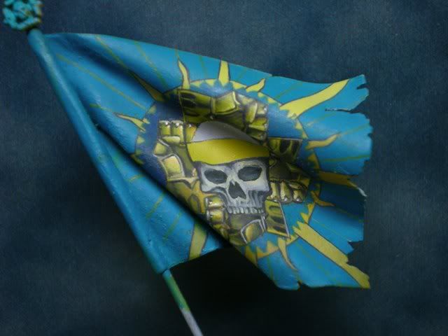
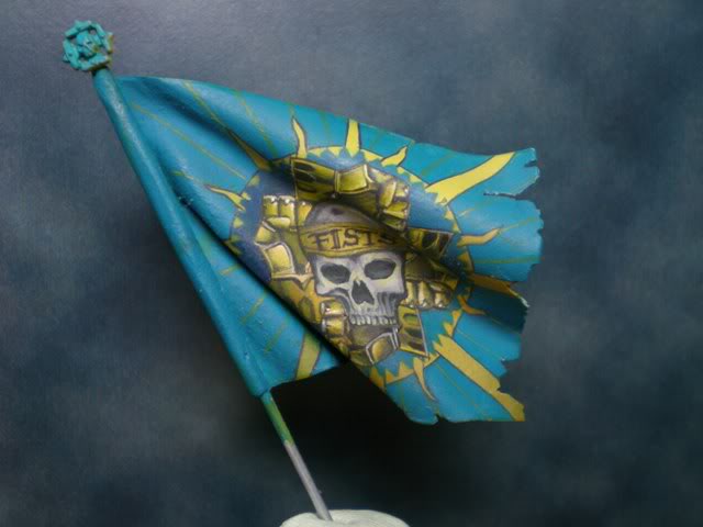
Seen that I liked the composition, I began the painting of the flag, which again seemed to be the most complicated part of the painting process. The design of the standards was courtesy of my friend Arturo Serrano (obiart). He offered to create a design in Photoshop because his job consists of things like this. So with a few basic indications from my part (idiosyncrasy of the Imperial Fists, symbols they use and predominant colours of the flag) he created this wonderful design in Photoshop:


As you can see, the design is very good, and the task of painting when you have the concept very clear is much simpler. In fact, I don’t advise you to paint a standard with no previous design at all.
The painting process has a lot of engineering from my part. I planned all the steps of the process in the most efficient way possible to optimize the job. What I did is mentally divide the design of the flag and cut out some airbrush templates so that you have the basic shapes of the drawing to have all the elements well placed in the flag, which is in the end the most important thing to bear in mind when painting this type of freehands. It’s very similar to what happens with sculpture, if the mannequin is badly placed, there is no way of fixing the error later. It’s basic to have all the elements well placed.


And now we start with the painting with normal brush. This has no secret at all, you paint the same way you would paint a miniature, giving lights and shadows, with the difference of having a previous design, which indicated the spots where the lights should be and makes the work really simpler.

With the back part the job is the same. Airbrush templates to place the elements where they have to be. With the template normally you leave quite a dirty finish if you don’t control the technique, so afterwards you have to go over it with normal brush.


All that is left is to continue until we get to the final drawing!


Afterwards I gave general shadows to the whole flag with airbrush. I should have taken into consideration how the lights affected the flag while I was painting the freehand, and this is one of the reasons why the flag lacks contrast at the end of the process. This is something I learnt and then applied with more or less success in the standard of Tribute to the Fallen.
These were the last photos I took during the process. The rest of the figure are basically scratches which I’m sure you are tired of reading tutorials on how to do them, and anyway they are not very well done in this marine. Perhaps the most interesting part of the rest of the process is that in the end, I found out that the yellow and the turquoise contrasted too much, and was very clear to the eye that the flag and the marine had been painted separately. This is a big ambience issue which I solved in quite an easy way. With airbrush, I gave glazes of turquoise all over the marine, and, with yellow, I gave glazes all over the blue of the standard. The whole figure became greener, but it can’t be appreciated unless you see the photos of the process, and it really helps to integrate the flag and the marine together.
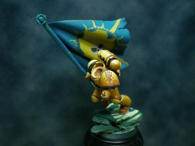
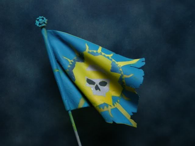
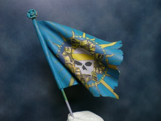
I leave you the final photos of the marine and the close-up of the standard so you can see how the thing ended.

