
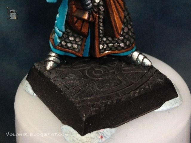
And now that I'm so motivated with freehands, let's work on the banner. But before that, let's paint some metallic boots.
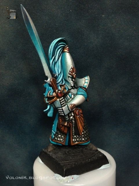
They are supposed to be the same material as the shiny elvish armour, so let's use the same process. First, basecoat of Boltgun Metal.
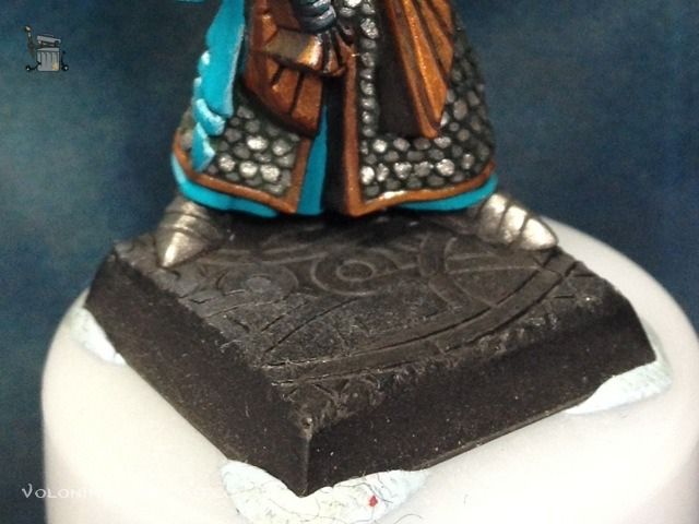
First highlights with Mithiril silver, respecting the basecoat middle tone of Boltgun Metal.
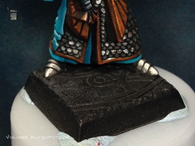
Final highlights on the edges and shines of Metallic Medium. It's very difficult to see it in the photo, but trust me: it's there.
Some shadows are also necessary, so a little bit of glazing with blue and green ink tones to get that reflection effect working.
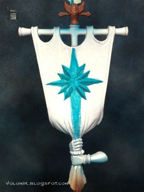
And that's it with the boots! Let's go with the banner then. First, primed white, as usual.
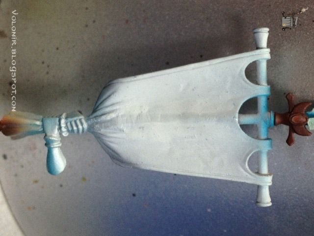
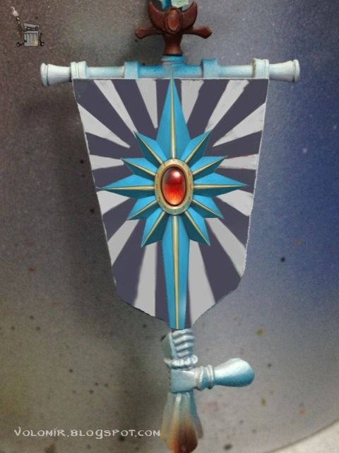
From that "white canvas" kind of photograph, I make a design in my computer (don't forget my article on the subject) and then I will print it to actual size so I have an idea of what I'm doing.
And then I'll start painting. I feel kind of lazy about doing the airbrush template process, so I'm going to directly draw lines from scratch. I begin with roughly shaping the turquoise star.
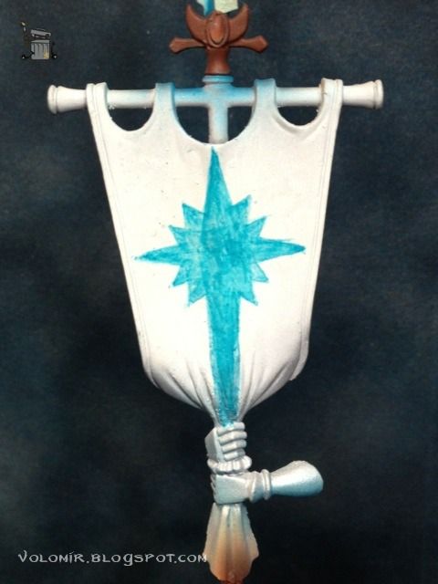
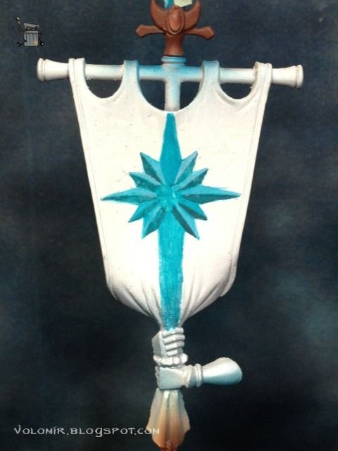
I paint the shadow on the star arms once I'm happy with the overall shape and proportions.
Then I highlight the arms with Space Wolves Grey.
I place the red ellipse which will be the gem in the centre.
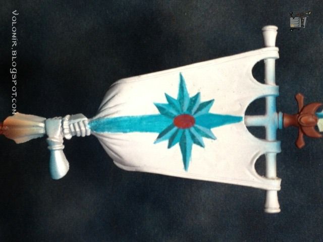
And then outline the metallic frame in the star with Ice Yellow. It's a little rough but no worries because I will fix it all as I paint. It's important to have it all properly outlined first and then clean it up.
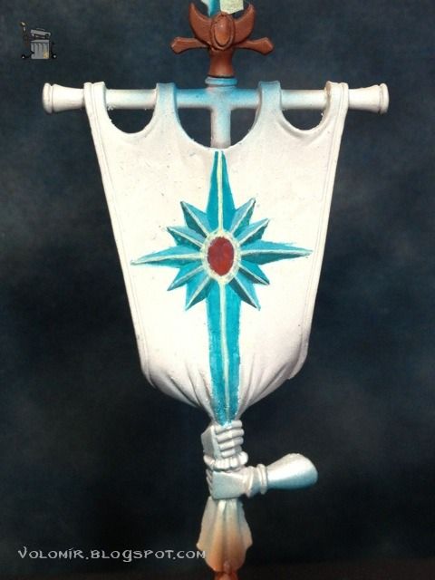
So this is how the star looks after some more outlining, cleaning here and there, and outlining some more.
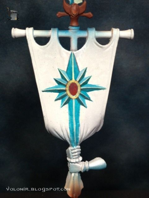
Ok, something doesn't look right though. I'm not happy with the banner. Can you guess what's the problem?
Continue to WIP: Swordmasters of Hoeth Part 8
6 comments:
Would say it's kinda flat looking, although the banner is pretty full of creases and folds in real life(although on the model I have at home it is ;))
Maybe that's the problem?
Nice try Ver_Bla! But no... that is not the problem, I could always fix that by doing more work on the banner as it is now, but there's something wrong with it and I will have to undo some work. Any more guesses? :)
I had the same feeling on my banner while painting the skull side
http://pinselwut.blogspot.de/2013/01/black-knights-banner-wip-3.html
but this feeling disappeared when in painted the green glow and cloth structure.
I guess, if you go on, painting the sorroundings of the "star", maybe a shadow, outline or a golden NMM border it will truly look awesome.
I think the plain white background of the banner is making it look kind of "wrong" as you say.
I hope you know what i mean. :)
Solmar, what you say makes total sense to me. It is true that by coping with the banner, results are much more clear since the beginning. I should have done that. Actually, that's my normal way of working, just this time I wanted to try something else.
However, that is not the problem I'm anticipating here. The problem cannot be solved by continuing, but rather starting again from scratch, and this comes from the very first step in the process, the concept behind it...
Also, I just checked your Black Knight banner and it's freakin' awesome!!!! I love it big time :)
Thank you! That means a lot to me to get nice words from a master of painting ;)
I am looking forward to your progress on the banner :)
Post a Comment