Sadly, I wasn't happy with the star. So let's wipe it out of existence.
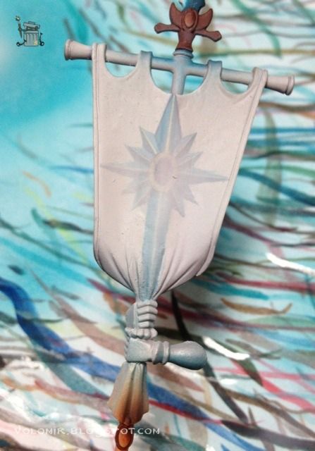
Before you start shrieking in confusion, let me explain. Some of you might have guessed what was wrong. If you go back to our previous computer design you'll see I didn't take into consideration the top shape of the banner. So without considering that part of the banner, the star is placed high in the standard, but when the gaps come in, the star is placed way too high and the composition is not balanced. So back to our white canvas!
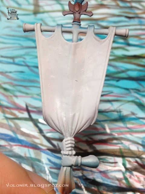
And back to our computer to re-position the computer design.
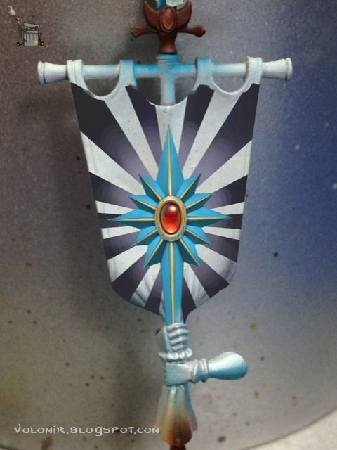
Now the star rough drawing is situated much lower.
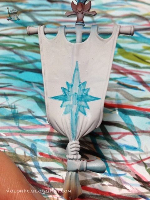
The goal now is exactly the same as before, but the process in freehands is not a strict guide to follow, so I'll finish up the gem first, just because I feel like it.
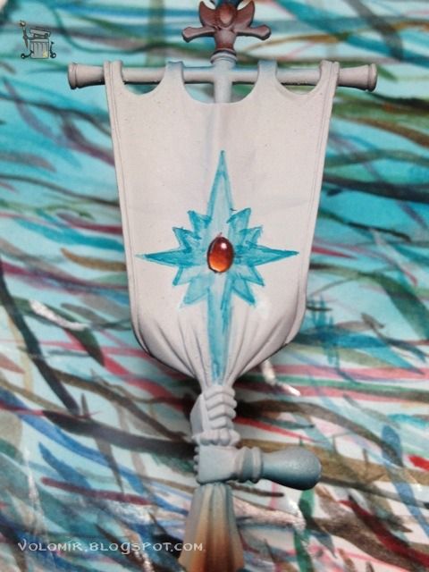
Now I colour the whole star.
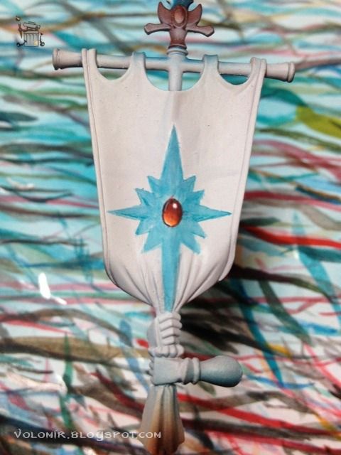
Then shadow the lower part of the arms.
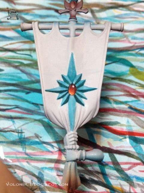
Ice Yellow again for the metallic frame.
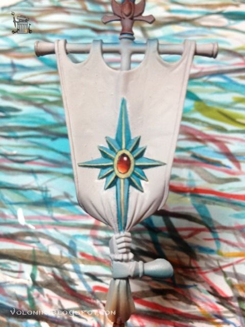
And now that the star is starting to look good, I'll focus on the background. I'll use airbrush to shadow the outer parts of the design to concentrate the light on the star, which is what I'm interested in.
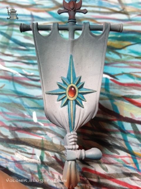
I realize now that maybe shifting out of my normal airbrush template process wasn't such a good idea. But no worries, I can improvise some template for the star rays with the actual printout of the design.
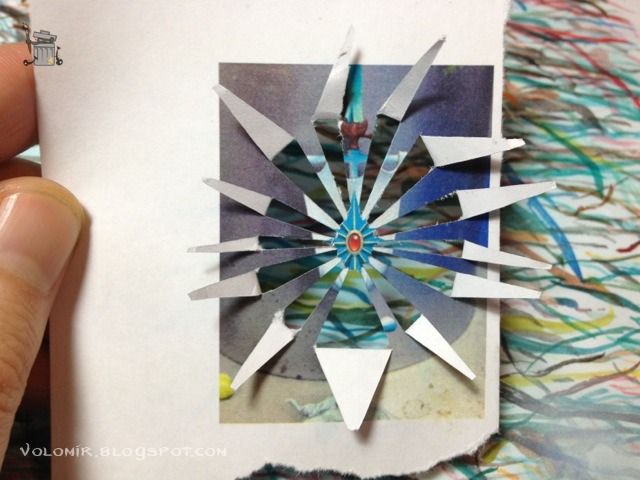
Carefully, and masking other parts of the banner to avoid troubles, I use it as template for the airbrush and this is the result. I will clean it up with some brushwork.
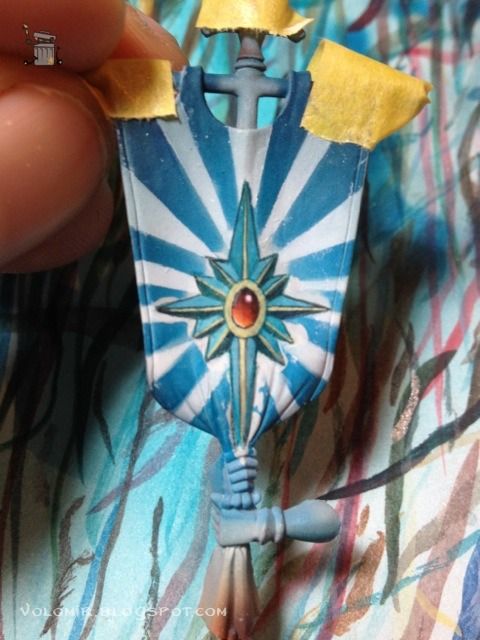
The upper part of the design is a little empty, so I'll introduce a couple of elven runes to fill it. This is after I cleaned the airbrush work, of course.
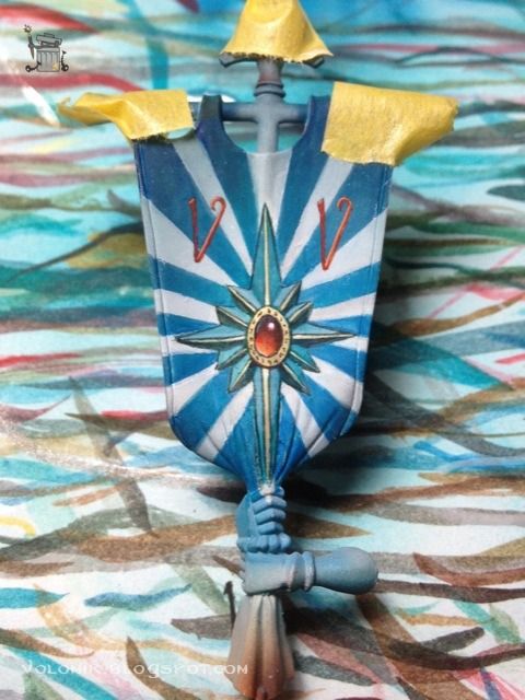
But as much as you clean, there is always more cleaning to do.
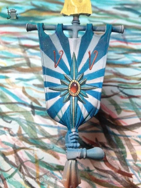
Now it looks nearly finished, so it's time to integrate it all together with some glazes with the airbrush, again shadowing the outer parts of the flag to make the star pop out.
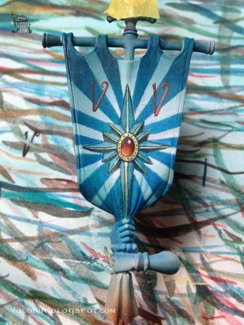
And a bit more to make the contrast higher.
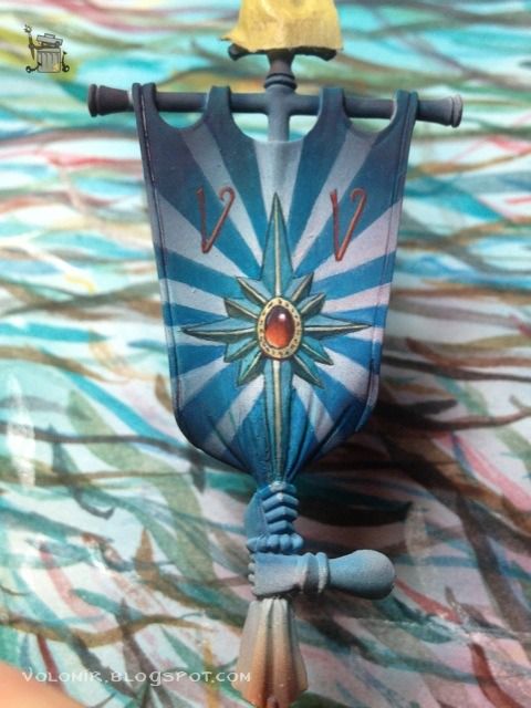
And finally, back to the brush to bring back the pure white on the areas closer to the star.
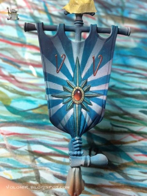
That is more like it. Now I'm happy!
More work on the other side of the banner soon. Stay tuned!

4 comments:
Yep, now it looks great! Nice to see you have found a woraround your problem :)
Cheers, Solmar
Really great, what do you pan for the lowet part of the banner?
Regards Tuffskull
Thanks guys! It will be painted following the same scheme as the background of the banner, with blue and white stripes, but bigger, since its the lower part of the design and the stripes come from the upper part.
hi, looks really good.
like all your stuff.
some line of the star are not 100% straight, might be because of the shape of the banner.
harald
Post a Comment