-
Old Friends by Iguazzu and Piqui:
Really touching scene from the southern monkeys. The guy in the portrait is obviously the guy from Up!
-
Griminn by Roberto Chaudon:
And yet another great sculpture from Roberto for Mierce Miniatures.
-
Ur-Fildyr by Thomas David for Mike McVey:
Just pronouncing these two names together seems like some kind of sorcery is going to be unleashed.
-
Plague Lord Deadzone by Remy Tremblay:
Mantic is developing a new game called Deadzone, and this is one of the miniatures for their new range.
-
Touch of Death by Raffaele Picca:
The thoughts behind this great creation of Raffa put into words in this article. 450 hours in 5 weeks? Seriously??
-
2012 clash of Slayer Sword Winners:
Interesting article depicting the opinion of different artists about last year's Slayer Swords. I happen to be one of the people giving their opinion!
-
Mephisto by Roman Lappat:
Really cool paintjob for this amazing bust. I love the lava effect! Jungle boogie!
-
Mill scenery by Manuel Pariente:
Impressive and very realistic mill scenery which you can see in Rafa Coll's Blog.
-
Dream and Nightmare by Amon Chakai
"Foiatore" has done it again. Great idea and very well worked execution for this pretty awesome diorama.
-
Glaun by Roberto Chaudon
Another super big and scary monster for Mierce Miniatures by Roberto.
-
The Walking Dead by Enrique Velasco (emuse)
Months of hype around what emuse would bring to Crystal Brush! This is the marvelous diorama he presented that was first runner up in Chicago.
-
Mago by Roberto Chaudon
Don't forget Roberto also sculpts busts! Really nice one!
-
How to make rust and corrosion
Great tutorial to make rust easily and very convincingly in Coloured Dust.
-
How to sculpt a sword by Piquifl
Piqui shows us in the newly rebuilt Cursed Monkeys Blog how to sculpt a sword from plasticard.
Friday, May 31, 2013
Do Not Miss: May 2013
These are the most interesting things I've seen in May 2013:
Thursday, May 30, 2013
An early Do Not Miss for May with Elías Alonso
I'll post tomorrow night the real Do Not Miss selection for the month of May (which by the way is really big this month), but before that, I needed to post this because it can't wait until tomorrow (you never know if you will run out of spots!).
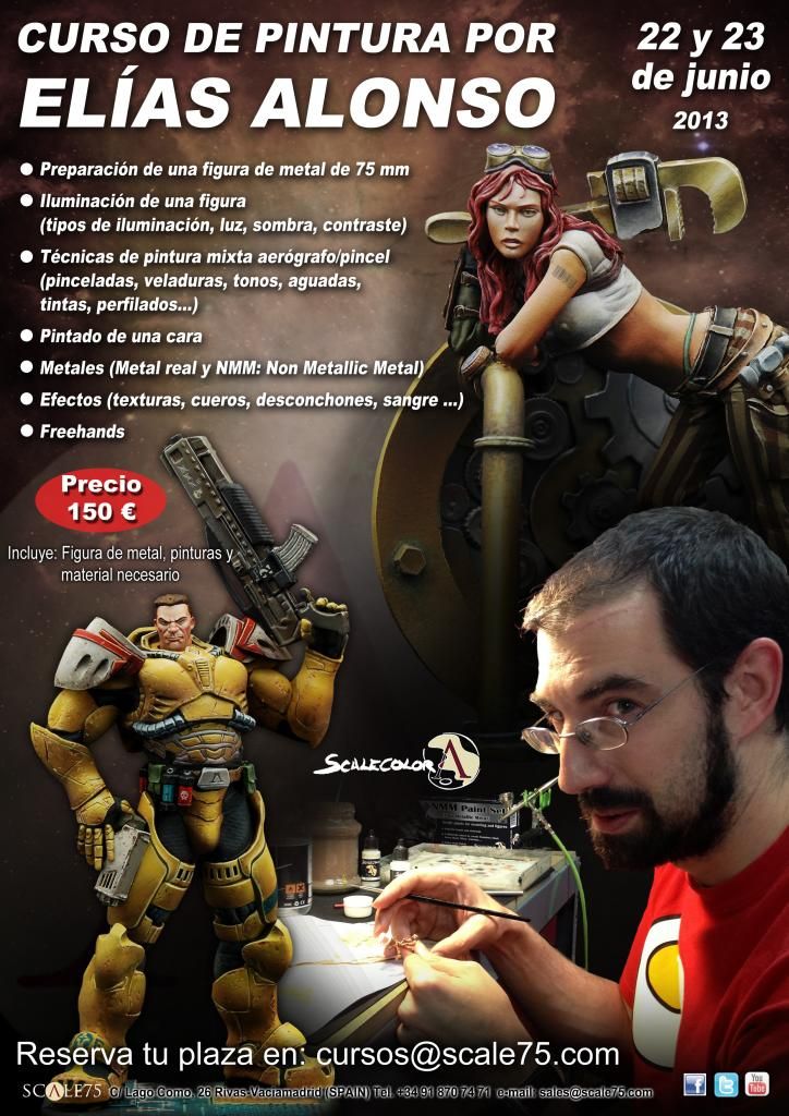
The gods of painting know this is THE OPPORTUNITY.
I'm definitely going to try to make it happen! I'm already going to Pedro Fernández's sculpting workshop in Alcalá de Henares on the weekend of July 6-7, but no sane painter should miss this one!

The gods of painting know this is THE OPPORTUNITY.
I'm definitely going to try to make it happen! I'm already going to Pedro Fernández's sculpting workshop in Alcalá de Henares on the weekend of July 6-7, but no sane painter should miss this one!
Tuesday, May 28, 2013
Metals
The old Volomir's Blog is not in use anymore.
You're currently being redirected to volomir.com, it will only take a few moments.
Metals are difficult surface to represent with paint. The natural shines that metal produces and its capacity for reflection of light makes it very complicated. In traditional painting, metal represented in two dimensions is relatively easy to achieve: we force contrasts and glares, and simulate reflections that occur naturally, limiting ourselves to the context of a single view. In sculpture painting, three-dimensional, this is something much more complicated. Glares and shines are something that depends on the relative position of the viewer to the figure, and therefore traditional methods do not work as easily, because, when we switch views, shine spots are fixed in one place and do not move with the viewer's point of view, thus ruining the feeling of metal.
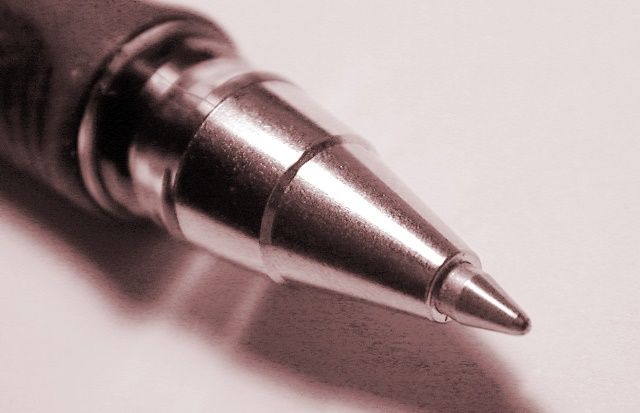
Polished metal shines on a ball pen.
To achieve a realistic metal effect, paints wich metallic pigments were developed to simulate the natural shine of these materials. When painting with these pigments, all the surface acquires a metallic feeling, but despite being a good approximation, we do not get the natural reflection of polished metals (although with some very specific paintings we may get close enough). We will try to fool the eye forcing the glare to be always in the same position, as we do with any other surface in miniature painting, but this time the placement does not depend so much on the light scheme chosen but rather on our intention.
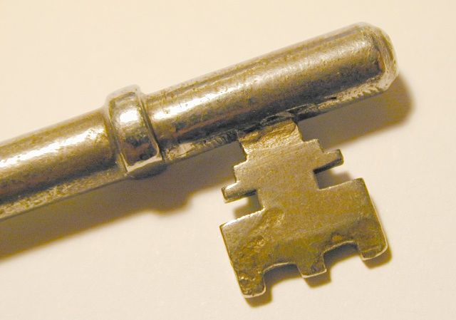
Even when rusty, metal still has strong shines.
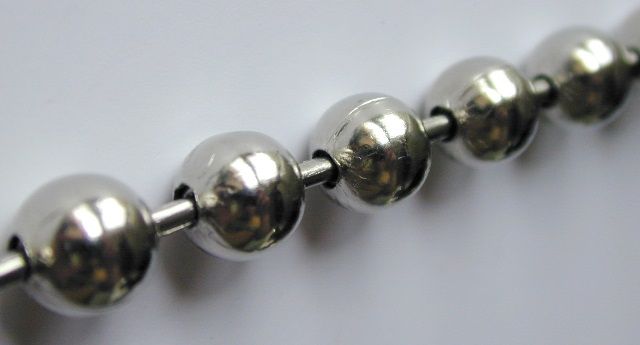
Shines on metallic spheres.
The secret of metals is therefore represent the reflection of light in the appropriate manner. The more polished metals are, the more they suffer from specular reflection, i.e. the more they resemble a mirror in how they reflect those images. This is what we will try to do when trying to represent our miniatures. For this we will use two features that when properly controlled will define the quality of our painting:
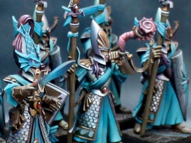
Metallic armours with slight colour reflections.
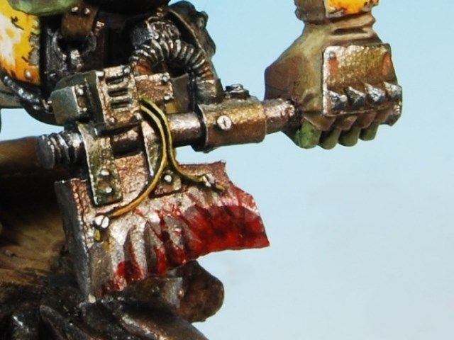
Worn out metal with rust and blood effects.
In metal, light spots will be specular reflections of light rays either from the sun or from an alternative source of light. The shadows will be reflected images of nearby surfaces surrounding the metal, and we will ensure that the more polished the metal has to be, the stronger the reflection we will have to insinuate. These nearby surfaces mark the colour that we will use for the shadows. We will have to do a study of the metal surface to identify where the lights go, and what they are reflecting with the shadows. At times when there is no object close to the metal to be used as reflection, we will use a creative license. We will use the sky if the metal is looking up, so we'll use blueish colours, or the ground if it is looking down, so usually we will use the same colours that we use for the base. We can also use the predominant colour of the miniature, so that the metal is kept in harmony with the rest of the figure. The possibilities are endless.
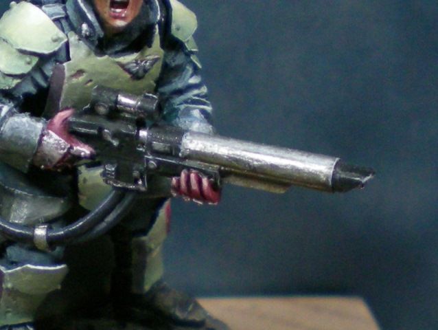
Polished metal painted using metallic paints.
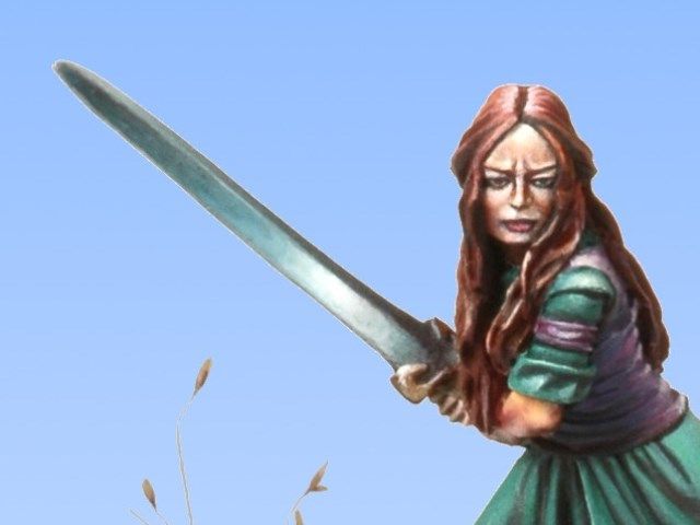
Polished metal painted using non-metallic paints
That said, let's look at the two most popular styles of painting metals that we have in miniature painting, True Metallic Metal and Non Metallic Metal (NMM). The two forms, despite having names so pretentious, are actually the same technique. The difference is that in the first one we will use metallic pigment colours and gloss while in the other we will use matte colours.
You're currently being redirected to volomir.com, it will only take a few moments.
Metals are difficult surface to represent with paint. The natural shines that metal produces and its capacity for reflection of light makes it very complicated. In traditional painting, metal represented in two dimensions is relatively easy to achieve: we force contrasts and glares, and simulate reflections that occur naturally, limiting ourselves to the context of a single view. In sculpture painting, three-dimensional, this is something much more complicated. Glares and shines are something that depends on the relative position of the viewer to the figure, and therefore traditional methods do not work as easily, because, when we switch views, shine spots are fixed in one place and do not move with the viewer's point of view, thus ruining the feeling of metal.

Polished metal shines on a ball pen.
To achieve a realistic metal effect, paints wich metallic pigments were developed to simulate the natural shine of these materials. When painting with these pigments, all the surface acquires a metallic feeling, but despite being a good approximation, we do not get the natural reflection of polished metals (although with some very specific paintings we may get close enough). We will try to fool the eye forcing the glare to be always in the same position, as we do with any other surface in miniature painting, but this time the placement does not depend so much on the light scheme chosen but rather on our intention.

Even when rusty, metal still has strong shines.

Shines on metallic spheres.
The secret of metals is therefore represent the reflection of light in the appropriate manner. The more polished metals are, the more they suffer from specular reflection, i.e. the more they resemble a mirror in how they reflect those images. This is what we will try to do when trying to represent our miniatures. For this we will use two features that when properly controlled will define the quality of our painting:
- The first feature is that the use of very strong colour contrasts is essential, going from light to dark in a extreme way. We will be able to go from black to white in silver metallics, from light to dark browns in golden metallics, etc. The great difference from painting any other type of surface is that we will extremely differentiate changes of places and position of highlights. The latter, which at other times is determined by the position of light sources, in this case is arbitrary, almost at will, representing the fact that metals act like mirrors. We will use all forms of contrast that we have seen and will use them combined with each other.
- The second feature is the cleaning of transitions. Metallics with dirty transitions will not be believable, and this is especially critical the more polished the metal is supposed to be. When we paint metals with metallic paints we will play with gloss contrast, and that contrast is very sensitive to the smoothness of transitions, as improper blending of transitions in glossiness are easily noticed and spoil all the work.

Metallic armours with slight colour reflections.

Worn out metal with rust and blood effects.
In metal, light spots will be specular reflections of light rays either from the sun or from an alternative source of light. The shadows will be reflected images of nearby surfaces surrounding the metal, and we will ensure that the more polished the metal has to be, the stronger the reflection we will have to insinuate. These nearby surfaces mark the colour that we will use for the shadows. We will have to do a study of the metal surface to identify where the lights go, and what they are reflecting with the shadows. At times when there is no object close to the metal to be used as reflection, we will use a creative license. We will use the sky if the metal is looking up, so we'll use blueish colours, or the ground if it is looking down, so usually we will use the same colours that we use for the base. We can also use the predominant colour of the miniature, so that the metal is kept in harmony with the rest of the figure. The possibilities are endless.

Polished metal painted using metallic paints.

Polished metal painted using non-metallic paints
That said, let's look at the two most popular styles of painting metals that we have in miniature painting, True Metallic Metal and Non Metallic Metal (NMM). The two forms, despite having names so pretentious, are actually the same technique. The difference is that in the first one we will use metallic pigment colours and gloss while in the other we will use matte colours.
Saturday, May 25, 2013
Happy Towel Day!!!
It's that time of the year fellows!!!
¡Feliz Día del Orgullo Friki!.
Today is May 25! A super intergalactic coincidence of very important anniversaries happens on this date, and if you are a nerd (who I'm pretty sure you are since you happen to be reading these lines), I don't need to remind you that Star Wars was released today more than 35 years ago, or that it's Towel Day for the Hitch-hikers of the galaxy everywhere. Today is known as "Towel Day", or as an even cooler name that we have for it in Spain: "Día del Orgullo Friki" (translated as "Nerd Pride Day").
All of you must be preparing their best galas for the Nerd Pride Parades happening everywhere, or maybe preparing to re-watch Star Wars at home. I am celebrating it doing even more translations for the super DVD set from Painting Buddha, Season 1.1 "Target Identified". While resting from one of my long translating sessions, I'm sharing with you this wonderful teaser trailer for the DVD set, released today (obviously had to be today) by Mr. President Bartels from masterminis.net.
Check out the TEASER TRAILER!.
From Painting Buddha himself:
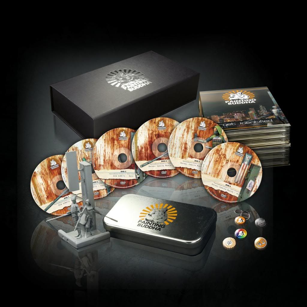
Look at this bit of Wonderland!.
I tell you, I can't wait for this to see the light! Or at least... to finish the subtitles in Spanish! :D

¡Feliz Día del Orgullo Friki!.
Today is May 25! A super intergalactic coincidence of very important anniversaries happens on this date, and if you are a nerd (who I'm pretty sure you are since you happen to be reading these lines), I don't need to remind you that Star Wars was released today more than 35 years ago, or that it's Towel Day for the Hitch-hikers of the galaxy everywhere. Today is known as "Towel Day", or as an even cooler name that we have for it in Spain: "Día del Orgullo Friki" (translated as "Nerd Pride Day").
All of you must be preparing their best galas for the Nerd Pride Parades happening everywhere, or maybe preparing to re-watch Star Wars at home. I am celebrating it doing even more translations for the super DVD set from Painting Buddha, Season 1.1 "Target Identified". While resting from one of my long translating sessions, I'm sharing with you this wonderful teaser trailer for the DVD set, released today (obviously had to be today) by Mr. President Bartels from masterminis.net.
Check out the TEASER TRAILER!.
From Painting Buddha himself:
-
The Budget Box will be a no-thrills box which holds all the essentials you need to become a better painter: 6 full loaded DVDs in a beautiful DVD Collectors Edition and our Hero's Brad & Yanet (without the base) protected by a stylish metal box. And of course it had to be 42€!
But we are nerds, and we wanted more. So we stuffed all kinds of goodies into the deal and realized that - if we sold it for 42€ - we would be in the red. Not that red is a bad color, but hey,... A suporter box at 84€ is twice as hoopy as 42!
You wonder what kind of hoopy gifts we will put in the Budget and the Supporter Box?

Look at this bit of Wonderland!.
I tell you, I can't wait for this to see the light! Or at least... to finish the subtitles in Spanish! :D
Monday, May 20, 2013
Subtitle translation mayhem!
You might remember this.

Join the Revolution, NOW!.
And these three motherfuckers:
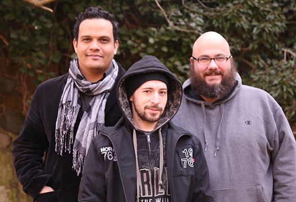
The happy family of Ben, Mati and Michael.
Well there's some DVD goodness Season 1 coming very soon (seriously!). But all great release comes with great responsibility. And I wanted my fellow friends in Spain to be able to enjoy the videos even if their English level is not that great. So because of that, this week I'm immersed in a subtitle translation mayhem because I want to make sure that everything in the DVDs is properly subtitled, not only in English and German, but also in SPANISH!
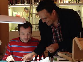
Even Ben Komets will speak in Español too.
So you'll be guessing that with a 6 DVD (!!!!!!) translation task as huge as this one, I won't be doing much of anything else this week...

Join the Revolution, NOW!.
And these three motherfuckers:

The happy family of Ben, Mati and Michael.
Well there's some DVD goodness Season 1 coming very soon (seriously!). But all great release comes with great responsibility. And I wanted my fellow friends in Spain to be able to enjoy the videos even if their English level is not that great. So because of that, this week I'm immersed in a subtitle translation mayhem because I want to make sure that everything in the DVDs is properly subtitled, not only in English and German, but also in SPANISH!

Even Ben Komets will speak in Español too.
So you'll be guessing that with a 6 DVD (!!!!!!) translation task as huge as this one, I won't be doing much of anything else this week...
Tuesday, May 14, 2013
The brushstroke
The old Volomir's Blog is not in use anymore.
You're currently being redirected to volomir.com, it will only take a few moments.
In my opinion, one of the most basic concepts in miniature painting is the proper way to use a paintbrush. The speed and quality of our painting depends on how well we know how to use it. Specially crucial is to control the brushstroke when we choose a style of painting based on layers or gradients, because in these cases the way we lay our brushstroke is the key of the process. Other styles like puntillism or wet painting permit us more freedom when choosing the brushstroke, but we should take into consideration how the use our paintbrush will affect our choice.
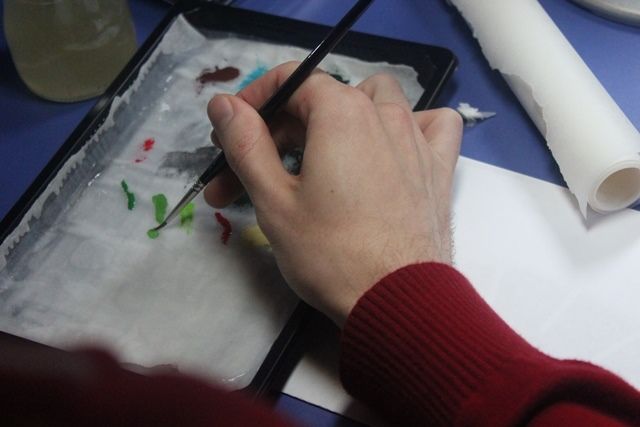
When using a painting style based on layers, the first myth that needs to be broken is that a brush to paint miniatures needs to be small. We are actually going to prefer using a brush with a big head, capable of loading a decent quantity of paint so that we don't have to go back to our palette every time we give a stroke. We will also prefer longer hairs because we are going to paint with the brush horizontally, using the pointed tip of the brush only when strictly necessary. Small brushes with short and little hair, though pointy, do not have enough capacity for paint loading and they will rarely keep paint wet from the palette to the miniature.
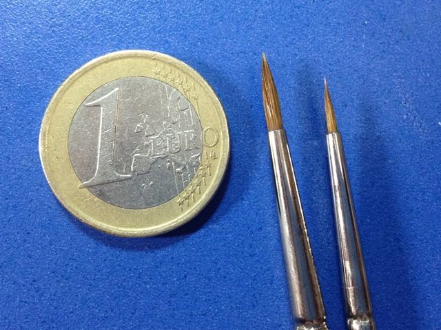
Comparison between a euro coin, an interesting W&N size 1 and a not so interesting W&N size 00.
To apply a paint layer, the brushstroke will be performed describing a plane instead of a line, we don't want to drag the tip of the brush, we do it laterally. With a wider brushstroke, paint will cover and distribute more homogeneously and we will take advantage of the load capacity of a good brush. Also, we will control better the pigment distribution this way.
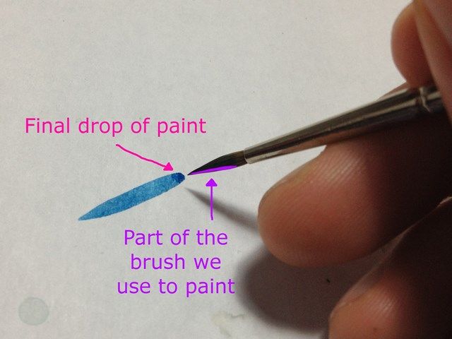
With every brushstroke, we'll notice that at the end of the stroke, just before lifting the brush from the painting surface, we are dropping the biggest quantity of paint. The colour drop will be bigger the more we load the brush. This is a paint drop which could spoil a good job that seemed smooth if we don't control it. However, now that we know about it, we can use for our own benefit. If we are, for example, trying to do some shadows, we will make sure that the direction of the brushstroke is that which leaves that final colour drop in the area of maximum shadow, for the colour we are painting. The same will occur when painting lights.
If what we want to achieve is a homogeneous colour plane, the best thing to do is dilute the paint as much as possible. We need to master brush-stroking to be able to apply semitransparent layers of paint. Brush-stroking in planes or semi-planes is also key in this case. What we will control carefully is the dilution of paint, and the quantity of paint that the brush will load when painting. The more diluted the paint is, the more transparent the layer will be, and as we reduce the quantity of paint in the brush, the more control we will have over the effect and faster the process will be, because the paint will dry faster. If we load the brush too much, we have the risk of soaking instead of painting, and when there's too much water which does not dry fast on the miniature, the dissolved pigment will not be homogeneously distributed, it will disperse and crate paint stains.
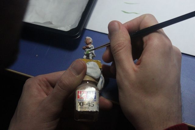
The most important thing to consider is that we need to let each layer of paint dry before applying the next one. This is by far one of the most common and extended errors when starting to paint by layers. With every brushstroke we will deposit wet paint on the surface and if we use the brush again over that same surface before the paint has dried, instead of depositing more paint we will be moving around the paint previously applied.
Whatever our ability with the brush may be, the state and quality of our brush is fundamental, we must never be careless about it because this can be a continuous reason for frustration, or even a limitation to our painting skill.
You're currently being redirected to volomir.com, it will only take a few moments.
In my opinion, one of the most basic concepts in miniature painting is the proper way to use a paintbrush. The speed and quality of our painting depends on how well we know how to use it. Specially crucial is to control the brushstroke when we choose a style of painting based on layers or gradients, because in these cases the way we lay our brushstroke is the key of the process. Other styles like puntillism or wet painting permit us more freedom when choosing the brushstroke, but we should take into consideration how the use our paintbrush will affect our choice.

When using a painting style based on layers, the first myth that needs to be broken is that a brush to paint miniatures needs to be small. We are actually going to prefer using a brush with a big head, capable of loading a decent quantity of paint so that we don't have to go back to our palette every time we give a stroke. We will also prefer longer hairs because we are going to paint with the brush horizontally, using the pointed tip of the brush only when strictly necessary. Small brushes with short and little hair, though pointy, do not have enough capacity for paint loading and they will rarely keep paint wet from the palette to the miniature.

Comparison between a euro coin, an interesting W&N size 1 and a not so interesting W&N size 00.
To apply a paint layer, the brushstroke will be performed describing a plane instead of a line, we don't want to drag the tip of the brush, we do it laterally. With a wider brushstroke, paint will cover and distribute more homogeneously and we will take advantage of the load capacity of a good brush. Also, we will control better the pigment distribution this way.

With every brushstroke, we'll notice that at the end of the stroke, just before lifting the brush from the painting surface, we are dropping the biggest quantity of paint. The colour drop will be bigger the more we load the brush. This is a paint drop which could spoil a good job that seemed smooth if we don't control it. However, now that we know about it, we can use for our own benefit. If we are, for example, trying to do some shadows, we will make sure that the direction of the brushstroke is that which leaves that final colour drop in the area of maximum shadow, for the colour we are painting. The same will occur when painting lights.
If what we want to achieve is a homogeneous colour plane, the best thing to do is dilute the paint as much as possible. We need to master brush-stroking to be able to apply semitransparent layers of paint. Brush-stroking in planes or semi-planes is also key in this case. What we will control carefully is the dilution of paint, and the quantity of paint that the brush will load when painting. The more diluted the paint is, the more transparent the layer will be, and as we reduce the quantity of paint in the brush, the more control we will have over the effect and faster the process will be, because the paint will dry faster. If we load the brush too much, we have the risk of soaking instead of painting, and when there's too much water which does not dry fast on the miniature, the dissolved pigment will not be homogeneously distributed, it will disperse and crate paint stains.

The most important thing to consider is that we need to let each layer of paint dry before applying the next one. This is by far one of the most common and extended errors when starting to paint by layers. With every brushstroke we will deposit wet paint on the surface and if we use the brush again over that same surface before the paint has dried, instead of depositing more paint we will be moving around the paint previously applied.
Whatever our ability with the brush may be, the state and quality of our brush is fundamental, we must never be careless about it because this can be a continuous reason for frustration, or even a limitation to our painting skill.
Monday, May 13, 2013
Get a miniature painted by Ben Komets for free!
You certainly can't win a miniature from an artist like Ben Komets everyday.
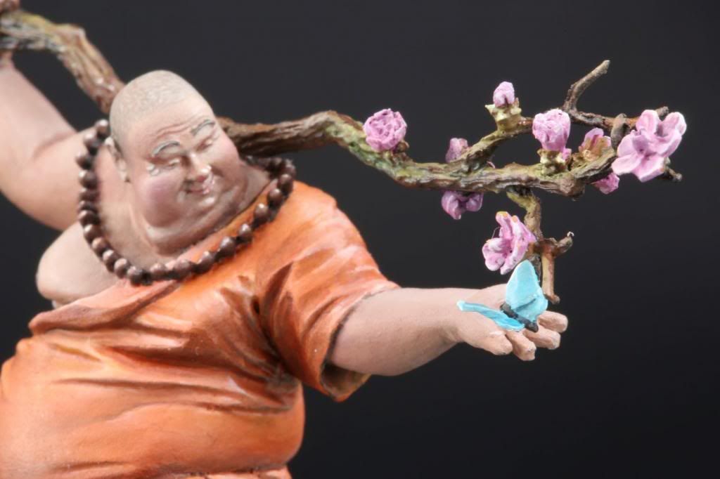
Well, our friends from masterminis.net are giving away FOR FREE a miniature painted by no other than Ben Komets himself, as well as other super cool stuff. Check it out now!

Liebe für alle! <3
Well, our friends from masterminis.net are giving away FOR FREE a miniature painted by no other than Ben Komets himself, as well as other super cool stuff. Check it out now!


Liebe für alle! <3
Monday, May 6, 2013
WIP: Swordmasters of Hoeth Part 9
Previously on... WIP: Swordmasters of Hoeth
I've decided that for the back part of the banner I will be using a simple yet effective elvish filigree design.
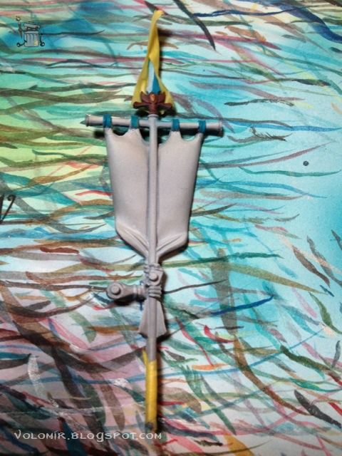
I just searched the web for cool elvish designs and then edited the motif to my intentions in the computer. Voilà!
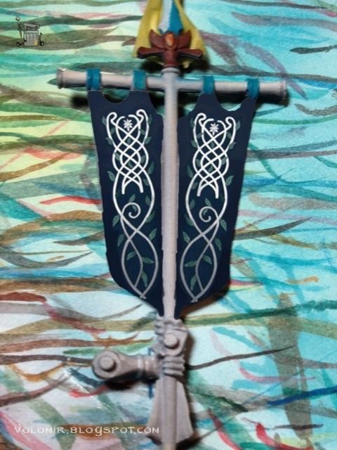
So this is what I want to achieve. But first, I shall secure the other side of the banner. We don't have to compromise the work we have already finished!
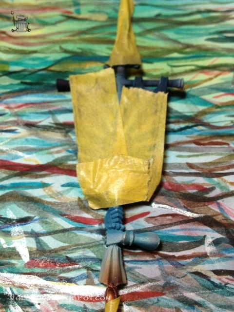
Basecoating the banner with Dark Sea Blue, airbrushed.
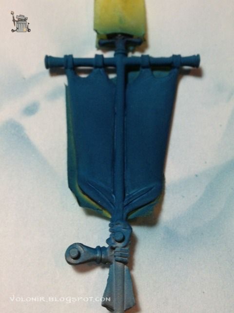
The colour is very light because the priming of the banner was white. So I will work to shadows. Dark Sea Blue adding black, airbrushed.
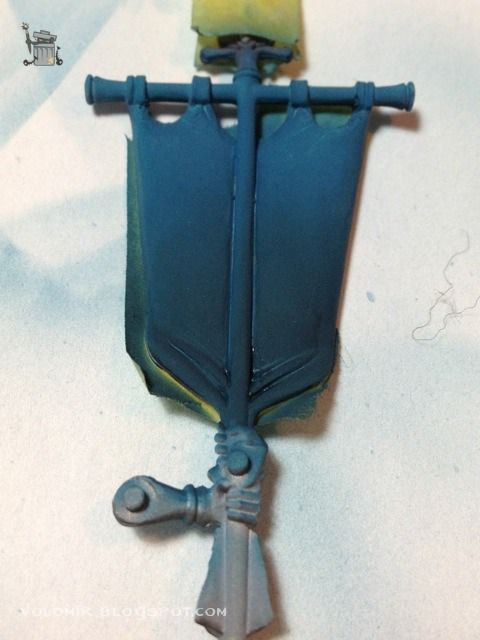
For the final gradient I'm going to add some blue and green inks to the mix.
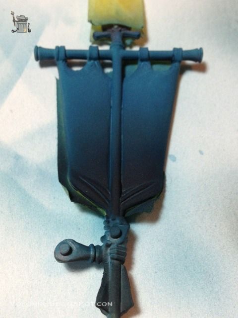
With the blue background I can start painting the filigrees. Very lightly at first; I just have a soft guide, something to let me get the proportions and be erased easily if necessary.
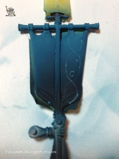
From that guide I start drawing more definite shapes. Notice how some of the lines do not correspond to the first guides. I am correcting the proportions as I advance.
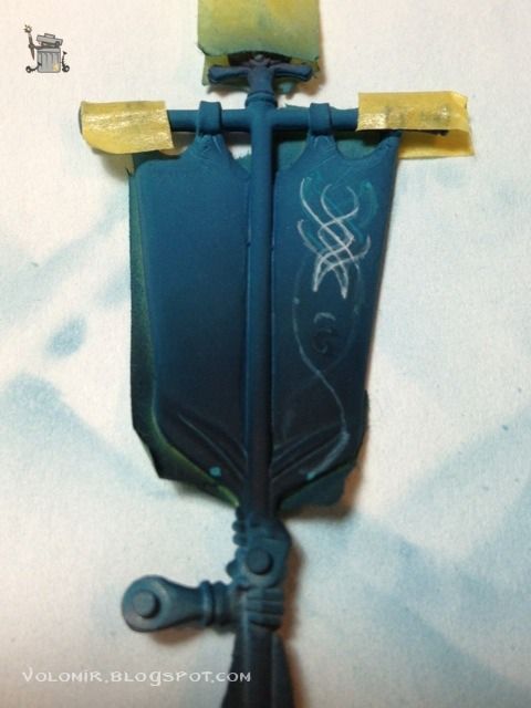
As I progress with the new lines, I erase the underneath guides that were incorrect, just by using glases of the background colour on top.
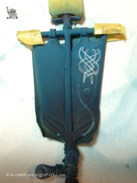
The lines become more definite as the whole design becomes clearer.
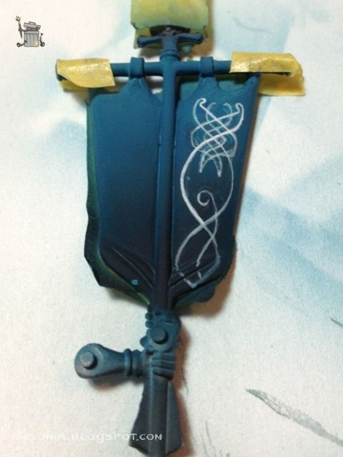
So when I am happy with the line, I insist and insist over it untile the line becomes strong enough. It is always better to do it in one quick and clean stroke, but that is reserved only to the most dexterous painters.
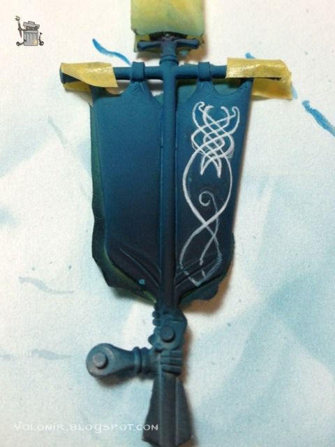
Finally, I correct all the blurryness by cleaning the lines using the background colour. It could be a tricky task because of the gradient in the background.
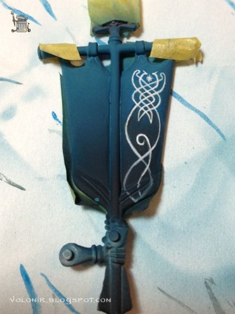
Painting the other filigree should be easier, as I have the experience of the previous one and the proportions are clearer.
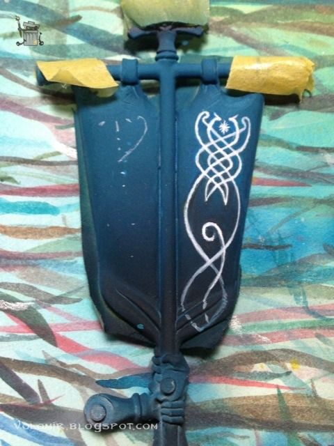
The process is exactly the same.
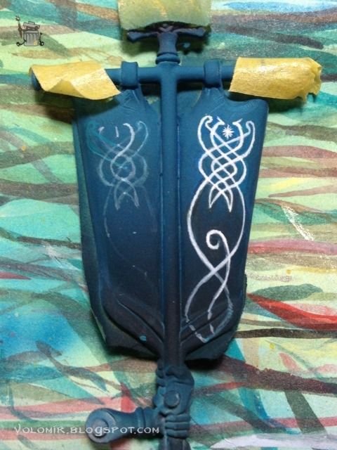
The trick is to user lighter lines as guides which will turn into thicker lines as the whole design progresses..
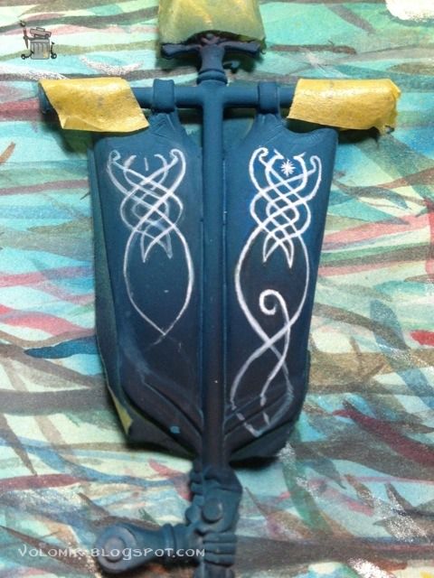
And when you are happy with the proportions, make them thick and final...
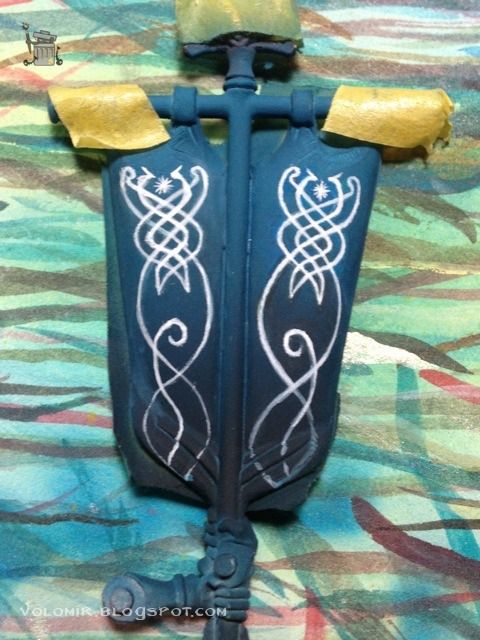
Clean the lines by using background colours...
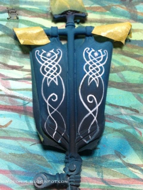
And clean some more.
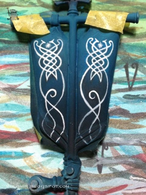
Stay tuned for a final roundup!
I've decided that for the back part of the banner I will be using a simple yet effective elvish filigree design.

I just searched the web for cool elvish designs and then edited the motif to my intentions in the computer. Voilà!

So this is what I want to achieve. But first, I shall secure the other side of the banner. We don't have to compromise the work we have already finished!

Basecoating the banner with Dark Sea Blue, airbrushed.

The colour is very light because the priming of the banner was white. So I will work to shadows. Dark Sea Blue adding black, airbrushed.

For the final gradient I'm going to add some blue and green inks to the mix.

With the blue background I can start painting the filigrees. Very lightly at first; I just have a soft guide, something to let me get the proportions and be erased easily if necessary.

From that guide I start drawing more definite shapes. Notice how some of the lines do not correspond to the first guides. I am correcting the proportions as I advance.

As I progress with the new lines, I erase the underneath guides that were incorrect, just by using glases of the background colour on top.

The lines become more definite as the whole design becomes clearer.

So when I am happy with the line, I insist and insist over it untile the line becomes strong enough. It is always better to do it in one quick and clean stroke, but that is reserved only to the most dexterous painters.

Finally, I correct all the blurryness by cleaning the lines using the background colour. It could be a tricky task because of the gradient in the background.

Painting the other filigree should be easier, as I have the experience of the previous one and the proportions are clearer.

The process is exactly the same.

The trick is to user lighter lines as guides which will turn into thicker lines as the whole design progresses..

And when you are happy with the proportions, make them thick and final...

Clean the lines by using background colours...

And clean some more.

Stay tuned for a final roundup!
Subscribe to:
Comments (Atom)
