I've decided that for the back part of the banner I will be using a simple yet effective elvish filigree design.
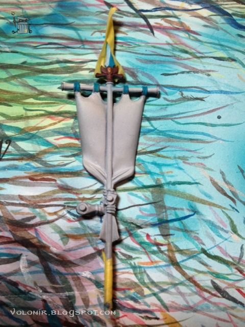
I just searched the web for cool elvish designs and then edited the motif to my intentions in the computer. Voilà!
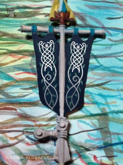
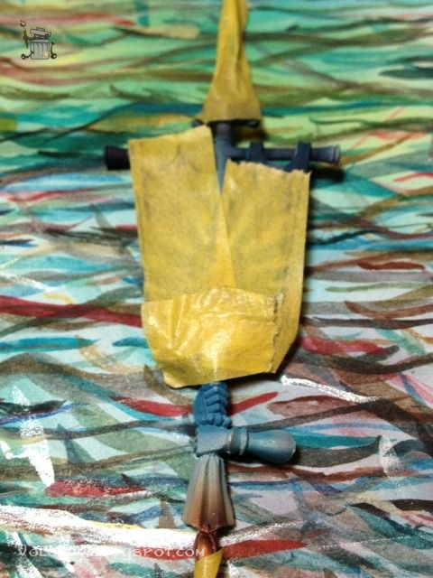
So this is what I want to achieve. But first, I shall secure the other side of the banner. We don't have to compromise the work we have already finished!
Basecoating the banner with Dark Sea Blue, airbrushed.
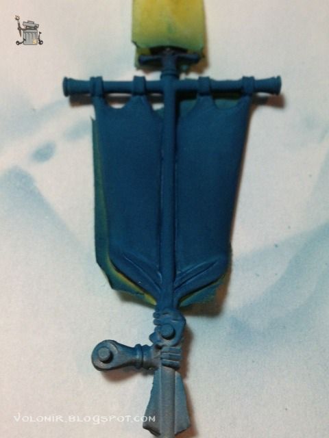
The colour is very light because the priming of the banner was white. So I will work to shadows. Dark Sea Blue adding black, airbrushed.
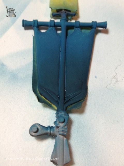
For the final gradient I'm going to add some blue and green inks to the mix.
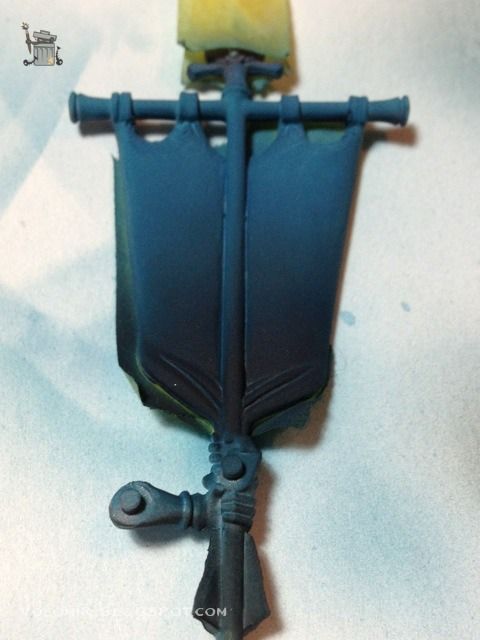
With the blue background I can start painting the filigrees. Very lightly at first; I just have a soft guide, something to let me get the proportions and be erased easily if necessary.
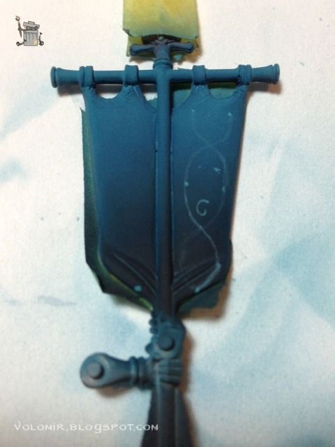
From that guide I start drawing more definite shapes. Notice how some of the lines do not correspond to the first guides. I am correcting the proportions as I advance.
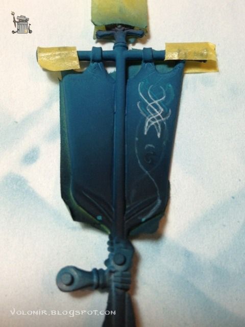
As I progress with the new lines, I erase the underneath guides that were incorrect, just by using glases of the background colour on top.
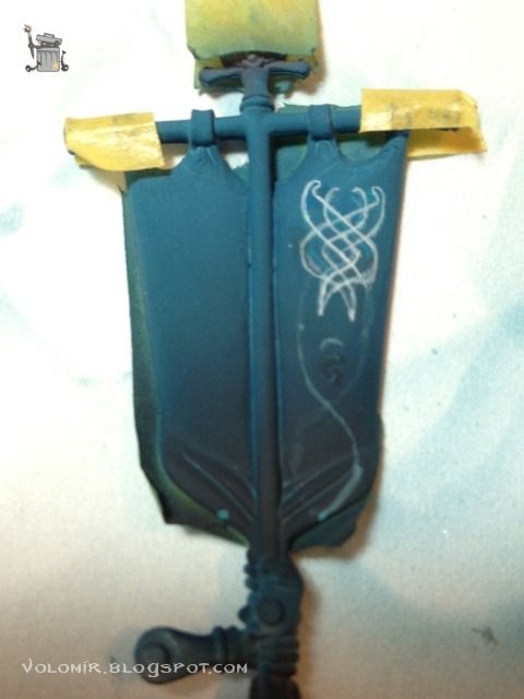
The lines become more definite as the whole design becomes clearer.
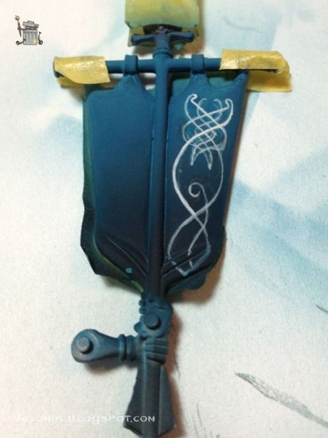
So when I am happy with the line, I insist and insist over it untile the line becomes strong enough. It is always better to do it in one quick and clean stroke, but that is reserved only to the most dexterous painters.
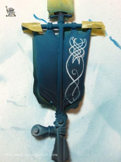
Finally, I correct all the blurryness by cleaning the lines using the background colour. It could be a tricky task because of the gradient in the background.
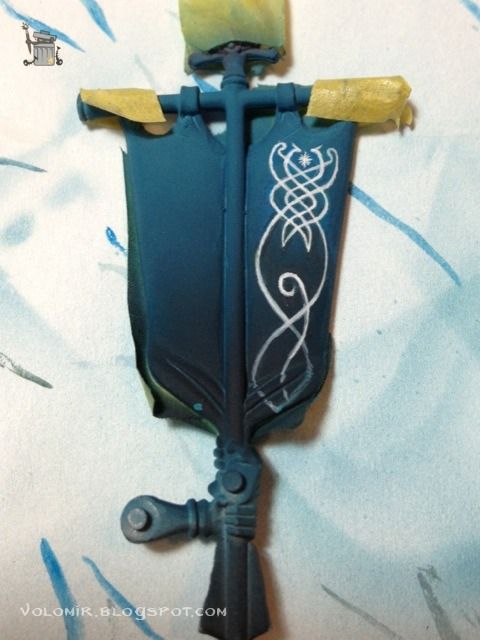
Painting the other filigree should be easier, as I have the experience of the previous one and the proportions are clearer.
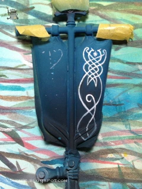
The process is exactly the same.
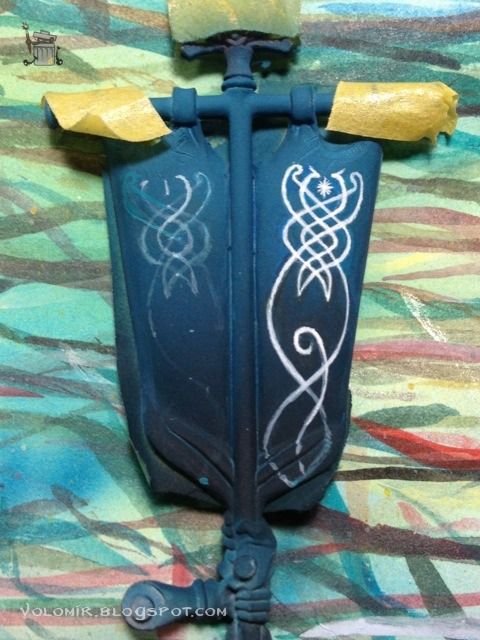
The trick is to user lighter lines as guides which will turn into thicker lines as the whole design progresses..
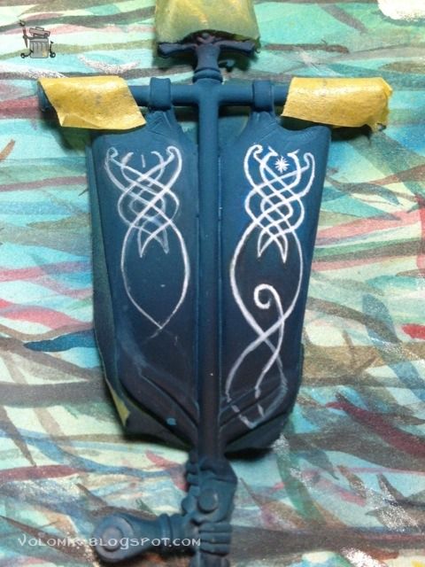
And when you are happy with the proportions, make them thick and final...
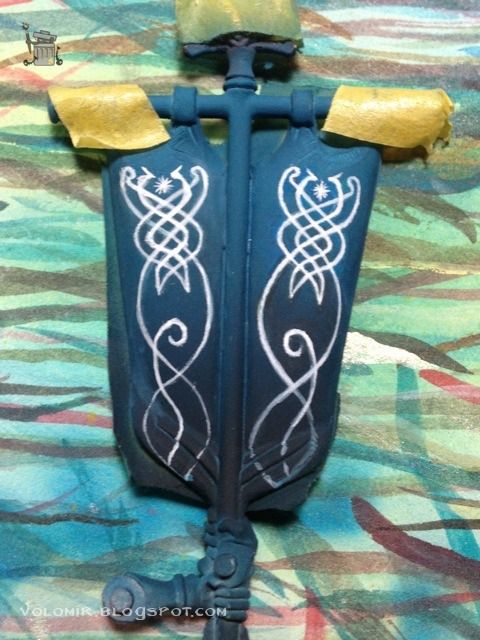
Clean the lines by using background colours...
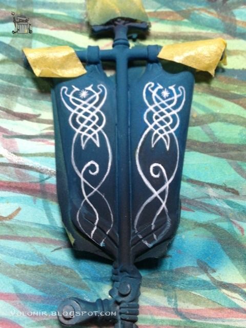
And clean some more.
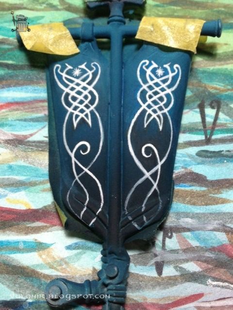
Stay tuned for a final roundup!

1 comment:
Lovely work.
Post a Comment