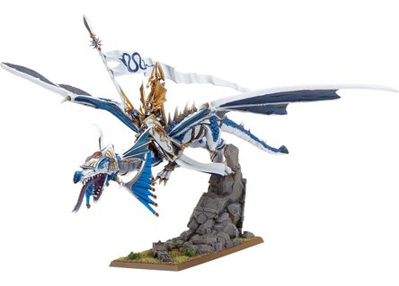
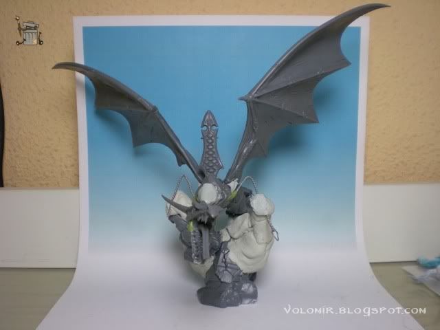
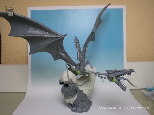
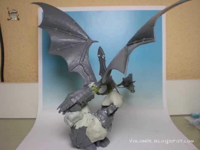
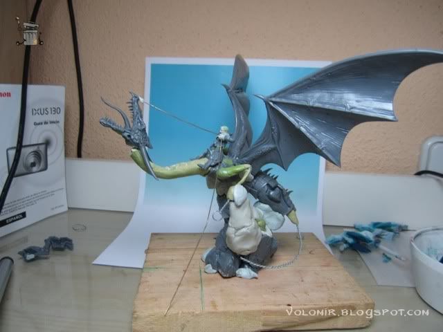
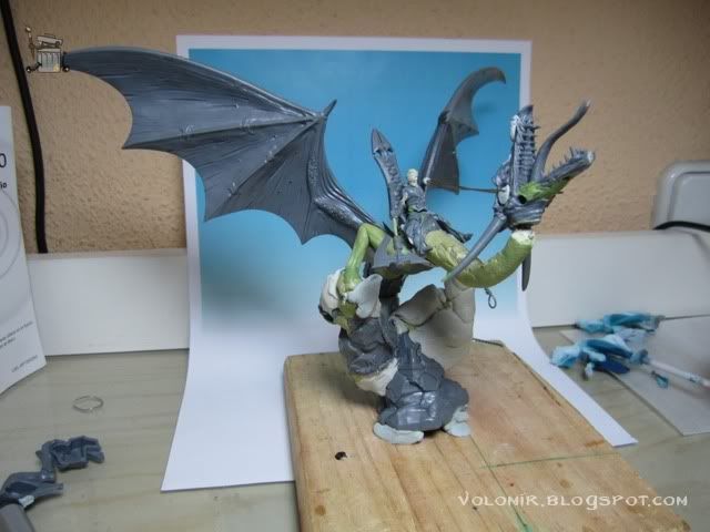
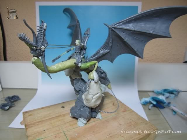
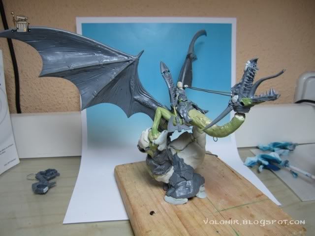
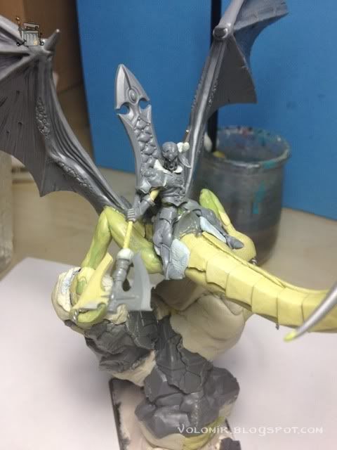
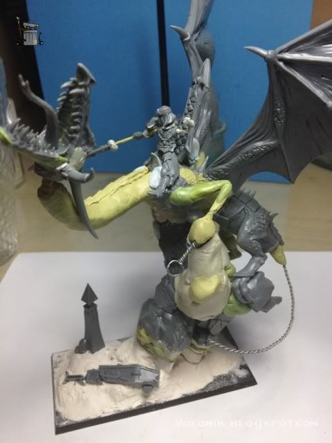
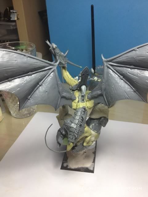
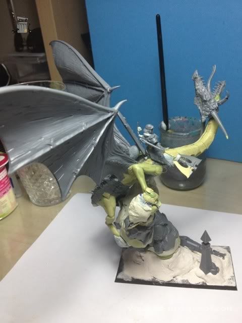
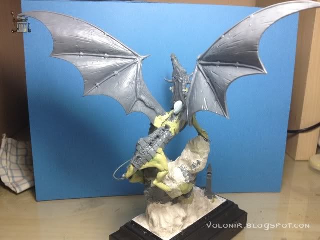
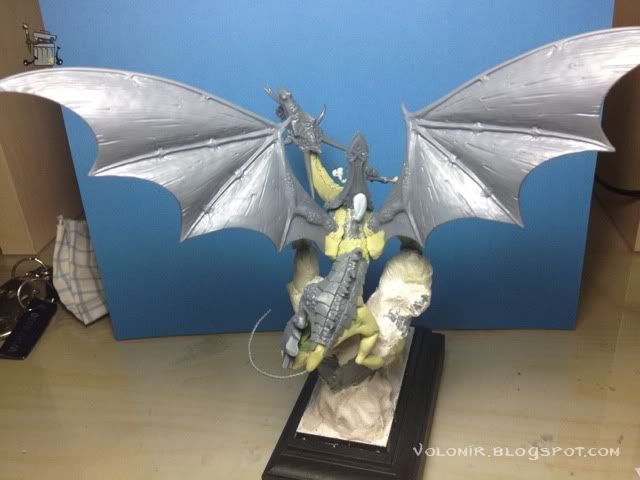
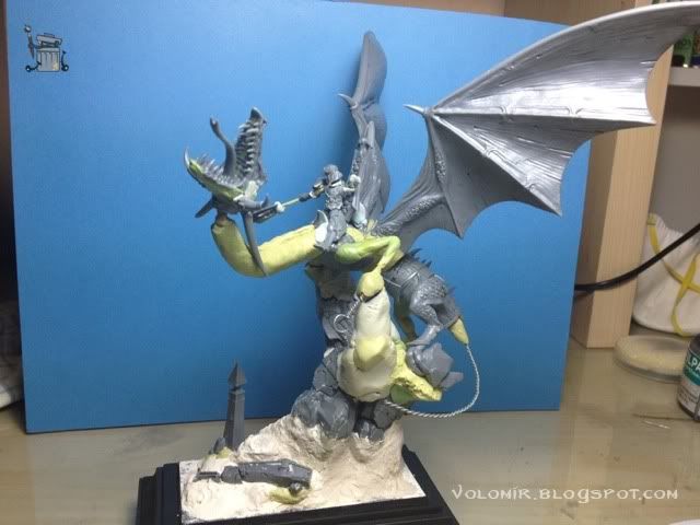
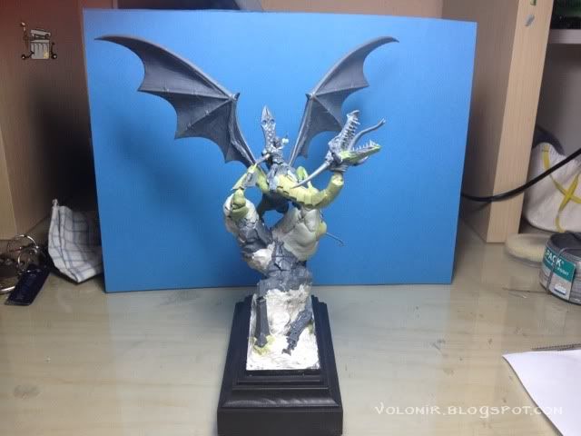
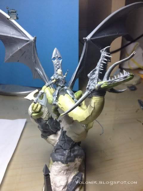
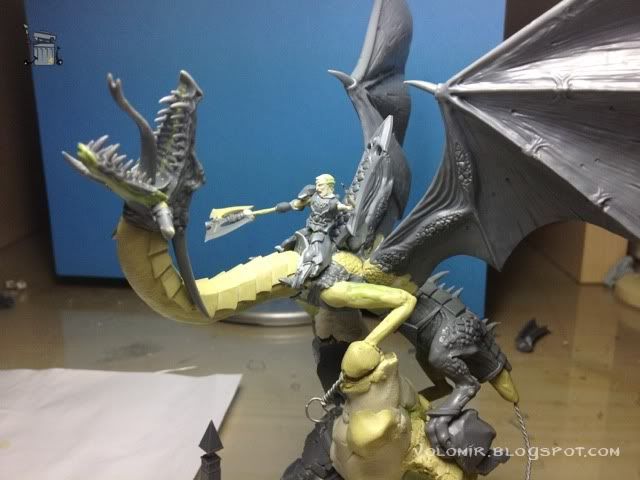
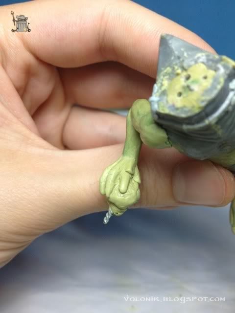
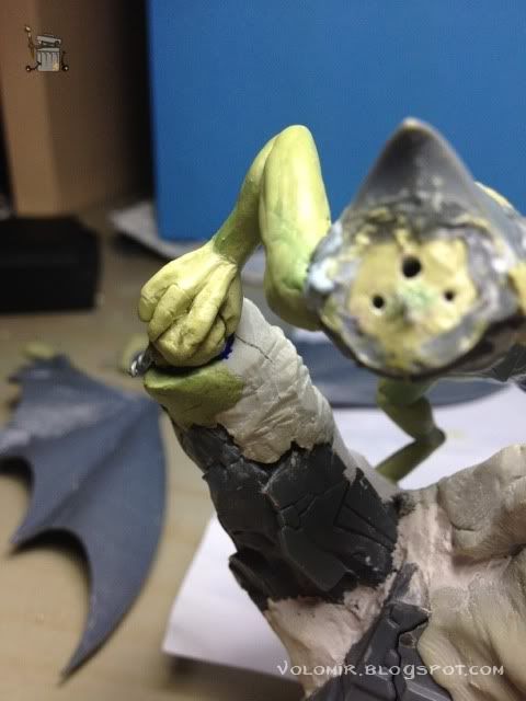
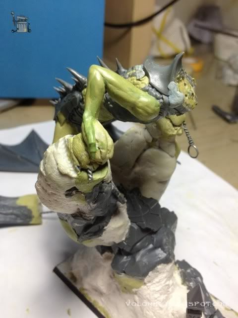
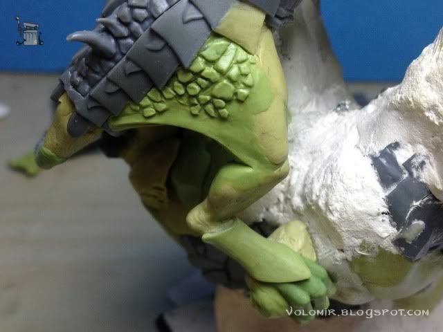
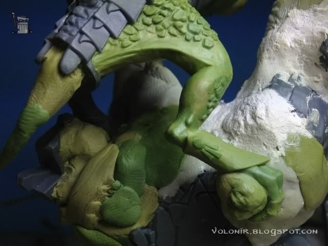
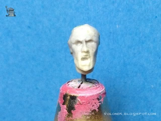
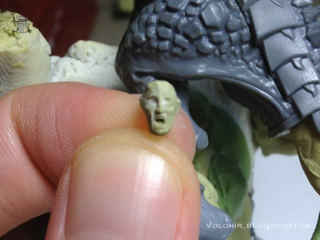
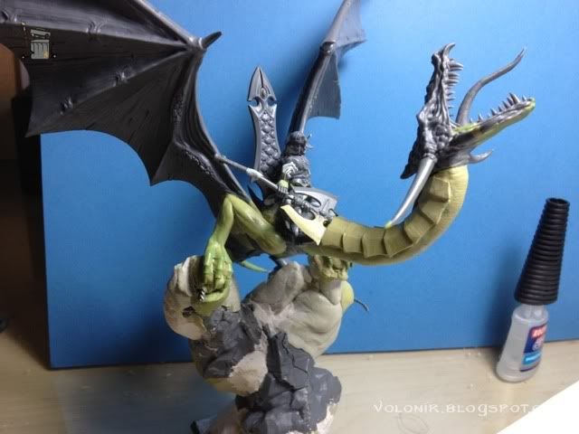
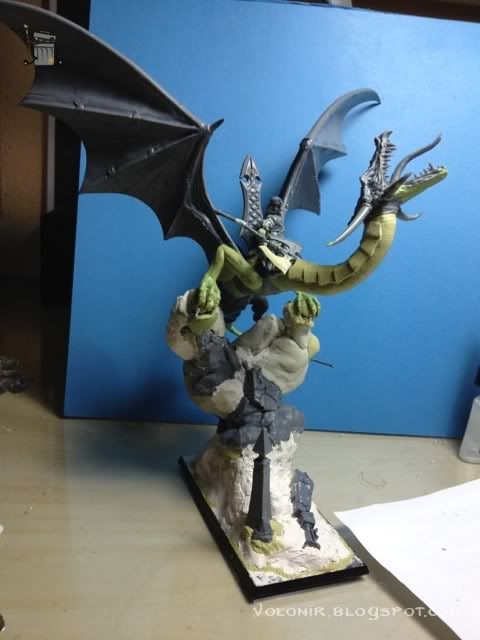
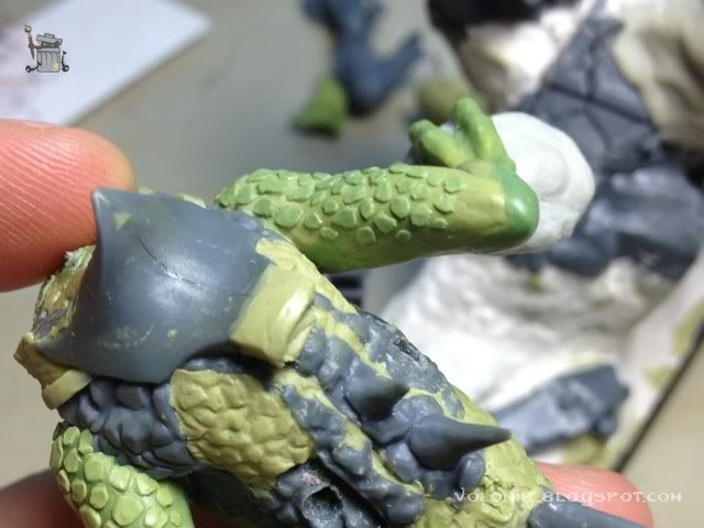
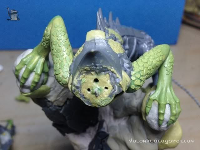
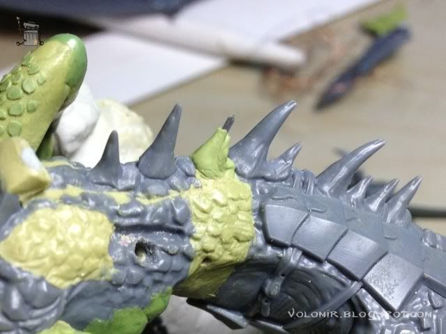
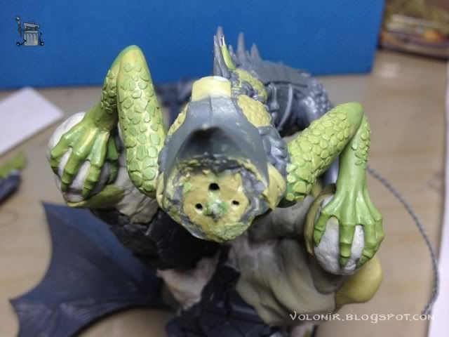
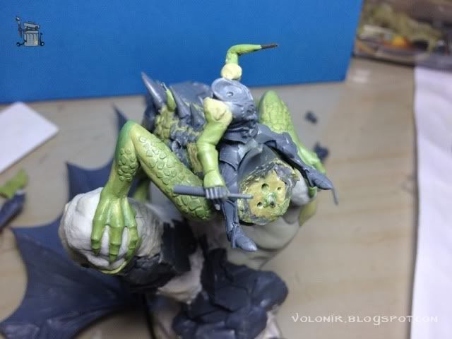
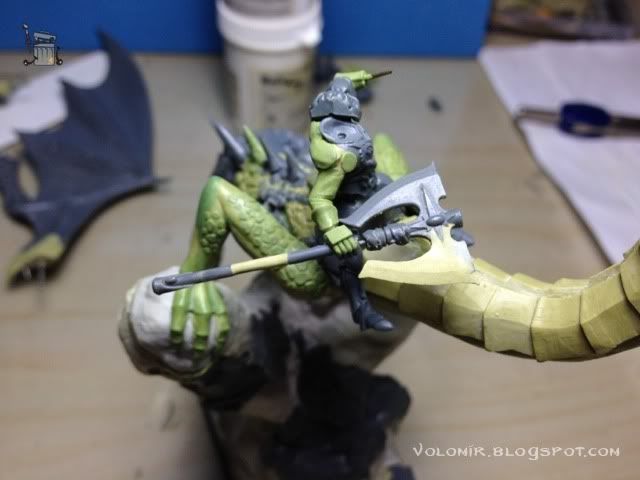
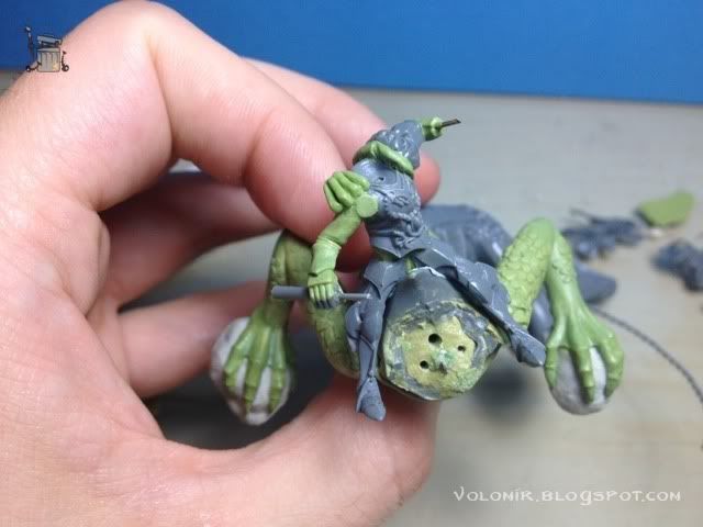
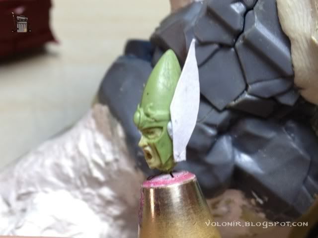
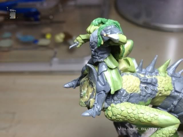
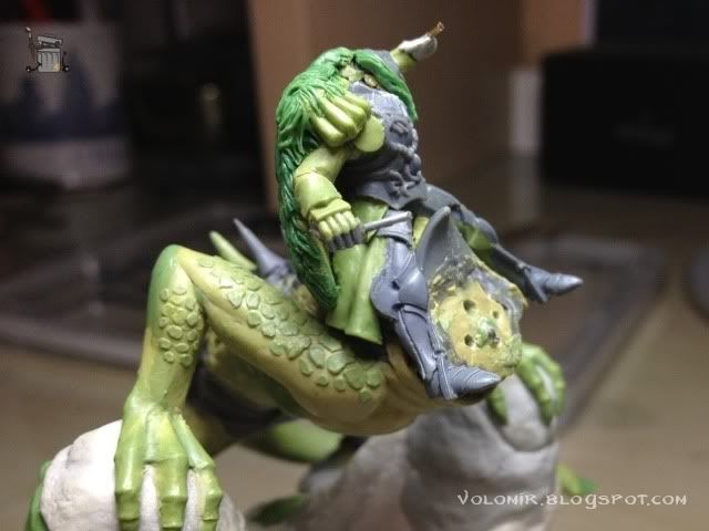
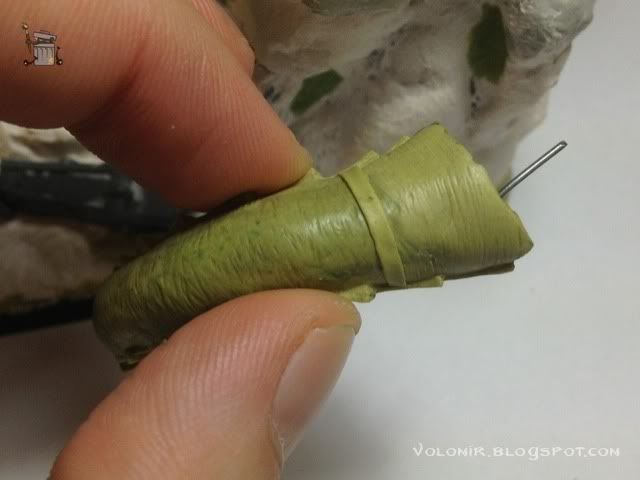
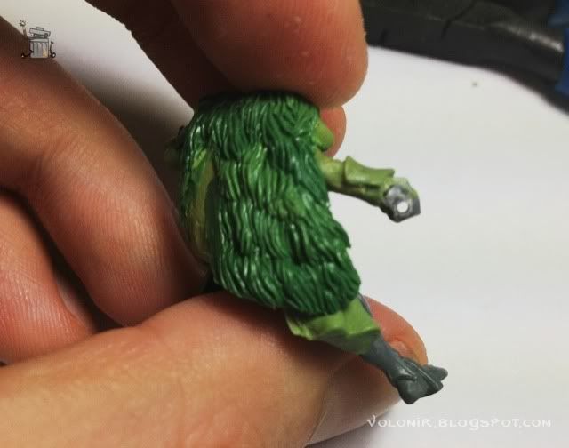
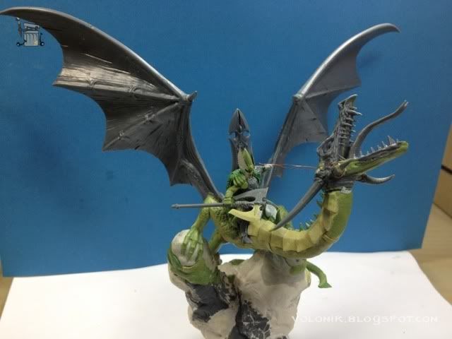
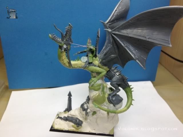
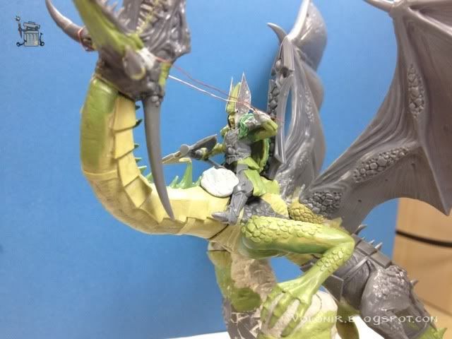
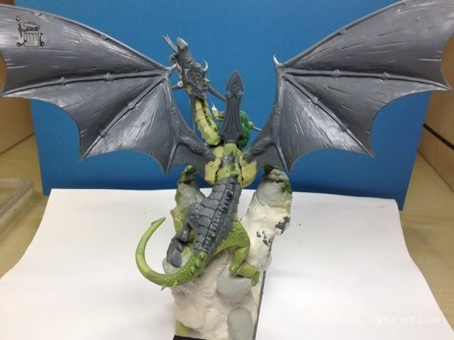
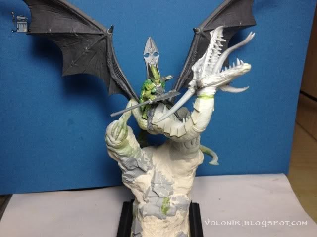
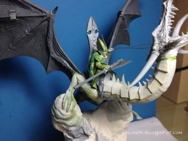
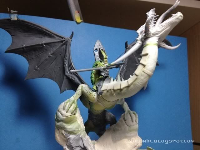
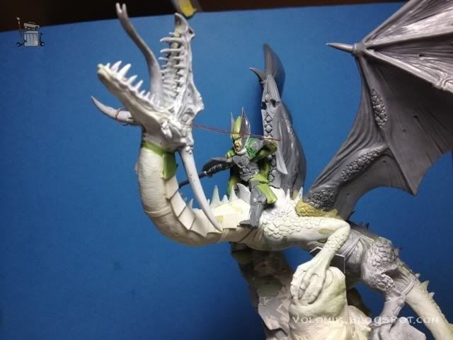
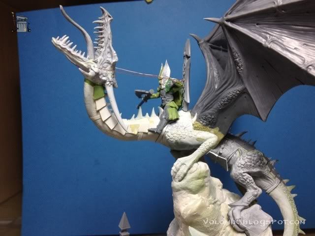
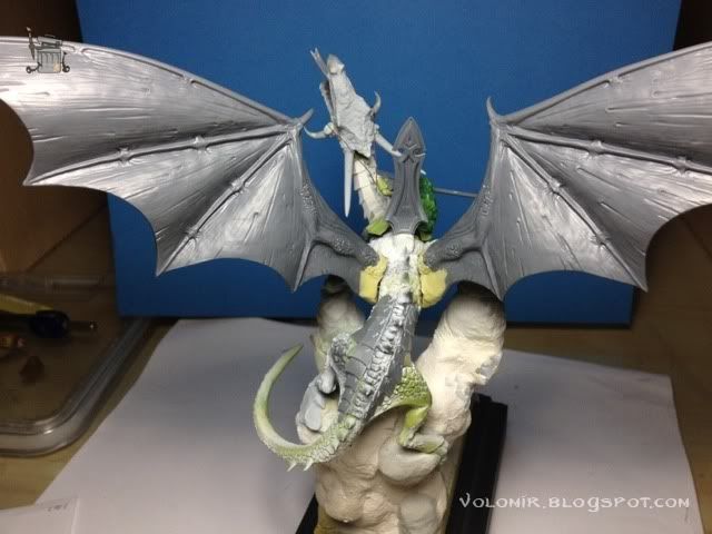
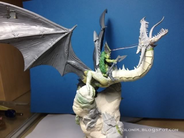
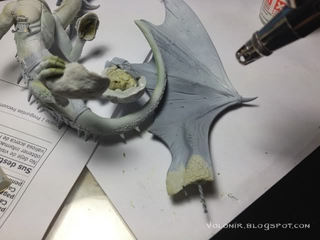
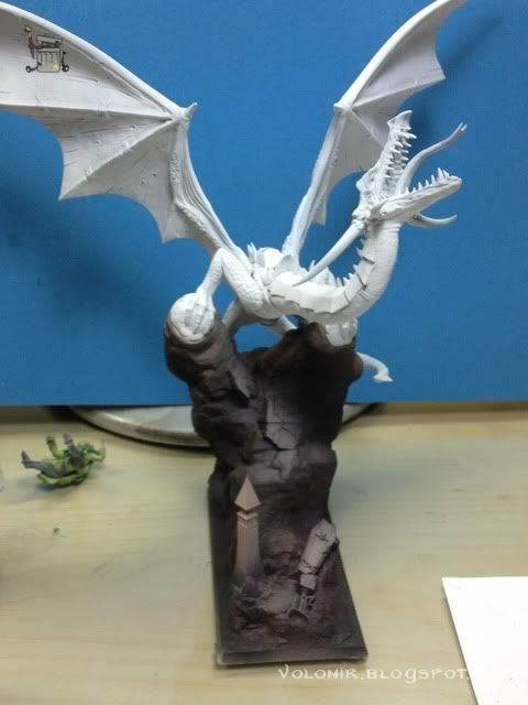
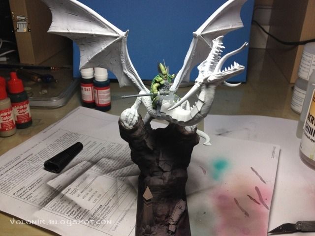
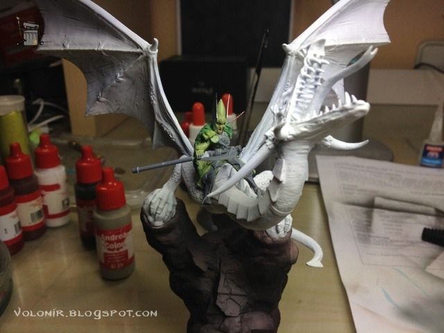
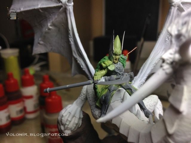
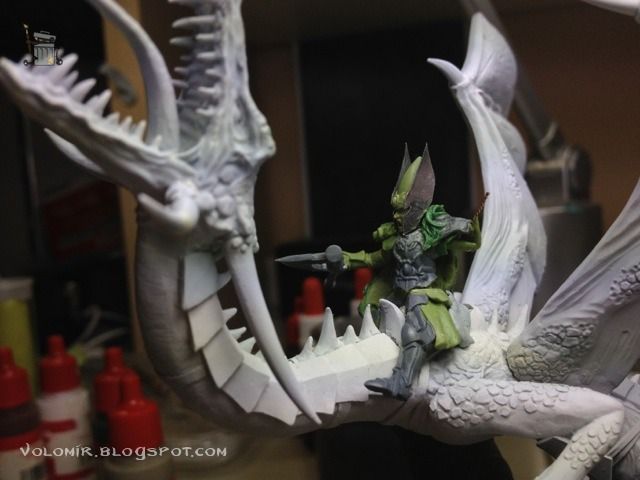
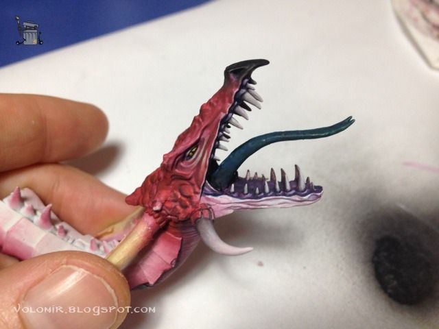
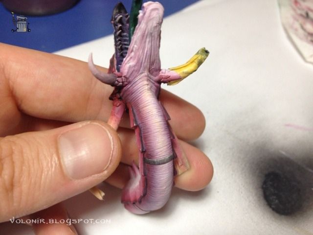
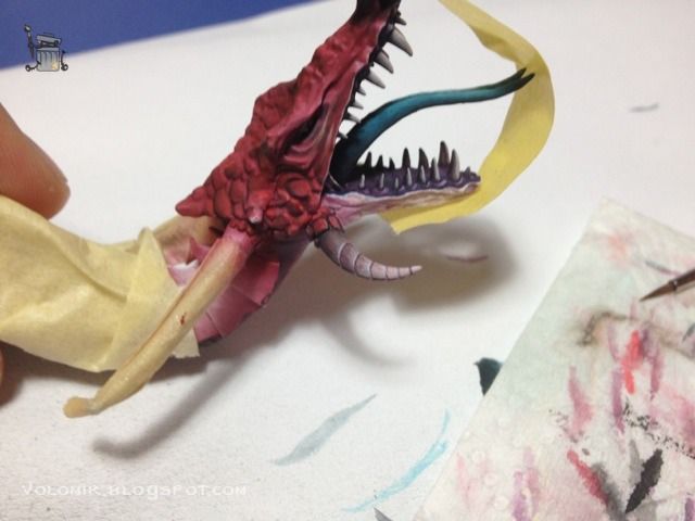
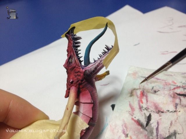
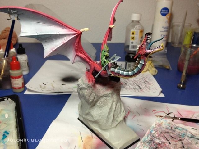
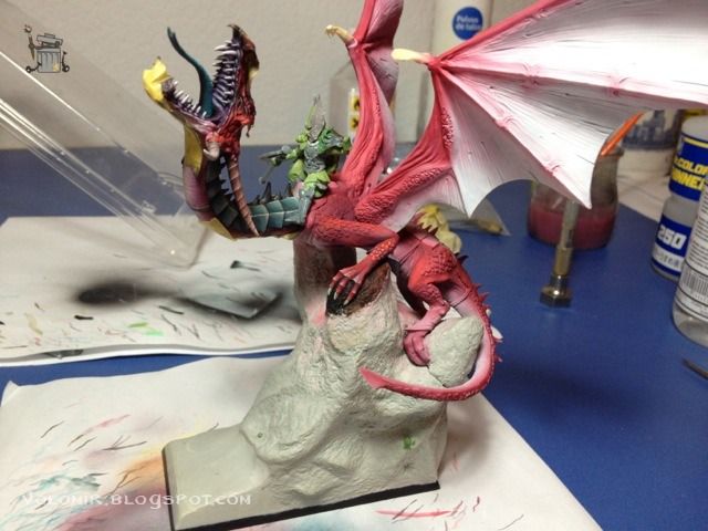
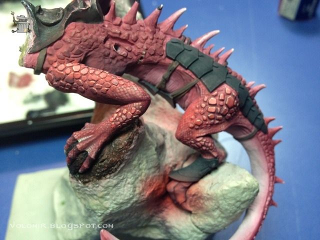
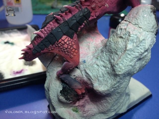
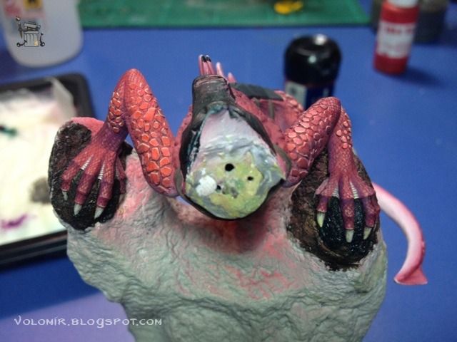
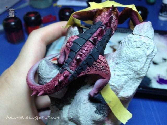
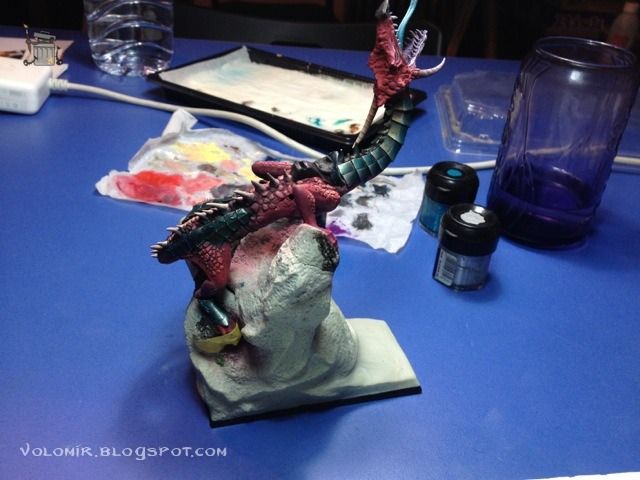
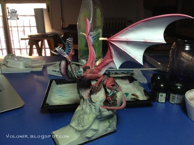
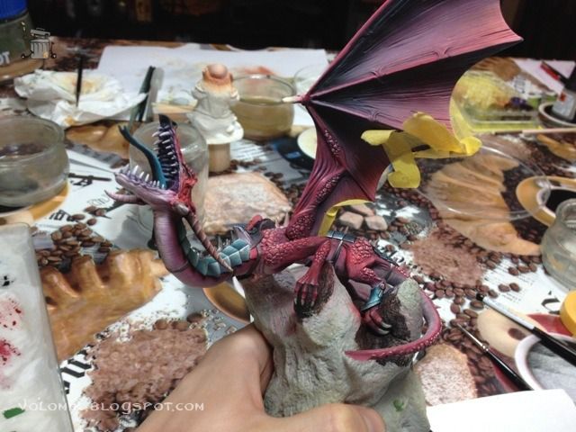
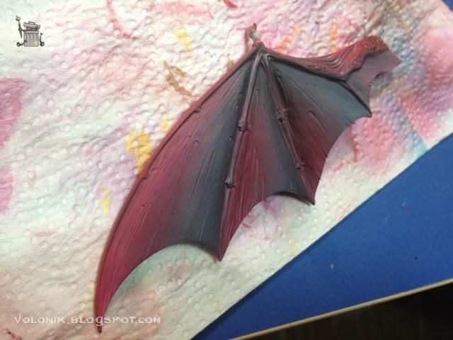
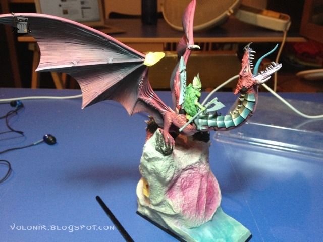
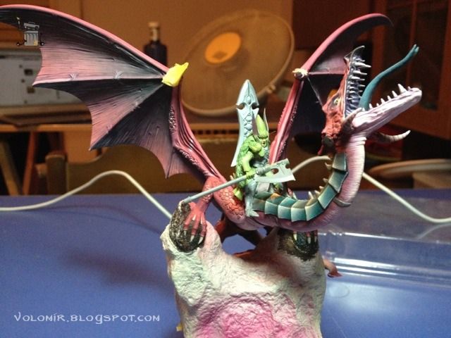
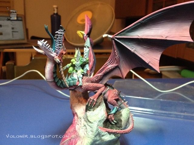
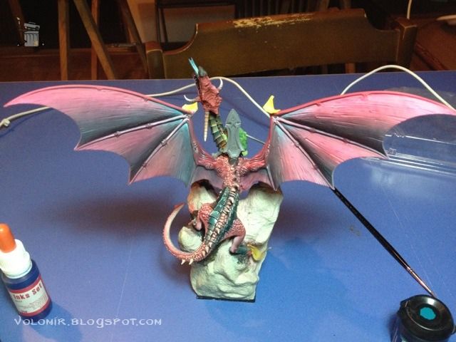
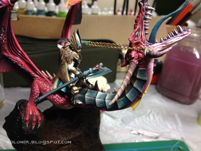
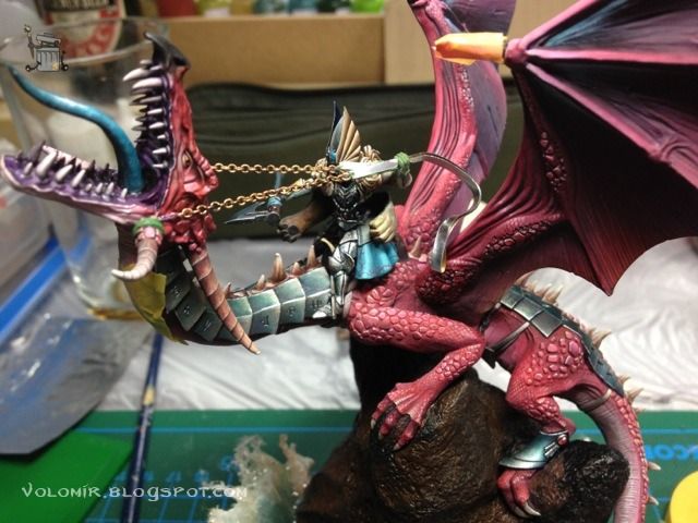
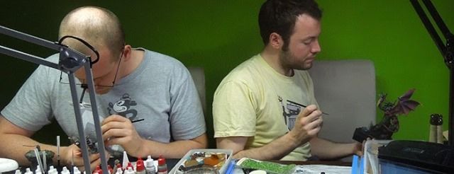
This is the final compilation of all the steps of the process which I shared with you on creating this High Elf Dragonlord. More than 300 photos with detailed explanations about how I did everything. Sit down, get comfortable and relax because this is going to be very long! Enjoy it!
I started with the idea of building the High Elf Dragonlord in December 2010. At the time, I was painting the High Elves Sea Guard, so I was in the middle of one of my deepest motivation spikes for my High Elves army. Remember my High Elf Army project? Check it out so far:
Before we start let me say something... I LOVE DRAGONS. I've always loved those creatures. They are simply AWESOME. But Games Workshop as of 2010 had never released any dragon kit that deserved any pride on their part. Since the dragons of the old Fantasy editions, terribly awful, one after another they just released clones of the same horrible miniature. However, a few years ago, GW decided to release a new plastic dragon kit which could have been a new beginning on their relationship with the creature. It was a good kit, I can't say the contrary, but it had the same flaws which you can find in 90% of Games Workshop miniatures. If you assemble it right out of the box you get a nice miniature, not very fancy, but OK for gaming purposes. And this is not enough. So here's me trying to get something interesting out of this kit.

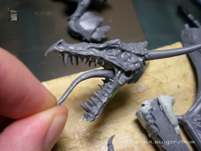
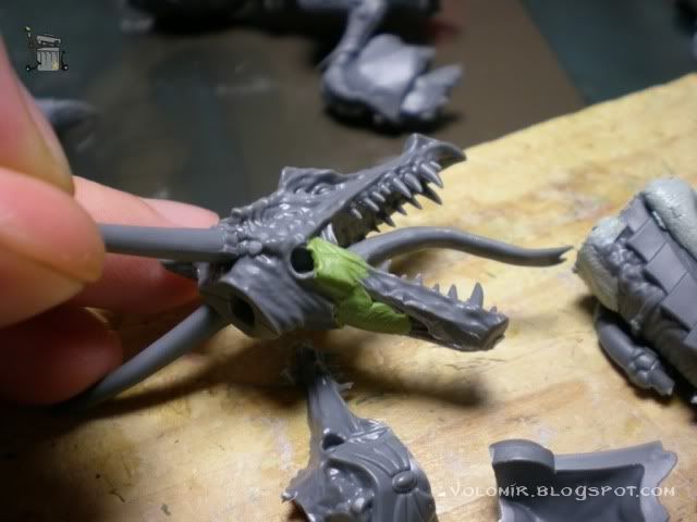
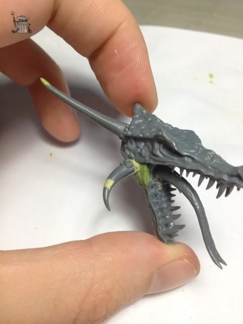
The first thing I realised when I saw the plastic dragon, was that the jaw made no sense. The lower jaw was considerably smaller than the upper one. This gives the dragon a weird look, and one of the most important parts of a dragon is the head, it can give the creature all the awesomeness just by itself. Even so, the head in this kit really has a lot of potential and doesn't need too much work. Fortunately, the GW kit comes with two heads, with and withour armour. So I took the lower jaw of the armoured one, and the head of the other one.


Now it does look awesome enough!
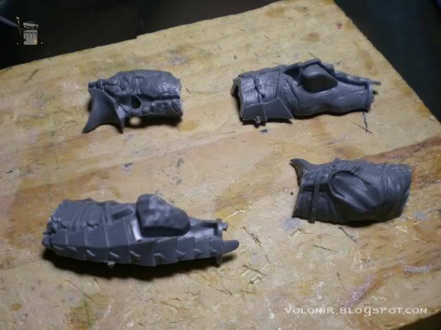
Now that I have a cool head to start with, let's see what we can get out of the body. The whole torso comes in two pieces, but this only enables the rigid pose that the boxart shows. I'll cut so I can develop poses a little more.

The same happens with the neck. It is very rigid and straight, really boring stuff. There's nothing really to get out of it, so I'll just use wire and once I'm happy with the pose, I'll model it from scratch. Shouldn't be too difficult!

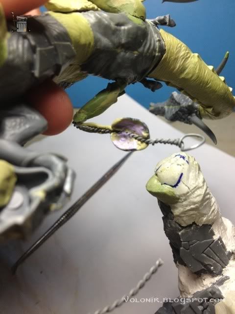
Wires give you a lot of field to work with. The arms are also really horrible. I'll make larger arms with wire, and attach them to the torso which has also wire to be able to twist the lizard.

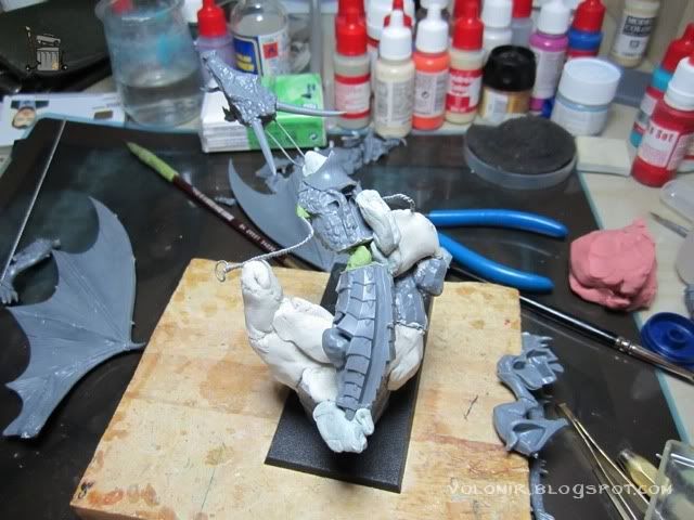
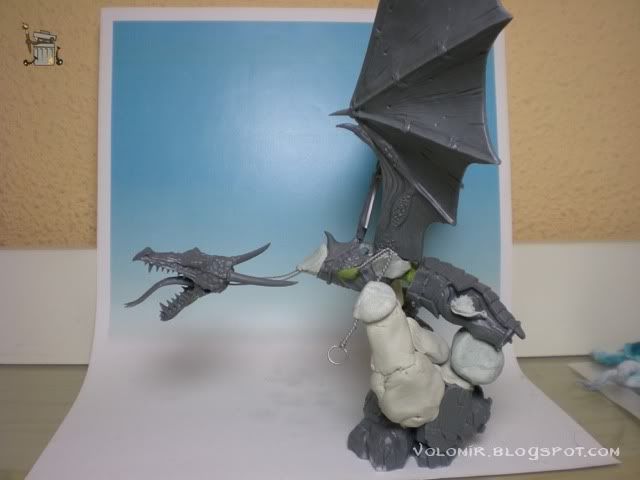
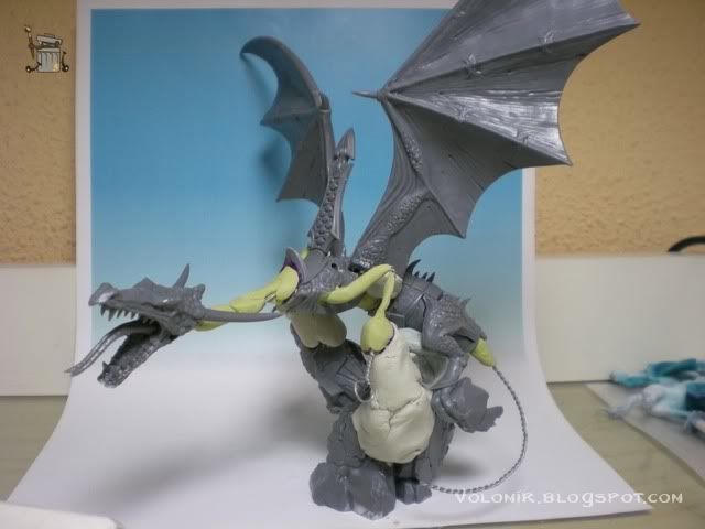
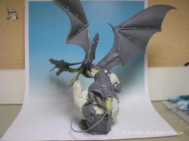
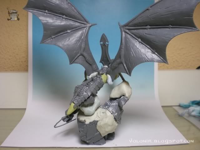
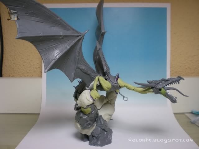
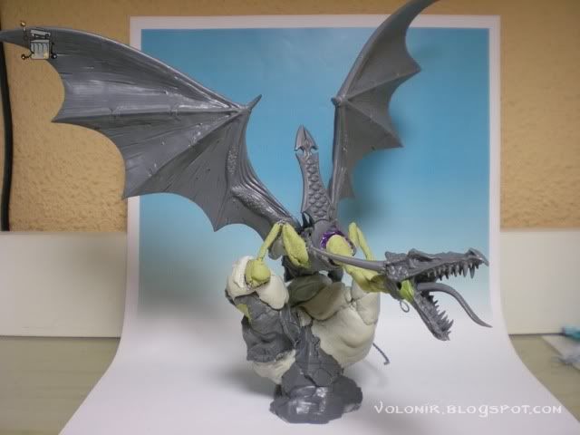
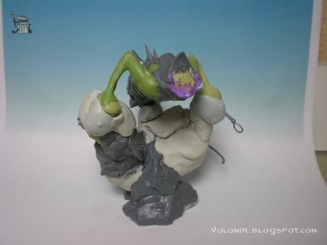
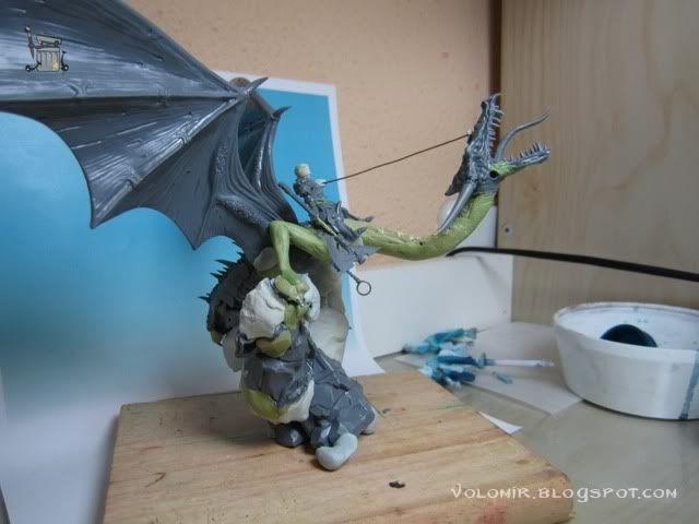
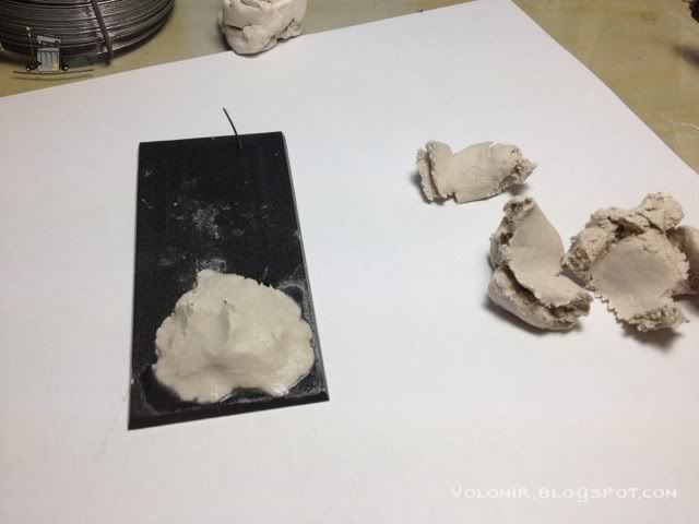
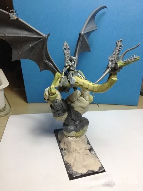
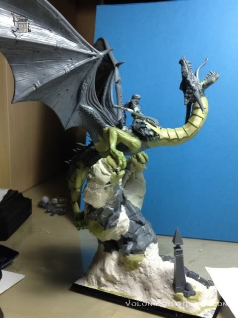
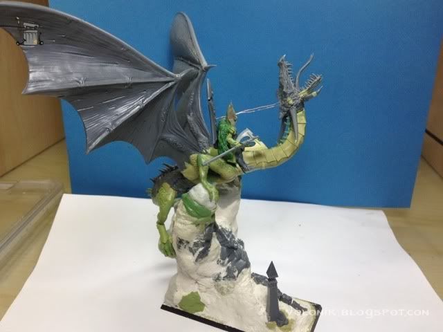
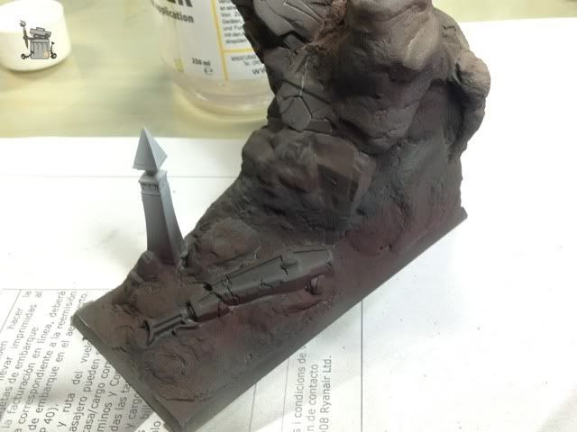
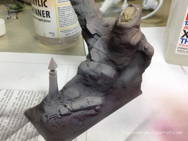
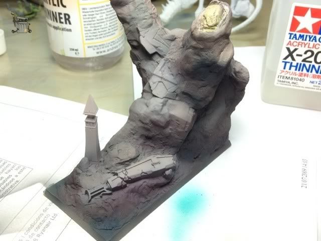
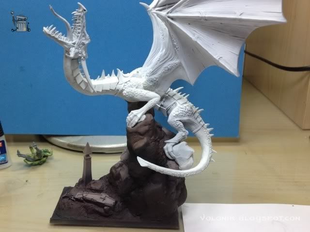
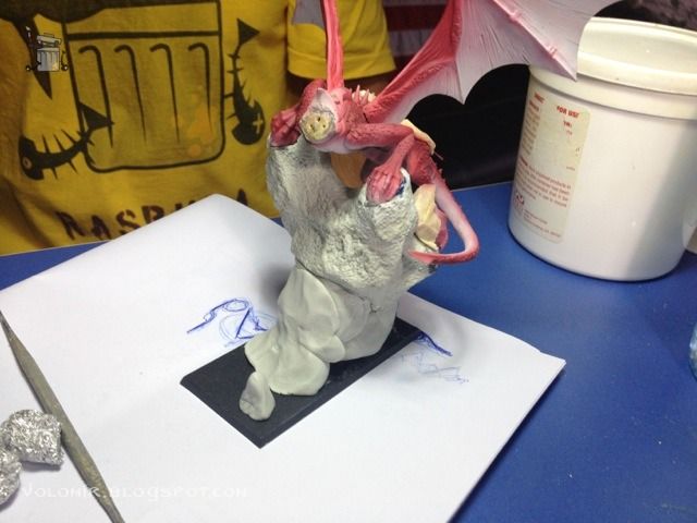
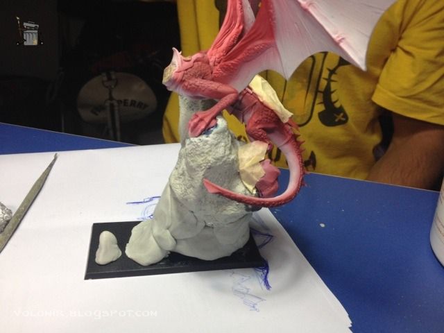
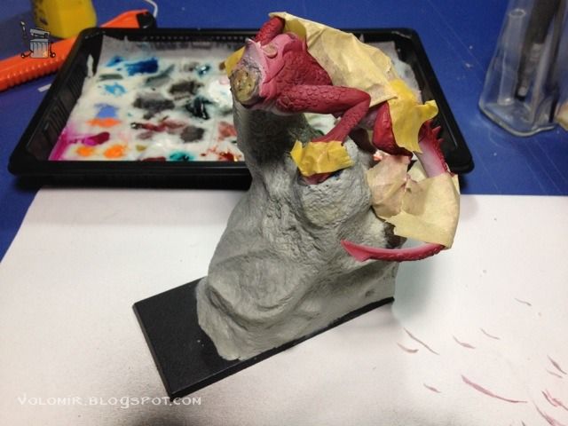
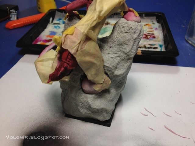
I thought it would be cool if the dragon was climbing a rock instead of flying, and once it reached the top, the head moved forward in an intimidating and epic pose. So let's go with that for now. I built a simple rock where the dragon would lean on out of the actual base in the kit and some spare Magic Sculpt putty I had at home which was about to go bad soon.


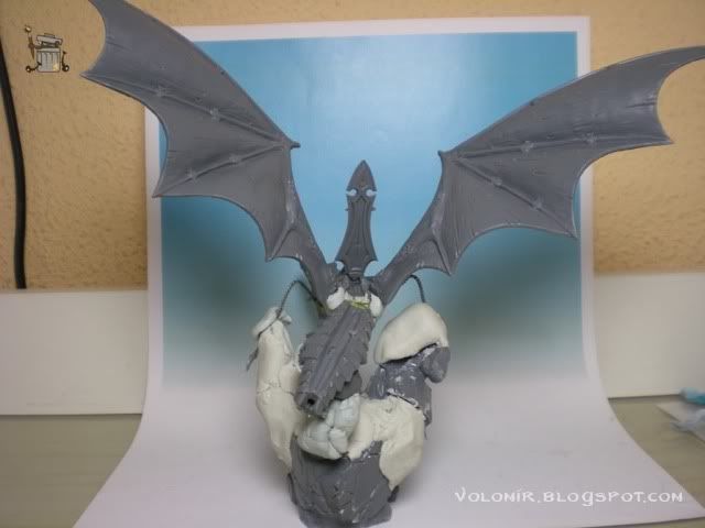
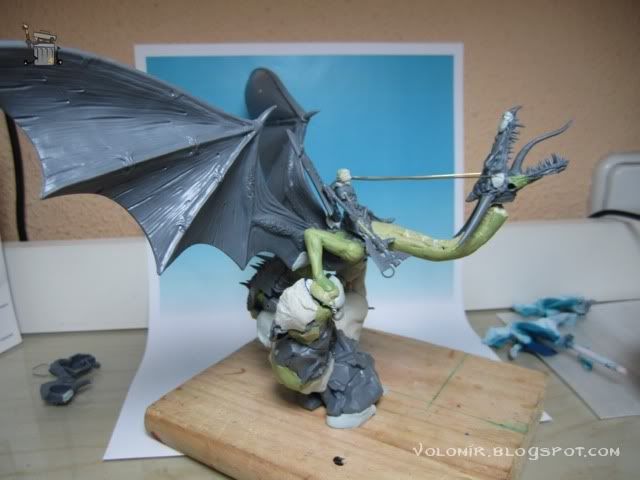
It has potential! Let's put on some more pieces to see how it looks, the wings and the throne backrest. Obviously, the wings are very important, they are about 70% of the whole miniature, so no way I'm going to put them like the kit encourages you to. So LAME!


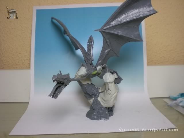
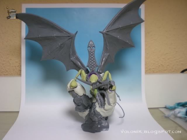
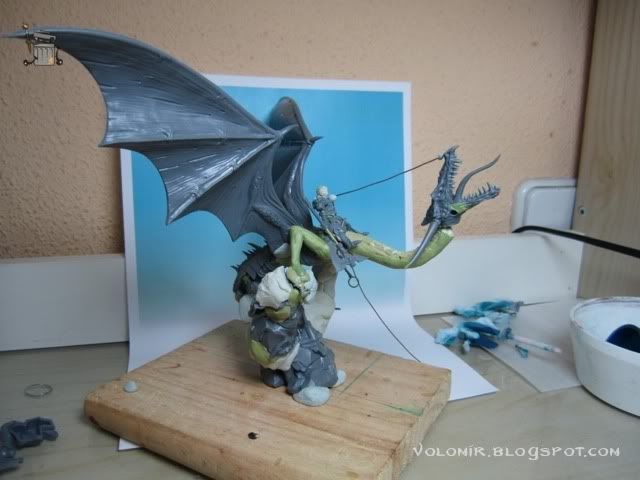
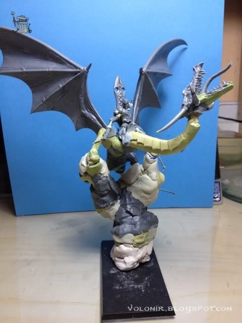
So yes... I'm starting to feel it! It really looks cool. I'm pretty convinced with the pose, it is very straightforward. So before I continue, I'll put putty on the wires to fix it for now and keep on progressing from there.


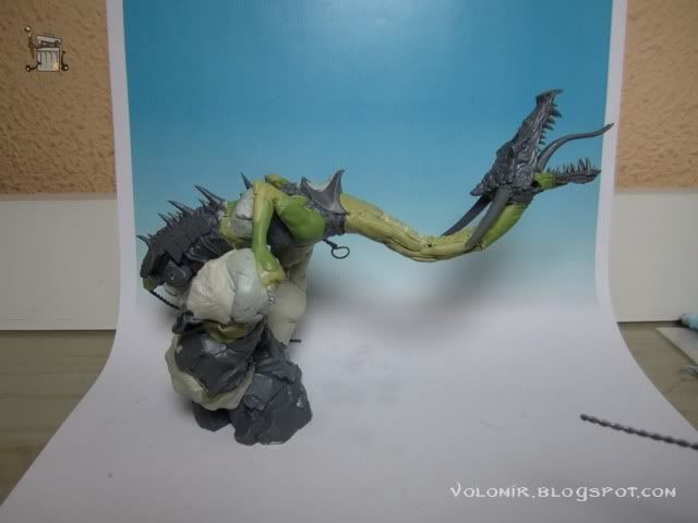
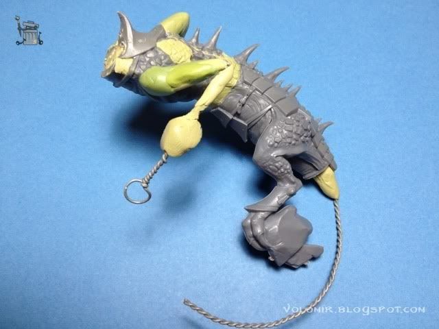
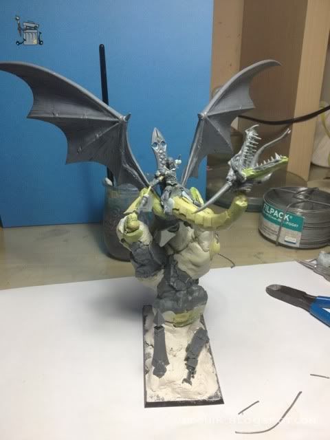
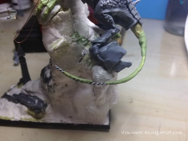
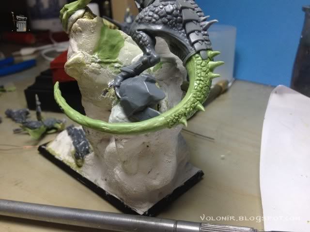
I also added the right leg from the kit, looks like I will be able to use that one, and also some wire for the tail. I think it would be very cool if the tail was wrapped around the rock, and the tails that come with the kit are really dull too, so I'll sculpt that. I don't need putty there, I can leave that for a later stage as it won't affect the whole miniature.


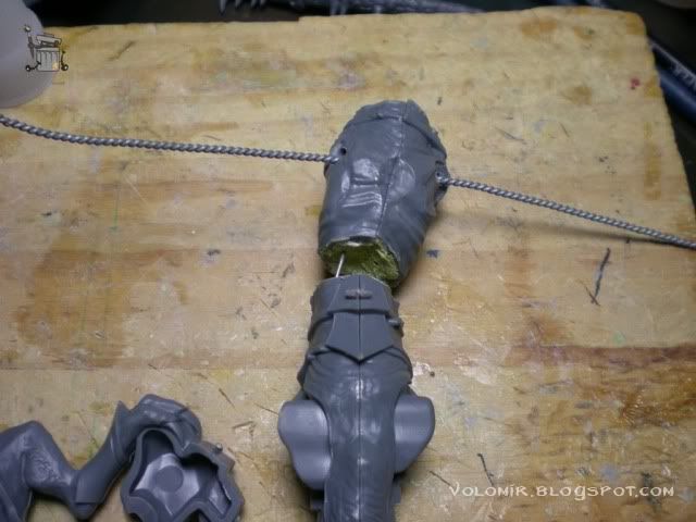
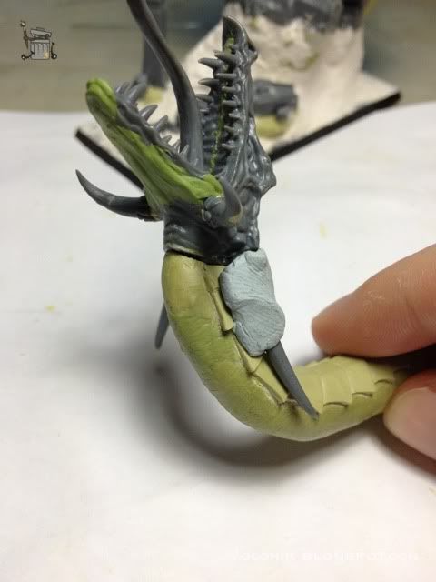
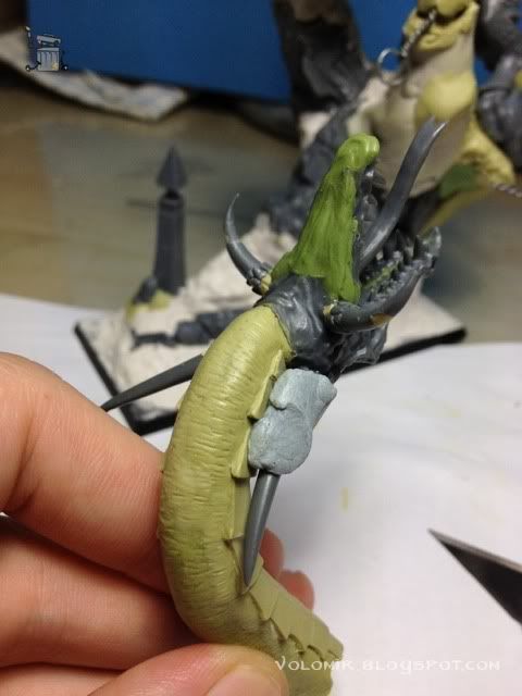
It really looks good so far so I'll start fixing stuff. First of all, the neck. I want some nice curves in the neck so it gives the whole body of the lizard some interesting shapes. For now I think it would be wise to make it removable, I might want to paint it separate from the body, so I put liquid mask on the union of the torso and neck so that the putty doesn't glue them together. Then I'll put putty on the neck to make it final.


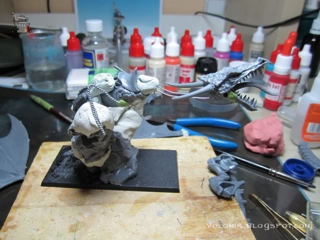
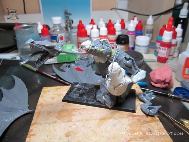
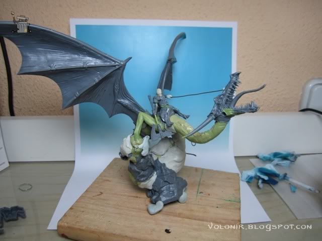
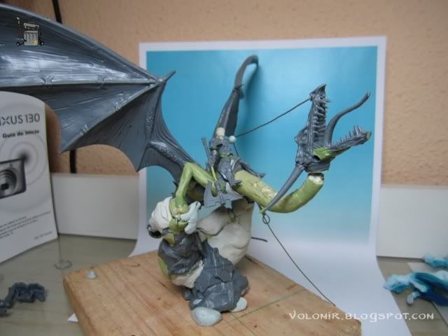
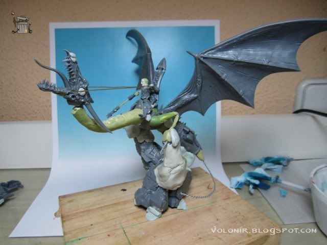
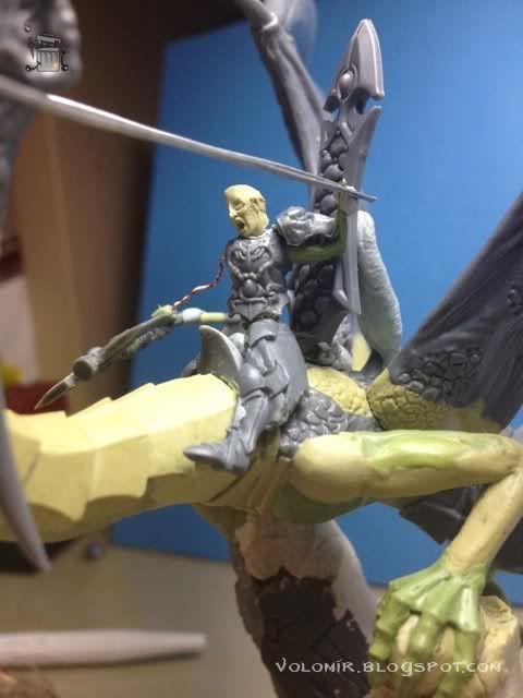
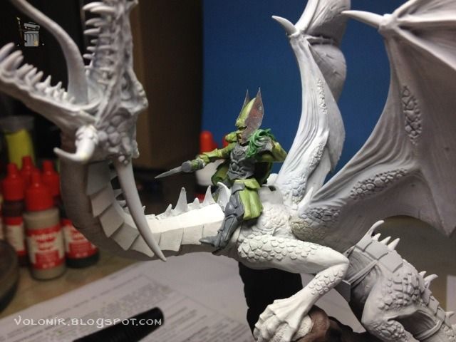
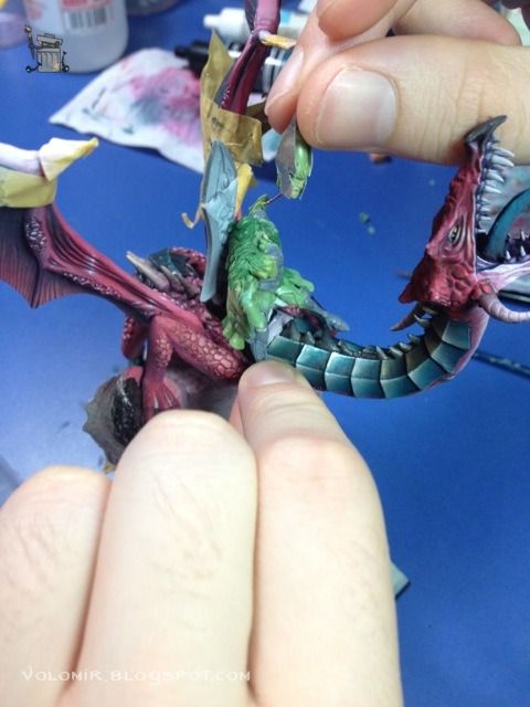
The curve looks nice but it might not be enough. With the help of my good friend Lord_Azoth, I push the concept a little further. Why not make the rider as the central piece of the miniature, and show the dragon submit to its legendary power? I could do the rider pulling the reins of the dragon so that the head falls back and the neck twists a bit more. Let's do some tests with the rider on top.
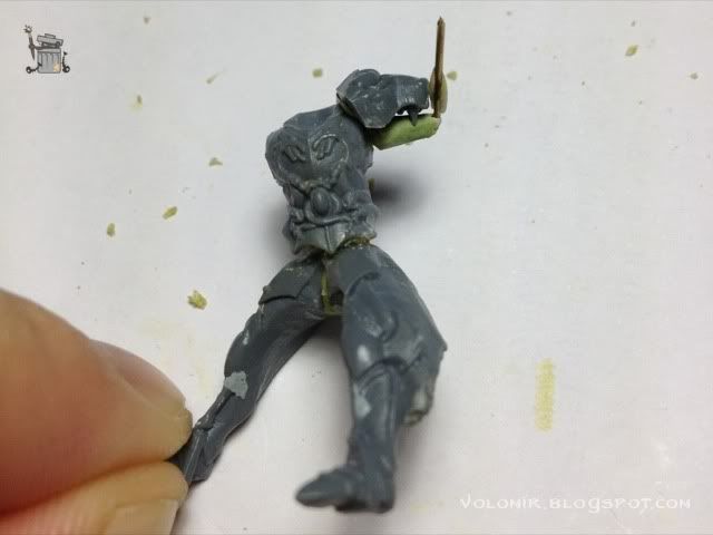
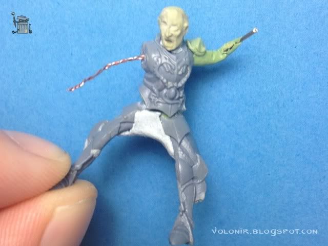
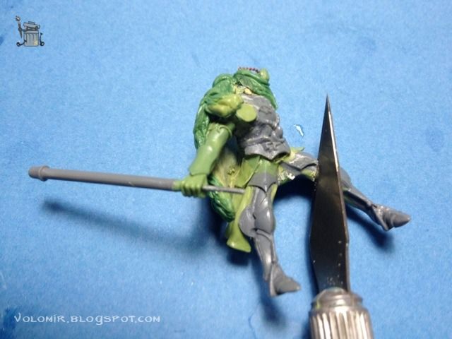
By the way, the rider needs a little presentation too. He is going to be a mighty Elf Dragonlord, but also a White Lion of Chrace. My army is going to be based around White Lions of Chrace so it makes no sense to put a dragon in it, but they are so cool that I don't care about this. So he will have the usual White Lions marks... a lion head on his shoulder, big badass axes and so on. I make the rider out of spare parts of elves I have at home. The legs are from Dark Elves on Cold Ones, much more suitable for my purpose.
Here are some pics of the early concept trial:


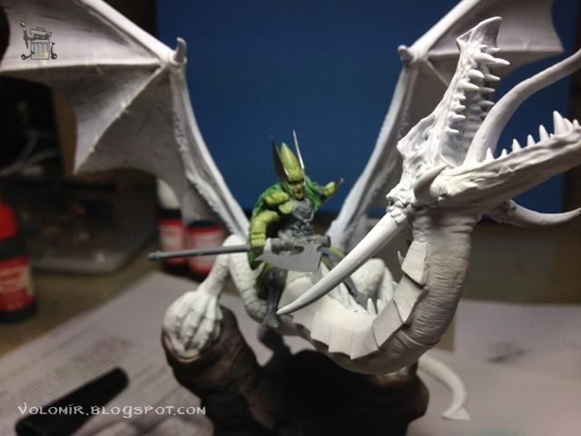
I really like the effect, it looks like the dragon is totally dominated by his rider. The main problem is the rein. It makes no sense that it is attached to the mouth of the dragon like that, so I have to revise the concept even at the risk of losing a lot of strength of the pose.


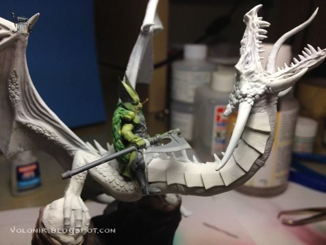
So a classical two piece rein seems much more fitting. As you can see, now the sensation of strength pulling back from the rider is much less. On the other hand, I gain realism because now it makes sense that the dragon has reins attached to the side of his head. I'll take it from here, as I lose a lot of time trying to fit in all the pieces with blu tack just to see how the whole composition looks like. Let's start by making the neck a little more final.
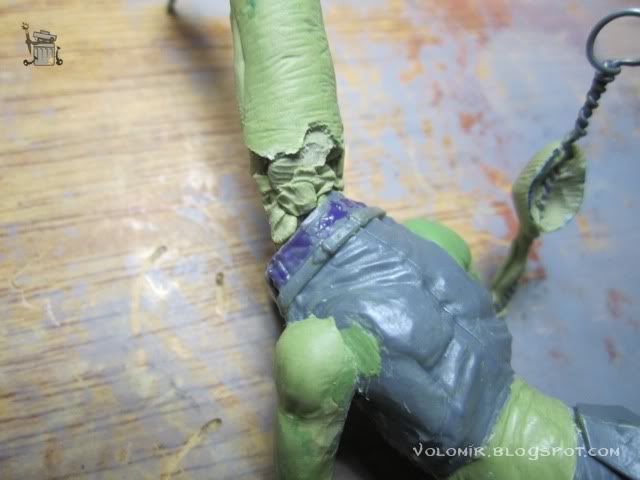
Here is where the neck attaches to the body. I put some liquid mask as usual so I can model on top and make sure that the putty doesn't glue the neck and torso (I don't want that yet). I really want to have torso and neck separated for now, for modelling purposes.

Here's how the neck union looks like at this point.

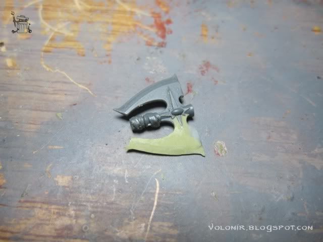
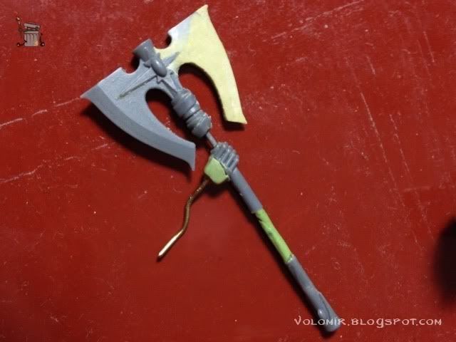
In the meantime, I can also start on some details that are not vital at this point of the project. They will be very important later on, but not now. Like the axe, I want it double-bladed so I make the other side of the blade with putty. It is true that I don't need it know but it may help to give me a rough idea of the composition when testing the pose.

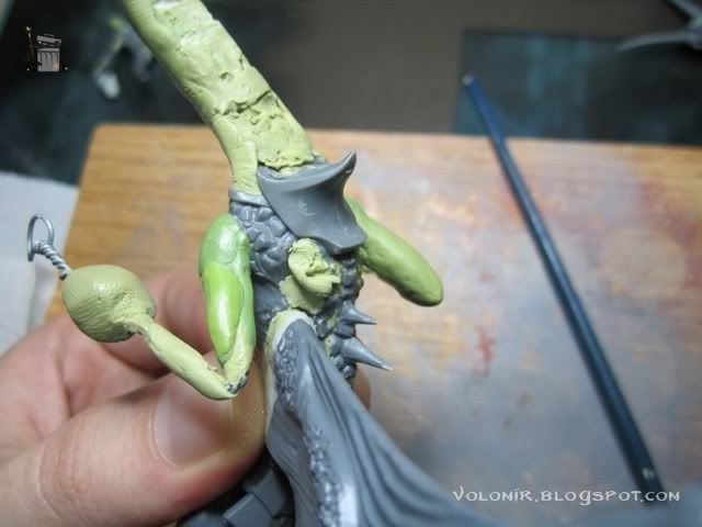
I'll being modelling some of the armour plaques in the neck of the dragon. I want them to look like the ones that come with the plastic kit.
This was the last photo I took in 2010. I stopped working on the project at this point, but after a year and a half after, I continued. Therefore, there is a gap of 18 months between the last photo and the ones that follow.

Now I decide to glue the left leg to the body. I am definitely going to use this one in the kit.

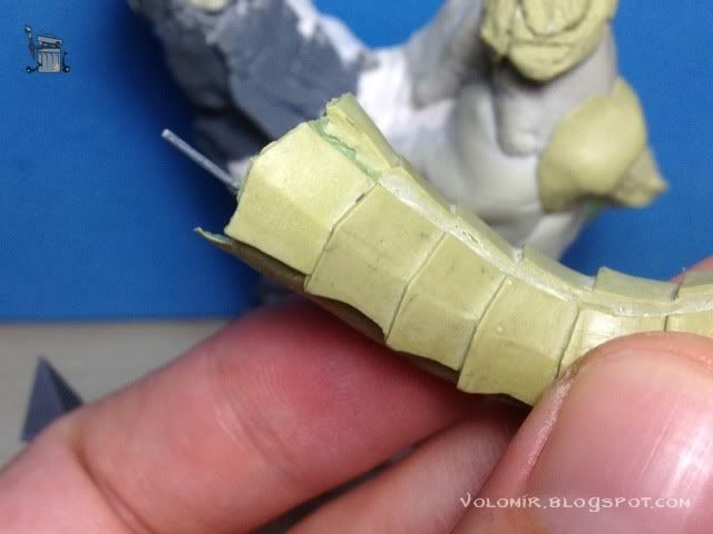
And I continue with the modelling of the armour parts in the neck. It's a slow process, but working with Milliput to do this is perfect because I can cut and shape the plates once the putty is cured, to make the surface smoother and sharpen the edges.

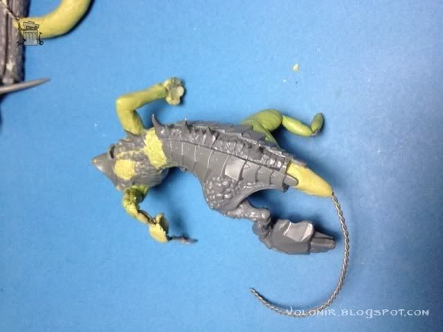
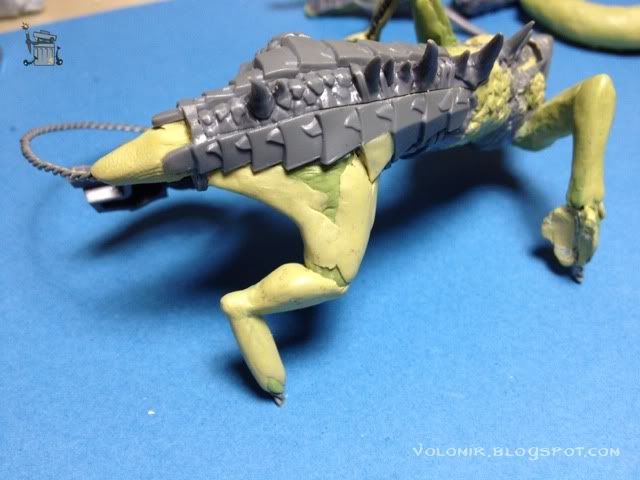
I also start the right leg, some wire and then bits of putty to create the first volumes, to see how it looks like. Now the piece really starts looking like a lizard!


As I said, there was a big gap of time between the last photos and this point, about 18 months, so it wouldn't do harm to see the overall look of the miniature again. I can't find the old head I used for the rider so I'll use another one, from the High Elves kits(my god, they are so bad, there is no way I'm going to use this head, this is just to see how it looks like).

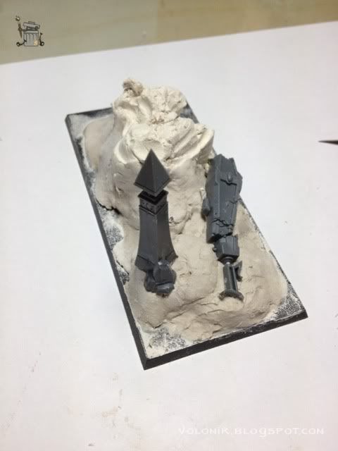
Notice how the base is getting higher and higher. The idea is to place the dragon in some rocks in the sea shore, to make some wave effects just like the ones I did for Tribute to the Fallen, just this time it's going to be bigger and much more epic. So, I'm going to bring the rock up! Let's do some work on the base, with DAS putty.


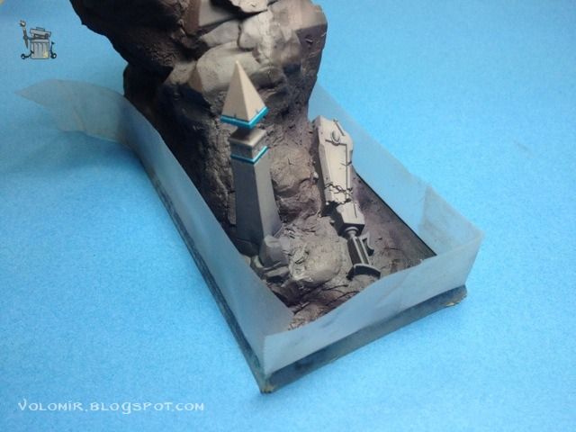
Introducing some Elven materials from the Dragon kit, stuff the elves want on their sea shores of Ulthuan.

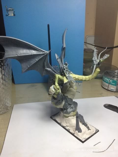
The position of the rock is key in this case, it's going to force the main view of the miniature, and I want it to capture the strength of the idea. The rider pulling from the reins, the dragon opening his jaws, the lizard climbing on the rock, the waves, the wings spreading all over the frame... so I need to spin the rock around a little bit so the neck of the dragon is in a diagonal direction to the base and the rider with the axe breaks that diagonal to the other side, always avoiding any parallel line, may that be to the ground, to the base or to any other object.

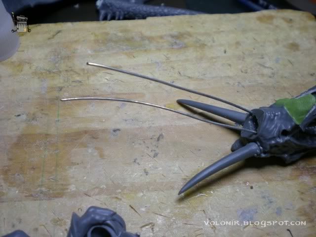
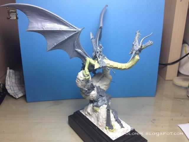
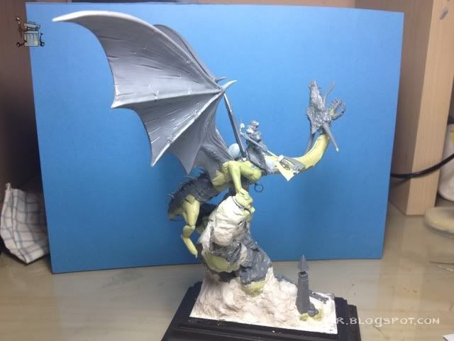
Let's see some shots of the different views of the piece so far. Notice the addition of the horns in the sides of the head. The reins will be attached to the beginning of those horns.


DAS putty can be tricky, it's cheap and useful but it has trouble sticking to surfaces, so I have to seal gaps with Milliput, to make sure that the whole base does not create any cracks or separates from the plastic base.

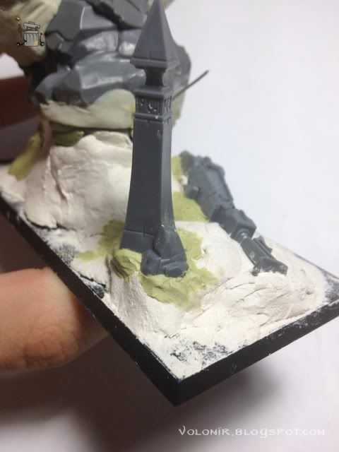
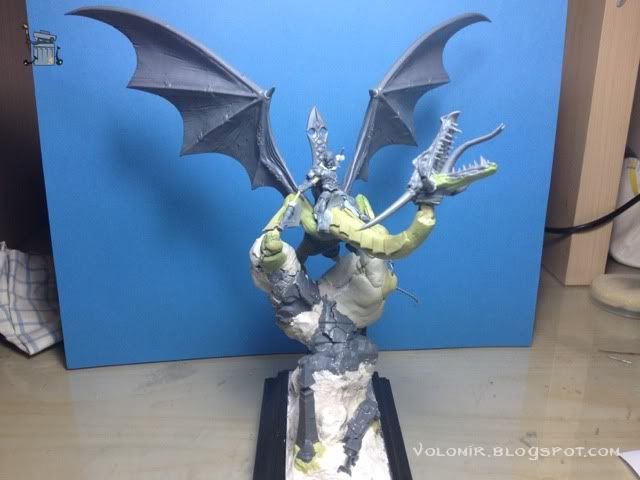
And now some more shots, with the brand new addition of the advanced terrain and the showcase plinth! This is moving forward!


I continue the work on the armour plates of the neck. It can be a little tedious but it's ok. As I said, it needs some cutting and shaping with knife after the putty is cured.


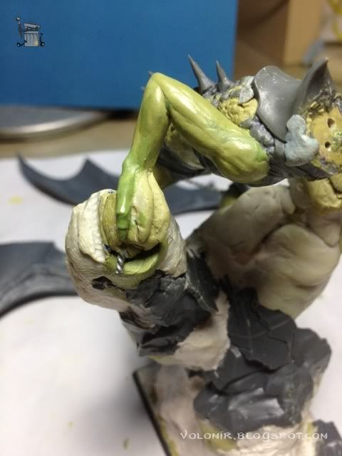
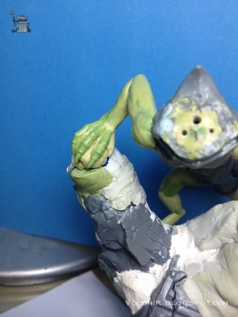
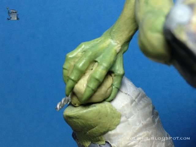
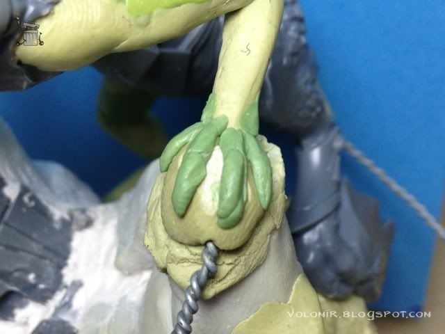
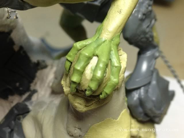
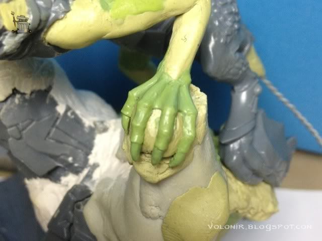
More changes to the overall composition. Some feedback I was given suggested that I should change one of the dragon arms so they don't have exactly the same position. So what I'm going to do is lower the left leg by cutting the rock there a little bit and position the hand on top of the remains.


This will change the arm so it doesn't look exactly the same as the other. Anyway, it has to fit into the hole in the rock, so I use some liquid mask again and putty, again to ensure it does not become one piece.

Time to attach the horns to the head. I position them pointing down, forward and tilted a little bit so they are the least perpendicular to the mouth as possible. Breaking diagonals!

While the work on the neck progresses, I want to fix the union between neck and head because it plays a vital role on the whole set. Let's do that. I make it removable anyway, at least for now, so liquid mask, milliput...


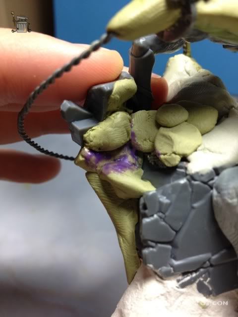
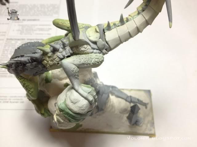
And I also need the unions of the back legs to the rock. These have to be removable, if I don't want to die painting! I won't attach those probably until the very end of the painting process. Those putty balls you see are just the excess bits of putty that I mix and don't use. All of that will be covered completely by more putty, this is just a way of using as much putty as I can without wasting any.


Also the same applies to the right leg, though this one needs to be sculpted entirely. Until I do that, I'm just using some putty ball to fix the position of the dragon on the rock.

Now that I have the position of the dragon safely fixed, I can test the pose with more confidence. Also, I found the old head! That's great because I am definitely going to use this one. I will probably take off the bandage of the face and then sculpt a nice elven helmet like the one in
Tribute to the Fallen.


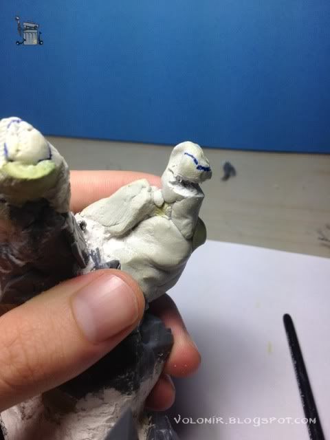
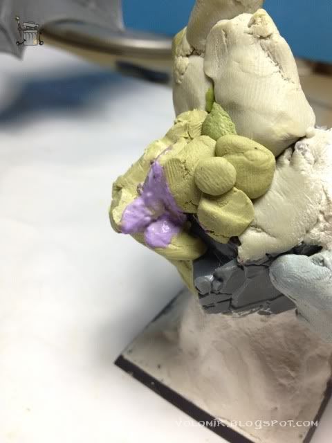
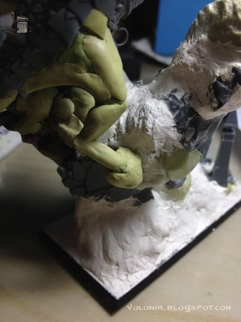
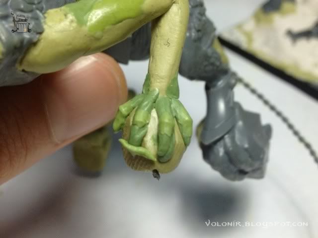
Now I'll start sculpting the hands (or claws, whatever you want to call those). First I do a rough approximation with putty to have a basic idea of how it will look like and where each element will be positioned.

Also, this rough approximation works as a starting surface for the putty I will be modelling the fingers with.

I will use a different putty for this, a mix of Milliput and Duro, 50-50. The key here is to identify the knuckles and joints of the fingers because that is where there will be more volume. I add some putty there and smooth it up by kneading the putty carefully with a clay shaper. See how the fingers magically start to shape out.


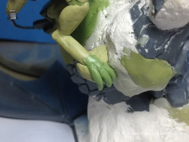
This modelling part is probably the most fun of all! I enjoy sculpting hands very, very much. Now I'll do the left hand, same process. First some putty applications as a rough draft.

Once these are cured (or hard enough to model over them) I put some more putty applications to make the knuckles and finger joints, the key to make the hands stand out.

After the knuckles are cured and I have marked the nails with putty (roughly at first, again, to make a surface to model on later), it starts to look like an actual hand/claw.

Perfecting nails a little bit and other minor details...

I use some excess of putty to start work on the right foot, first rough approximation which will serve as a surface for the fingers.

And then I do the same thing I did with the hands, first some minor applications of putty for the knuckles (I'm not sure if knuckles is the right word).

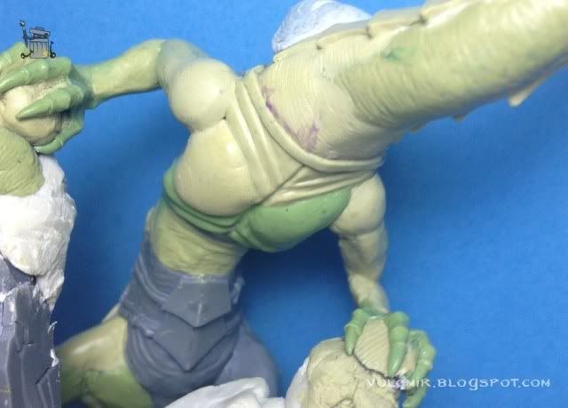
At the same time, I decided to make the torso wider. This will make sense soon, because I've started to notice that the neck is somehow too thin and large, and I want to compensate that sensation.

Some putty applications to be the first approximation of nails on the foot.

And the final widening of the torso.

The foot wasn't much work so I'll move on to model the whole leg. More putty applications to perform the lower armour pad on the leg and some textures on the skin, basicly lizard scales similar to the ones the original model has. First steps.

And more progress, adding details on the armour pad and completing the scales on the legs.

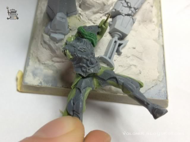
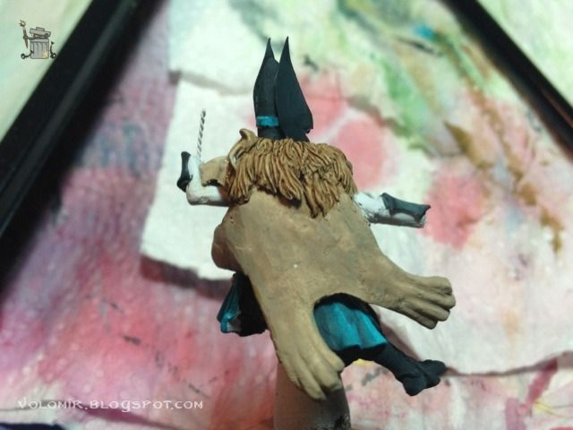
But before moving on the arms, I start some parallel work on the rider. First I want the final head, which is one of the most important elements. As I said, I'm going to use the face of the bandage but I'm going to model an elven helmet on top, and it will need some serious modelling work (at least very detailed).
Here's the first attempt on the head. I cut off the bandage and then model the eyes and front.

I leave it and then go back to it and I realize I did it badly. The eyes were too high so I decide to do it again.

This one is much better. I will model the eyes and the rest of the skull and then do the helmet on top. Let's start with the rest of the rider at the same time.

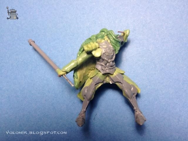
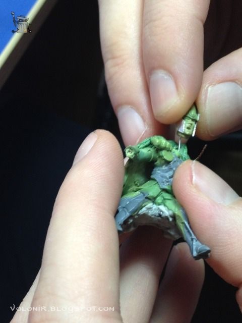
I need to position the arms finally before introducing some putty on them, so I put some wires and start moving them around (with the head fixed with some blu-tack to see how it looks like).

And I'll test it on top of the dragon, including some temporary wires to see how the reins would look like.

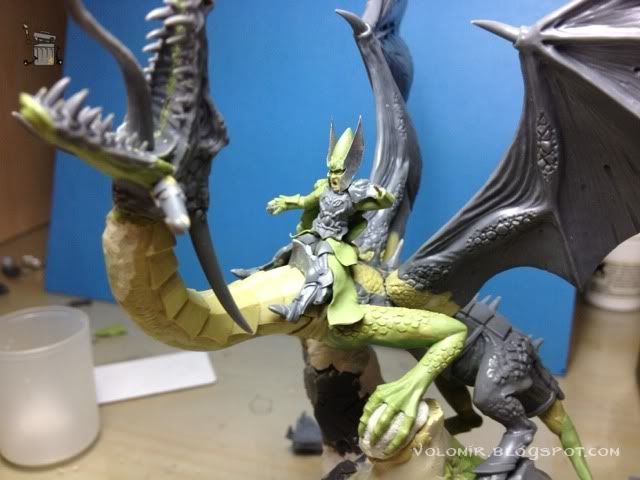
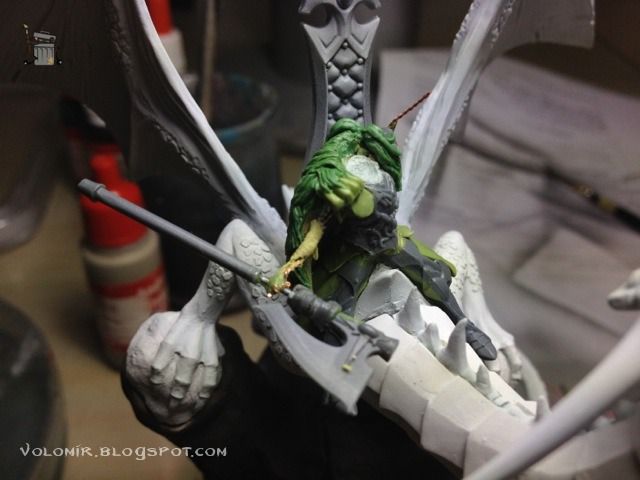
Ok, I think I'm pretty satisfied with the pose of the rider. Notice the lion head on the left arm! However, it is at this point of the sculpting when I realise that the neck of the dragon is too long. I was warned by some people but I didn't want to listen, and now it's very very evident. I have to fix that by shortening the neck, just taking out the lenght of two armour scales. In the next photo I have cut them off, and I use some green stuff to reattach the neck to the torso.

In that green stuff gap, I model the armour scale again to fit the union.

And back to refitting the neck to the torso (remember some steps back?). I use maskol for the temporary union and then putty over it to make it final.

This is how it looks like once it has been shortened. I think it's much better now.


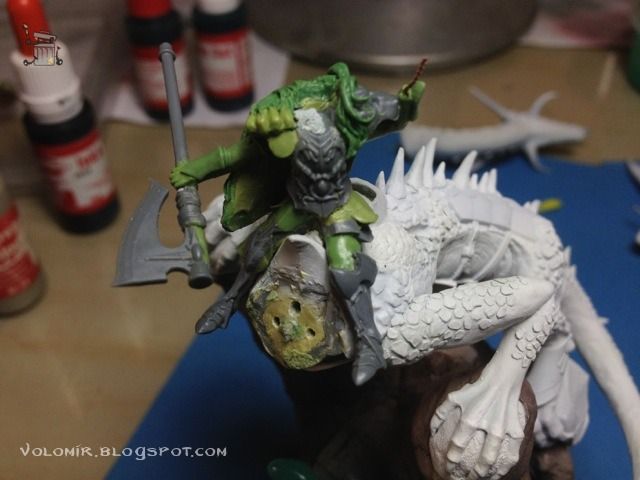
The head was the elf one, the other one is still under some putty work so before I finish it I will use this one for the pose studies. Also, notice the new position of the axe. Now the rider grabs it closer to the blades and the pose is different. I will need to redo the axe for this new idea.

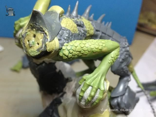
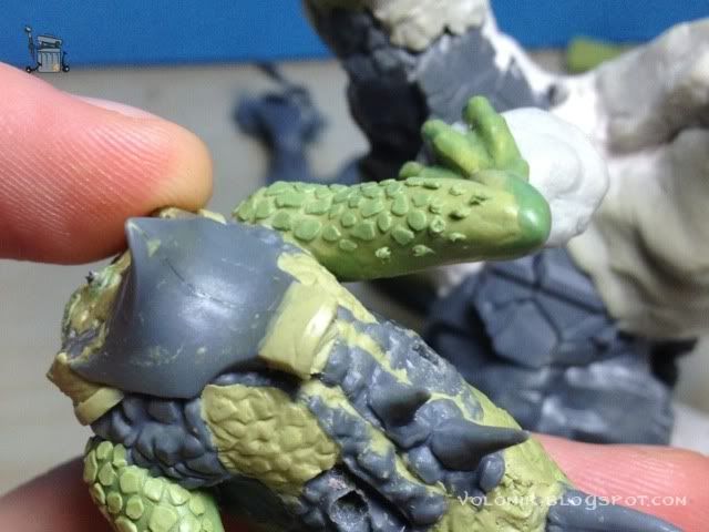
I'll start with the scales on the arms. Similar to what I did on the legs.

The method is this: I take some little balls of putty and I put them over the skin.

Once I have a few of them, I use a clay shaper to transform the balls into scales. I could do the process scale by scale, but this is much faster.

It reminds me of the old lizardmen!

The scales are too similar, I'll make some of them bigger.

But in the meantime here's one of the horns in the back. I use some wire to ensure it stays still.

Now I make the scales bigger. You might notice the difference if you look carefully enough.

Let's see how it looks like with the rider on top. Notice how I started the arm, but I'm afraid I will have to change that.


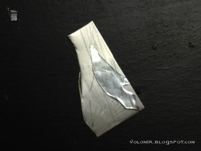
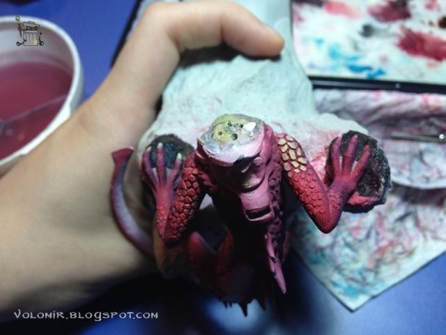
So let's start doing some work on the rider. First of all, I took an old elven helmet an used it on top of the head, very carefully so that the two things match. I sculpted the sides of the helmet to cover the sides of the face (not perfectly now, just to see how it would look like), and then used some paper cut wings as approximation.

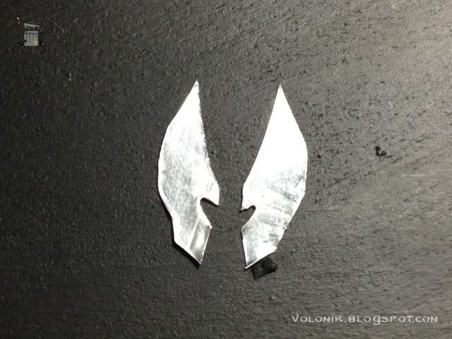
Looks good so I will elaborate on the wings. I will use some tin to create them. I use the same shape of the paper to cut around the tin.

Here's how they would look like, freshly cut.

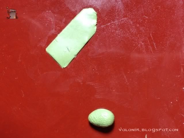
At the same time, I'm going to cover the sides of the legs with some cloth. I knead some putty and make it plain just by using the sides of a pen or something like that with water or little oil so that if doesn't stick to fingers or surface.

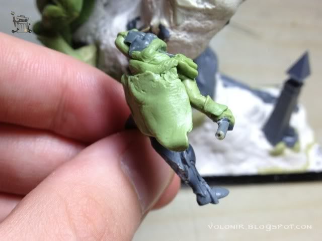
And I will use those as some kind of cloth on the sides. First approximation, as always.

Let's continue kneading and making plain pieces of putty.

Glue the wings to the helmet and complete all the clothes of the legs. Here's how the rider looks like on top!

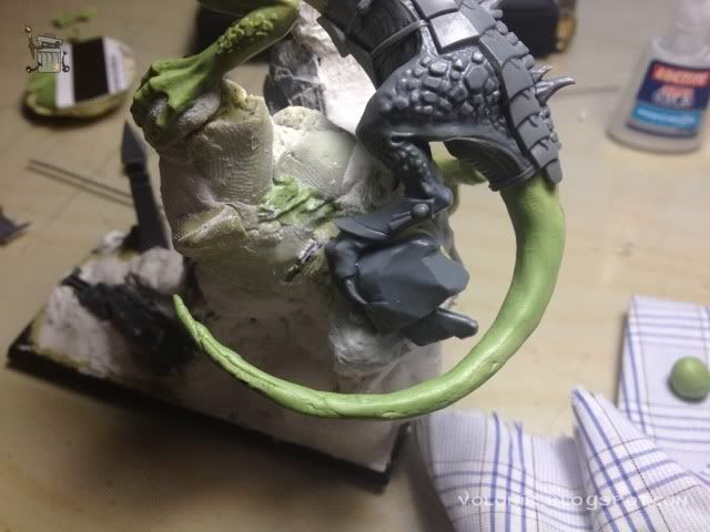
Not bad, but there's still a lot of work to do here. In the meantime, I've been covering the tail of the dragon with the excesses of putty I wasn't using, so it might be time to complete that.

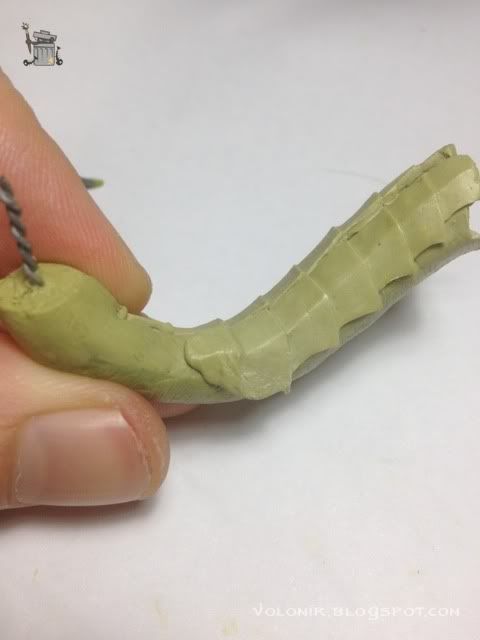
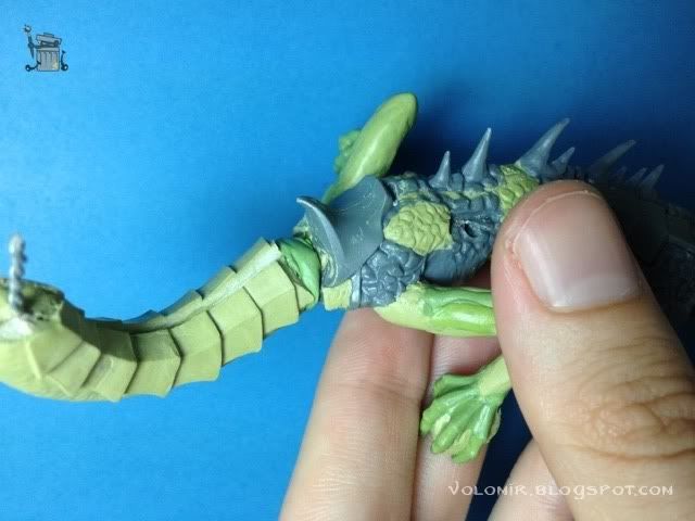
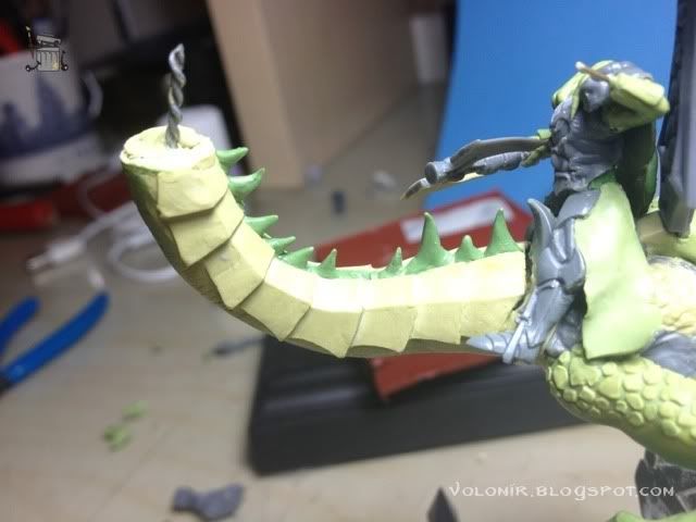
First I'll do a rough shape of the whole tail with green stuff and milliput.

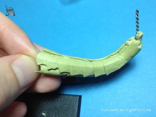
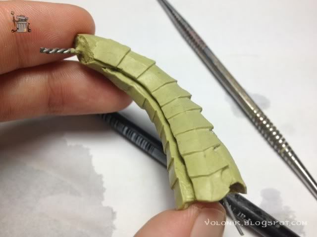
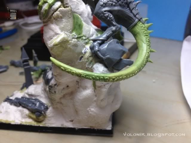
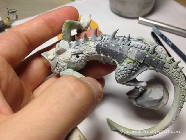
And now little by little, I start shaping the scales on top of that rough shape of a tail. I divide the tail in a few sections so I can concentrate on each one before the putty dries and then on to the next. I did the whole tail while watching a football match, so the method proved to be very productive!

This is how the tail looks nearly completely finished.

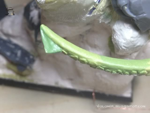
Let's add a cool termination at the end.

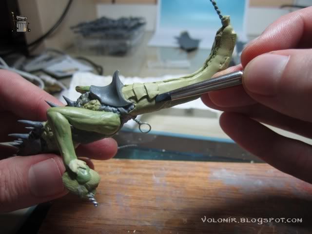
I am also doing the horns on the middle part of the neck. They are not very big so I won't be needing a wire to make them stronger. Just a mix of milliput and greenstuff, with more quantity of greenstuff so that the mix is harder than usual, will be enough. Don't use the putty when just mixed, wait a little bit so it cures and it gets harder.

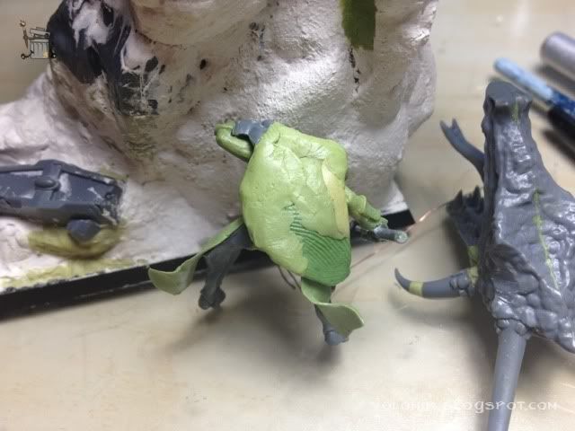
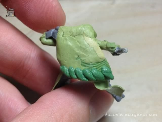
The rider needs a good cape or lion fur (or some kind of fur, I won't fool you guys, this hair I'm going to sculpt is certainly not lion fur).

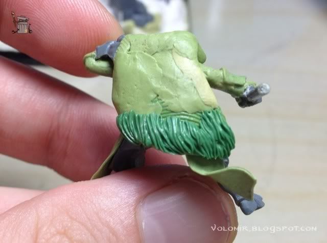
I'm sure you've read tons of tutorials on how to sculpt fur. So probably this technique will be very similar to anything you've seen so far. First of all, I put a row of little cones of greenstuff on the lower part.

With a clay shaper (the black one with the flat head), or simply a metal sculpting tool like the ones GW sells, I'll start shaping up the hairs.

Remember I said that the clothes on the sides of the legs were really bad? They really were. So i'm doing them again, using the ones I had before, I cut them shorter and then sculpt some waves so they look more realistic.


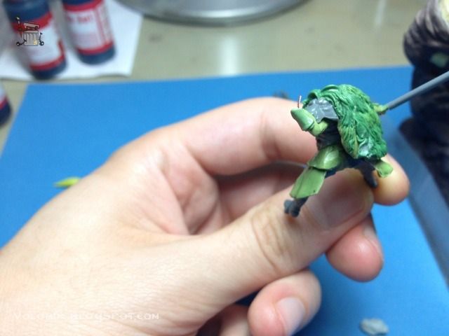
Here's with the torso and the right arm quite advanced. Also, I've added the typical lion paw at the shoulder, and some fur all around it. So White Lion!

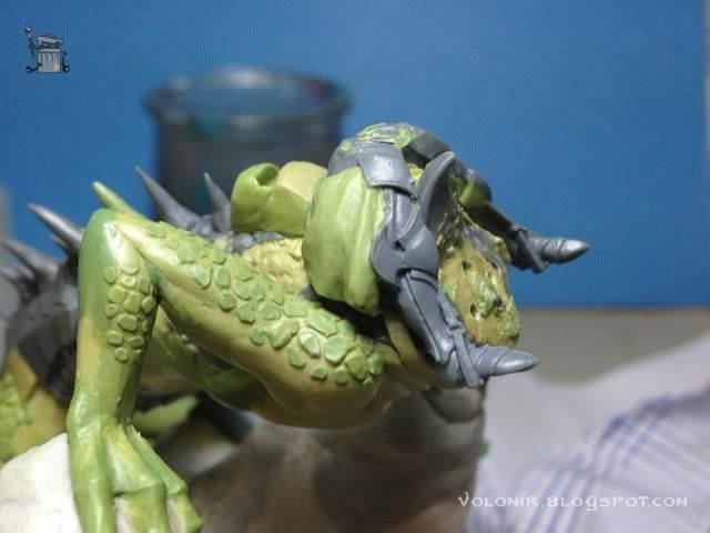
In the meantime, I'm doing the straps that fix the armour plates to the neck of the dragon.

Here's the back fur cape finished.

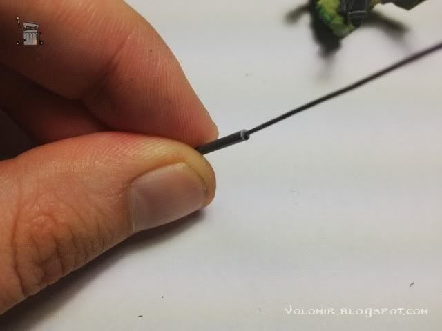
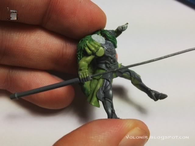
The axe needed some fixing. With all the work I've been doing on the rider, I broke it. So let's do it again. First, I get a pole from another axe of a high elf, and then drill and glue some wire.

I leave enough wire so that the front part will also attach (obviously in this photo there's far too much, but always better to have spare and then cut, because once cut you cannot go back).

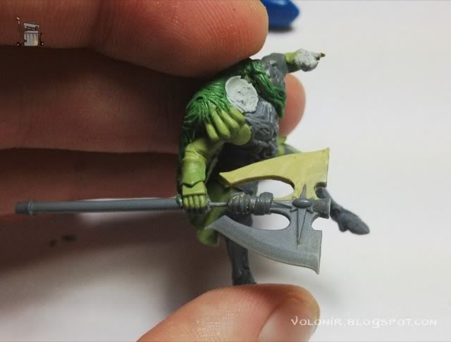
This is the front part attached. I'm starting to realize that such a big axe and so close to the chest might look weird.

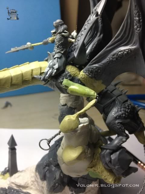
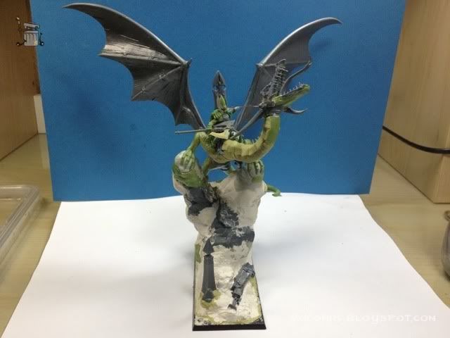
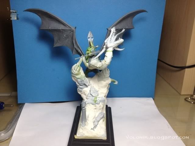
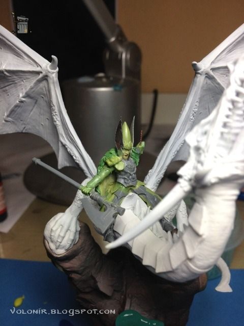
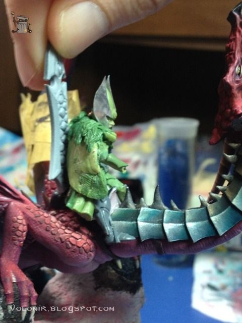
Let's take a look at how it's looking so far, with the rider on top.


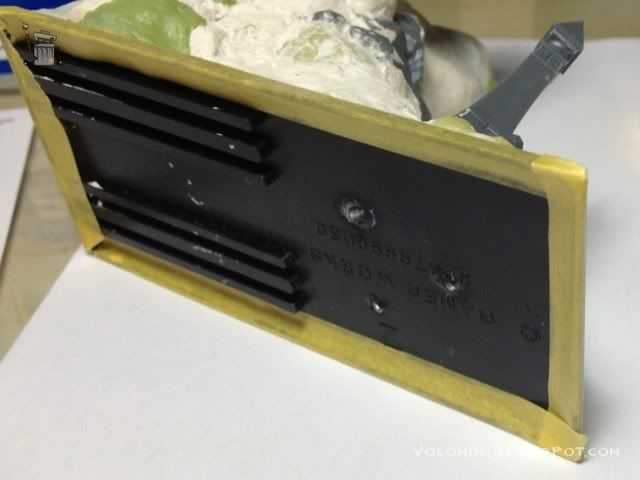
At this point, time is running out, so the process starts to be more chaotic and I'm going to mix painting and modelling at the same time. Why? Because the pose of the rider is still not convincing, but while converting the rider, I can start work con the base and dragon. So what I'm going to do now, is mask the sides of the base so I can prime it without changing the natural black of the plastic. This way, I won't have to paint it black in the end.

I'm going to prime everything in white. As usual, with Gunze Sangyo matt white using airbrush. It's a big piece so it takes some time to do this.

I said I wasn't convinced with the rider, so while priming the dragon, I break the different parts of him that determine the pose. Basically, right arm and torso union to the legs.

Also, priming thin at first is very important, because once the entire piece is covered in the same colour, you'll see all those little flaws you couldn't see while modelling and converting. In this case, there was a lot of imperfections in the unions of different mixes of putty and also, Milliput from my fingers had been slowly depositing on the flat areas of the armour in the back of the dragon, and the priming revealed it. So I use a knife to scrap it all.

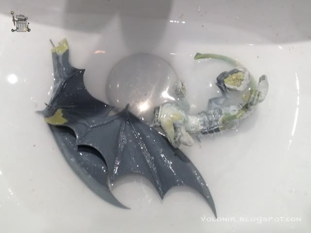
After that, to ensure that all is clean before the final priming, I wash everything with soap and water.

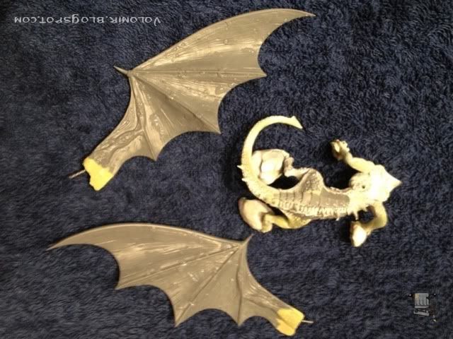
You must be familiar by now with this classical volomir WIP photo. Drying in my towel!

I also continued the work on the rider, basically reposing all those elements I talked about, and took off one half of the axe's blade, because it was definitely a problem. I think it looks much better now.


I'm still not convinced with the rider though. He leans forward and doesn't seem like pulling the reins. I still have to rework on that.


Time for the priming of base and dragon.

Once primed in white, I'm going to give the base a little coat of black so that it takes better the brownish dark colours that I'm going to use on it.

The process in the base is simple, but complicated at the same time. I want to create sea waves crashing in the rock, and that will be an effect which might be difficult to achieve. Even so, the process should be simple. First I will paint the whole base with the rock colours, and all the elements in the scenery. Then I will use resin water to create the water on top of that. The colours in the base are not a big problem because they will probably be covered by the water. So, first brown base with Dark Brown from Andrea, all airbrushed.

Adding blues and greens to the mix, and also different quantities of black to create the first shadows.

Some reds also will work well.

And more blacks.

I'll get some of the light back by airbrushing with some lighter ocre.

I am using some blue and green inks from Andrea in some areas.

Let's look at the dragon primed white on top of the painted brown base.


Let's see how the rider looks on top of the dragon.


It looks cool, but it's not exactly what I am looking for. The rider does not really look like pulling the reins. So even though I already primed the dragon, seems like the rider needs some more adjustments. The head of the rider is not fixed to the body, so I can play with it (which is very important because it will provide all strength and weight to the pose). The left arm however, needs some modifications, and it is fixed to the body. So here I decide that the best thing to do is redo the whole left arm.


And with the wire of the left arm exposed, I can see that the right arm is only a bit odd. I need to change that one also. Shit happens.


But it's not so bad. It shouldn't be a lot of work. Here's the left arm redone.

And here's how the guy looks on top, with both arms redone.

Ok, now the guy has way more strength in the pulling of the reins, but still, there's something wrong. I believe it's the legs, too straight. Nobody said this would be easy!

The left leg will bend slightly, so that we suggest that all the weight of the left side of the rider is on the left arm pulling the reins, and not on the leg. The left leg is actually loose, so the rider's weight is basically sustained by the right leg and the left arm pulling the rein.

Because of what I just said, the right arm might need to also bend a little bit. But I'm not sure about that. That is why I'm going to move on to work on something else while I decide.
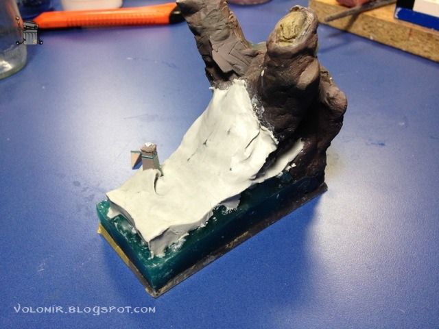
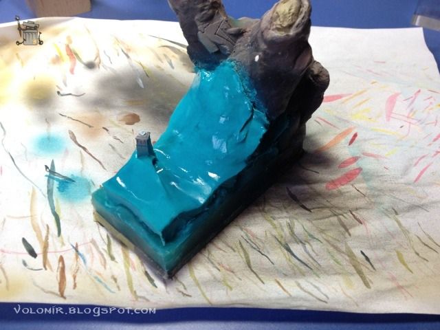
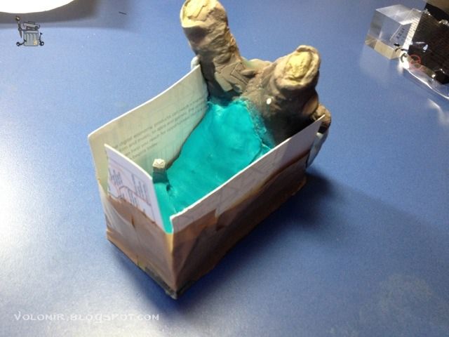
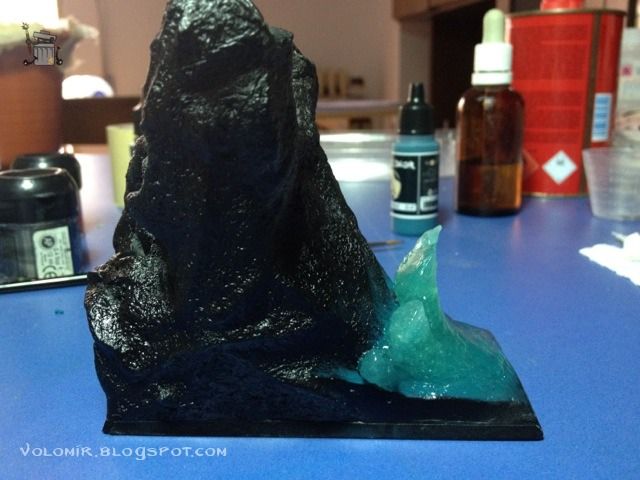
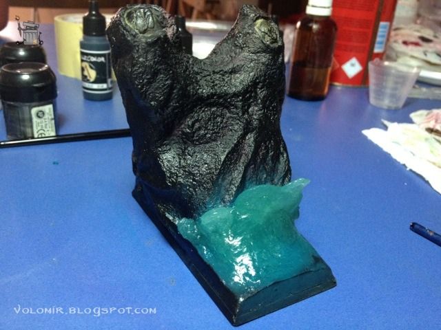
Time to add some water into the base. As you know, my intention is building a sea shore environment, with a big wave crashing into the rocks just beneath the dragon. This idea will give a lot of strength to the scene. First of all, I will build a cavity where I will pour the liquid resin which will serve as the sea base.

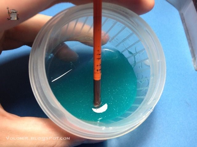
The liquid resin is mixed in a pot, and I add a little bit of turquoise oil colour so that the water gets a blueish kind of tone.

The first pour will be the sea base level, but the wave will be added on top of that. To do it we let some of the resin water in the pot dry to the point where it can be modelled (very roughly and not comfortably because it's sticky like chewing gum) and then add it on top modelling it accordingly.

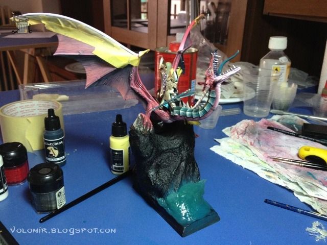
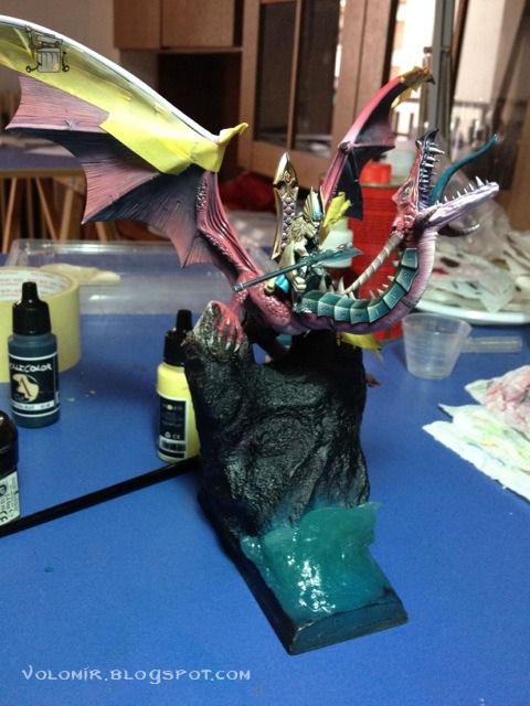
This is how it looks with the dragon on top.

With this first sea base, I can add more waves to the composition.

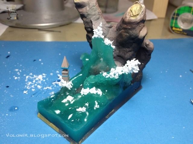
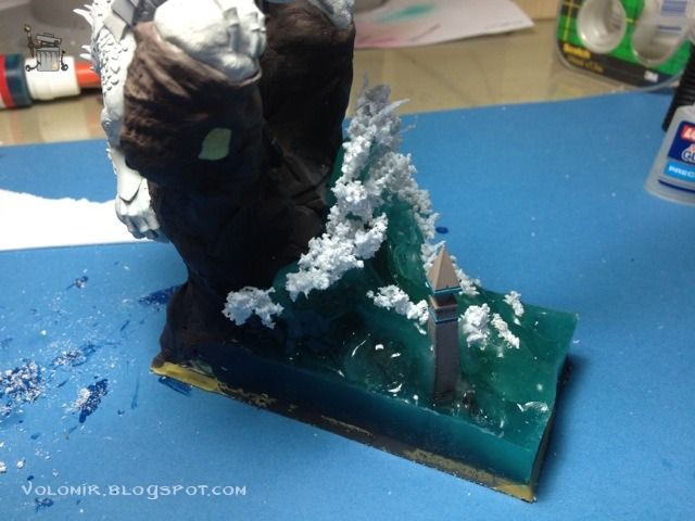
Now I will add some foam to the crashing waves.

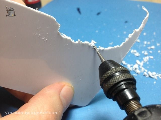
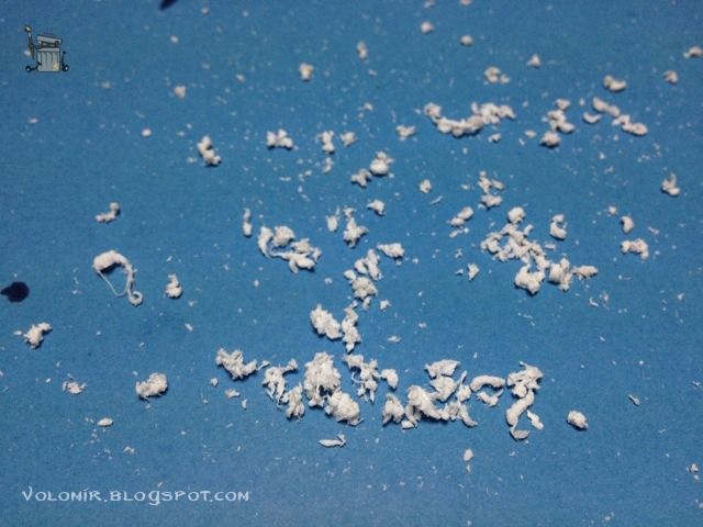
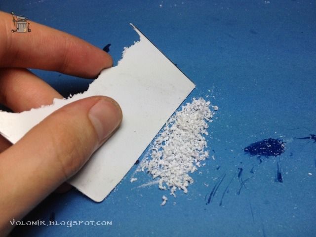
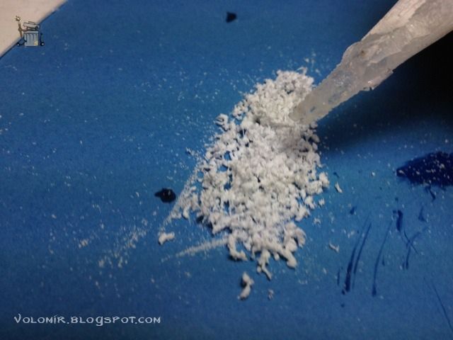
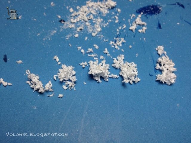
It's made out of plasticard burnt with a dremmel to the point where it melts and creates scraps of melted white plasticard.


The little bits and pieces of foam should be added to the base, sticking them with superglue, which is transparent and won't be noticeable with the water works.


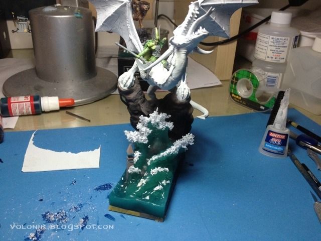
Here's how it would all look with the dragon again.


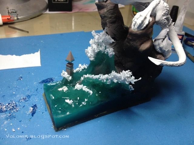
At this point, I sit down and relax. I see the composition from every angle. Something is just not right. After neverending consideration and thinking, I decide that this water is crap and that it should be done again. This type of water and foam may have worked with
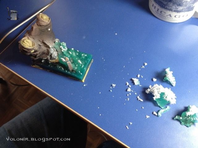
Tribute to the Fallen because the base was way smaller. But this is just not doing it. This is nothing like the sea, or waves crashing in the shore. Looks like a popcorn tree. And the water is not than convincing. So... time to destroy!

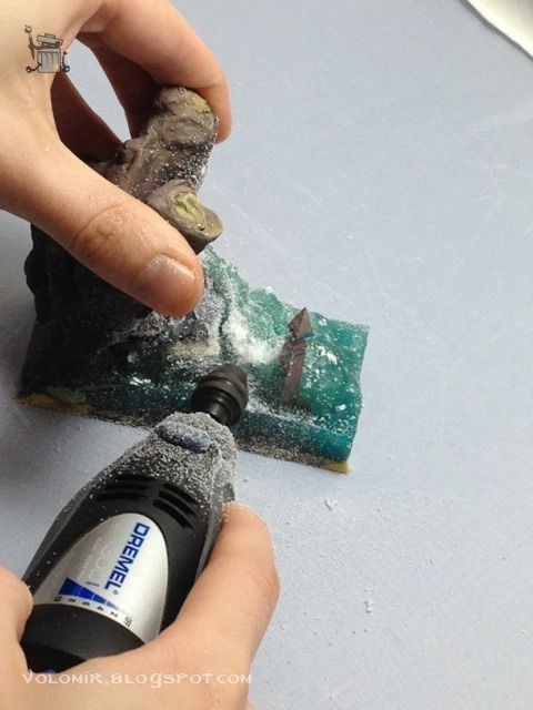
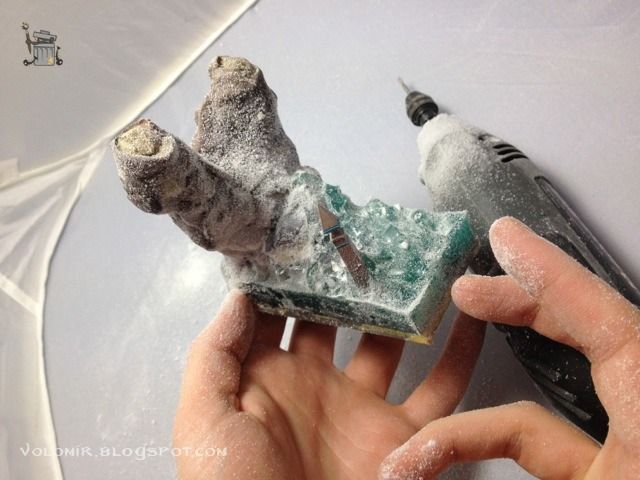
With a dremmel I destroy the water waves in the base.


Always wear protection when working with resin!


Ok, so I will rebuild the base, but this time I will use a different approach. I will use waves made out of putty (in this case, Magic Sculpt), and then put some resin on top. This will let me model the waves in a more controlled fashion.

Before adding the waves, I need to put some blue colour to the white putty.

And then I build some more cavity walls which will hold the new water resin.

But wait... what was I thinking about? Obviously I didn't have to pour in water resin this time. I just needed some water effects... ugh... total failure.
This base ended up as a complete failure and was destroyed for the greater good. There are no photos of this because it was a very sad and frustrating moment. But obviously it wasn't all in vain. Failure is important to be able to learn. From this experience, I rose like a DBZ Saiyan, better, harder, stronger.
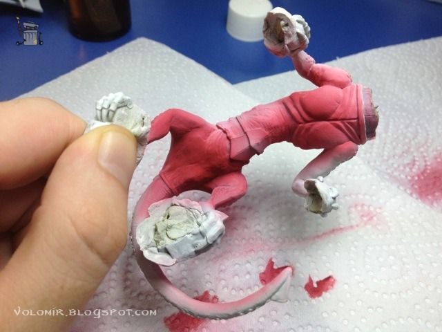
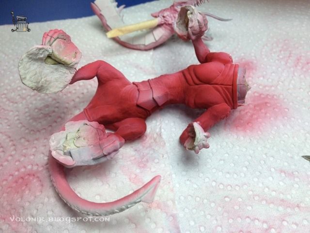
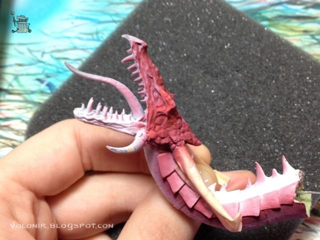
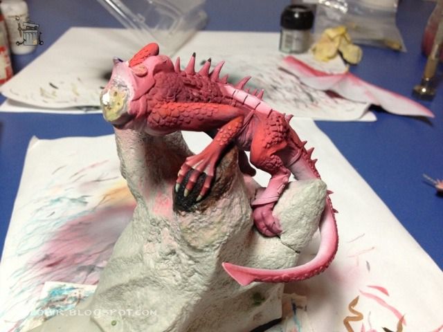
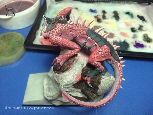
So let's start the painting on the Dragon. Here's the lower part of the body. In my first approach I thought of painting it all red, basically Red Gore from Citadel applied with airbrush.


The upper parts would be left in white so that the lights on top of that priming colour turn out to be brighter.

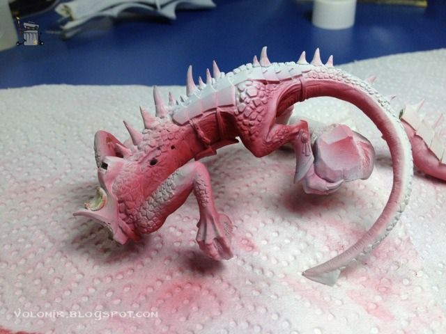
But in the end I decide that I actually want a lighter lower part of the dragon, in the same way many lizards are like. Also, notice the popcorn tree on the water? You might have guessed that this was the first base version, the one that was destroyed.


The colour seems right. I will also try it on the wings.

I leave the lighter parts of the wings in a lighter colour.

Here's how they look with the dragon. I think that this is way too bright, especially because I want the rider to be the main character, not the dragon. Anyway, I will go back to this later.

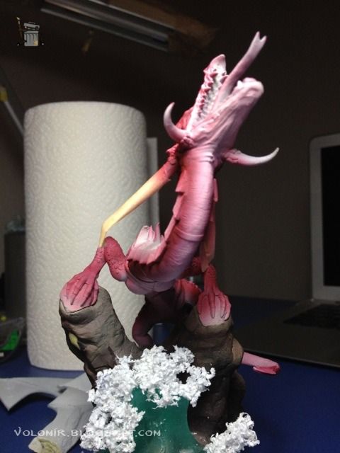
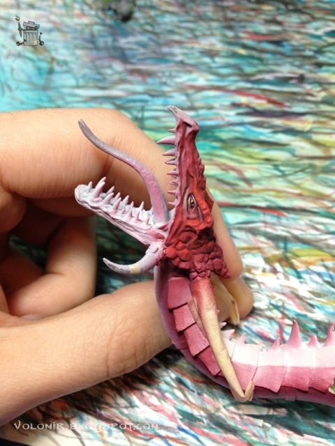
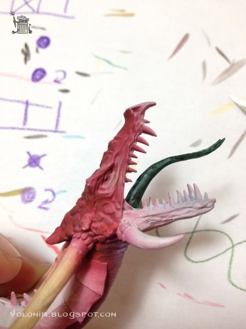
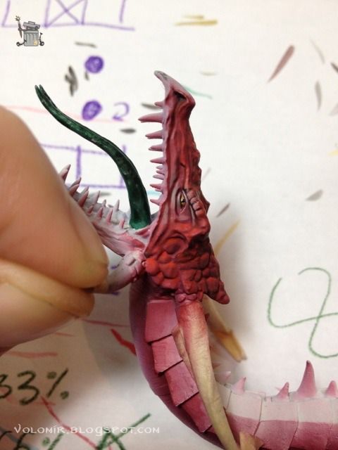
Let's start the painting on the head. Same way as the rest of the dragon, airbrush in red, leaving the lower parts in white.

This project is very big, I'm not used to painting monsters. I'd rather start finishing parts and then go back to them, I'm a bit lost in the process. I'll do some brushwork in the head. Eye painting and red highlights.


Ok, the head starts to look good. I really like it. Let's pause for a moment and go back to the base. After all the mess, we will have to create a new one. I will cut the upper part of the old base and use it in a new one. This will prevent me from making the unions of the paws to the base again, which is a lot of work.

I will just have to worry about the height and tilt of the dragon relative to the ground.

Once that is right, texture to simulate rock is done by using aluminum paper, squished into a ball, and used as texturizer for fresh putty.


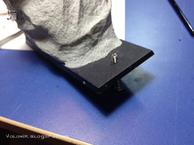
Using so much Magic Sculpt increases the weight of the figure exponencially. It is going to be difficult to glue to the base, so I will do a drill for a screw so that this is less problematic.

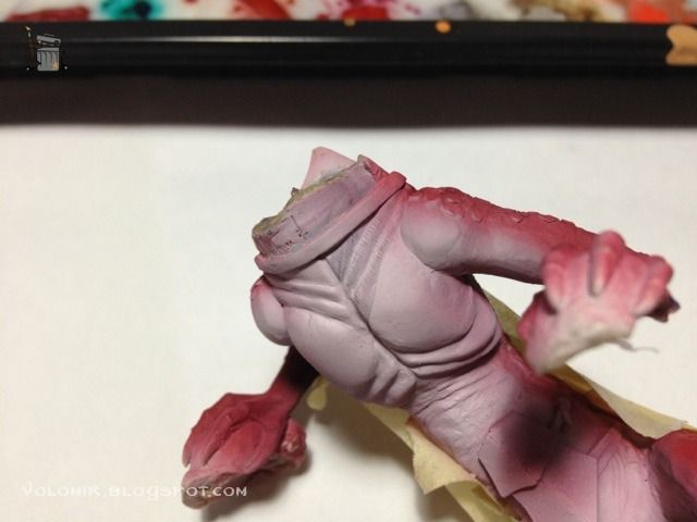
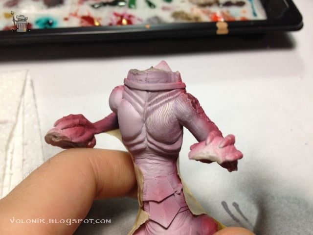
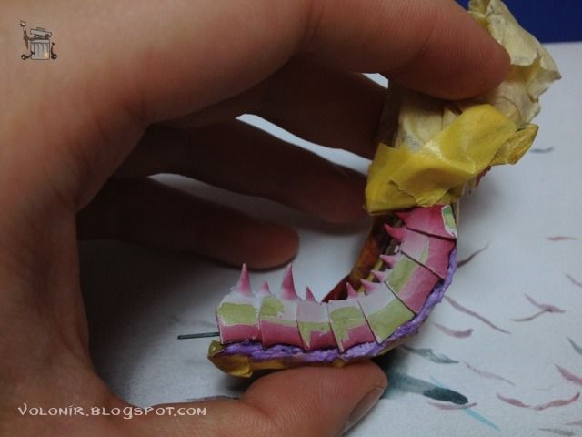
I'll go back to painting the body now. The lower part of the chest seems tricky at first. It's a completely flat surface, so I'm going to perform some nice texture by using freehand lines.

I think this pattern is really interesting. Pity this is the lower part and won't be very visible once the dragon is posed on its base.

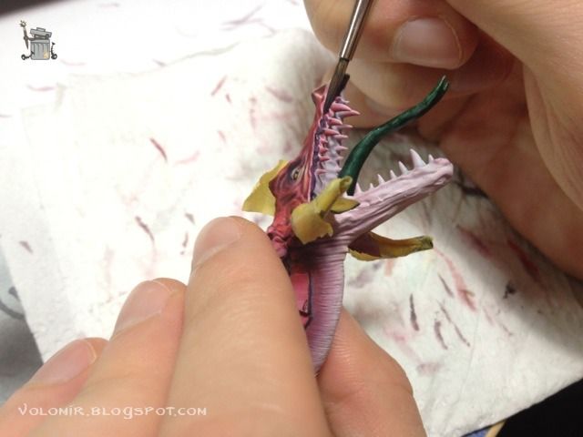
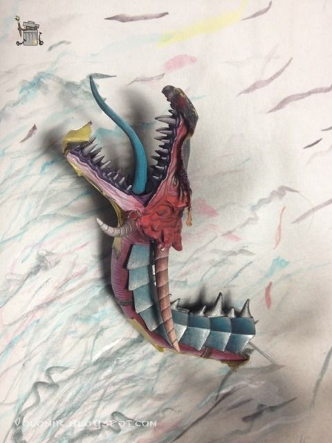
Painting of the mouth is vital to define all the volumes in the head. Before doing any work there, I will put a background purple colour for the inner part of it.

The head rocks with those outlines.

The neck is also one of those tricky parts. I try to replicate the same pattern used on the chest.

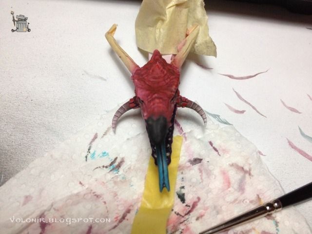
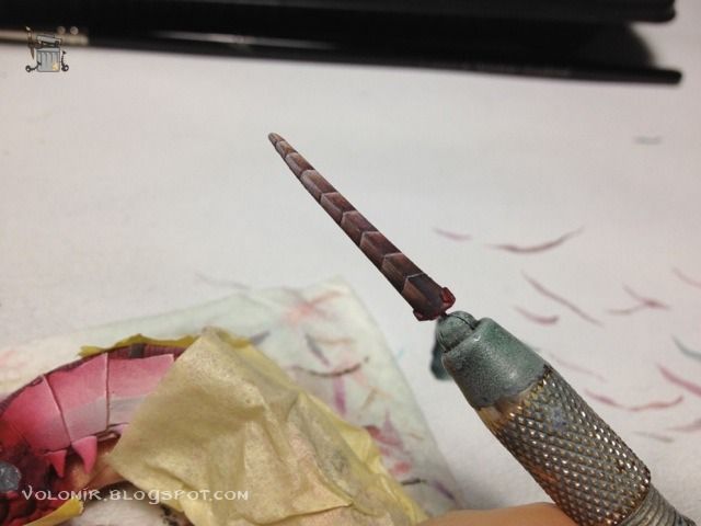
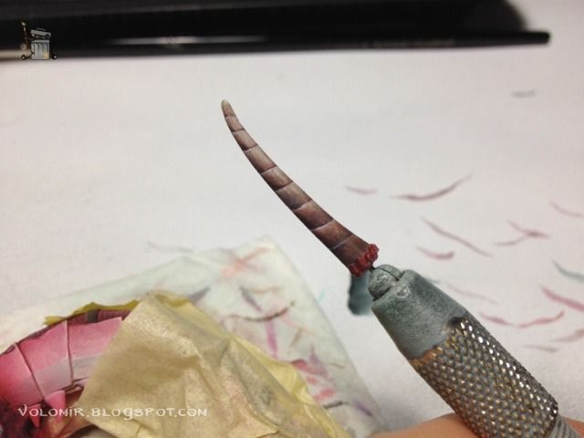
The horns are another of those parts which are flat and dull, I experiment with them by breaking them into little segments and giving them an interesting texture, while at the same time making a gradient from a darker brown to a light bone colour.

And also the lower part of the horn is also different. The pattern resembles some kind of non metallic metal.

Both horns completed.

The same is done on the horns of the back of the head, and these are way longer.


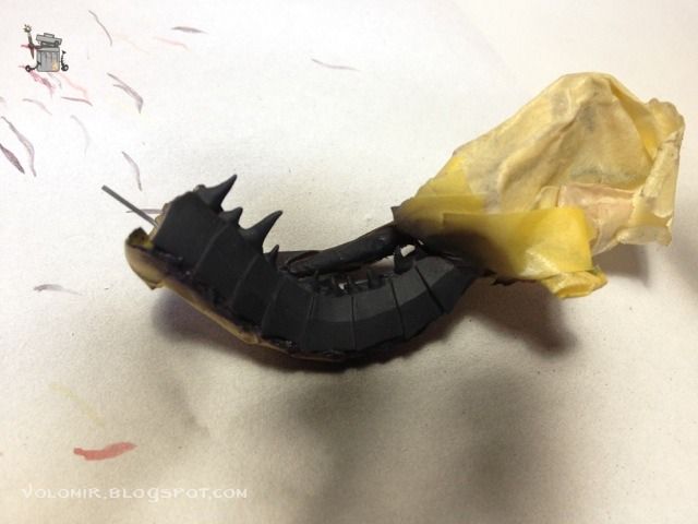
The neck is a very sensitive part. It's built from scratch, so the armour plaques may not be as polished and flat as one would desire, especially if the objective is creating metallics. These will look awful on a rough surface. Once the priming is on, you can see defects much better, so I use the opportunity to scrape out some rough parts, even with paint on top.

And once that's fixed, I prefer to prime it black. I am going to use metallic paints, and it is way easier to start this way.

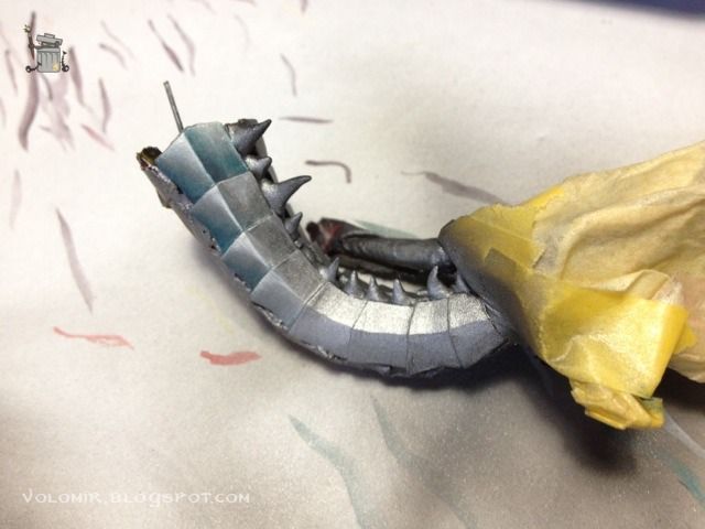
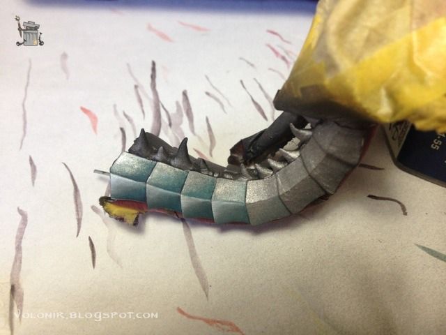
First steps of the metallic approach.

Paiting by parts is not good for this kind of work. I'm painting metallics but I don't really know how the global impression would be once the dragon is all mounted.

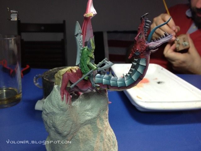
Once I have it more or less advanced, I put it on the dragon, to see how it looks.

Once the colours start to build up together, I can see that some things need ajusting. The tongue is now going to be more turquoise.

When I get tired of one surface, I switch to another area. Back to the lower part and the skin patterns.

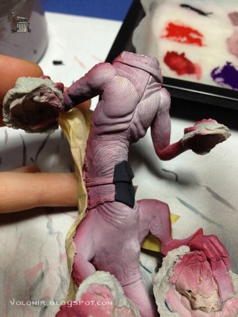
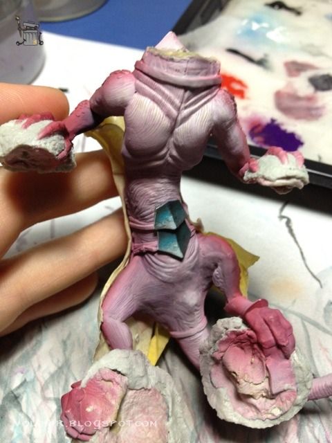
The plaque that was primed black will also be metallic, in the same way as the neck plaques.

Now I'm going to concentrate on the upper part of the body. I'm not really sure what to do now, so I'm just going to prime the scales in black first, maybe it will give me an idea of how darker scales would look.

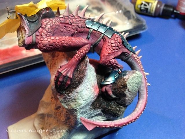
I'm not satisfied with different colours that I try, so I will stick to red on the scales too. This first approach is a warmer red. Also I begin the painting on the hands.

With the wings without paint on top. I start to get a sense of colour.


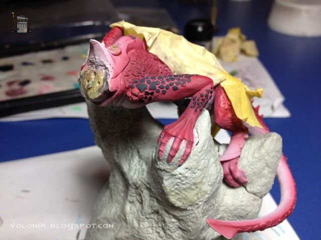
The scales are too similar to the skin. I will try another approach by using yellow colour as a starting point and then glazing red on top.

Also, I want the skin to look scaly, so I will do a pattern over the whole dragon trying to resemble lizard scales. It's a lot of work, but I like it.

The same is done in the legs.

In this photo you can see the difference of simple red scales (left) versus the corrected light version using yellows and purples.

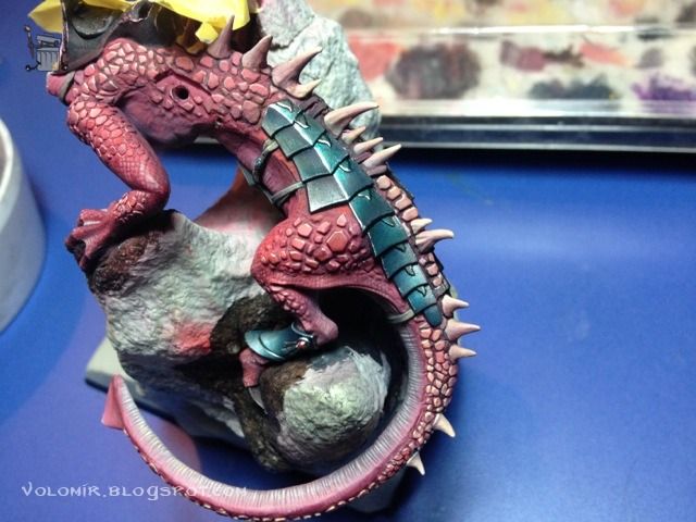
The metal plaques of the body will be done in the same way as the ones in the neck. First, priming black.

But first I will paint the horns of the body.

Painting the metallic parts with green inks and dark sea blue.

The leather straps are painted with browns and mixing them with yellow/white for the upper parts.

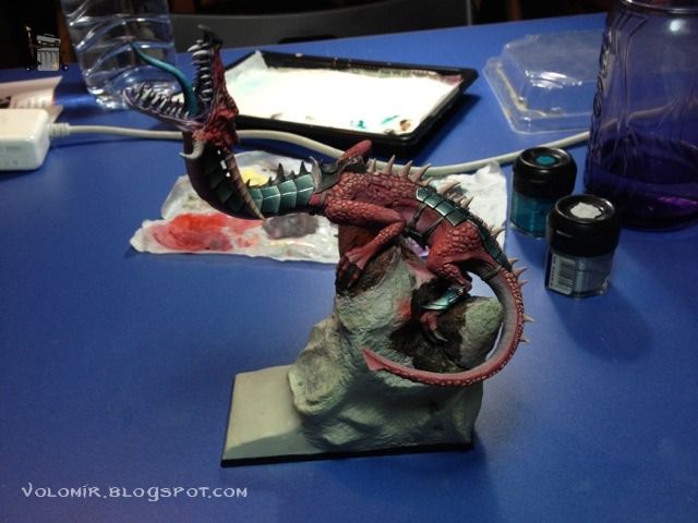
I check how the set looks with the neck and head attached.

Seems like everything fits.

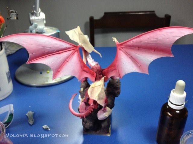
And the same with the wings on top.

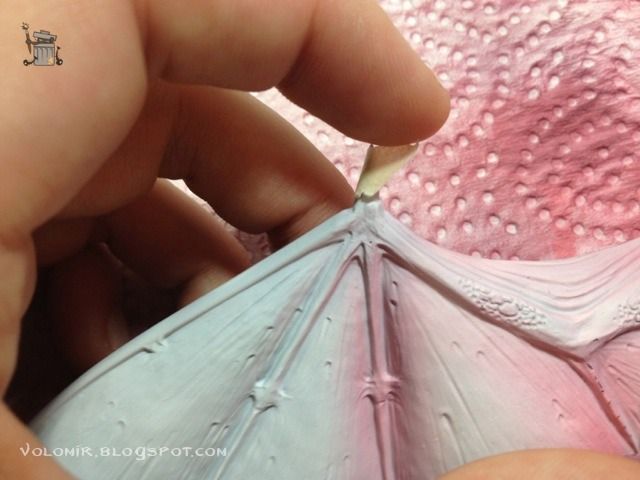
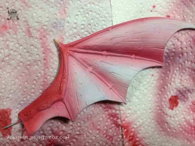
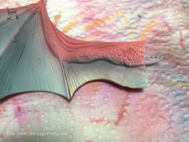
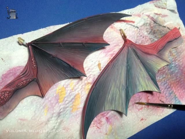
Let's start with the wings. The sculpted texture of the plastic wings that come with the kit is absolutely awful, but there is no way I can fight against it with just paint, so it will just be better to follow the sculpted trend. I want to go with a ligther tone of the red used in the dragon.

The upper part of the wing segments will be the light areas and will be more red and magenta, the lower parts will be darker, using dark sea blue, green ink and blue ink.

Even so, the wings need some more texture following the same pattern sculpted.

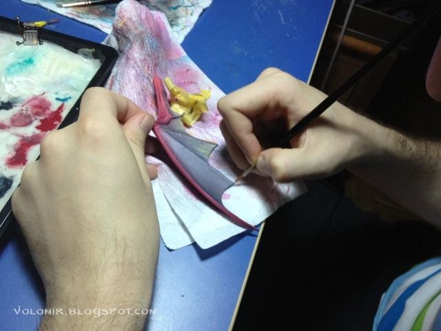
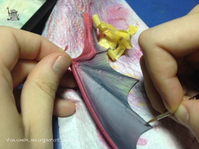
Seems easy but it's a very time consuming process. The wings are really big!


After lining all the texture with brush, I will airbrush on top with the same colours as in the beginning, which will show the texture underneath. This is the difference between a wing that has the texture finished (left) and one that is still lacking the airbrush on top (right).

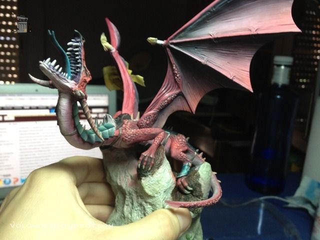
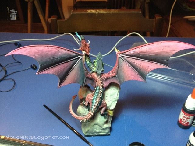
So now it's time to see how they look with the rest of the dragon.

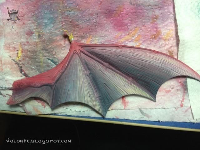
They turned out a little grey, so it might be interesting to bring in more colour. Maybe some turquoise in the mid tones (in the wing that hasn't been completed).

Apparently the turquoise (left wing) is pretty interesting. I works well with all the other colours in the dragon.


Let's use it a bit more, and maybe even suggest some kind of weird light effect in the upper edges of the inner wings. It looks much more interesting.

I will do the same on the inside, but it will help if I paint the wing frames, scales and so on. Using lightspots will increase definition.

The wings are a very tiring process. Maybe it would be nice to start the work on the rider for a change.

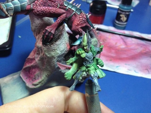
It's time to finally fix the position of the rider, and the head is extremely important.

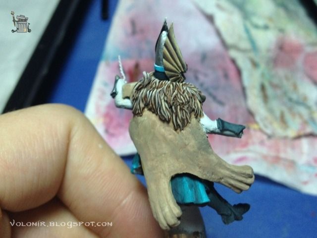
At this stage, I realized that the lion cloak looked really sloppy. Too much hair with that quality would be a real pain to paint. Let's take the hair off and do a real lion cloak.

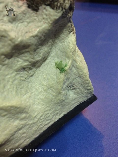
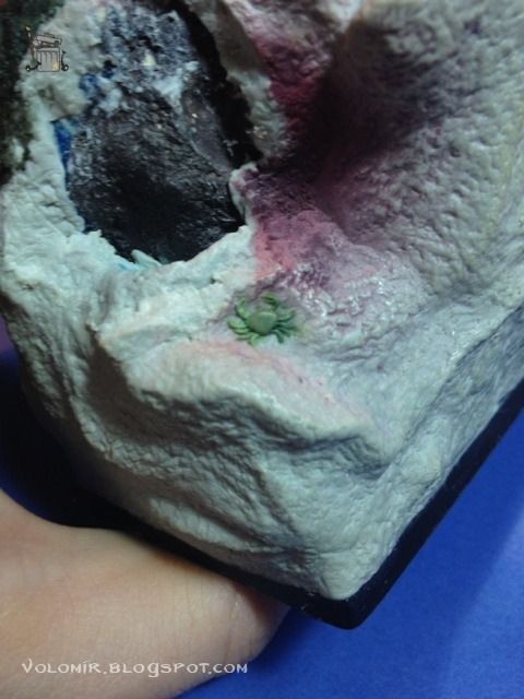
With the putty I'm using to sculpt the new lion cloak I finish a couple of crabs in the base, these details really make a difference.


And this is the new lion cloak. Paws in the air with help with the cinematics of the rider's movement.
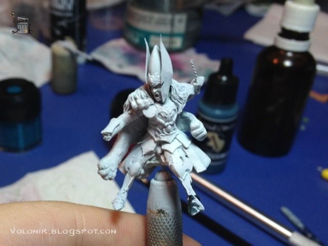
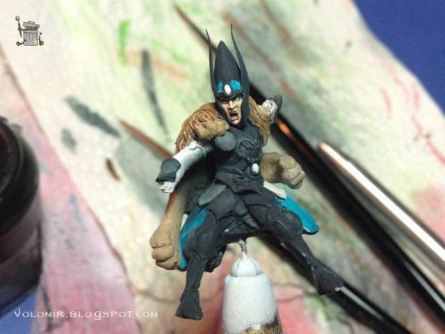
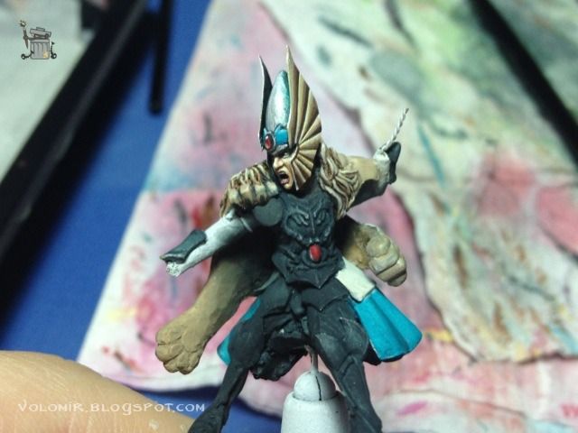
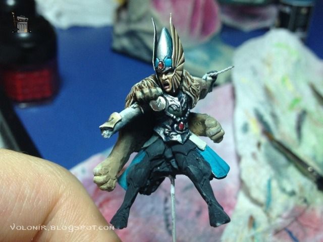
It's finally time to paint the rider. First of all, I will prime it white. I prefer this kind of priming because the rider should be the main figure, and white will make everything glow more intensely, thus making it more eye catching.

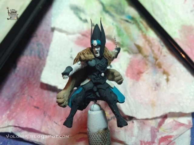
Everything that will be metallic will receive a basecoat of a dark blue sea, and I also put all the other colours in place to see the overall effect.


The face is one of the most important parts of the whole scene. This is what I will concentrate on first. It requires a lot of attention and care, we need to make sure that the expression of tension is maintained, and that is not an easy task. The painting of the eyes is key to this task, we need eyes that are slightly closed and tense, and this is not easy because the eyes are scratchbuilt so the surface is not very smooth.

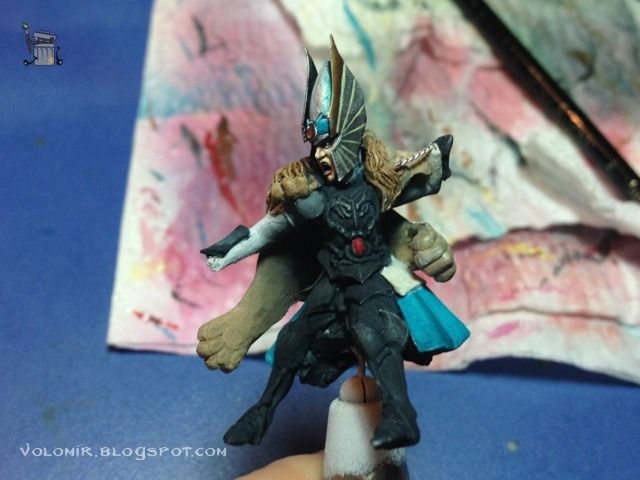
The winged helmet is also a very interesting area. I will paint it in a similar fashion as the one in
Tribute to the Fallen.

It is trying to resemble a metallic pattern using matte paints and some final highlights with gloss and metallic colours.

This is the final effect.


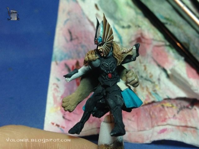
First metal on the armour. Basically my normal metallic approach. The rider starts to pop out.

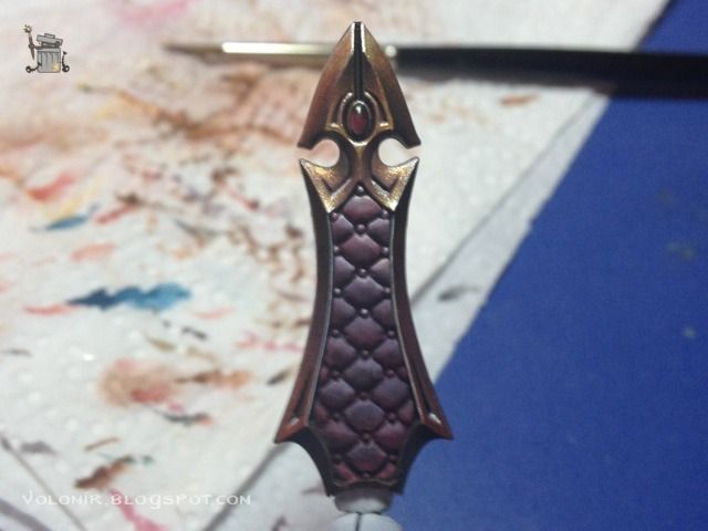
The chair-throne will also be in metallics, but golden this time. I used metallic paints and purple for the back of the chair which is made out of reds and blues used in the dragon.

The other side is completely flat and uninteresting. I decide to do some kind of conceptual freehand, by raising the purple to nearly white on the top and to dragon scales on the lower part.

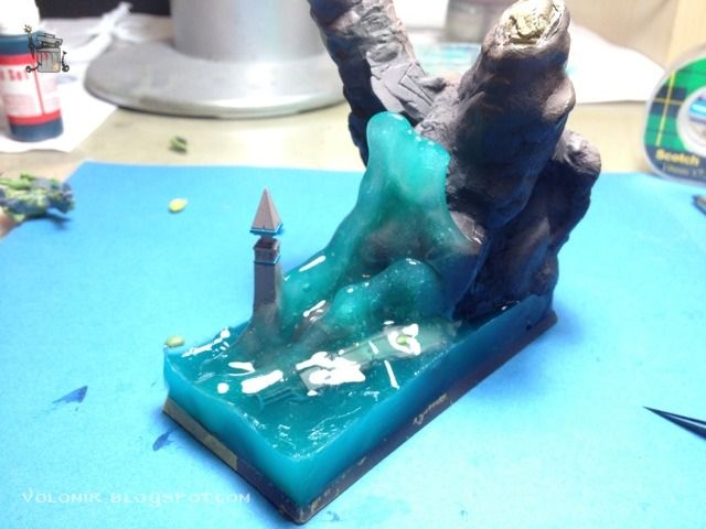
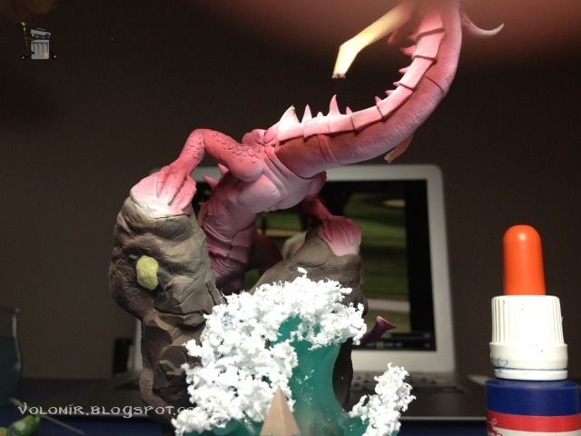
Time to start work on the base now. It's the third time I try water, but this time I have no option to fail. I will use water splashes made using the same process that Mr. Christian Petit, the french watermaster, uses.

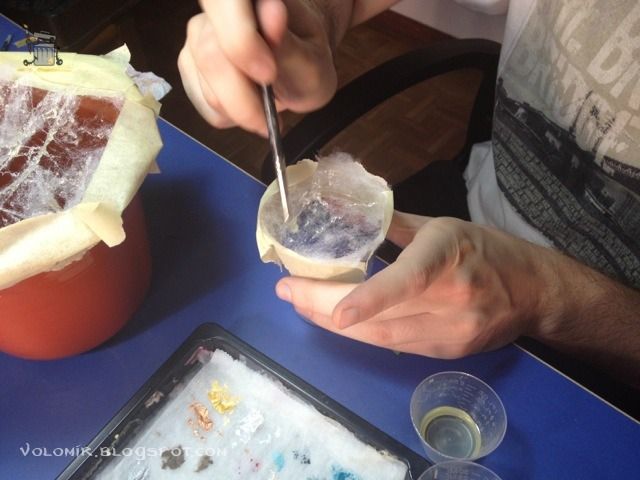
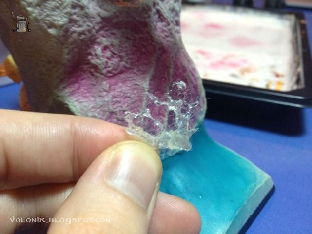
Using thin fibers, stretched out and splashed with water resin, once it is cured, they resemble little water splashes.

This is one of those water splashes. There is still fiber that needs to be removed, but the effect is really great.

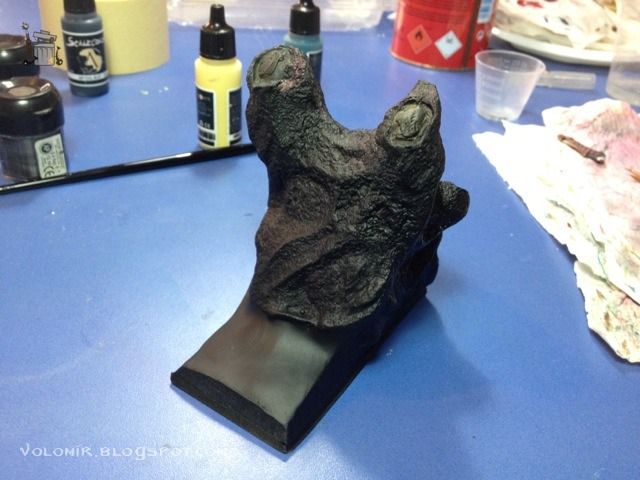
Before I start creating the sea wave, I will paint the sea floor, so I will prime it all black.

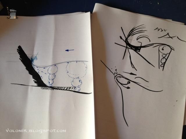
My friend Jorge (commonly known as Tupperware) knows a lot about sea waves, so he made some graphs for me to help me understand how a wave behaves when crashing on a rock. That should help me build a better wave, more realistic.

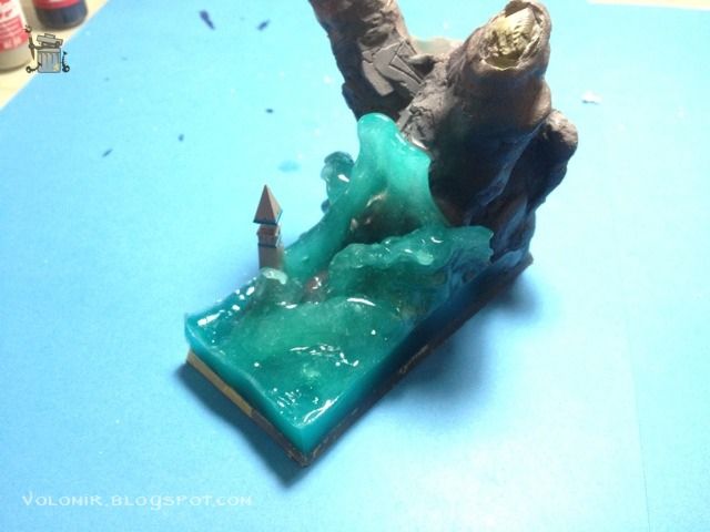
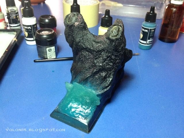
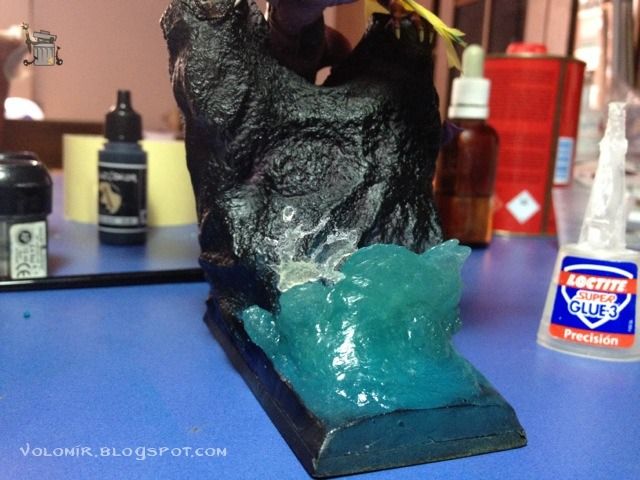
With his indications, I model the first approach to the wave. This water resin modelled will serve as the basepoint.

I need to check if the curl is right or not, that is one of the most important parts of the wave.

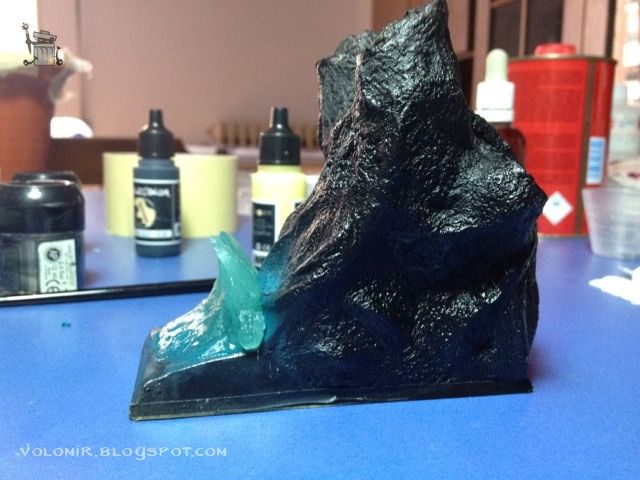
I check both sides.

The blue on the rock is not because the sea is glowing. It's turquoise residue from the airbrush work before I put the wave in.

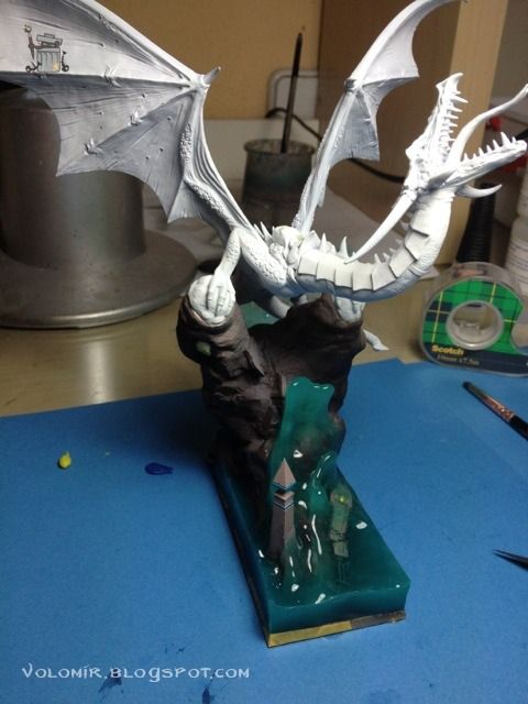
Here's how it all looks with the dragon on top.

I think the turquoise of the sea works well with the metal job and the red of the dragon. Also, the black priming of the base helps see the colours much better.

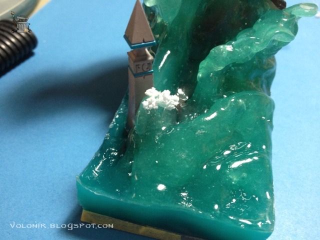
The splashes will go on top of the wave, stuck with superglue.

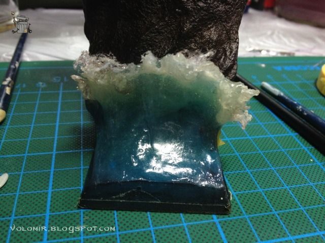
At this point, time was running out very quickly, so I couldn't stop to make photos that often. The sea wave was completed using more layers of resin on top to even out the difference between the water splashes and the blue wave.
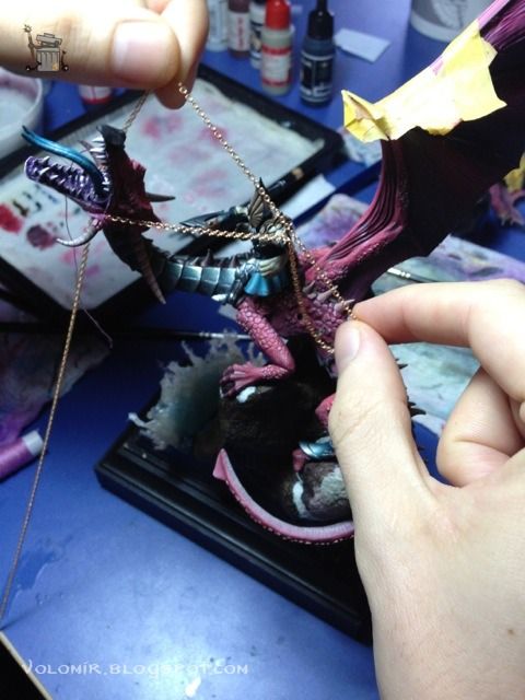
These are the last photos of the WIP! Once the wave was done, I glued everything to the base, and now that the rider was fixed, I could start working on the reins. First with an entire chain.

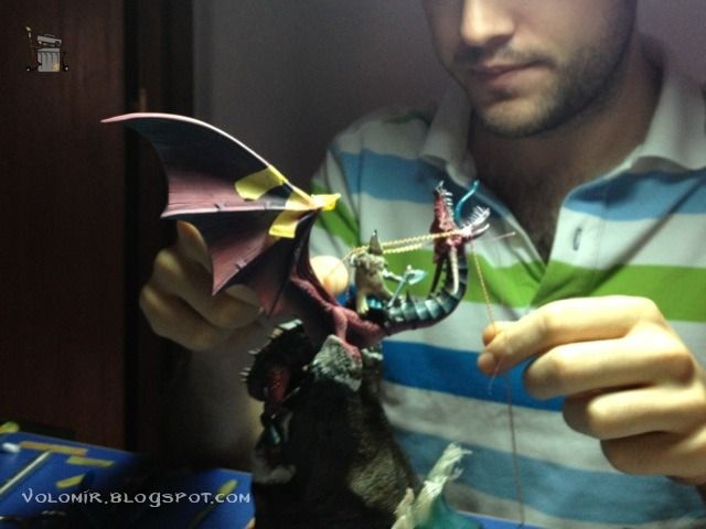
Getting the right amount of tightness and grip was no easy task!

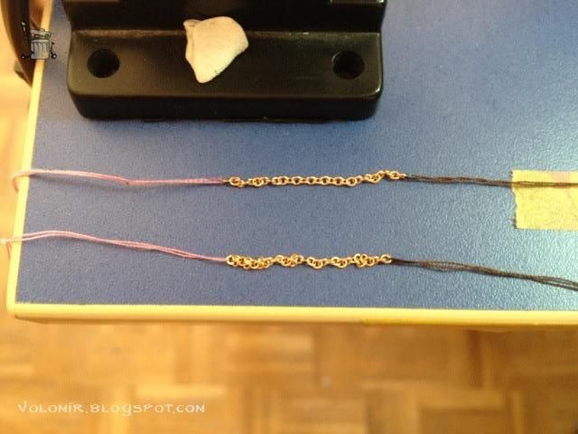
To put the chains in place I used trings attached to the ends. Much easier to manipulate than the normal chain.

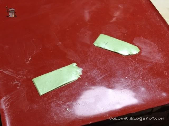
Using chain for all the rein proved really difficult, especially because the hand could not grip the entire chain. I decided to add leather to the back part of the rein. Much more natural. I used tin and green stuff to make the lower part of the rein.

With the rein in place I modelled the hand. That was no easy task, I tell you. At this point I realized how tough was painting everything by separate parts. The dragon is really big!

This is how the wave looks seeing it from the front view. Still lacking the polish work of sanding and black priming of the base edges.

So the only thing left now is the base. I had to finish it just in time before the contest, so I couldn't make photos of the process. But I have proof of this last minute painting!

Thus ends the Step by Step article. That was all folks! I hope you enjoyed reading this. Don't forget to check the final pictures in the Gallery.
May the dragon be with you all!

